library(here)
library(tidyverse)

Dabrowska.data <- readRDS(file = here("data", "processed", "combined_L1_L2_data.rds"))10 The GrammaR of Graphics
One of the advantages of working in R is that it allows us to create beautiful graphs for effective data visualisation. In this chapter, we will focus on the Grammar of Graphics (Wilkinson 2005), a theoretical framework that defines a structured approach to building and understanding statistical graphs, and on using the tidyverse package {ggplot2} (Wickham 2016) to create effective data visualisations. The {ggplot2} is an implementation of the Grammar of Graphics (GG) syntax in R.
This chapter is divided into two parts: the first explains the syntax of the Grammar of Graphics and how the {ggplot2} package works, while the second part focuses on the semantics of statistical graphics and provides an introduction to the most common types of data visualisations that are used in the language sciences.
Chapter overview
In this chapter, you will learn how to:
- Create and interpret barplots to visualise categorical variables
- Create and interpret histograms, density plots, and violin plots to visualise continuous numeric variables
- Create and interpret boxplots to visualise the distribution of continuous numeric variables across different subsets of the data
- Create and interpret scatterplots to visualise correlations between pairs of numeric variables
- Create and interpret facetted plots to explore the relationship between three or more variables at once
- Create interactive plots for data exploration
Set-up and data import
WarningPrerequisites
This chapter assumes that you are familiar with the concepts of descriptive statistics explained in Chapter 8 and the data wrangling functions from Chapter 9. All examples and quiz questions are based on data from Dąbrowska (2019). Our starting point for this chapter is the wrangled combined dataset that we created and saved in Chapter 9. Follow the instructions in Section 9.7 to create this R object. Alternatively, you can download Dabrowska2019.zip from the textbook’s GitHub repository. To launch the project correctly, first unzip the file and then double-click on the Dabrowska2019.Rproj file.
Before we begin, we must load the combined_L1_L2_data.rds file that we created and saved in Chapter 9. This file contains the data of all the L1 and L2 participants of Dąbrowska (2019). We have converted all categorical variables to factors and corrected obvious data entry errors and typos (see Chapter 9).
Check that your data are correctly imported by examining the output of View(Dabrowska.data) and str(Dabrowska.data). Once you are satisfied that that’s the case, you are ready to get creative! 🎨
10.1 The syntax of graphics
The syntax of the Grammar of Graphics (Wilkinson 2005) is made up of layers (see Figure 10.1), which allow us to create highly effective and efficient data visualisations, while giving us lots of flexibility and control.
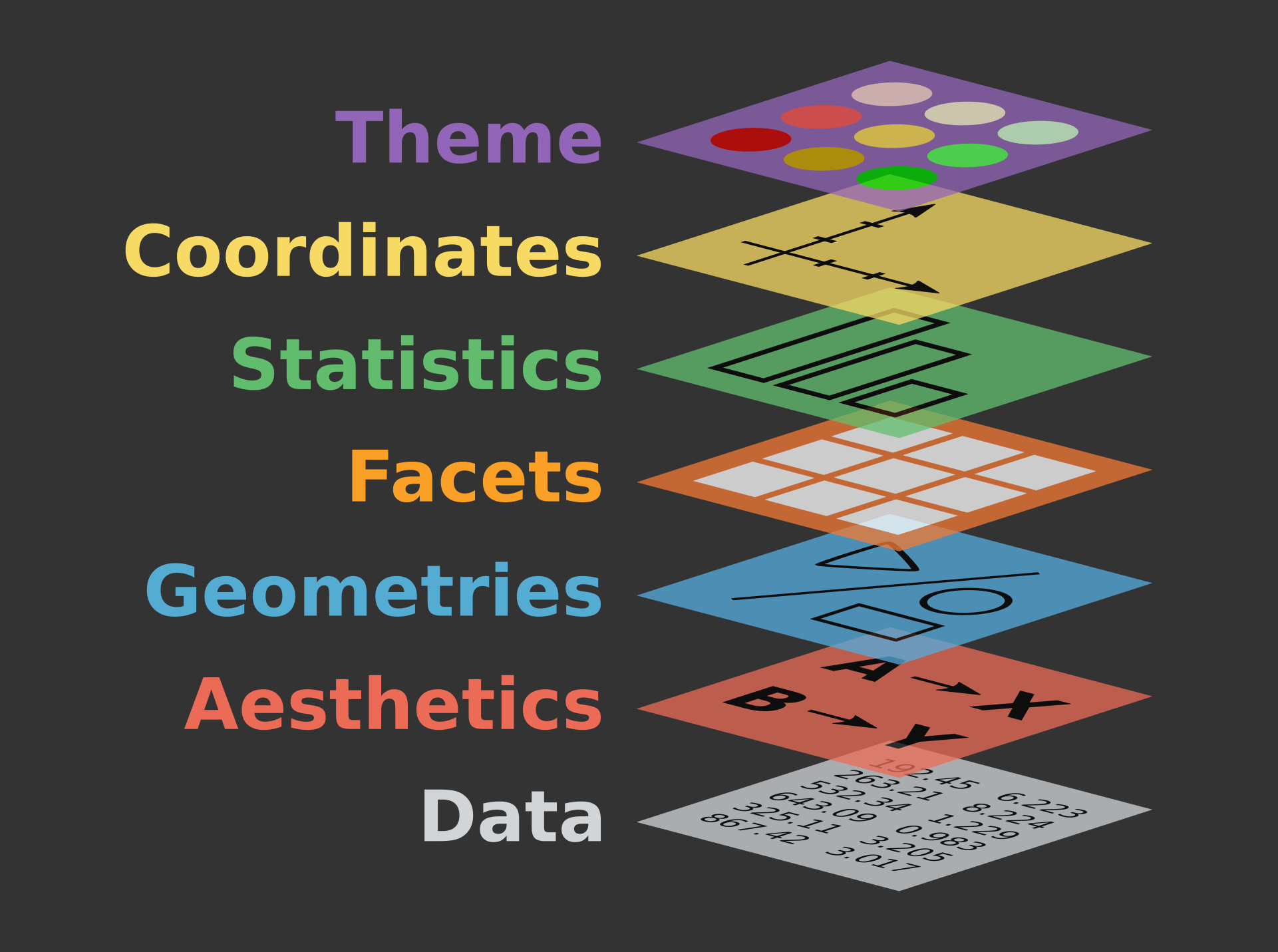
The data layer and the aesthetics layer are compulsory as you cannot build a graph that does not map some data onto some visual aspect (i.e. an “aesthetic”) of a graph. The remaining layers are optional, but some are very important. In the following, we will explain how the geometries, facet, scales, coordinates, and theme layers are used to build and customise graphs using the {ggplot2} library.
10.1.1 Aesthetics
As explained in the documentation, the ggplot() function1 has two compulsory arguments (see ?ggplot). First, we must select the data that we want to visualise. Second, we must specify which variable(s) from the data should be mapped onto which visual property or aesthetics (short: aes) of the plot.
ggplot {ggplot2} R Documentation Description
ggplot()initializes a ggplot object. It can be used to declare the input data frame for a graphic and to specify the set of plot aesthetics intended to be common throughout all subsequent layers unless specifically overridden.Usage
ggplot(data = NULL, mapping = aes(), ...)
For example, to create a barplot visualising the distribution of participants’ occupational groups in the combined dataset from Dąbrowska (2019) (Dabrowska.data), we need to map the OccupGroup variable from Dabrowska.data onto our plot’s x-axis (x).
ggplot(data = Dabrowska.data,
       mapping = aes(x = OccupGroup))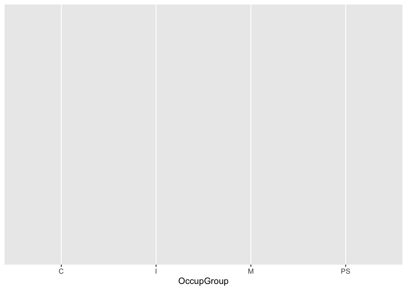
As you can see from Figure 10.2, however, running this code returns an empty plot! All we get is a grid background and a nicely labelled x-axis, but no data… Why might that be? 🤔
10.1.2 Geometries
The reason we are not seeing any data is that we have not yet specified with which kind of geometry (short: geom) we would like to plot the data. The {ggplot2} library features more than 30 different geom functions! They all begin with the prefix geom_. To create a barplot showing participants’ occupational groups, we need to add a geom_bar() layer to our empty ggplot object (see Figure 10.3).
ggplot(data = Dabrowska.data,
       mapping = aes(x = OccupGroup)) +
  geom_bar()
WarningFrequent error
Note that we use the + operator to add layers to ggplot objects. You might be tempted to use the pipe operator (|>). But if we try to pipe something inside the ggplot() function, R returns an error message:
ggplot(data = Dabrowska.data,
       mapping = aes(x = OccupGroup)) |>
  geom_bar()
Error in `geom_bar()`:
! `mapping` must be created by `aes()`.
ℹ Did you use `%>%` or `|>` instead of `+`?
Run `rlang::last_trace()` to see where the error occurred.10.1.3 Statistics and labels
We now have a simple barplot that represents the distribution of participants’ occupational groups in Dąbrowska (2019). By default, the axis labels are simply the names of the variables that are mapped onto the plot’s aesthetics. That’s why, in Figure 10.3, our x-axis is labelled “OccupGroup”.
What about the y-axis? We did not specify a y-aesthetic within the mapping argument of our ggplot() object, yet the y-axis is labelled “count”. This is because geom_bar() automatically computes a “count” statistic that gets mapped to the y-aesthetic. If we want to change these axis labels, we can do so by adding a labs() layer to our plot (see Figure 10.4).
ggplot(data = Dabrowska.data,
       mapping = aes(x = OccupGroup)) +
  geom_bar() +
  labs(x = "Occupational group",
       y = "Number of participants")
TipYour turn!
Q10.1 Which of the following labels can be added or modified using the labs() function?
🐭 Click on the mouse for a hint.
NoteWhat is alt-text and why is it important?
Alternative text, or alt-text, is a concise description of an image used to make its informational content accessible to people with visual impairments. Using a screen reader programme, blind and low-vision readers can have the alt-text associated with an image read out to them.
A good alt-text aims to convey the main message and insights of the graph, allowing someone who cannot see it to understand the information being presented (WAI) (2022). In the context of online publications, alt-text is also useful in regions with low bandwidth as images may take a very long time to load. By including alt-text, we can therefore make our work more accessible and inclusive, enabling more people to engage with and understand our data and analyses.
Section 14.8 explains how to add alt-text to plots and figures in Quarto documents. If you take a peek at the source code of this textbook chapter, you will see that every figure in this textbook is described with alt-text. Whilst some AI products now claim to be able to automatically generate alt-text for us, it is best to write alt-text ourselves. This is because auto-generated alt-text often does not focus on the visual information that we want to convey, misses out on important aspects, and/or overwhelms the user with redundant information (for more on AI-assisted research and learning, see Chapter 15).
Blind and low-vision readers may also want to check out the {BrailleR} package (Godfrey & al. 2025), which converts plots generated in R into a textual form that can be interpreted by blind and low-vision R users who cannot access the graphs without printing the image to a tactile embosser, or who need the extra text to support any tactile images that they have created.
10.1.4 Data
Instead of using the data argument of the ggplot() function as we did above, we can pipe the data into the function’s first argument (see Section 7.5.2). Compare these two methods and their outputs.
Using the data argument of ggplot()
ggplot(data = Dabrowska.data,
       mapping = aes(x = OccupGroup)) +
  geom_bar() +
  labs(x = "Occupational group",
       y = "Number of participants")
Piping the data into ggplot()
Dabrowska.data |>
  ggplot(mapping = aes(x = OccupGroup)) +
  geom_bar() +
  labs(x = "Occupational group",
       y = "Number of participants")
The outputs are exactly the same! Piping the dataset into the ggplot() function, however, allows us to easily wrangle the data that we want to visualise ‘on the fly’, without transforming the data object itself. For example, we can use the tidyverse filter() function (see Section 9.7) to examine the distribution of occupational groups among L2 participants only (see Figure 10.5).
Dabrowska.data |>
  filter(Group == "L2") |>
  ggplot(mapping = aes(x = OccupGroup)) +
  geom_bar() +
  labs(x = "Occupational group",
       y = "Number of participants")
We can also combine several filter() conditions using the & (AND) and | (OR) operators. For example, we may want to visualise the distribution of the occupational groups of participants who are L2 speakers of English and whose first language is Polish (see Figure 10.6).
Dabrowska.data |>
  filter(Group == "L2" & NativeLg == "Polish") |>
  ggplot(mapping = aes(x = OccupGroup)) +
  geom_bar() +
  labs(x = "Occupational group",
       y = "Number of participants")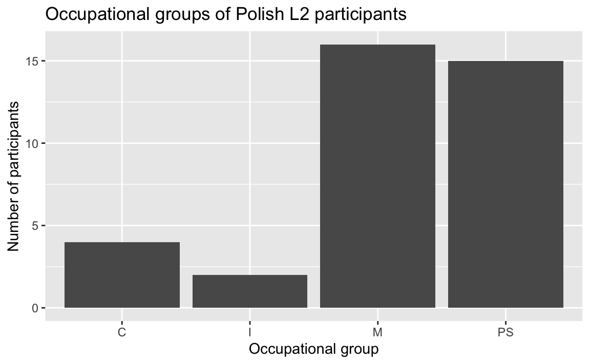
10.1.5 Facets
If we want to compare two subsets of the data, we can add a facet layer to subdivide the plot into several plots each representing a subset of the data. In the following, we use the facet_wrap() function to subdivide our barplot by the Group variable (~ Group). This allows us to easily compare the distribution of occupations across L1 and the L2 participants (see Figure 10.7).
Dabrowska.data |>
  ggplot(mapping = aes(x = OccupGroup)) +
  geom_bar() +
  facet_wrap(~ Group) +
  labs(x = "Occupational group",
       y = "Number of participants")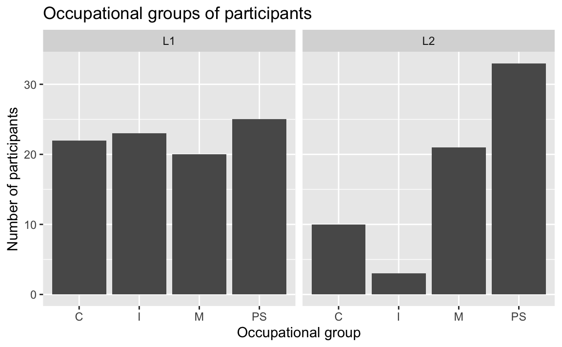
WarningFrequent error when attempting to generate a plot in RStudio
Error in seq.default(from, to, by) : invalid '(to - from)/by' If you get this error message when trying to run a chunk of code that generates a plot, this is most likely due to your Plots pane in RStudio not being large enough to accommodate the plot. If you increase its size and rerun the chunk, your plot should appear in the Plots pane as expected.
If you have a small screen, you can also click on the 🔎 Zoom button at the top of the Plots pane to view your plot in a separate RStudio window, which you can resize according to your needs.
To compare the distributions of occupations of the male and female L2 participants, we can combine a filter() operation to select only the L2 participants with a facet_wrap() layer (see Figure 10.8).
Dabrowska.data |>
  filter(Group == "L2") |>
  ggplot(mapping = aes(x = OccupGroup)) +
  geom_bar() +
  facet_wrap(~ Gender) +
  labs(x = "Occupational group",
       y = "Participants")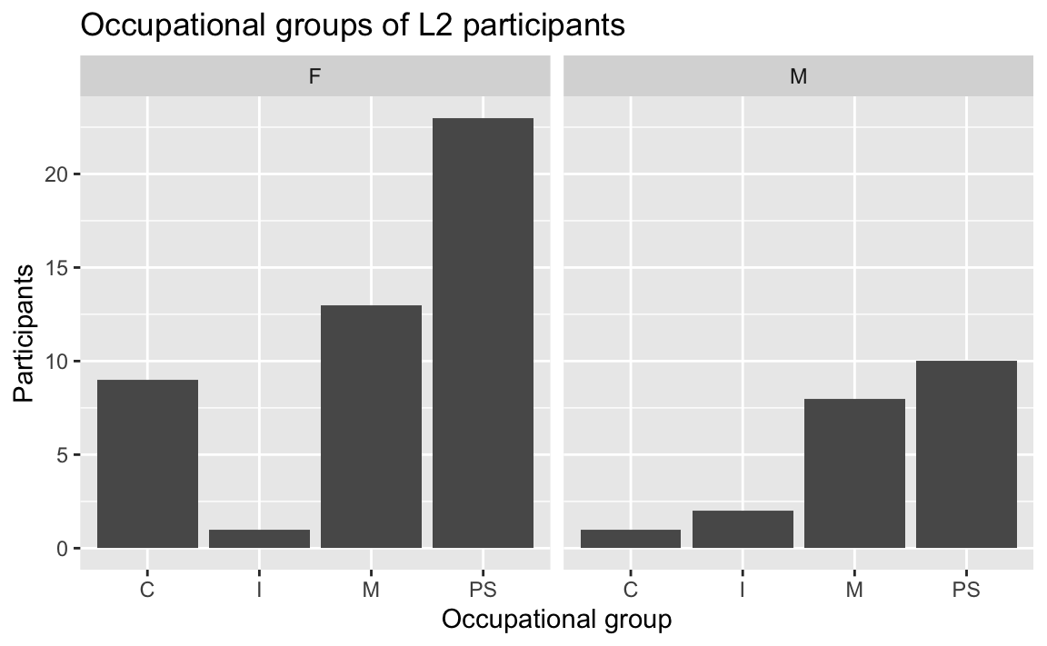
To explore potential gender differences in occupational groups across both L1 and L2 groups, we can combine the two variables within the facet_wrap() function (see Figure 10.9).
Dabrowska.data |>
  ggplot(mapping = aes(x = OccupGroup)) +
  geom_bar() +
  facet_wrap(~ Group + Gender) +
  labs(x = "Occupational group",
       y = "Participants")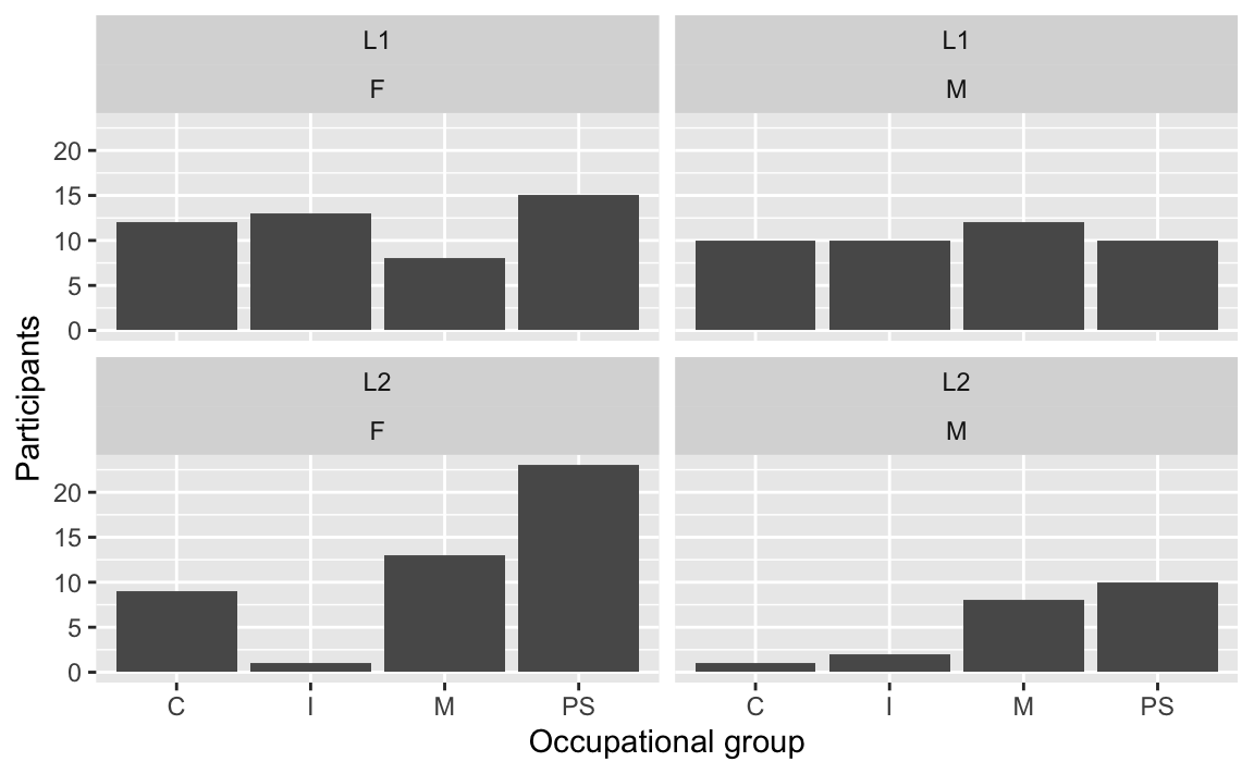
10.1.6 Scales
Scale layers allow us to map data values to the visual values of an aesthetic. For example, to make our facetted plot in Figure 10.9 easier to read, we could add some colour using a fill aesthetic to fill each bar with a colour that corresponds to the participants’ gender. To do so, we map each unique value of the variable Gender (“F” and “M”) onto a colour that is then used to fill the corresponding bars of our barplot. Adding the fill aesthetic automatically generates a legend (see Figure 10.10).
Dabrowska.data |>
  ggplot(mapping = aes(x = OccupGroup,
                       fill = Gender)) +
  geom_bar() +
  facet_wrap(~ Group + Gender) +
  labs(x = "Occupational group",
       y = "Participants")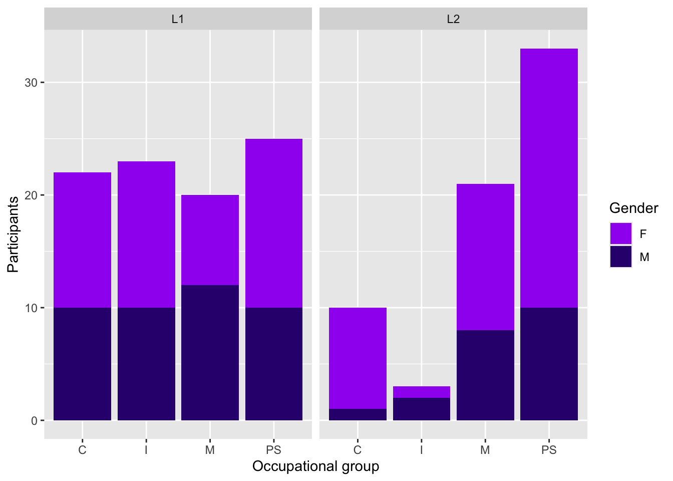
As we did not specify any fill colours for Figure 10.10, {ggplot2} used default colours taken from the {scales} package of the tidyverse environment. This is because, in the Grammar of Graphics, colour palettes are governed by scales. To specify a different set of colours, we therefore need to specify a scale layer. One way to do this is to use scale_fill_manual() to manually pick our own colours, either using R colour codes (such as purple) or hexadecimal colour codes (such as #34027d). Note that both types of colour codes must be enclosed in quotation marks.
Dabrowska.data |>
  ggplot(mapping = aes(x = OccupGroup,
                       fill = Gender)) +
  geom_bar() +
  facet_wrap(~ Group + Gender) +
  labs(x = "Occupational group",
       y = "Participants") +
  scale_fill_manual(values = c("purple", "#34027d"))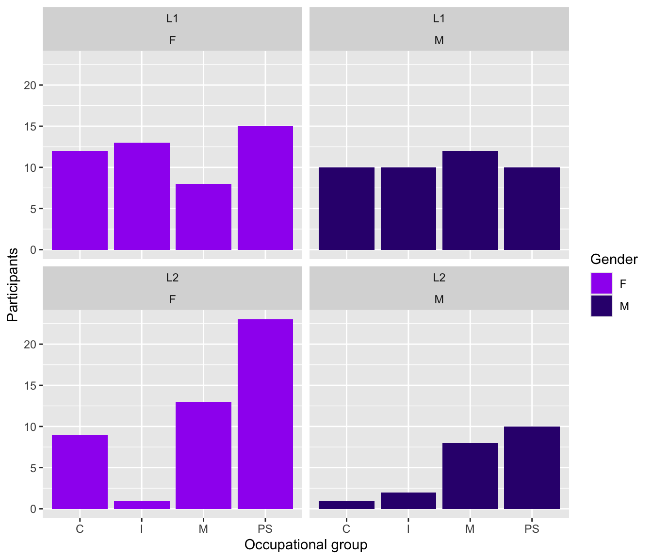
Although it makes the plot easier to interpret, the colour aesthetic (here fill) is not strictly necessary to understand the data represented in Figure 10.11. After all, the two gender subgroups are already distinguished by the facet_wrap() layer. That’s not necessarily a bad thing, but you must consider whether such redundant elements facilitate the interpretation of the data visualised or not.
In some cases, colour is used as the only way of identifying subgroups in the data, for example in a stacked barplot (see Figure 10.12). In such cases, it is important to consider how the plot will be perceived by different people (see note on colour blindness below).
Dabrowska.data |>
  ggplot(mapping = aes(x = OccupGroup,
                       fill = Gender)) +
  geom_bar() +
  facet_wrap(~ Group) +
  labs(x = "Occupational group",
       y = "Participants") +
  scale_fill_manual(values = c("purple", "#34027d"))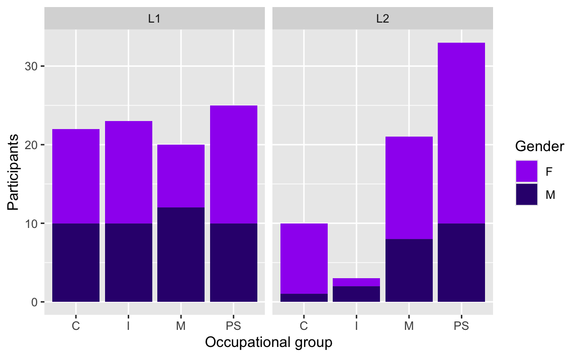
Scale layers can be used to control the axes of your plots. Play around with the expand and limits arguments of the scale_y_continuous() function to understand how they work.
Dabrowska.data |>
  ggplot(mapping = aes(x = OccupGroup)) +
  geom_bar() +
  labs(x = "Occupational group",
       y = "Participants") +
  scale_y_continuous(expand = c(0,0),
limits = c(0,100)) 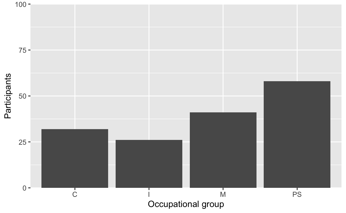
NoteA note on colours and colour blindness 🌈
Colour blindness is a condition that results in a decreased ability to see colours and perceive differences in colour. There are different types of colour blindness but, in general, it is best to avoid red-green contrasts. To ensure that your data visualisations are accessible to as many people as possible, you may want to use the {colorBlindness} package (Ou 2021) to simulate the appearance of a set of colours for people with different forms of colour blindness.
#install.packages("colorBlindness")
library(colorBlindness)
colorBlindness::displayAllColors(scales::hue_pal()(6))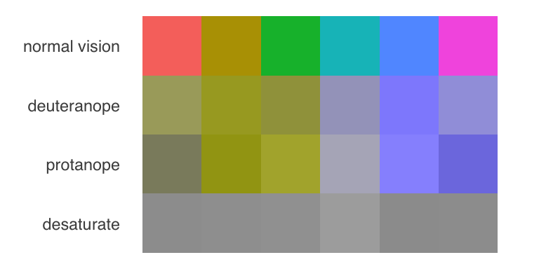
Using the {colorBlindness} package, we can immediately see that the default {scales} discrete palette that {ggplot2} used in Figure 10.10 is not accessible to colour-blind people (deuteranope and protanope), nor is it distinguishable when printed in grey-scale (desaturate). In contrast, our hand-picked colours from Figure 10.11 fare much better.
colorBlindness::displayAllColors(c("pink", "#34027d"))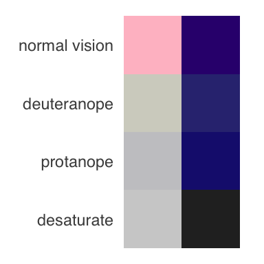
But you need not manually pick colours, as many people have developed and shared R packages that feature attractive, ready-to-use colour-blind friendly palettes. The {viridis} package (Garnier et al. 2023), for example, includes eight such palettes (“magma”, “inferno”, “plasma”, “cividis”, “rocket”, “turbo”) that also reproduce well in grey-scale. And, as it is included in the {ggplot2} installation, you don’t even need to install the {viridis} package separately!
colorBlindness::displayAllColors(viridis::viridis(6))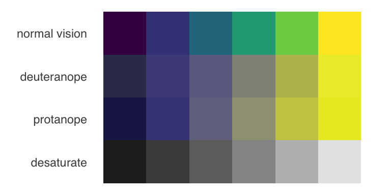
Choosing an appropriate palette is not the only way to make your visualisations accessible to colour-blind readers. Another way is to provide redundant mappings to other aesthetics such as size, line type, shape, or pattern.
Finally, it is important to remember that colour blindness is by no means the only type of visual impairment you should consider when creating visualisations. Worldwide, far more people are affected by blindness and low vision. Section 14.8 explains how to add alternative texts (alt-text) to plots and images. Many people with visual impairments rely on screen readers that use these alternative texts to provide audio descriptions of images and plots. These alternative texts can also improve the experience of users facing internet connection issues resulting in images that do not load properly or quickly enough.
Some academic publishers still require grey-scale plots, in which case you will want to use the scale layer scale_fill_grey(). Alternatively, the colour palettes of the {viridis} package (see information box on colour blindness) render well in grey, too. The {viridis} function for a discrete colour scale (as needed for a categorical variable such as Gender) can be called up using the scale_fill_viridis_d() function. With the option argument, you can switch between eight different viridis palettes (“magma”, “inferno”, “plasma”, “cividis”, “rocket”, “turbo”).
Dabrowska.data |>
  ggplot(mapping = aes(x = OccupGroup, fill = Gender)) +
  geom_bar() +
  facet_wrap(~ Group) +
  labs(x = "Occupational group",
       y = "Participants") +
  scale_y_continuous(expand = c(0,0),
                     limits = c(0,35)) +
  scale_fill_grey()
Dabrowska.data |>
  ggplot(mapping = aes(x = OccupGroup, fill = Gender)) +
  geom_bar() +
  facet_wrap(~ Group) +
  labs(x = "Occupational group",
       y = "Participants") +
  scale_y_continuous(expand = c(0,0),
                     limits = c(0,35)) +
  scale_fill_viridis_d(option = "viridis")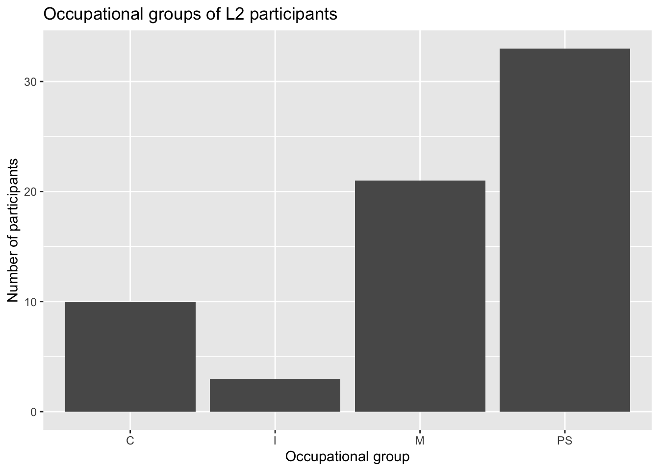
Dabrowska.data |>
  ggplot(mapping = aes(x = OccupGroup, fill = Gender)) +
  geom_bar() +
  facet_wrap(~ Group) +
  labs(x = "Occupational group",
       y = "Participants") +
  scale_y_continuous(expand = c(0,0),
                     limits = c(0,35)) +
  scale_fill_viridis_d(option = "turbo")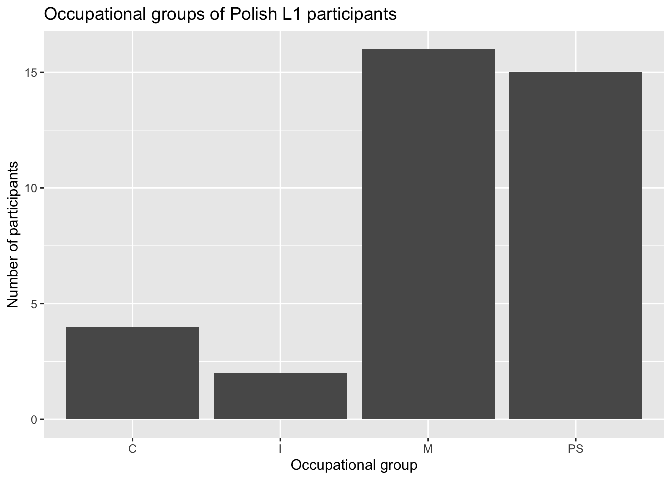
If you like colours, check out the {paletteer} package (Hvitfeldt & al. 2021), which provides a neat interface to access a very large collection of R colour palette packages, some of which are very fun! The advantage is that you only need to install one package (install.packages("paletteer")) to have a huge range of palettes at your disposal. Below is a small selection of some personal favourites..
Dabrowska.data |>
  ggplot(mapping = aes(x = OccupGroup, fill = OccupGroup)) +
  geom_bar() +
  labs(x = "Occupational group",
       y = "Participants") +
  scale_y_continuous(expand = c(0,0),
                     limits = c(0,60)) +
  paletteer::scale_fill_paletteer_d("beyonce::X11")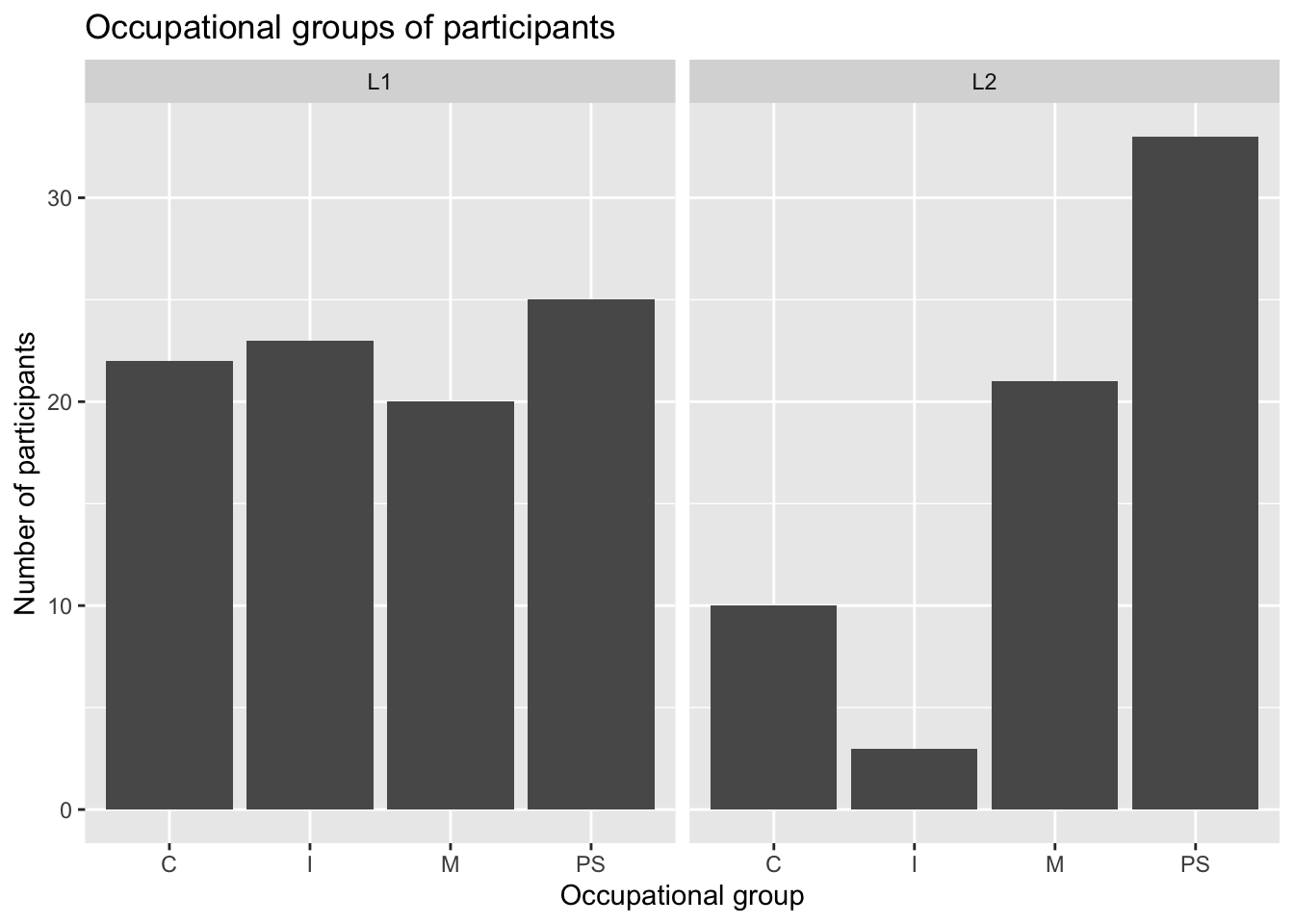
Dabrowska.data |>
  ggplot(mapping = aes(x = OccupGroup, fill = OccupGroup)) +
  geom_bar() +
  labs(x = "Occupational group",
       y = "Participants") +
  scale_y_continuous(expand = c(0,0),
                     limits = c(0,60)) +
  paletteer::scale_fill_paletteer_d("lisa::BridgetRiley", direction = -1)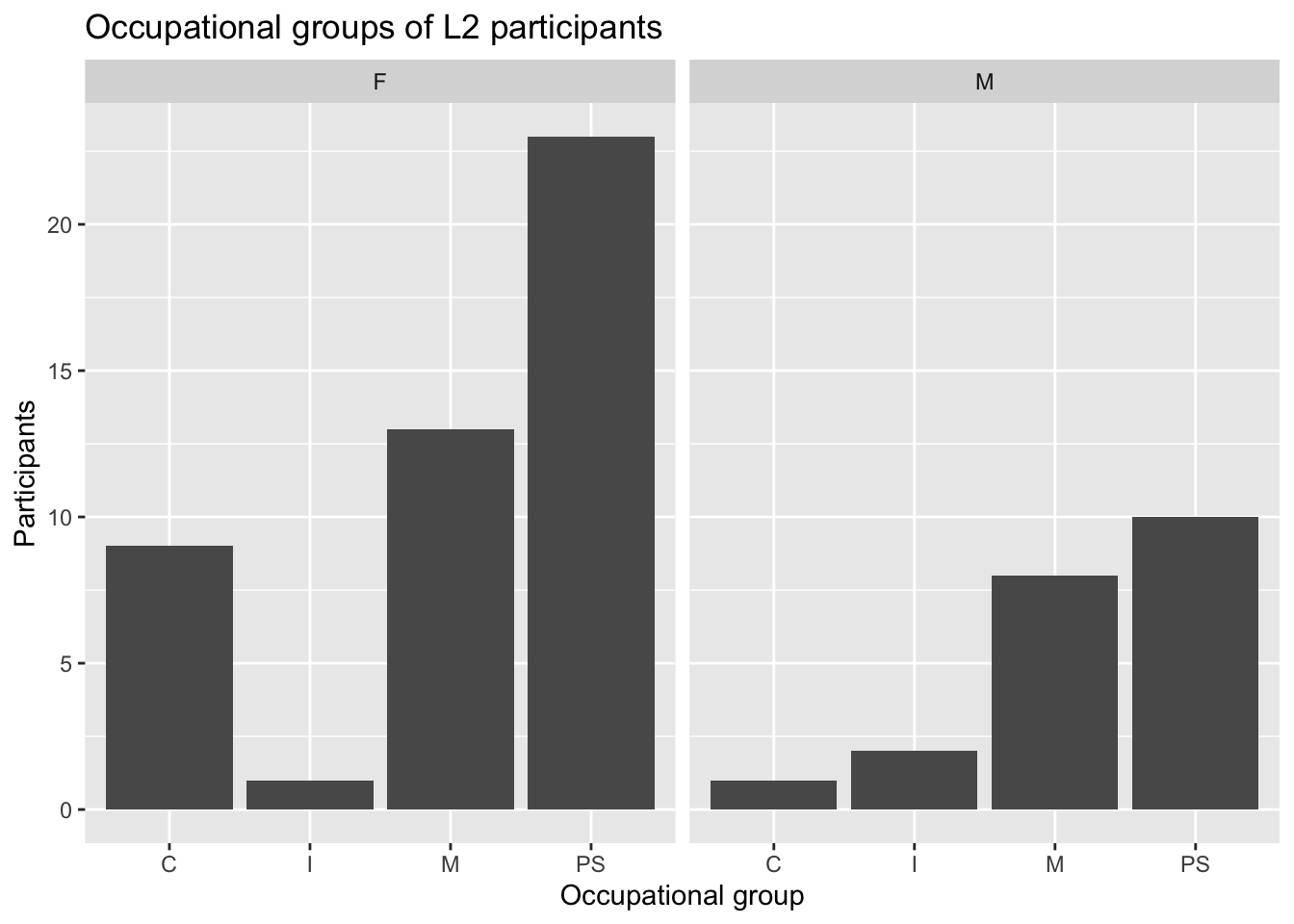
Dabrowska.data |>
  ggplot(mapping = aes(x = OccupGroup, fill = OccupGroup)) +
  geom_bar() +
  labs(x = "Occupational group",
       y = "Participants") +
  scale_y_continuous(expand = c(0,0),
                     limits = c(0,60)) +
  paletteer::scale_fill_paletteer_d("rockthemes::janelle")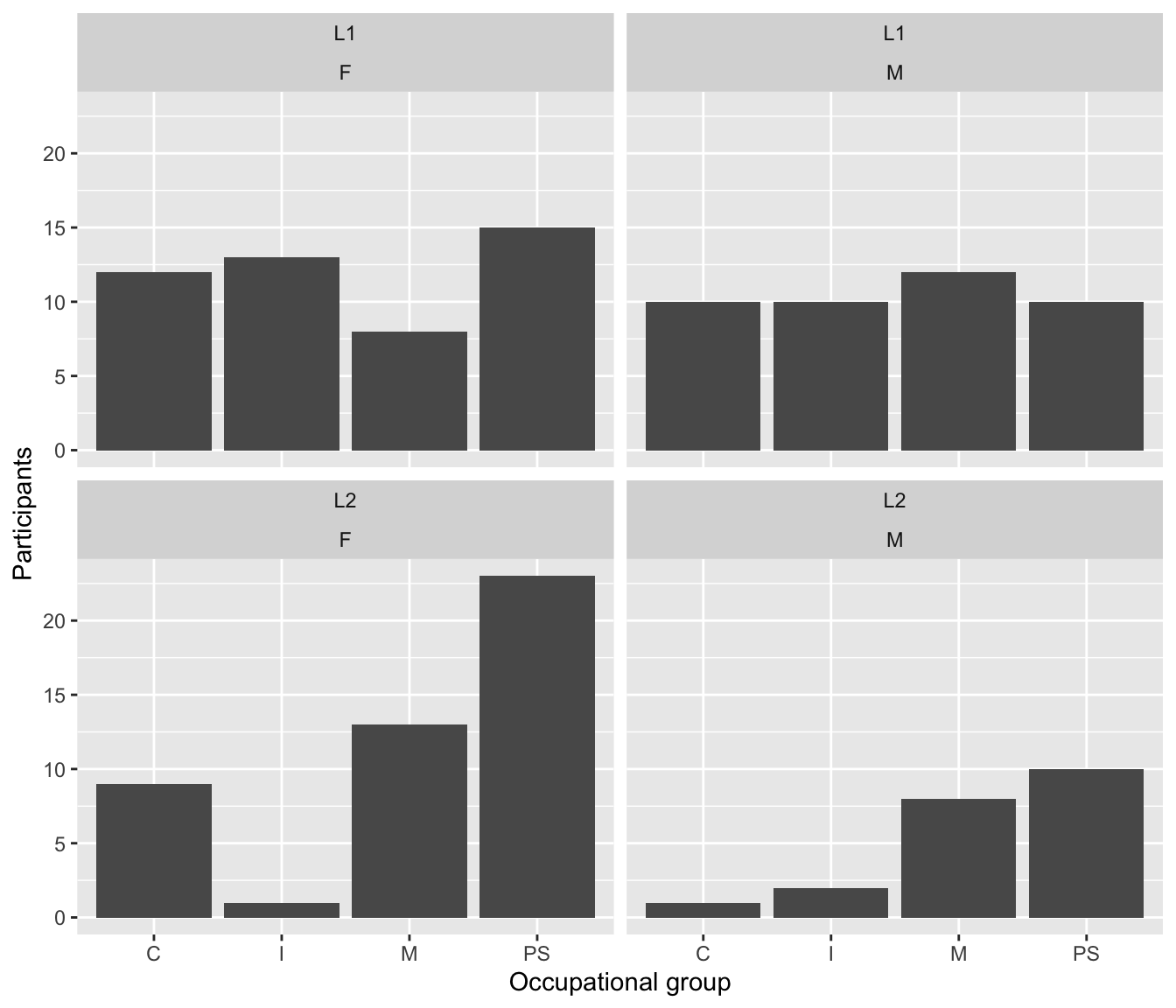
Dabrowska.data |>
  ggplot(mapping = aes(x = OccupGroup, fill = OccupGroup)) +
  geom_bar() +
  labs(x = "Occupational group",
       y = "Participants") +
  scale_y_continuous(expand = c(0,0),
                     limits = c(0,60)) +
  paletteer::scale_fill_paletteer_d("lisa::FridaKahlo", direction = -1)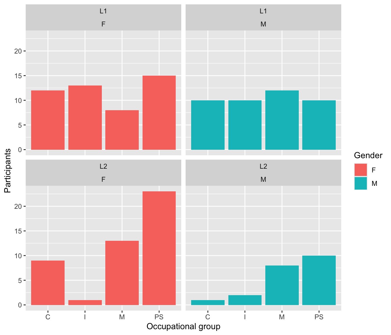
Dabrowska.data |>
  ggplot(mapping = aes(x = OccupGroup, fill = OccupGroup)) +
  geom_bar() +
  labs(x = "Occupational group",
       y = "Participants") +
  scale_y_continuous(expand = c(0,0),
                     limits = c(0,60)) +
  paletteer::scale_fill_paletteer_d("ltc::kiss")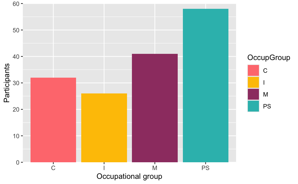
Dabrowska.data |>
  ggplot(mapping = aes(x = OccupGroup, fill = OccupGroup)) +
  geom_bar() +
  labs(x = "Occupational group",
       y = "Participants") +
  scale_y_continuous(expand = c(0,0),
                     limits = c(0,60)) +
  paletteer::scale_fill_paletteer_d("tayloRswift::speakNow")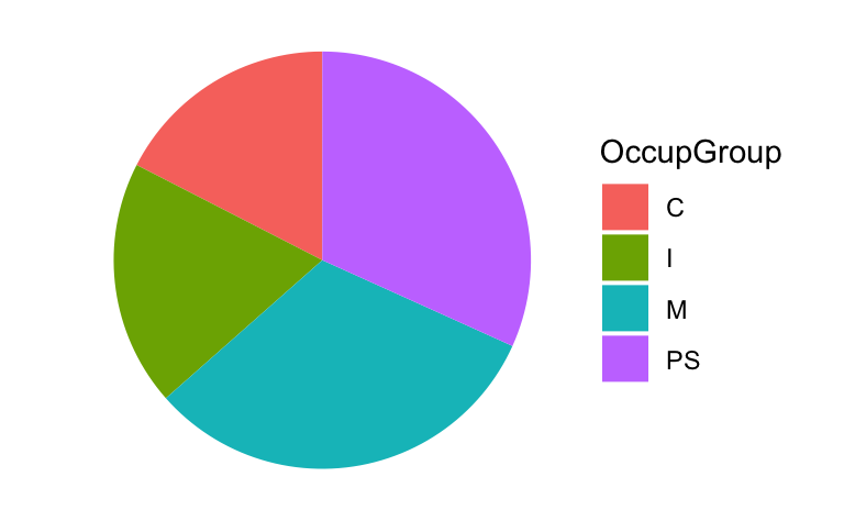
10.1.7 Themes
The {ggplot2} framework also allows for the addition of an optional theme() layer to further customise the look of plots. The default {ggplot2} theme is theme_grey(). Here are some of the pre-built themes that come with the {ggplot2} library for you to try out and compare:
theme_bw()theme_classic()theme_dark()theme_light()theme_minimal()theme_void()
ggplot(data = Dabrowska.data,
       mapping = aes(x = OccupGroup)) +
  geom_bar() +
  labs(x = "Occupational group",
       y = "Number of participants") +
  theme_bw()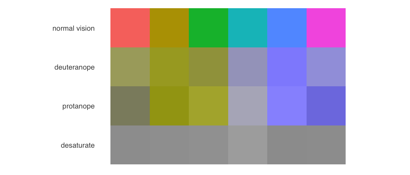
ggplot(data = Dabrowska.data,
       mapping = aes(x = OccupGroup)) +
  geom_bar() +
  labs(x = "Occupational group",
       y = "Number of participants") +
  theme_classic()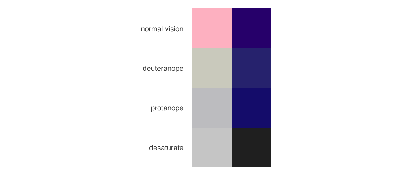
ggplot(data = Dabrowska.data,
       mapping = aes(x = OccupGroup)) +
  geom_bar() +
  labs(x = "Occupational group",
       y = "Number of participants") +
  theme_dark()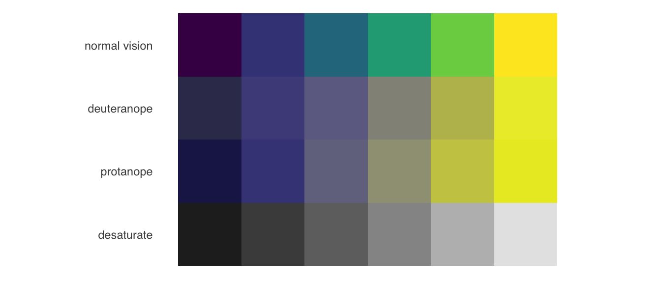
ggplot(data = Dabrowska.data,
       mapping = aes(x = OccupGroup)) +
  geom_bar() +
  labs(x = "Occupational group",
       y = "Number of participants") +
  theme_light()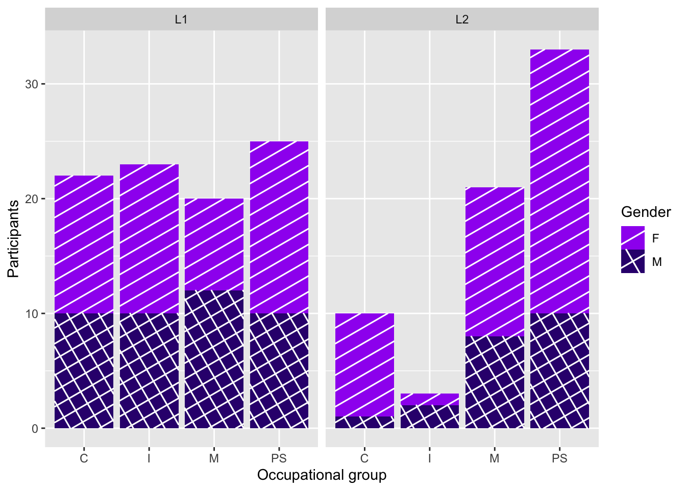
ggplot(data = Dabrowska.data,
       mapping = aes(x = OccupGroup)) +
  geom_bar() +
  labs(x = "Occupational group",
       y = "Number of participants") +
  theme_minimal()
ggplot(data = Dabrowska.data,
       mapping = aes(x = OccupGroup)) +
  geom_bar() +
  labs(x = "Occupational group",
       y = "Number of participants") +
  theme_void()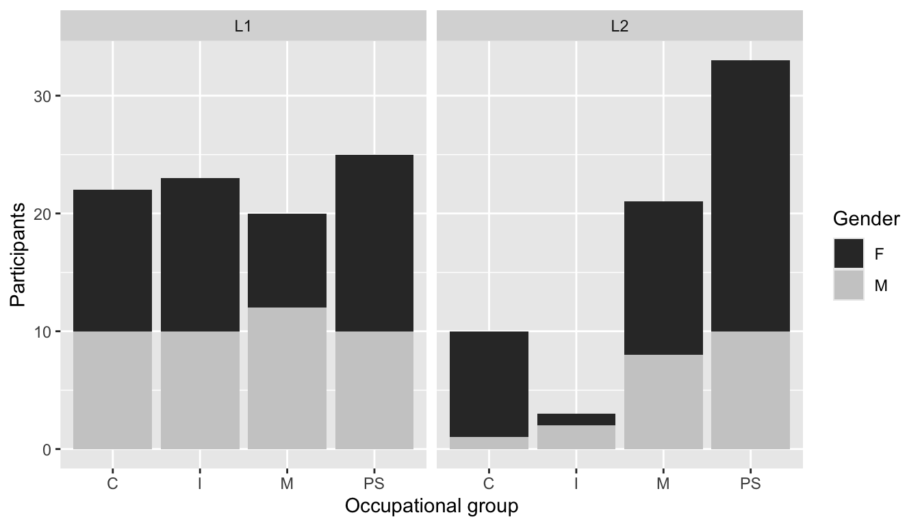
As with colour palettes, you can also install additional packages that will give you access to literally hundreds of ready-made themes for you to explore. Figure 10.17 customised by adding a theme_economist() layer from the {ggthemes} package (Arnold 2025).
#install.packages("ggthemes")
library(ggthemes)

ggplot(data = Dabrowska.data,
       mapping = aes(x = OccupGroup,
                     fill = OccupGroup)) +
  geom_bar() +
  labs(x = "Occupational group",
       y = "Number of participants") +
  scale_fill_economist() +
  theme_economist()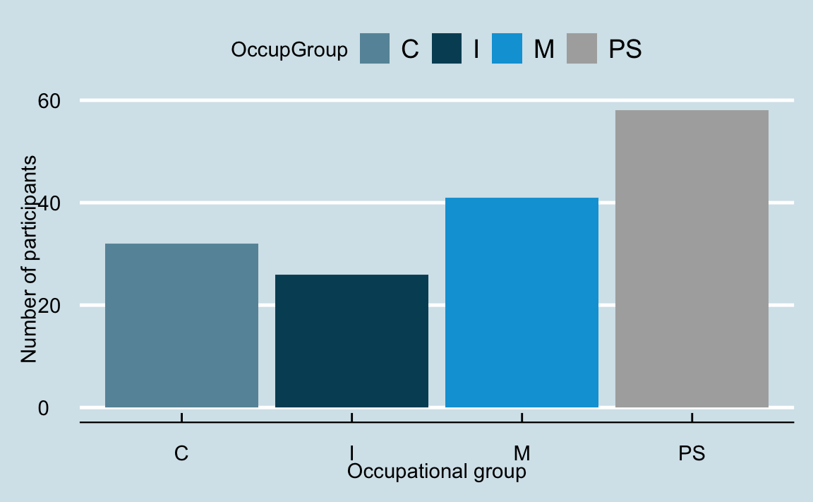
Pretty much all aspects of plot themes can be customised. To demonstrate this, the code below creates Figure 10.18, a barplot with some highly customised aesthetics. I will let you judge how meaningful these custom choices are and whether they genuinely help the reader to interpret the data… 🤨
Show code customising ggplot theme layer.
ggplot(data = Dabrowska.data,
       mapping = aes(x = OccupGroup, fill = Gender)) +
  geom_bar() +
  labs(x = "Occupational group",
       y = "Number of participants",
       title = "An example of an extravagantly customised ggplot...") +
    theme(
      panel.background = element_rect(fill = "#FFC080", color = NA),
      panel.grid.major = element_line(color = "gold", linewidth = 1.5),
      panel.grid.minor = element_line(color = "grey20", linewidth = 0.5),
      axis.title.x = element_text(face = "bold", size = 12, color = "brown", angle = 10),
      axis.title.y = element_text(size = 25, color = "green", family = "Courier New"),
      axis.text.x = element_text(face = "italic", size = 12, color = "cyan"),
      axis.text.y = element_text(size = 14, color = "grey"),
      plot.title = element_text(face = "bold", size = 10, color = "purple", family = "Comic Sans MS"))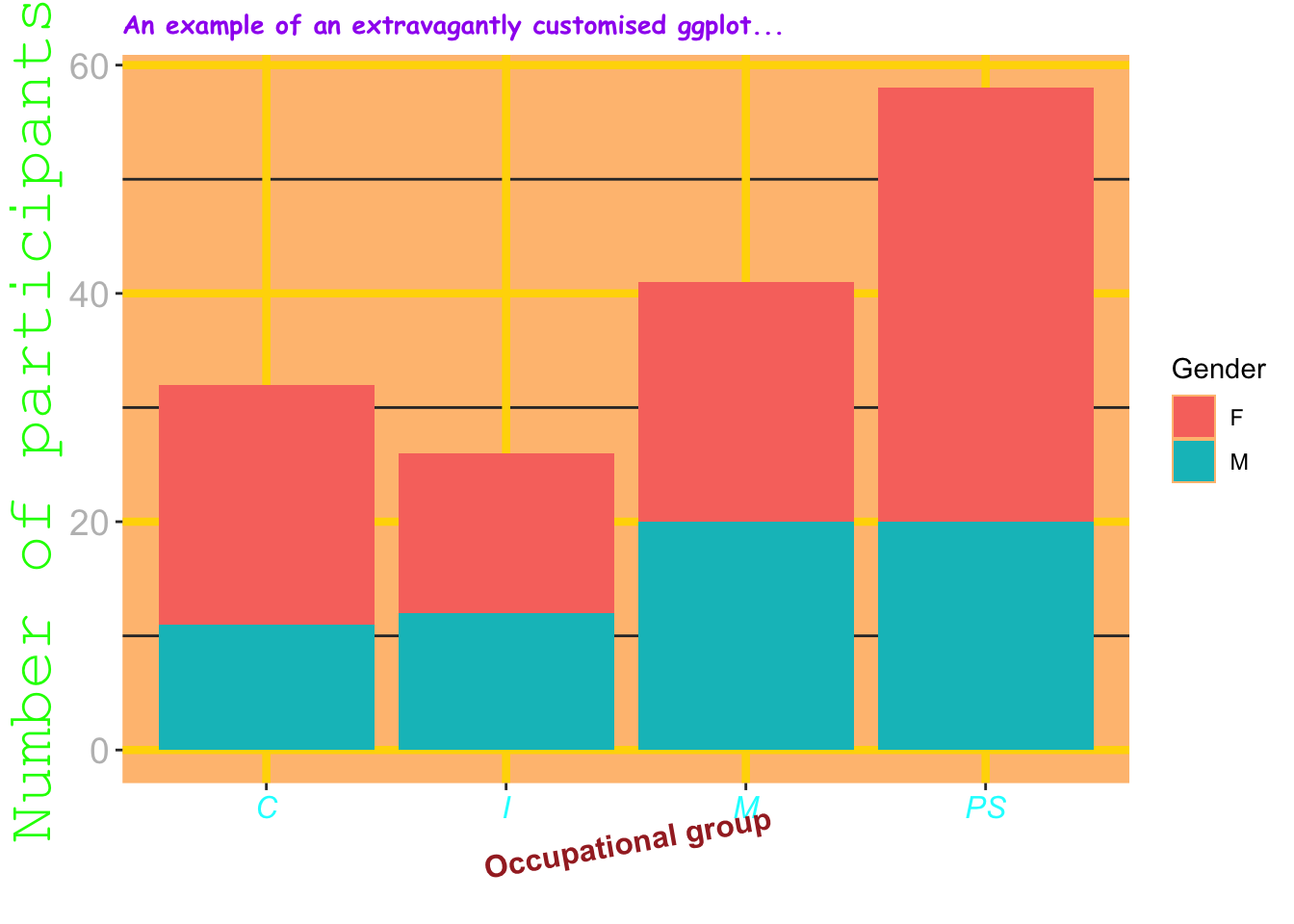
ggplot theme layer
10.1.8 Coordinates
By default, the coordinate system that is used in ggplot objects is the Cartesian coordinate system, which has a horizontal axis (x) and a vertical axis (y) that are perpendicular to each other. To change this default Cartesian coordinate system, we need to add a coordinate layer.
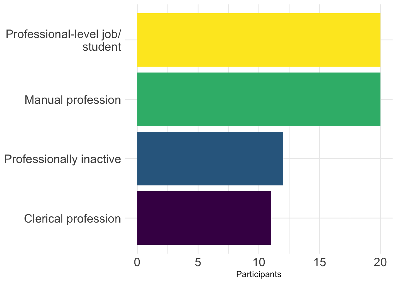
For example, to be able to display the full names of the four occupational groups used in Dąbrowska (2019), we can change the labels of the categories using mutate() and fct_recode() before piping the data into ggplot() (see Section 10.1.4) and then flip the x and y axes using the coordinate layer coord_flip(). As shown in Figure 10.19, this makes long labels much easier to read.
Dabrowska.data |>
  mutate(OccupGroup = fct_recode(OccupGroup,
                                 `Professionally inactive` = "I",
                                 `Clerical profession` = "C",
                                 `Manual profession` = "M",
                                 `Professional-level job/\nstudent` = "PS")) |>
  mutate(Gender = fct_rev(Gender)) |>
  ggplot(mapping = aes(x = OccupGroup, fill = Gender)) +
  geom_bar() +
  labs(x = NULL,
       y = "Participants") +
  scale_fill_viridis_d() +
  coord_flip() +
  theme_minimal() +
  theme(axis.text = element_text(size = 12))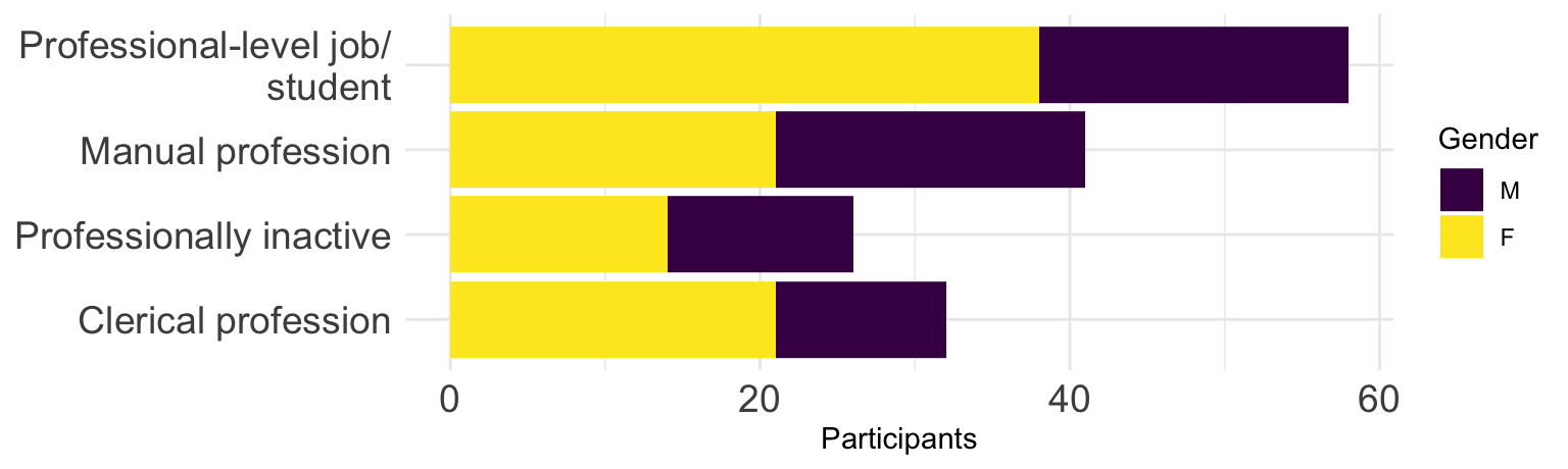
The vast majority of statistical graphs use the Cartesian coordinate system. Pie charts and other circular plots, however, use the polar coordinate system (coord_polar), whereby quantities are mapped onto angles rather than distances. In general, humans are much better at judging lengths than angles or areas (Cleveland & McGill 1987), which is why circular graphs such as pie charts are typically not recommended forms of good data visualisations (Few 2007). That said, they can be produced using the {ggplot2} library by adding the coordinate layer coord_polar("y") and modifying a few parameters.
Dabrowska.data |>
  mutate(OccupGroup = fct_recode(OccupGroup,
                                 `Professionally inactive` = "I",
                                 `Clerical profession` = "C",
                                 `Manual profession` = "M",
                                 `Professional-level job/\nstudent` = "PS")) |>
  ggplot(mapping = aes(x = "", fill = OccupGroup)) +
  geom_bar(width = 1) +
  labs(fill = "Occupational group") +
  scale_fill_viridis_d(direction = -1) +
  coord_polar("y") +
  theme_void()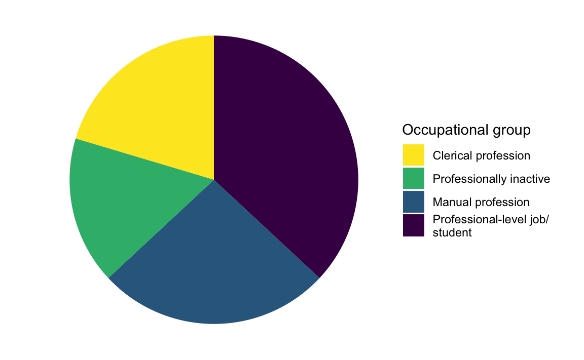
10.2 The semantics of graphics
So far, we have seen how the syntax of the Grammar of Graphics can be used to build statistical graphs layer by layer. We now turn to the semantics of graphics. As linguists are well placed to know, semantics is the study of meaning. In the Grammar of Graphics, the semantics of graphics is defined as “the meanings of the representative symbols and arrangements we use to display information” (Wilkinson 2005: 20). In what follows, we will see how thinking about the semantics of graphics can help us to think about how the different components of a graph interact to convey insightful visual information from raw data. This will help us to make informed choices when choosing the geometries, scales, facets, and themes of our data visualisations.
But, first, let’s think about why we visualise data. Data visualisation is about more than just communicating the results of our analyses to others at the publication stage. In fact, good data visualisation can help us make informed decisions throughout the research process from the data wrangling stage to the evaluation of complex statistical models. Here are some reasons for visualising data. Can you think of others? 🤔
For yourself
- To explore your data
- To detect data processing errors and outliers
- To check assumptions of statistical tests or models (see Section 11.7 and Section 12.4)
- To examine variation across different subsets of the data
- To better interpret the results of statistical tests (see Chapter 11) and models (see Chapter 12 and 13)
For others
- To communicate the results of your analyses more effectively
- To communicate about your data (in more detail)
- To communicate complex information more efficiently
- To attract the reader’s attention
- To allow the reader to reach their own conclusions
Depending on the type of data that we want to visualise and why, we can choose different types of plots. A great resource to choose a graphic that is suitable for your data is the R Graph Gallery. In the following, we will first look at how we can plot categorical variables and discrete numeric variables, before we move on to visualising continuous numeric variables and combinations of different types of variables (see Section 7.2).
10.2.1 Barplots
As we saw in Section 10.1, barplots (also called bar charts) are a great way to visualise categorical variables. We also saw that, when using horizontal writing systems, it is often easier to interpret a barplot if its coordinates are flipped so that longer labels can be read more readily.
TipYour turn!
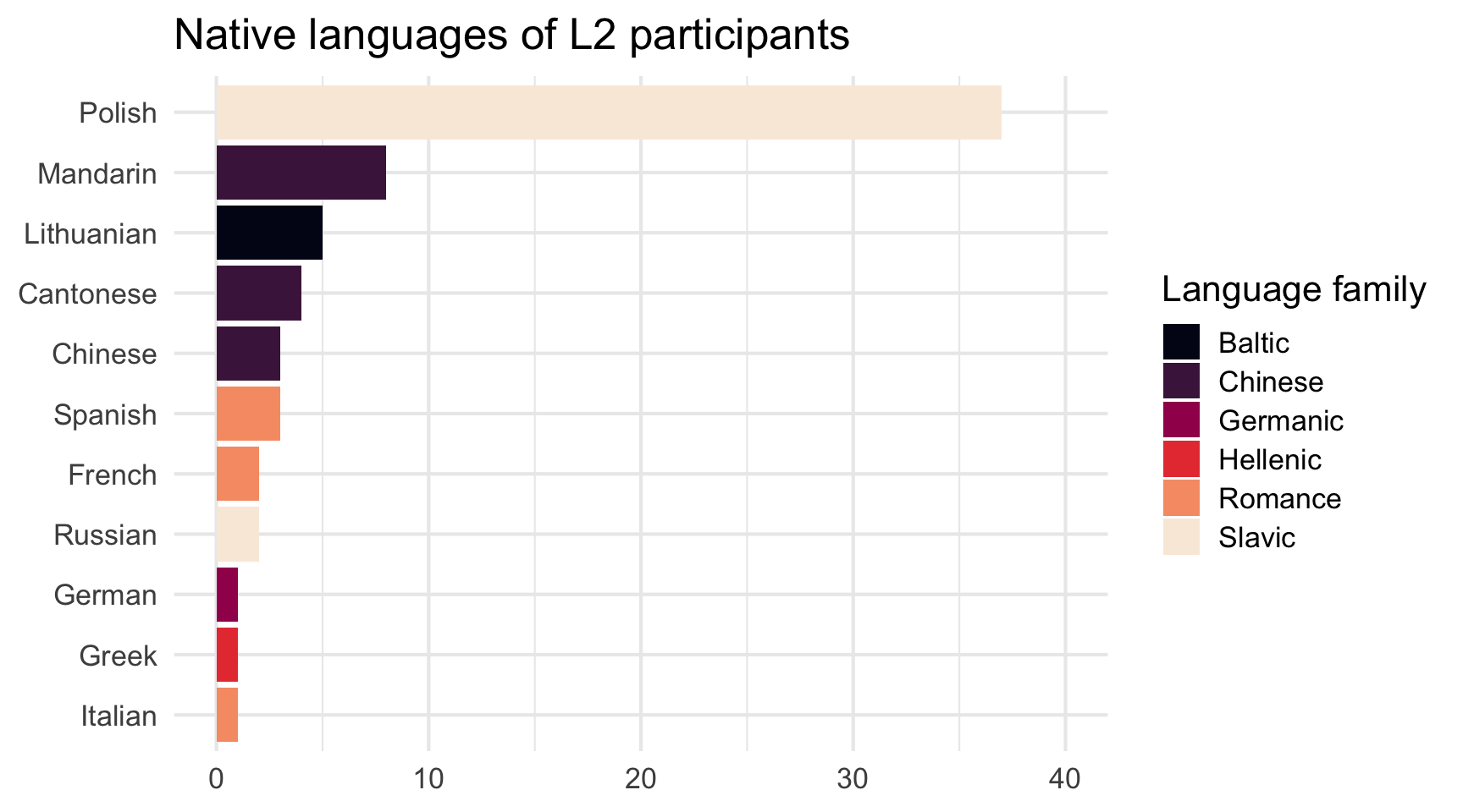
Q10.2 Study Figure 10.21 and think about which {ggplot2} functions were used to generate it. 🤔
Then, click on the “Show R code” button the figure to compare your intuitions with the actual code. Note that there may well be more than one solution, so do try out your version and see if you can spot any differences!
Show R code to generate plot.
Dabrowska.data |>
  filter(Group == "L2") |>
  mutate(NativeLg = fct_rev(fct_infreq(NativeLg))) |>
  ggplot(aes(x = NativeLg,
           fill = NativeLgFamily)) +
  geom_bar() +
  coord_flip() +
  scale_fill_viridis_d(option = "F") +
  scale_y_continuous(limits = c(0, 40)) +
  theme_minimal() +
  labs(x = NULL,
       y = NULL,
       fill = "Language family",
       title = "Native languages of L2 participants") +
  theme_minimal(base_size = 12)
To create Figure 10.21, we reordered the factor levels of the NativeLg variable using two functions from the {forcats} package (see Section 9.3.2): fct_infreq() is first used to order the factors according to their frequency (by default, they are sorted alphabetically) and then fct_rev() is used to reverse that order. The latter step is needed because the coord_flip() functions “flips” everything around. You can check the order of a factor’s level using the function levels(). Notice how, if two levels have the same number of occurrences, they are ordered alphabetically (as seen in Figure 10.21).
levels(Dabrowska.data$NativeLg) [1] "Cantonese" "Chinese" "French" "German" "Greek"
[6] "Italian" "Lithuanian" "Mandarin" "Polish" "Russian"
[11] "Spanish" levels(fct_infreq(Dabrowska.data$NativeLg)) [1] "Polish" "Mandarin" "Lithuanian" "Cantonese" "Chinese"
[6] "Spanish" "French" "Russian" "German" "Greek"
[11] "Italian" levels(fct_rev(fct_infreq(Dabrowska.data$NativeLg))) [1] "Italian" "Greek" "German" "Russian" "French"
[6] "Spanish" "Chinese" "Cantonese" "Lithuanian" "Mandarin"
[11] "Polish"
TipYour turn!
Q10.3 Compare the two plots below. Which one makes it easier to see which occupational group has the fewest participants and why?
Barplot
Show R code to create the barplot.
Dabrowska.data |>
  mutate(OccupGroup = fct_recode(OccupGroup,
                                 `Professionally inactive` = "I",
                                 `Clerical profession` = "C",
                                 `Manual profession` = "M",
                                 `Professional-level job/\nstudent` = "PS")) |>
  filter(Gender == "M") |>
  ggplot(mapping = aes(x = OccupGroup,
                       fill = OccupGroup)) +
  geom_bar() +
  labs(x = NULL,
       y = "Participants") +
  scale_fill_viridis_d() +
  coord_flip() +
  theme_minimal() +
  theme(axis.text = element_text(size = 15),
        legend.position = "none")
Pie chart
Show R code to create the pie chart.
Dabrowska.data |>
  mutate(OccupGroup = fct_recode(OccupGroup,
                                 `Professionally inactive` = "I",
                                 `Clerical profession` = "C",
                                 `Manual profession` = "M",
                                 `Professional-level job/\nstudent` = "PS")) |>
  filter(Gender == "M") |>
  ggplot(mapping = aes(x = "", fill = OccupGroup)) +
    geom_bar(width = 1) +
    scale_fill_viridis_d(direction = -1) +
    coord_polar("y") +
    theme_void(base_size = 20) # This increases the font size.
🦉 Hover over the owl for a first hint.
🐭 Click on the mouse for a second hint.
TipYour turn!
Using the {ggplot2} library, create a barplot that shows the distribution of occupational groups (OccupGroup) among male L1 and L2 participants in Dąbrowska (2019)’s study.
Q10.4 Drawing on the information provided by your barplot, how many male participants reported having manual jobs?
Show sample code to answer Q10.4
Dabrowska.data |>
  filter(Gender == "M") |>
  ggplot(mapping = aes(x = OccupGroup)) +
  geom_bar() +
  labs(x = "Occupational group",
       y = "Male participants") +
  theme_minimal()
Q10.5 Is the legend in the barplot that you have created necessary?
See code.
Dabrowska.data |>
  filter(Gender == "M") |>
  ggplot(mapping = aes(x = OccupGroup,
                       fill = OccupGroup)) +
  geom_bar() +
  theme_minimal() +
  theme(legend.position = "none")
Q10.6 Create a pie chart that shows the distribution of occupational groups among male participants (as shown in Figure 10.20). Which line of code is essential to create a pie chart using {ggplot2}?
Show code to create pie chart below.
Dabrowska.data |>
  filter(Gender == "M") |>
  ggplot(mapping = aes(x = "",
                       fill = OccupGroup)) +
    geom_bar(width = 1) +
    coord_polar("y") +
    theme_void()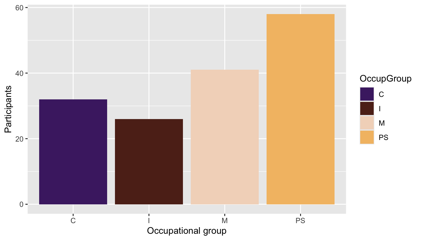
Q10.7 Transform the pie chart that you just created in c. to make it look like the plot below. To achieve this, wrangle the data before piping it into the data argument of the ggplot() function. Which {tidyverse} function can you use to rename the labels?
Show sample code to answer Q10.7
Dabrowska.data |>
  mutate(`OccupGroup` = fct_recode(OccupGroup,
                                 `Professionally inactive` = "I",
                                 `Clerical profession` = "C",
                                 `Manual profession` = "M",
                                 `Professional-level job` = "PS")) |>
  filter(Gender == "M") |>
  ggplot(mapping = aes(x = "",
                       fill = OccupGroup)) +
  geom_bar(width = 1) +
  coord_polar("y") +
  theme_void() +
labs(fill = "Occupational group") # This last line of code changes the title of the legend, which is the label for the variable associated with the `fill` aestetics. 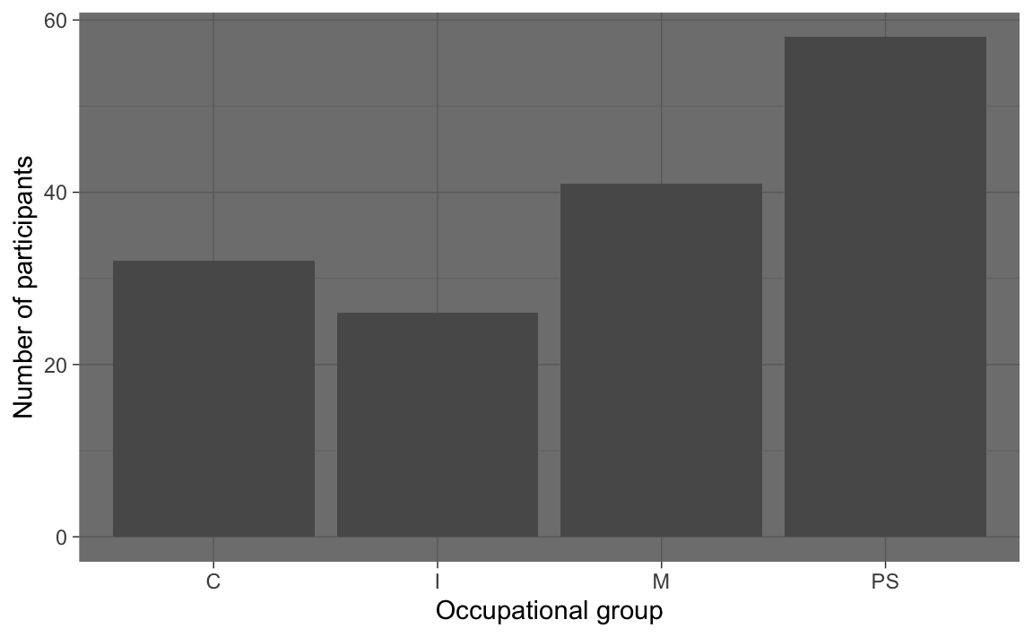
10.2.2 Histograms
In Section 8.2.2, we visually examined the distribution of participants’ ages in a barplot. This was possible because the age variable in Dąbrowska (2019) was recorded as a discrete numeric variable (i.e. either as 18 or 19, but not 18.4 years of age).
ggplot(data = Dabrowska.data,
       mapping = aes(Age)) +
  geom_bar() +
  scale_x_continuous() +
  theme_minimal()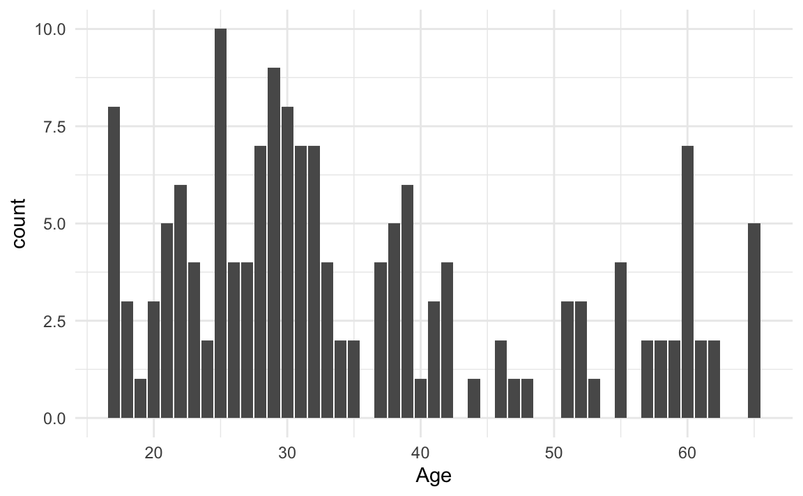
Barplots are best suited for categorical data and should only be used to visualise discrete numeric variables that have a limited number of possible values. They should never be used to report mean values (see #barbarplot campaign)! As we can see from the output of the unique() function below, the Age variable in Dabrowska.data features 40 different age values, ranging from 17 to 65.
unique(Dabrowska.data$Age) |>
  sort()
[1] 17 18 19 20 21 22 23 24 25 26 27 28 29 30 31 32 33 34 35 37 38 39 40 41 42
[26] 44 46 47 48 51 52 53 55 57 58 59 60 61 62 65Clearly, these data are unsuitable for a barplot! The distribution of participants’ ages would be much better visualised as a histogram or density plot. To visualise participants’ age as histogram (Figure 10.23) rather than as a barplot (Figure 10.22), we change the plot geometry (see Section 10.1.2) from geom_bar() to geom_histogram():
ggplot(data = Dabrowska.data,
       mapping = aes(x = Age)) +
  geom_histogram() +
  labs(x = "Age (in years)",
       y = "Number of participants") +
  theme_minimal()
`stat_bin()` using `bins = 30`. Pick better value `binwidth`.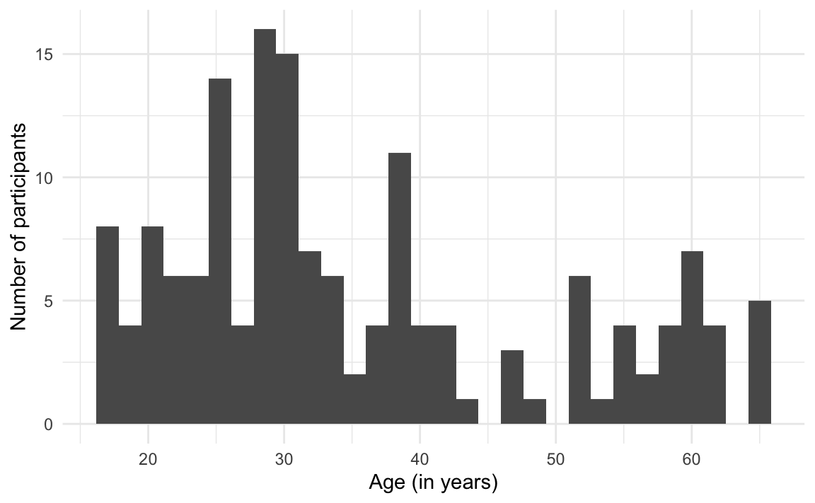
When generating this histogram, a message appears in the R console that informs us that, by default, the geom_histogram() function subdivided the Age values into 30 bins. This means that the age range from 17 to 65 was subdivided into 30 groups of equal size. Given that there is a range of 48 in the Age values in this dataset, this is not a great way to subdivide the values of this variable.
As indicated in the message, to change this behaviour, we can adjust the value of the binwidth argument. This argument determines how many years go in each bin. So if we choose to have two years in each subdivision of the Age variable, we will end up with 24 bins. Thus, if we decide to group four years in each subdivision of the Age variable, we will end up with just 12 bins.
Compare the three histograms below. In your opinion, which binwidth provides the most effective way to visualise the distribution of participants’ ages? 🤔
ggplot(data = Dabrowska.data,
       mapping = aes(x = Age)) +
  geom_histogram(binwidth = 2) +
  labs(x = "Age (in years)",
       y = "Number of participants") +
  theme_minimal()
ggplot(data = Dabrowska.data,
       mapping = aes(x = Age)) +
  geom_histogram(binwidth = 5) +
  labs(x = "Age (in years)",
       y = "Number of participants") +
  theme_minimal()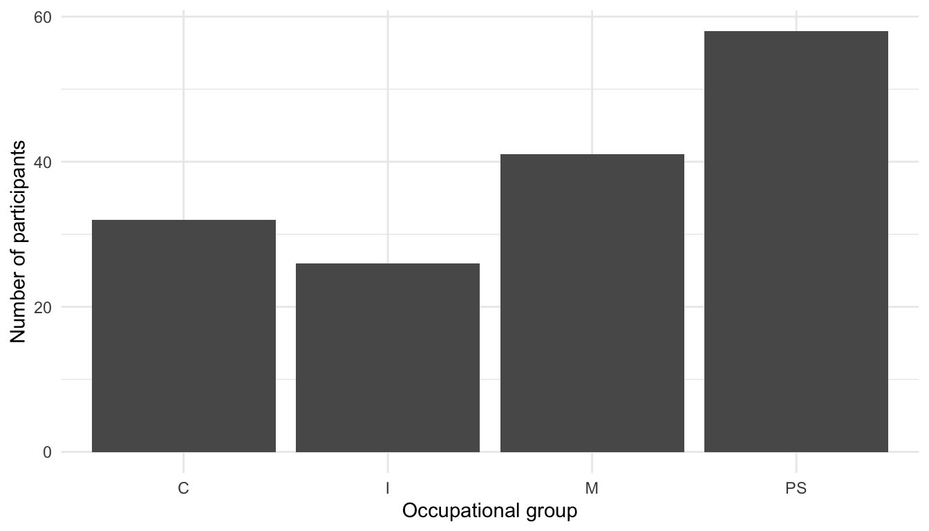
ggplot(data = Dabrowska.data,
       mapping = aes(x = Age)) +
  geom_histogram(binwidth = 10) +
  labs(x = "Age (in years)",
       y = "Number of participants") +
  theme_minimal()
The distribution of two continuous variables can also be compared by superimposing two histograms as in Figure 10.24. This requires the addition of a fill aesthetics (see Section 10.1.6) and the argument position = "identity". For both distributions to be visible, it is also necessary to add some transparency to the fill colour of the bars. This is achieved using the alpha argument of the geom_histogram() function. An alpha value of 0 corresponds to full transparency (e.g. no colour), whilst an alpha value of 1 corresponds to complete opacity.
ggplot(data = Dabrowska.data,
       mapping = aes(x = Age,
                     fill = Group)) +
  geom_histogram(binwidth = 5,
                 position = "identity",
                 alpha = 0.5) +
  scale_fill_viridis_d() +
  labs(x = "Age (in years)",
       y = "Number of participants") +
  theme_minimal()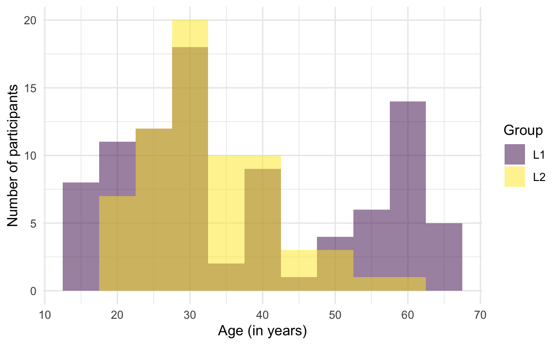
TipYour turn!
Q10.8 How many different scores did participants obtain on the English grammar test (as stored in the Grammar variable).
Show sample code to help you answer Q10.8.
unique(Dabrowska.data$Grammar) |>
  length()
Q10.9 What are the lowest Grammar scores among L1 and L2 participants?
Show sample code to help you answer Q10.9.
Dabrowska.data |>
  group_by(Group) |>
  summarise(lowest = min(Grammar))
Q10.10 Create a histogram of participants’ Grammar scores. Which geometrical parameters need to be used to obtain exactly the same histogram as below?
Show answer to Q10.10
ggplot(data = Dabrowska.data,
       mapping = aes(x = Grammar)) +
  geom_histogram(binwidth = 6) +
  labs(x = "Scores on English grammar test",
       y = "Number of participants") +
  theme_bw()
Q10.11 Without trying out the code for yourself, which script was used to generate Plot 1 below?
Plot 1
Script A
ggplot(data = Dabrowska.data,
       mapping = aes(x = Grammar,
                     fill = Group)) +
  geom_histogram(binwidth = 6,
                 alpha = 0.6) +
  labs(x = "Scores on English grammar test",
       y = "Number of participants") +
  theme_minimal() +
  theme(legend.position = "none")
Script B
ggplot(data = Dabrowska.data,
       mapping = aes(x = Grammar,
                     fill = Group)) +
  geom_bar(alpha = 0.6) +
  labs(x = "Scores on English grammar test",
       y = "Number of participants") +
  theme_minimal() +
  theme(legend.position = "none")
Script C
ggplot(data = Dabrowska.data,
       mapping = aes(x = Grammar,
                     colour = Group)) +
  geom_histogram(binwidth = 6) +
  labs(x = "Scores on English grammar test",
       y = "Number of participants") +
  theme_minimal() +
  theme(legend.position = "none")
Script D
ggplot(data = Dabrowska.data,
       mapping = aes(x = Grammar,
                     fill = Group)) +
  geom_histogram(binwidth = 6,
                 alpha = 0.6) +
  facet_wrap(~ Group) +
  labs(x = "Scores on English grammar test",
       y = "Number of participants") +
  theme_bw() +
  theme(legend.position = "none")
Q10.12 Without trying out the code for yourself, which script was used to generate Plot 2 below?
Plot 2
10.2.3 Density plots
An alternative to displaying the data in discrete bins is to apply a density function to smooth over the bins of the histogram. This is what we call a density plot. Figure 10.25 is a density plot of participants’ grammar test scores. Creating density plots in R using {ggplot2} is very simple. Because, yes, you’ve guessed it: there’s a geom_ function for density plots and it’s called… geom_density()! 😄
ggplot(data = Dabrowska.data,
       mapping = aes(x = Grammar)) +
  geom_density(fill = "#440154") +
  labs(x = "Scores on English grammar test") +
  theme_minimal()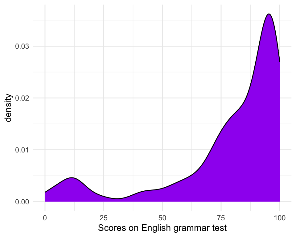
Density plots are particularly useful to examine distribution shapes. Looking at Figure 10.25, we can immediately see that the values of the Grammar variable are not normally distributed (see Section 8.2.2).
TipYour turn!
Q10.13 Which line of code needs to be added to the code used to generate Figure 10.25 to produce a two-panel density plot as in the figure below?
Show sample code to help you answer Q10.13.
ggplot(data = Dabrowska.data,
       mapping = aes(x = Grammar)) +
  geom_density(fill = "#440154") +
  facet_wrap(~ Group) +
  labs(x = "Scores on English grammar test") +
  theme_bw()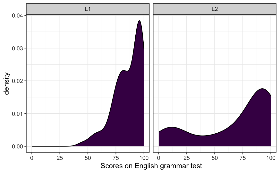
Q10.14 Create four density plots to visualise the distribution of participants’ ART (Author Recognition Test), Blocks (non-verbal IQ test), Colloc (English collocation test), and Vocab (English vocabularly test) scores.
Which variable’s distribution is closest to a normal distribution?
Show sample code to help you answer Q10.13.
Dabrowska.data |>
  select(Vocab, Colloc, ART, Blocks) |>
  tidyr::gather() |>  # This function from tidyr converts a selection of variables into two variables: a key and a value. The key contains the names of the original variable and the value the data. This means we can then use the facet_wrap function from ggplot2
  ggplot(aes(value)) +
    theme_bw() +
    facet_wrap(~ key, scales = "free", ncol = 2) +
    scale_x_continuous(expand=c(0,0)) +
    geom_density(fill = "#440154")
NoteGoing further: Setting properties within geoms
You can also change the attributes of any geometry layer by specifying them as arguments within their geom_ function. The help file of each geom_ function provides a list of the aesthetics arguments that each function has (see below for relevant extract). If we do not specify any of the optional aesthetics of the geom_ functions, sensible default values will be used. For instance, the line colour of density plots will be black, unless otherwise specified with the argument colour.
?geom_density[…] Aesthetics
geom_density()understands the following aesthetics. Required aesthetics are displayed in bold and defaults are displayed for optional aesthetics:
xyalpha→NAcolour→ viatheme()fill→ viatheme()group→ inferredlinetype→ viatheme()linewidth→ viatheme()weight→1Learn more about setting these aesthetics in
vignette("ggplot2-specs").
Below is an example of a density plot with some highly customised aesthetics. It goes without saying that, just because you can customise many aspects of a geom_ layer, it doesn’t necessarily mean that it’s a good idea to do so! :upside-down-face:
Show annotated R code to generate plot below.
Dabrowska.data |>
filter(Group == "L2") |>
ggplot(mapping = aes(x = Blocks)) +
geom_density(colour = "purple",
linewidth = 5,
linetype = "dotdash",
fill = "pink",
alpha = 0.6) +
labs(x = "Blocks test results",
title = "L2 participants' non-verbal IQ scores")- 1
- Sets the colour of the outline of the density plot.
- 2
- Sets the width of the outline.
- 3
- Sets the line type of the outline.
- 4
- Sets the colour of the area of the density plot.
- 5
-
Sets the transparency level of the fill colour (with
0being fully transparent and1being completely opaque)

It can, however, be very useful to help identify different elements within a complex plot such as Figure 10.26.
Show annotated R code to generate figure below.
mean.blocks <- Dabrowska.data |>
group_by(Group) |>
summarise(mean = mean(Blocks))
Dabrowska.data |>
ggplot(mapping = aes(x = Blocks,
fill = Group,
colour = Group)) +
geom_density(alpha = 0.6,
position = "identity") +
geom_vline(data = mean.blocks,
aes(xintercept = mean,
colour = Group),
linetype = "dashed",
linewidth = 0.8) +
scale_colour_viridis_d(guide = NULL) +
scale_fill_viridis_d() +
theme_minimal() +
labs(x = "Non-verbal IQ test (Blocks) test scores",
fill = NULL,
caption = "The dotted lines represent the means of each group.")- 1
-
To create Figure 10.26, we first calculate the mean
Blocksscores for both L1 and L2 participants and store these values as a newRobject. - 2
- We add some transparency to the fill colours of the density plots to ensure that the overlaps are interpretable.
- 3
-
We call this object within the
geom_vline()function that, as its name suggests, draws vertical lines. - 4
-
We use the
linetypeargument to make the lines dashed. - 5
- We increase the thickness of these lines slightly to make them more visible.
- 6
-
Try removing the argument
guide = NULLfrom this layer to see why we include it here!
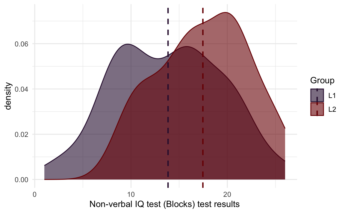
As demonstrated in Figure 10.26, in addition to setting aes() mappings at the start of our plot code within the main ggplot() function, we can also add additional data mappings within a specific geom_ function. With all these options, it’s no exaggeration to say that, if you really set your mind to it, pretty much anything is possible with {ggplot2} (see also recommended further resources at the end of this chapter)!
10.2.4 Boxplots
In Section 8.3.2, we saw that boxplots are a great way to visualise both the central tendency (median) of a numeric variable and the spread around this central tendency (IQR). There is an in-built function to create boxplots in {ggplot2}. No prizes will be awarded for guessing that the necessary geom_ function is called… geom_density()! 😆
Whilst it’s possible to plot just a single boxplot, that rarely makes sense. In fact, the x-axis in Figure 10.27 is entirely nonsensical! The distribution of Grammar scores across the entire dataset is much better visualised as a histogram or density plot (see Section 10.2.3) than as a single boxplot.
Dabrowska.data |>
  ggplot(mapping = aes(y = Grammar)) +
  geom_boxplot() +
  theme_minimal() +
  labs(y = "Grammar scores")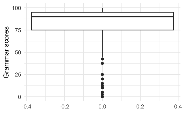
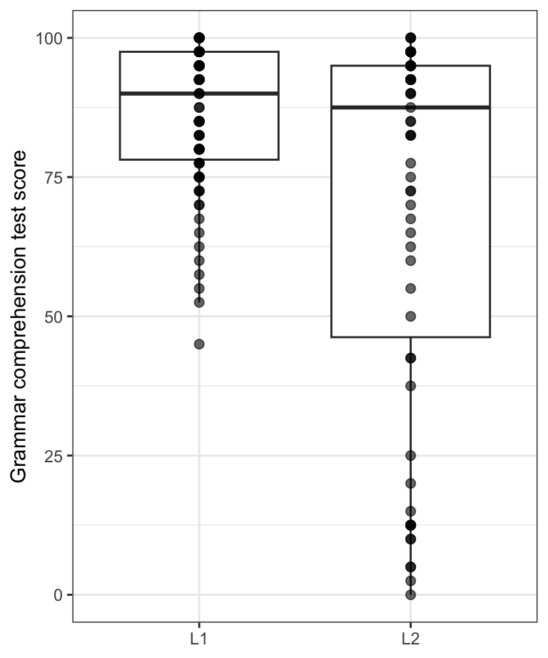
If, however, we want to compare the Grammar scores of two or more different groups of participants, a boxplot makes a lot more sense (see Figure 10.28). To achieve this, we add a second argument within the aes() function, which maps the values of the Group variable (which are either “L1” or “L2”) to the plot’s x-axis.
Dabrowska.data |>
  ggplot(mapping = aes(y = Grammar,
                       x = Group)) +
  geom_boxplot() +
  theme_minimal() +
  labs(y = "Grammar scores")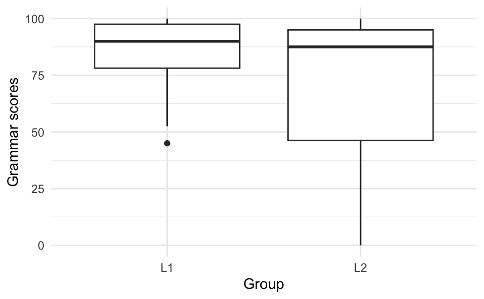
The meaning conveyed by Figure 10.28 is clear: there is hardly any difference between the average (median) grammar comprehension test scores of L1 and L2 participants in Dąbrowska (2019)’s dataset. Indeed, we can see that the thicker, middle lines within each boxplot are almost at the same level. However, the two boxplots have very different shapes and overall lengths: the scores of the 50% of L2 participants who scored below the median are much more spread out than those of the L1 participants who obtained below-average scores. This makes intuitive sense: native English speakers living in the UK who volunteer for such a study are likely to all have a fairly high to very high understanding of English grammar. By contrast, the L2 speakers are much more varied: some are highly proficient in English, while others are not. This range of proficiency could due to all sorts of reasons.
What are some of the possible reasons that you can think of? 🤔 Make a note of them as we will explore these hypotheses further in Section 10.2.5.
TipYour turn!
Q10.15 Create a boxplot to compare how participants in different occupational groups (OccupGroup) performed on the English grammar test. Which part of the code used to produce Figure 10.28 do you need to modify to achieve this?
Show sample code to answer Q10.15.
Dabrowska.data |>
  ggplot(mapping = aes(y = Grammar,
                       x = OccupGroup)) +
  geom_boxplot() +
  theme_minimal() +
  labs(y = "Grammar scores")
Q10.16 The code below was used to create Figure 1, except that the arguments of the aes() function have been deleted. Which data mappings were specified inside the aes() function to produce Figure 1?
Dabrowska.data |>
  mutate(Group = fct_recode(Group,
                            `L1 participants` = "L1",
                            `L2 participants` = "L2")) |>
  ggplot(mapping = aes(█ █ █ █ █ █ █ █ █ █ █ █)) +
    geom_boxplot(alpha = 0.8) +
    scale_fill_viridis_d(option = "viridis") +
    scale_y_continuous(breaks = seq(0, 100, 10)) +
    labs(y = "Grammar scores",
         x = NULL,
         fill = "Occupational group",
         title = "English grammar comprehension test results",
         subtitle = "among L1 and L2 participants with different occupations") +
    theme_bw() +
    theme(element_text(size = 12),
          legend.position = "bottom", # We move the legend to the bottom of the plot.
          legend.box.background = element_rect()) # We add a frame around the legend.
Show answer to Q10.16.
Dabrowska.data |>
  mutate(Group = fct_recode(Group,
                            `L1 participants` = "L1",
                            `L2 participants` = "L2")) |>
  ggplot(mapping = aes(y = Grammar,
                       x = Group,
                       fill = OccupGroup,
                       facet = OccupGroup)) +
    geom_boxplot(alpha = 0.8) +
    scale_fill_viridis_d(option = "viridis") +
    scale_y_continuous(breaks = seq(0, 100, 10)) +
    labs(y = "Grammar scores",
         x = NULL,
         fill = "Occupational group",
         title = "English grammar comprehension test results",
         subtitle = "among L1 and L2 participants with different occupations") +
    theme_bw() +
    theme(element_text(size = 12),
          legend.position = "bottom", # We move the legend to the bottom of the plot.
          legend.box.background = element_rect()) # We add a frame around the legend.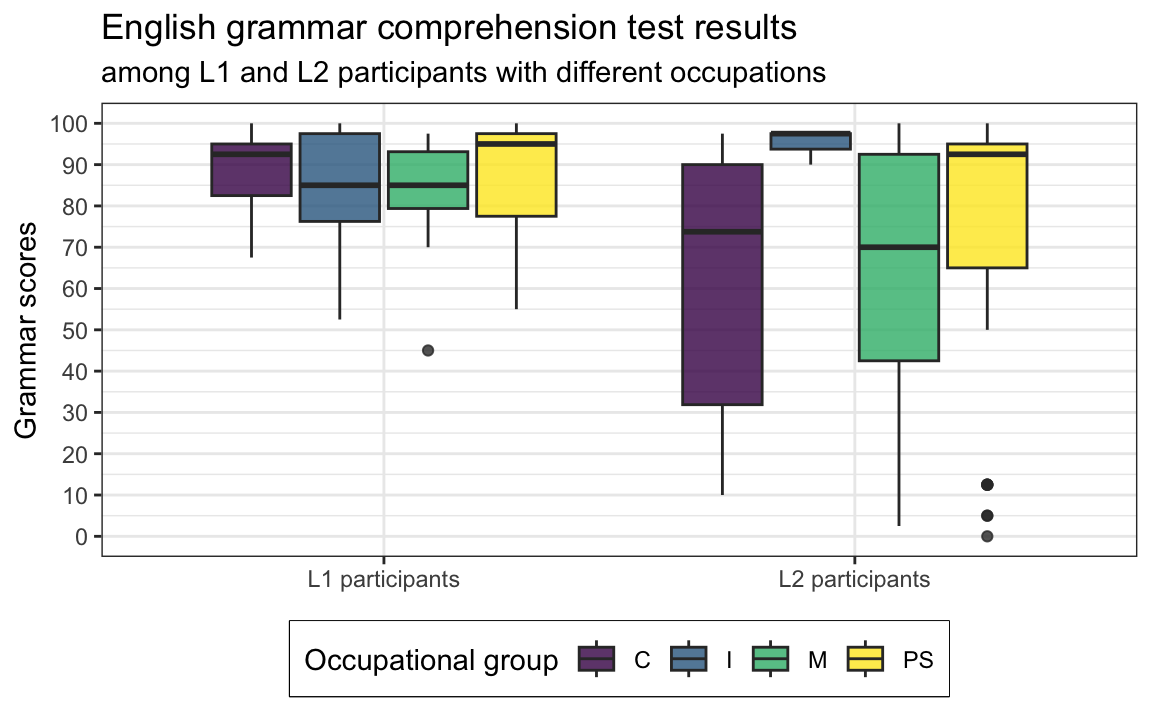
🦉 Hover over the owl for a first hint.
🐭 Click on the mouse for a second hint.
Note 10.1: Dot plots and violin plots 🎻
The {ggplot2} library offers many more geom_ functions for you to explore. Dot plots and violin plots are two more types of graphs that are currently only rarely used in the language sciences, but which can be very effective ways to visualise the distribution of a numeric variable across different levels of a categorical variable.
Dot plots
In a dot plot, each data point (corresponding, here, to a single participant) is represented by a single dot. The size of each dot corresponds to the chosen bin width. This makes dot plots a combination of a boxplot (see Section 8.3.2) and a histogram (see Section 10.2.2).
ggplot(data = Dabrowska.data,
    mapping = aes(y = Colloc,
                     x = Group)) +
    geom_dotplot(binaxis = "y",
              stackdir = "center",
              binwidth = 3) +
    labs(y = "Scores on English collocation test",
         x = NULL) +
    theme_bw()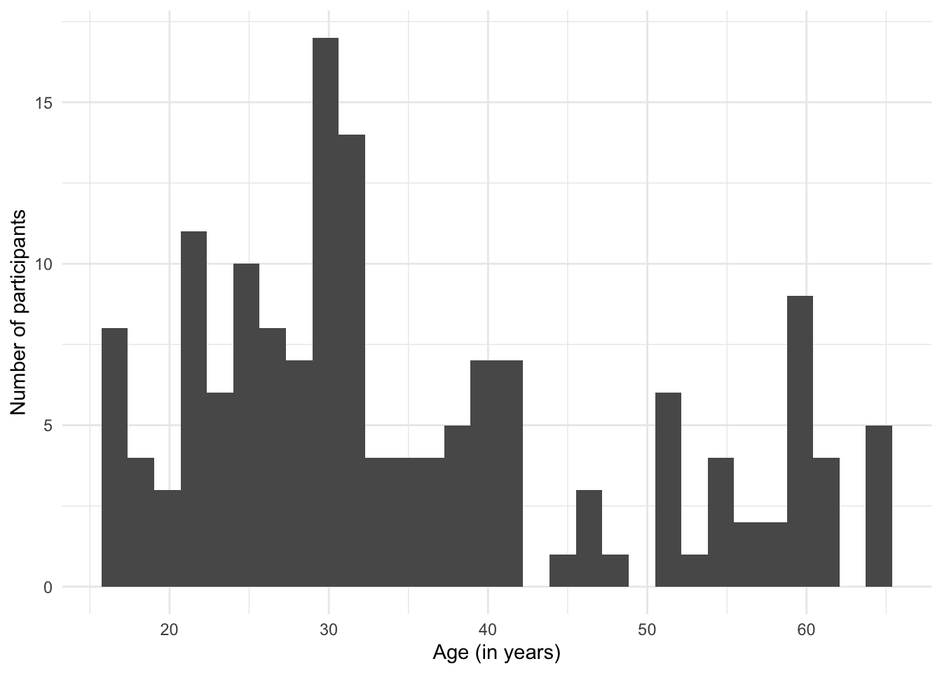
Violin plots
The help file of the geom_violin() function describes violin plots as follows:
A violin plot is a compact display of a continuous distribution. It is a blend of
geom_boxplot()andgeom_density(): a violin plot is a mirrored density plot displayed in the same way as a boxplot.
ggplot(data = Dabrowska.data,
       mapping = aes(y = Colloc,
                       x = Group)) +
    geom_violin() +
    labs(y = "Scores on English collocation test",
         x = NULL) +
    theme_bw()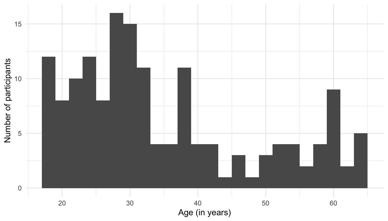
By themselves, violin plots are rather abstract representations of variable distributions. However, in combination with boxplots, they can be an effective way to visualise and compare data distributions. Note that, here, the order of the layers is important because, if we first draw the boxplots and then the violin plots, the violin plots will mask the boxplots completely.
Dabrowska.data |>
  ggplot(mapping = aes(y = Colloc,
                       x = Group)) +
    geom_violin(width = 1,
                colour = "grey",
                fill = "grey") +
    geom_boxplot(width = 0.08,
                 alpha = 0.2,
                 outliers = FALSE) +
    labs(y = "Scores on English collocation test",
         x = NULL) +
    theme_bw()
10.2.5 Scatterplots
Scatterplots are ideal to examine the relationship between two numeric variables. They are best suited to continuous numeric variables.
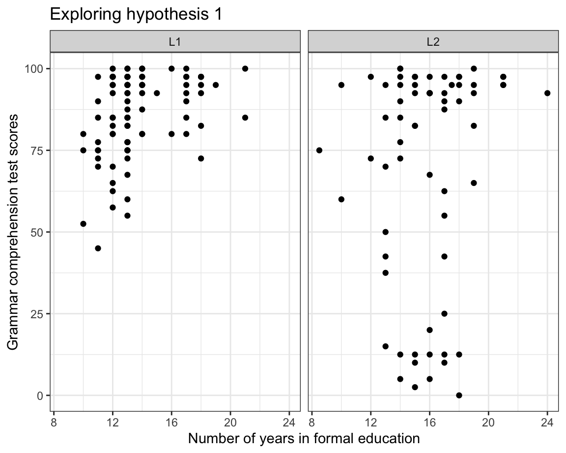
In the following, we will build a scatterplot to explore the following hypothesis:
- In the data from Dąbrowska (2019), English grammar comprehension scores are more strongly associated with the level of formal education among L2 speakers than among L1 speakers.
To explore this hypothesis, we map the total number of years that participants spent in formal education (EduTotal) onto the x-axis and their Grammar scores onto the y-axis. In addition, we use the facet_wrap() function to split the data into two panels: one for the L1 participants and the other for the L2 group.
Dabrowska.data |>
  ggplot(mapping = aes(x = EduTotal,
                     y = Grammar)) +
  facet_wrap(~ Group) +
  geom_point() +
  labs(x = "Years in formal education",
       y = "Grammar test scores") +
  theme_bw()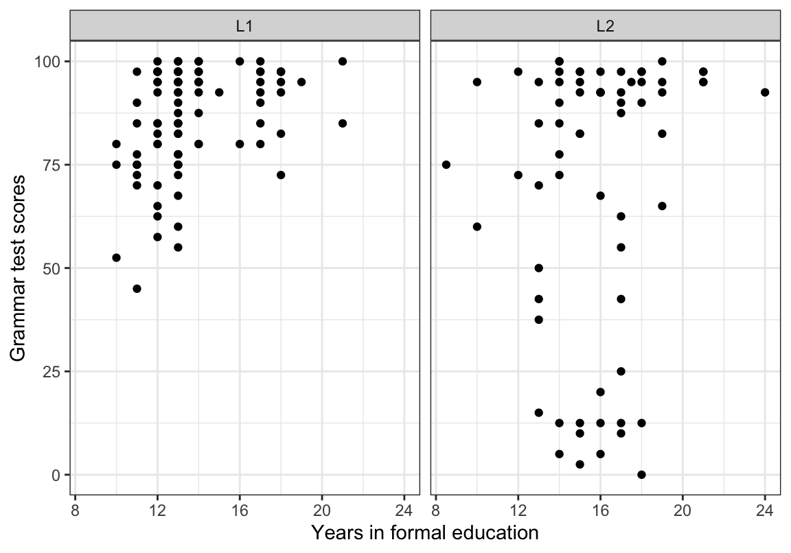
At first glance, it would seem that our data do not support our initial hypothesis: among the L2 participants, there is no obvious trend suggesting that those who scored lowest on the grammar test were the ones who spent fewer years in formal education. In the next plot (Figure 10.30), we add a regression line (in blue) per panel to our facetted scatterplot using the geom_smooth(method = "lm") function. This allows us to visualise the correlation between participants’ grammar scores and the number of years they spent in formal education.
Dabrowska.data |>
  ggplot(mapping = aes(x = EduTotal,
                       y = Grammar)) +
  facet_wrap(~ Group) +
  geom_point() +
  geom_smooth(method = "lm",
              se = FALSE) +
  labs(x = "Years in formal education",
       y = "Grammar test scores") +
  theme_bw()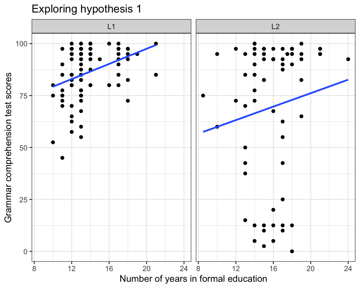
Regression lines in scatterplots are interpreted as follows:
- If the regression line goes up, there is a positive correlation between the two numeric variables. ↗️
- If the line goes down, there is a negative correlation. ↘️
- The steeper the line, the stronger the correlation. 💪
- If the line is flat (or nearly flat), there is no (linear) correlation between the two variables. ➡️
- Be aware that even very strong correlations do not necessarily imply (direct) causation (more on this in Note 12.1). ❌
The regression lines added by the geom_smooth(method = "lm") function in Figure 10.30 are lines of best fit: the better the fit, the closer the points are to the line. If few points are on or close to the line, it means that the regression line is not a good approximation of the relationship between the two variables. This is clearly the case in Figure 10.30 - especially in the L2 panel (more on this in Section 11.6). Our data visualisation therefore do not support our hypothesis that, among these participants, grammar scores are more strongly associated with the level of formal education among the L2 speakers than among the L1 speakers. If anything, our data show the opposite pattern! Our line of fit is both closer to the data points and steeper in the L1 panel than in the L2 panel.
Warning
So far, all of our data visualisations have displayed the characteristics of the collected data. In other words, they display descriptive statistics (see Chapter 8) that do not allow us to make inferences about other participants who were not tested as part of Dąbrowska (2019)’s study. Tests of statistical significance, including of correlations, are introduced in Chapter 11.
TipYour turn!
In this quiz, you will explore another hypothesis:
L2 speakers’ grammar comprehension scores (
Grammar) are positively correlated with their length of residence in the UK (LoR): L2 speakers who have lived in the UK for longer have a better understanding than those who arrived more recently.
Using {ggplot2}, create a scatterplot that allows you to explore this hypothesis.
Q10.17 What do you need to do before piping the data into the ggplot() function?
🐭 Click on the mouse for a hint.
Show sample code to answer Q10.17.
Dabrowska.data |>
  filter(Group == "L2") |>
  ggplot(mapping = aes(x = LoR,
                       y = Grammar)) +
  geom_point() +
  labs(x = "Length of residence in the UK (years)",
       y = "Grammar test scores") +
  theme_bw()
Q10.18 On your scatterplot, which data point(s) are clearly outliers?
🐭 Click on the mouse for a hint.
Identifying outliers is important to check and understand our data. If we spot an outlier corresponding to a participant having lived in a country for 400 years, we can immediately tell that something has gone wrong during data collection and/or pre-processing. In this case, however, common sense tells us that it is prefectly possible to have lived 40+ years in a country. Still, compared to the rest of the data, the outlier is striking and we should check that it is not due to an error.
Q10.19 Using data wrangling functions from the {tidyverse} (see Chapter 9), check whether the outlier participant is old enough to have lived in the UK for longer than 40 years. How old were they when they first came to the UK?
🐭 Click on the mouse for a hint.
Show sample code to answer Q10.19.
Dabrowska.data |>
  filter(LoR > 40) |>
  select(Age, LoR)

62-42
Q10.20 In order to better visualise a potential correlation between L2 participants’ grammar comprehension test results and how long they’ve lived in the UK, we will exclude the outlier and re-draw the scatterplot. Which function can you use to exclude the identified outlier before piping the data into the ggplot() function?
🐭 Click on the mouse for a hint.
Show sample code to answer Q10.20.
Dabrowska.data |>
  filter(Group == "L2") |>
  filter(LoR < 40) |>
  ggplot(mapping = aes(x = LoR,
                       y = Grammar)) +
  geom_point() +
  geom_smooth(method = "lm",
              se = FALSE) +
  labs(x = "Length of residence in the UK (years)",
       y = "Grammar test scores") +
  theme_bw()
Q10.21 Having removed the outlier point from the scatterplot, now add a regression line to visualise the correlation between the two variables. Which of the following options best fits the gap in the sentence below?
In this group of L2 speakers, there is _____________________ correlation between participants’ grammar test scores and their length of residence in the UK.
🐭 Click on the mouse for a hint.
Show sample code to answer Q10.21.
Dabrowska.data |>
  filter(Group == "L2") |>
  filter(LoR < 40) |>
  ggplot(mapping = aes(x = LoR,
                       y = Grammar)) +
  geom_point() +
  geom_smooth(method = "lm",
              se = FALSE) +
  labs(x = "Length of residence in the UK",
       y = "Grammar test scores") +
  theme_bw()
10.2.6 Word clouds
The {ggplot2} library does not include an in-built function to create word clouds. However, members of the R community are continuously creating and sharing new functions and packages to improve and extend the scope of what is possible in R. Two such community members, Erwan Le Pennec and Kamil Slowikowski, created the {ggwordcloud} package (Le Pennec & Slowikowski 2024), which adds the geom_text_wordcloud() function to the {ggplot2} framework.

#install.packages("ggwordcloud")
library(ggwordcloud)
We will use the geom_text_wordcloud() function to create a word cloud representing L2 participants’ native languages (see Figure 10.31). To this end, we first need to create a table that tallies how often each native language was mentioned. We also include a column for the language family (see Q9.9—Q9.12 in Section 9.5.2).
NativeLg_freq <- Dabrowska.data |>
  filter(Group == "L2") |>
  count(NativeLg, NativeLgFamily)
NativeLg_freq NativeLg NativeLgFamily n
1 Cantonese Chinese 4
2 Chinese Chinese 3
3 French Romance 2
4 German Germanic 1
5 Greek Hellenic 1
6 Italian Romance 1
7 Lithuanian Baltic 5
8 Mandarin Chinese 8
9 Polish Slavic 37
10 Russian Slavic 2
11 Spanish Romance 3Next, we enter this new dataset, NativeLg_freq, in a ggplot() function and map:
- each native language to a text
labelaesthetics - the number of participants to have this native language to the
sizeaestheticsof the words and - each native language family to a
colouraesthetics.
ggplot(data = NativeLg_freq,
       aes(label = NativeLg,
           size = n,
           colour = NativeLgFamily)) +
  geom_text_wordcloud() +
  scale_size_area(max_size = 30) +
  theme_minimal()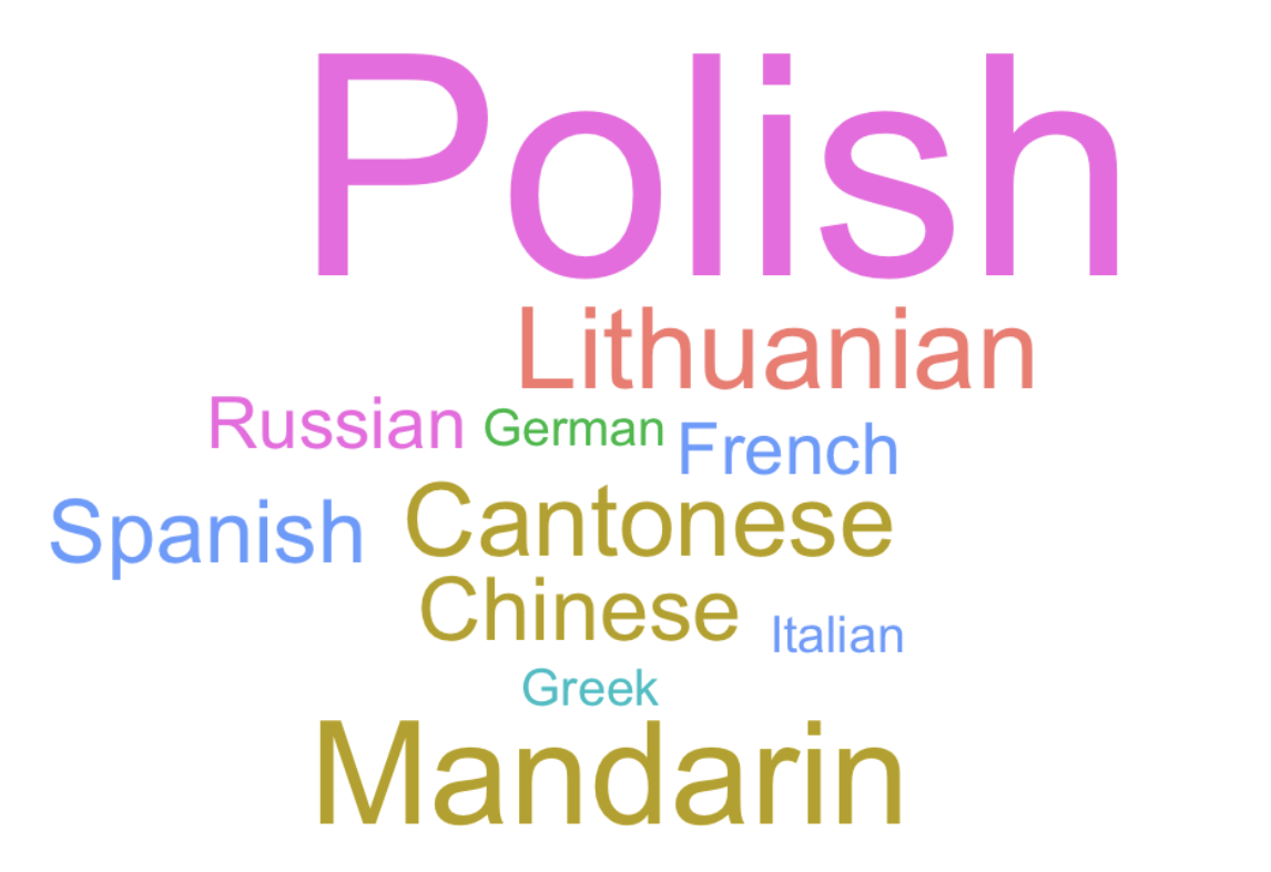
Word clouds are widely used in the media and corporate world, but they are much rarer in academic research. Although word clouds can help to visualise the most prominent words in a set of words, they mostly serve decorative purposes. Data visualisation experts warn against them for two main reasons:
- Longer words appear larger simply due to their length.
- The human eye is not good at discerning small differences in font sizes.
NoteGoing further: Using
geom_text()
We have seen that, on a scatterplot, each point represents an observation, in our case, a participant. For instance, in the scatterplot below, each point represents an L2 participant and displays their age and grammar comprehension test score. In addition, we can colour the points according to their native language family.
See R code.
Dabrowska.data |>
  filter(Group == "L2") |>
  ggplot(aes(x = Age,
           y = Grammar,
           colour = NativeLgFamily)) +
  geom_point() +
  labs(x = "Age",
       y = "Grammar test score",
       color = "Language family") +
  theme_bw(base_size = 14)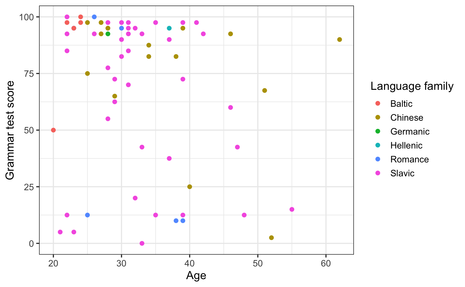
Instead of plotting points on the scatterplot, we can plot text. Thus, instead of using geom_point(), we can use geom_text(). For example, we can display the native language of each participant by mapping NativeLg to the label aesthetics.
See R code.
Dabrowska.data |>
  filter(Group == "L2") |>
  ggplot(aes(x = Age,
           y = Grammar,
           colour = NativeLgFamily,
           label = NativeLg)) +
  geom_text() +
  scale_x_continuous(limits = c(15,65)) +
  labs(x = "Age",
       y = "Grammar test score",
       color = "Language family") +
  theme_bw(base_size = 14)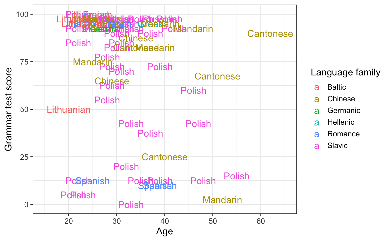
Clearly, there are too many L2 participants for this plot to be legible. For now, we will therefore focus on female L2 participants only. Moreover, we can see that there is dense cluster of L2 participants who are young and scored very high on the grammar comprehension test. In this exploratory analysis, we will therefore focus on female participants who obtained fewer than 90 points on the test.
See R code.
Dabrowska.data |>
  filter(Group == "L2") |>
  filter(Grammar < 90 & Gender == "F") |>
ggplot(aes(x = Age,
           y = Grammar,
           colour = NativeLgFamily,
           label = NativeLg)) +
  geom_text() +
  scale_x_continuous(limits = c(15,55)) +
  labs(x = "Age",
       y = "Grammar test score",
       color = "Language family",
       caption = "(Subgroup analysis of female L2 participants with grammar scores below 90.)") +
  theme_bw(base_size = 14)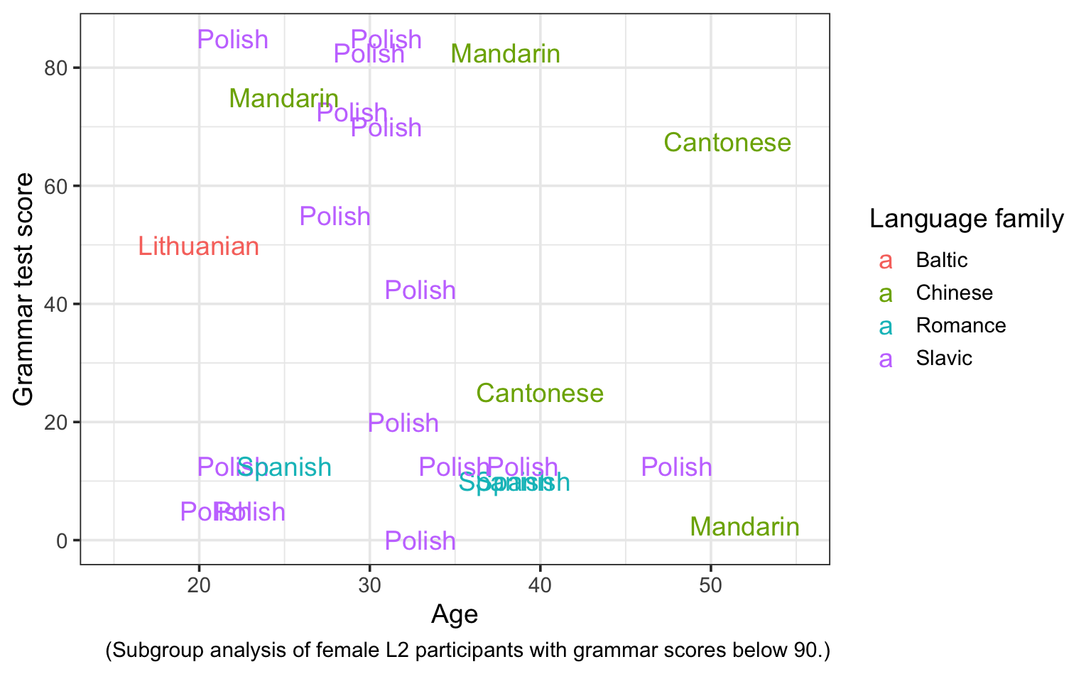
Note that we had to expand the limits of the x-axis in order for labels of the youngest and oldest participants to be displayed in this last plot. Still, there are a few labels that overlap nonetheless. If this bothers you, you’ll be pleased to hear that there is a handy {ggplot2} extension called {ggrepel}, which was designed to avoid text labels overlapping.
See R code.
#install.packages("ggrepel")
library(ggrepel)

Dabrowska.data |>
  filter(Group == "L2") |>
  filter(Grammar < 90 & Gender == "F") |>
ggplot(aes(x = Age,
           y = Grammar,
           colour = NativeLgFamily,
           label = NativeLg)) +
  geom_text_repel() +
  scale_x_continuous(limits = c(15,55)) +
  labs(x = "Age",
       y = "Grammar test score",
       color = "Language family",
       caption = "(Subgroup analysis of female L2 participants with grammar scores below 90.)") +
  theme_bw(base_size = 14)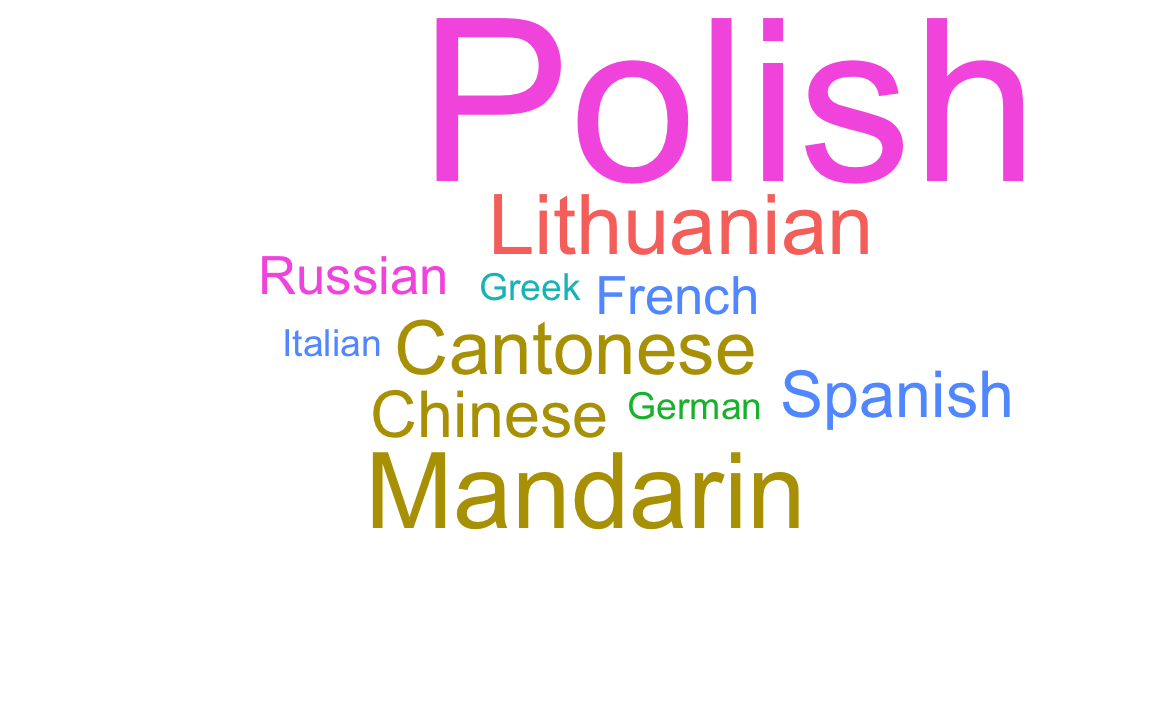

10.2.7 Combining geometries
Part of the magic of the Grammar of Graphics is that we can easily combine different geometries and aesthetics to create highly informative graphs. This is a feature that we have already made use of in several plots so far in this chapter (e.g., Figure 10.26). Figure 10.32 is another example. In this plot, we combine two geometries, geom_boxplot() and geom_point(), to see both the defining characteristics of the distributions of grammar test scores among L1 and L2 participants, as well as the exact score of each individual participant.
Dabrowska.data |>
ggplot(mapping = aes(y = Grammar,
x = Group)) +
geom_boxplot(outliers = FALSE) +
geom_point(alpha = 0.6,
size = 2) +
labs(x = NULL,
y = "Grammar test score") +
theme_bw()- 1
-
By default, the geom_boxplot() function plots dots for any outliers. Since we are now also plotting all the data points using the
geom_point()function, we need to switch off this option, otherwise the outliers will be plotted twice.
When there are too many points overlapping, even adding some transparency to the points with the alpha option may not suffice to tell the points apart. An alternative is to add a little bit of randomness to the position of the dots using the geom_jitter() function to ensure that there are fewer overlaps (Figure 10.33).
Dabrowska.data |>
  ggplot(mapping = aes(y = Grammar,
                       x = Group)) +
  geom_boxplot(outliers = FALSE) +
  geom_jitter(alpha = 0.6,
              size = 2,
              width = 0.2) +
  labs(x = NULL,
       y = "Grammar test score") +
  theme_bw()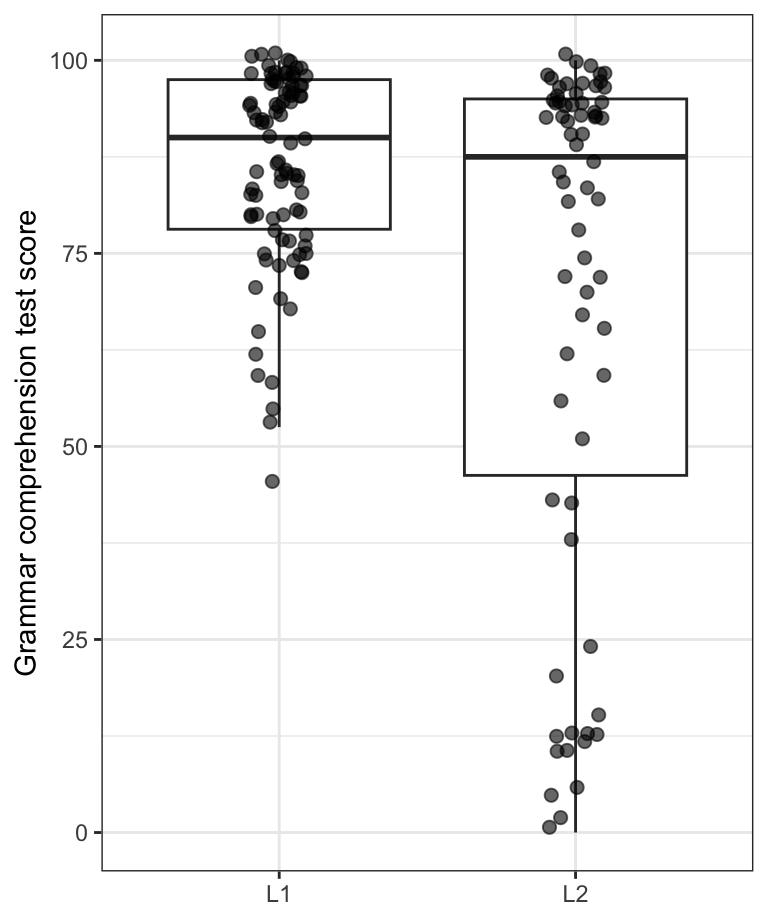
x-axis to avoid overlaps
We can also map the colour of the jittered points to another categorical variable from our dataset, e.g. Gender as in Figure 10.34.
Dabrowska.data |>
  ggplot(mapping = aes(y = Grammar,
                       x = Group,
                       colour = Gender)) +
  geom_boxplot(outliers = FALSE,
               colour = "black") +
  geom_jitter(alpha = 0.8,
              size = 2,
              width = 0.2) +
  scale_colour_viridis_d() +
  labs(x = NULL,
       y = "Grammar test score") +
  theme_bw()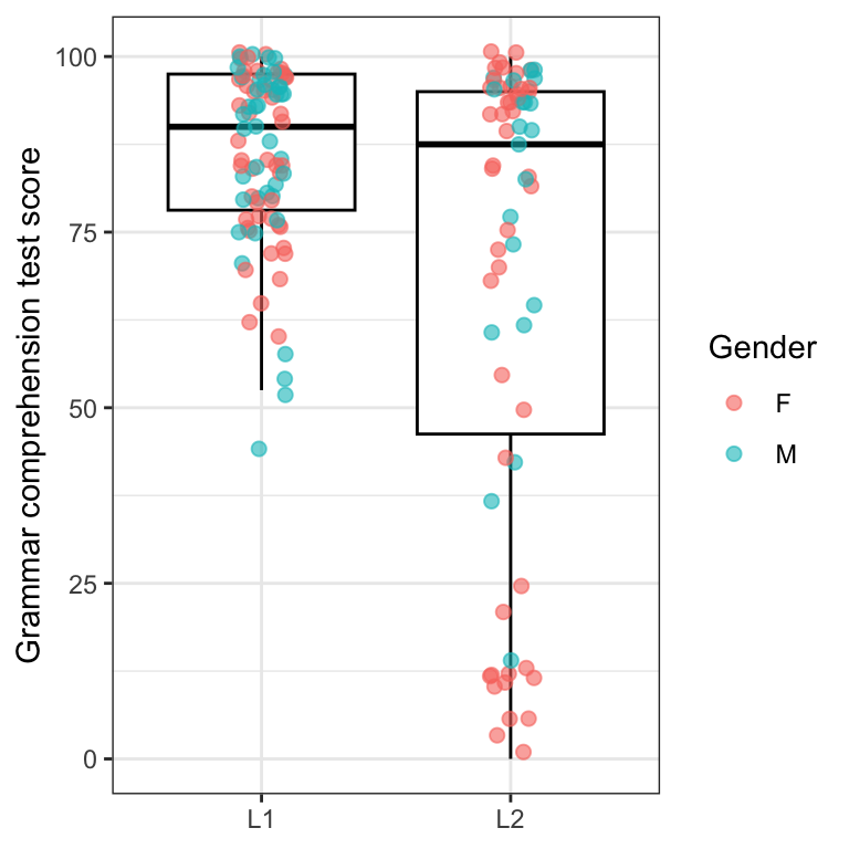
Figure 10.34 allows us to see that the lowest grammar comprehension test scores among L1 participants come from male participants, whereas the lowest scores in the L2 group come from female participants. Can you think of why this might be? 🤔 Make a note of your hypothesis as you will have a chance to explore it further in Section 10.2.8.
We can, in theory, visualise even more of our data by adding a shape aesthetics to the geom_jitter() (see Figure 10.34). However, increased plot complexity does not necessarily result in more meaningful or effective statistical graphics. How effective is Figure 10.35 in your opinion?
Dabrowska.data |>
  ggplot(mapping = aes(y = Grammar,
                       x = Group,
                       colour = OccupGroup)) +
  geom_boxplot(colour = "black",
               outliers = FALSE) +
  geom_jitter(mapping = aes(shape = Gender),
              alpha = 0.8,
              size = 2,
              width = 0.2) +
  scale_colour_viridis_d() +
  labs(x = NULL,
       y = "Grammar test score",
       colour = "Occupational\ngroup") +
  theme_bw()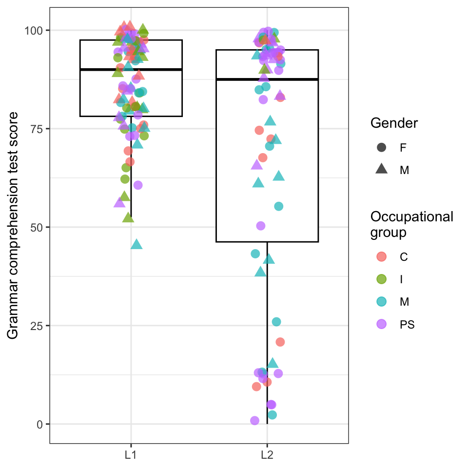
As the saying goes, less is often more. And, indeed, simpler plots are often more effective than complex ones. With {ggplot2} and its many extensions, the possibilities are almost endless, but that doesn’t mean that simple barplots, histograms, and scatterplots should be abandoned! When designing effective data visualisation to communicate your research, think carefully about your audience and the message that you want to convey.
10.2.8 Interactive plots
In Section 10.2.7, we saw that we can combine geometries and aesthetics, but that there are some limits as to what is meaningful and effective. In particular, it is difficult to visualise categorical variables with many different levels on a static graph. The good news is that now that you know how to create a plot using {ggplot2}, you are only a few seconds away from making it interactive! Interactive plots are particularly useful for data sanity checks and data exploration.

The {plotly} package provides access to a popular javascript visualisation toolkit within R. You will first need to install the package and load it.
#install.packages("plotly")
library(plotly)
Then, all we need to do is create and save a ggplot object, and call that object with the ggplotly() function. In RStudio, interactive plots are displayed in the Viewer pane. In the online version of the textbook and in your Viewer pane in RStudio, you can hover your mouse over the data points to explore the data interactively. You will see that, in addition to the variables mapped onto the plot itself, the variable mapped onto the label aesthetics (OccupGroup) also appears when you hover the mouse over any single data point.
myplot <- Dabrowska.data |>
  ggplot(mapping = aes(y = Grammar,
                       x = Group,
                       colour = Gender,
                       label = Occupation)) +
  geom_jitter(alpha = 0.8,
              width = 0.2) +
  scale_colour_viridis_d() +
  geom_boxplot(alpha = 0,
               colour = "black",
               outliers = FALSE) +
  labs(x = NULL,
       y = "Grammar test score") +
  theme_bw()

ggplotly(myplot)
If we want to display more than one additional variable on hover, we can do using the text aesthetics mapping. Here we have more options to customise which variables are displayed and how. As the interactive plot is coded in HTML, we need to use the </br> tag to add a new line.
myplot2 <- Dabrowska.data |>
  ggplot(mapping = aes(y = Grammar,
                       x = Group,
                       colour = Gender,
                       text = paste("Age:", Age, "</br>Years in formal education:", EduTotal, "</br>Job:", Occupation))) +
  geom_jitter(alpha = 0.8,
              width = 0.1) +
  scale_colour_viridis_d() +
  geom_boxplot(alpha = 0,
               colour = "black",
               outliers = FALSE) +
  labs(x = NULL,
       y = "Grammar test score") +
  theme_bw()

ggplotly(myplot2)10.3 Exporting plots 🚀
We may want to share the plots that you have created in R with others or insert them in a research paper or presentation. In Chapter 14, we will learn how to combine text, code, and plots into single documents using Quarto, but {ggplot2} also provides a convenient way to export plots for use in different programmes. Using the ggsave() function, we can specify the file name, format, and other options such as the image’s width, height, and resolution.
If we run the ggsave() function without specifying which plot should be saved, it will save the last plot that was displayed (see code below). The format of the image file is determined by the extension of the file name that we provide, e.g. a file name ending in .png will export our graph to a PNG file (see Section 2.3). We can specify the image’s dimensions in centimetres (cm), millimetres (mm), inches (in), or pixel (px). Working out appropriate dimensions can be tricky and typically requires a bit of experimenting until it’s just right!
Dabrowska.data |>
  ggplot(mapping = aes(x = Blocks,
                       fill = Group)) +
  geom_density(alpha = 0.7) +
  scale_fill_viridis_d() +
  scale_x_continuous(expand = c(0,0),
                     limits = c(0,30)) +
  labs(x = "Non-verbal IQ (Blocks test)") +
  theme_minimal()

ggsave("BlocksDensityPlot.png",
       width = 10,
       height = 8,
       units = "cm",
       dpi = 300)
By default, plots will be saved in the project’s working directory. We can save our figures elsewhere by specifying a file path before the file name (see Section 3.3). For example, the code below will save the last plot displayed as an SVG file in the project’s subfolder “figures”. This example makes use the {here} library to manage paths in a more robust way (see Note 6.1).
ggsave(here("figures", "BlocksDensityPlot.svg"),
       width = 1500,
       height = 1000,
       units = "px")
Note that, if the subfolder to which you want to save your graph does not yet exist, R will return an error. So make sure that the subfolder exists at the path that you specified before attempting to save anything to it!
Check your progress 🌟
Well done! You have successfully completed this chapter on data visualisation using the Grammar of Graphics approach. You have answered 0 out of 21 questions correctly.
Are you confident that you can…?
If so, you are ready to move out on inferential statistics in Chapter 11!
NoteCharting your way to success 🧭
If you have completed this chapter, you can now produce some of the most widely used plots in the language sciences: Congratulations!
Barplots, boxplots, scatterplots, density plots and histograms may well be all that you need for now. But you should know that the possibilities with R, the {ggplot2} library, and its many extensions are pretty much limitless: The R Graph Gallery lists some 50 different types of charts with over 400 examples with code!
Another great resource is The R Graphics Cookbook by Winston Chang. To go beyond the basics and to find out more information about the theoretical underpinnings of the {ggplot2} package, I recommend ggplot2: Elegant Graphics for Data Analysis.
There are also great R packages to produce more specialised types of graphs frequently used in linguistics such as vowel charts and dialectal maps (see list of next-step resources).
Note that, while the library is called {ggplot2}, its main function is called
ggplot().↩︎