library(here)

L1.data <- read.csv(file = here("data", "L1_data.csv"))
str(L1.data)

L2.data <- read.csv(file = here("data", "L2_data.csv"))
str(L2.data)8 DescRiptive statistics
Chapter overview
In this chapter, you will learn how to:
- Choose and interpret different measures of central tendency
- Calculate the mode, mean, and median of a numeric variable in
R - Interpret histograms and density plots
- Recognise the characteristics of a normally distributed variable
- Interpret and calculate the interquartile range in
R - Interpret boxplots
- Interpret and calculate the standard deviation in
R
In this chapter and the following chapters, all analyses are based on data from Dąbrowska (2019). You will only be able to reproduce the analyses and answer the quiz questions if you have created an RProject and saved the data within the project directory. Detailed instructions to do so can be found from Section 6.3 to Section 6.5.
Alternatively, you can download Dabrowska2019.zip from the textbook’s GitHub repository. To launch the project correctly, first unzip the file and then double-click on the Dabrowska2019.Rproj file.
Before we get started, make sure that both the L1 and the L2 datasets are correctly loaded by checking the structure of the R objects using the str() function.
8.1 Measures of central tendency
In Section 7.4, we calculated the mean average age of L1 and L2 participants. Averages are a very useful way to describe the central tendency of a numeric variable - both in science and everyday life. For example, it is useful for me to know if a particular bus journey lasts, on average, 12 minutes or 45 minutes. As it’s an average value, I am not expecting it to last exactly 12 or 45 minutes, but the average duration is nonetheless helpful to plan my schedule.
In science, we use averages to describe the central tendency of numeric variables that are too large for us to be able to examine every single data point. With very small datasets, averages are unnecessary. Imagine that a Breton1 language class in Fiji has five students. Their teacher hardly needs to calculate an average of the students’ vocabulary test results to get an understanding of how her students are doing. She can simply examine all five results!
Not only are averages of very small datasets unnecessary, they can, in fact, be misleading. Imagine that the five Breton learners got the following results (out of 100) on their vocabulary test:
89, 91, 86, 5, 82If we calculate the average result of the class, we get:
mean(c(89, 91, 86, 5, 82))[1] 70.6This average grade does not describe very well how any of the students did: Four did much better than that, while one did considerably worse! The results of quantitative studies, however, typically involve much larger datasets so that averages can be a very useful way to describe central tendencies within the data. But it’s important to understand that, depending on the data, different measures of central tendency make sense. Later on, we will also see that measures of central tendency do not suffice to describe numeric variables: measures of variability (Section 8.3) and good data visualisation (see Chapter 10) are also crucial.
8.1.1 Mean
The measure of central tendency that we have looked at so far is the arithmetic mean. When people speak of averages, this is the measure that they typically mean (no pun intended!).
In Section 7.4, we saw that means are calculated by adding up all the values and dividing the sum by the total of values.
sum((c(89, 91, 86, 5, 82))) / 5[1] 70.6Means are useful because they are commonly reported and widely understood. Their disadvantage is that they are very susceptible to outliers and skew (which far fewer people are aware of, see Section 8.2). As we saw in the example above, the fact that one “outlier” learner did very poorly in her Breton vocabulary test led to a much lower average grade than we would expect considering that the other four test-takers did much better than the mean.
Means are also frequently misinterpreted as “most likely value”. This is rarely the case. In fact, in the example above, 70.6 is not even a score that any of the five students obtained!
Q8.1 What was the mean English collocation test score (Colloc) of the L1 participants in Dąbrowska (2019)?
Q8.2 What was the mean English collocation test score (Colloc) of the L2 participants?
8.1.2 Median
Another way to report the central tendency of a set of numeric values like test results is to look for its “middle value”. If we sort our five Breton learners’ test results from the lowest to the highest value, we can see that the middle value is 86. This is the median.
sort(c(89, 91, 86, 5, 82))[1] 5 82 86 89 91For datasets with an even number of values (e.g. 2, 4, 6, 8), the median is the mean of the two middle values. Hence, in the following extended dataset with six Breton learners, the median test score is 86.5 because the two middle test results are 86 and 87 and (86 + 87) / 2 = 86.5.
sort(c(89, 91, 86, 5, 82, 87))[1] 5 82 86 87 89 91By now, you will probably not be surprised to learn that there is an R function called median(), which allows us to easily calculate the median value of any set of numbers.
median(c(89, 91, 86, 5, 82))[1] 86median(c(89, 91, 86, 5, 82, 87))[1] 86.5Q8.3 What was the median English collocation test score (Colloc) of the L1 participants in Dąbrowska (2019)?
Q8.4 What was the median English collocation test score (Colloc) of the L2 participants in Dąbrowska (2019)?
8.1.3 Mode
The mean and median are measures of central tendency that only work with numeric variables. However, data in the language sciences frequently also include categorical data (see Section 7.2). In the data from Dąbrowska (2019), this includes variables such as Gender, NativeLg, OtherLgs, and Occupation. We also need to be able to describe these variables as part of our data analysis. For such categorical variables, the only available measure of central tendency is the mode, which corresponds to a variable’s most frequent value.
The table() function outputs how often each unique value occurs in a variable:
table(L1.data$Gender)
 F  M
48 42
From this output, we can tell that the mode of the Gender variable in the L1 dataset is F, which stands for “female”.
When there are many different unique values (or levels), it makes sense to order them according to their frequency. To do so, we can pipe the output of the table() function into the sort() function (piping was covered in Section 7.5.2). Note that, by default, R sorts by ascending order (decreasing = FALSE). We can change this default to TRUE.
table(L1.data$Occupation) |>
  sort(decreasing = TRUE)
                  Retired                   Student                Unemployed
                       14                        14                         4
                Housewife            Shop Assistant                   Teacher
                        3                         3                         3
          Admin Assistant            Factory Worker                 Policeman
                        2                         2                         2
        Quantity Surveyor             Admin Officer             Administrator
                        2                         1                         1
              Boilermaker             Care Assisant             Carer/Cleaner
                        1                         1                         1
       Catering Assistant             Civil Servant                   Cleaner
                        1                         1                         1
                    Clerk            Content Editor    Creative Writing Tutor
                        1                         1                         1
 Customer Service Advisor              Dental Nurse         Finance Assistant
                        1                         1                         1
   Functions Co-ordinator                 Homemaker           Human Resources
                        1                         1                         1
               IT Support             Manual worker           Nail Technician
                        1                         1                         1
Office Admin Co-Ordinator         P/T Administrator         Personal Searcher
                        1                         1                         1
      Project Coordinator              Receptionist                    Roofer
                        1                         1                         1
          Sales Assistant     School Crossing Guard    School Crossing Patrol
                        1                         1                         1
          Senior Lecturer                    Singer         Student (college)
                        1                         1                         1
   Student/Support Worker     Supermarket Assistant            Support Worker
                        1                         1                         1
             Train Driver                 Unemploed       University lecturer
                        1                         1                         1
                 Waitress       Warehouse Operative              Web designer
                        1                         1                         1
We can see that, among the L1 participants, there were as many “Retired” participants as there were “Student” participants.2 Hence, we have two modes. In general, modal values rarely make good summaries of variables with many different possible values or levels. This is why the mode is not suitable for numeric variables, unless there are only a few possible discrete numeric values (e.g. the values of a five or seven-point Likert scale3).
Cross-tabulations of more than one categorical variable (or numeric variable with just a few unique values) can easily be generated using the table() function. In the following, we cross-tabulate the additional languages that the L1 participants speak with their gender. This allows us to see that most male and female L1 participants did not speak another language other than English. Hence, for both the male and female subsets of L1 participants the mode of the variable OtherLgs is “None”.
table(L1.data$OtherLgs, L1.data$Gender)
           F  M
  French   1  1
  German   2  1
  None    44 40
Spanish 1 0In comparative studies, it is important to ensure that comparisons are fair and meaningful. For example, it would probably not be very meaningful to compare the linguistic knowledge of a group of undergraduate student learners of English with a group of retired native speakers. In this quiz, you will examine how similar the L1 and the L2 participants in Dąbrowska (2019) were in terms of age.
Q8.5 What was the mean age of the L1 participants in Dąbrowska (2019)? Use the round() function to round off the mean value to two decimal places (see Section 7.5.2 for a reminder as to how to combine two functions).
Q8.6 On average, were the L1 participants older or younger than the L2 participants in Dąbrowska (2019)?
Q8.7 Which of the following statements is true about the L1 and L2 participants in Dąbrowska (2019)?
8.2 Distributions
Data analysis typically begins with the description of individual variables from a dataset. This is referred to as univariate descriptive statistics and is all about describing the distribution of a dataset’s variables. A distribution is a way to summarise how the values of a variable are dispersed. It tells us things like the variable’s range of values, its most frequent values, and how the values are clustered or spread out. Examining the shapes and patterns of distributions can help us understand the typical values of the variables of our data, identify outliers, and make informed decisions about how to analyse and visualise our data.
8.2.1 Distributions of categorical variables
Tables can be an effective way to examine the distribution of categorical variables. When applied to a categorical variable, the table() function outputs the frequency of each level in the variable. By default, the levels are ordered alphabetically.
table(L1.data$OtherLgs)
 French  German    None Spanish
      2       3      84       1
Earlier we saw that we can use the sort() function to change this behaviour:
table(L1.data$OtherLgs) |>
    sort(decreasing = TRUE)
   None  German  French Spanish
     84       3       2       1
The proportions() function allows us to describe the frequency of each level of a categorical variable as a proportion of all data points. This is especially useful if we want to compare the distribution of a categorical variable across different (sub)datasets of different sizes.
table(L1.data$OtherLgs) |>
  sort(decreasing = TRUE) |>
  proportions()
      None     German     French    Spanish
0.93333333 0.03333333 0.02222222 0.01111111
When computing proportions, 0 corresponds to 0% and 1 to 100%. If we want to obtain percentages, we multiply these numbers by 100. Here, we can see that more than 90% of English native speakers in Dąbrowska (2019) reported not being competent in any language other than English.
OtherLgs.prop <-
  table(L1.data$OtherLgs) |>
  sort(decreasing = TRUE) |>
  proportions()*100

OtherLgs.prop
     None    German    French   Spanish
93.333333  3.333333  2.222222  1.111111
To round the values to two decimal places, we can pipe the R object that we created in the previous chunk (OtherLgs.prop) into the round() function.
OtherLgs.prop |>
  round(digits = 2)
   None  German  French Spanish
  93.33    3.33    2.22    1.11
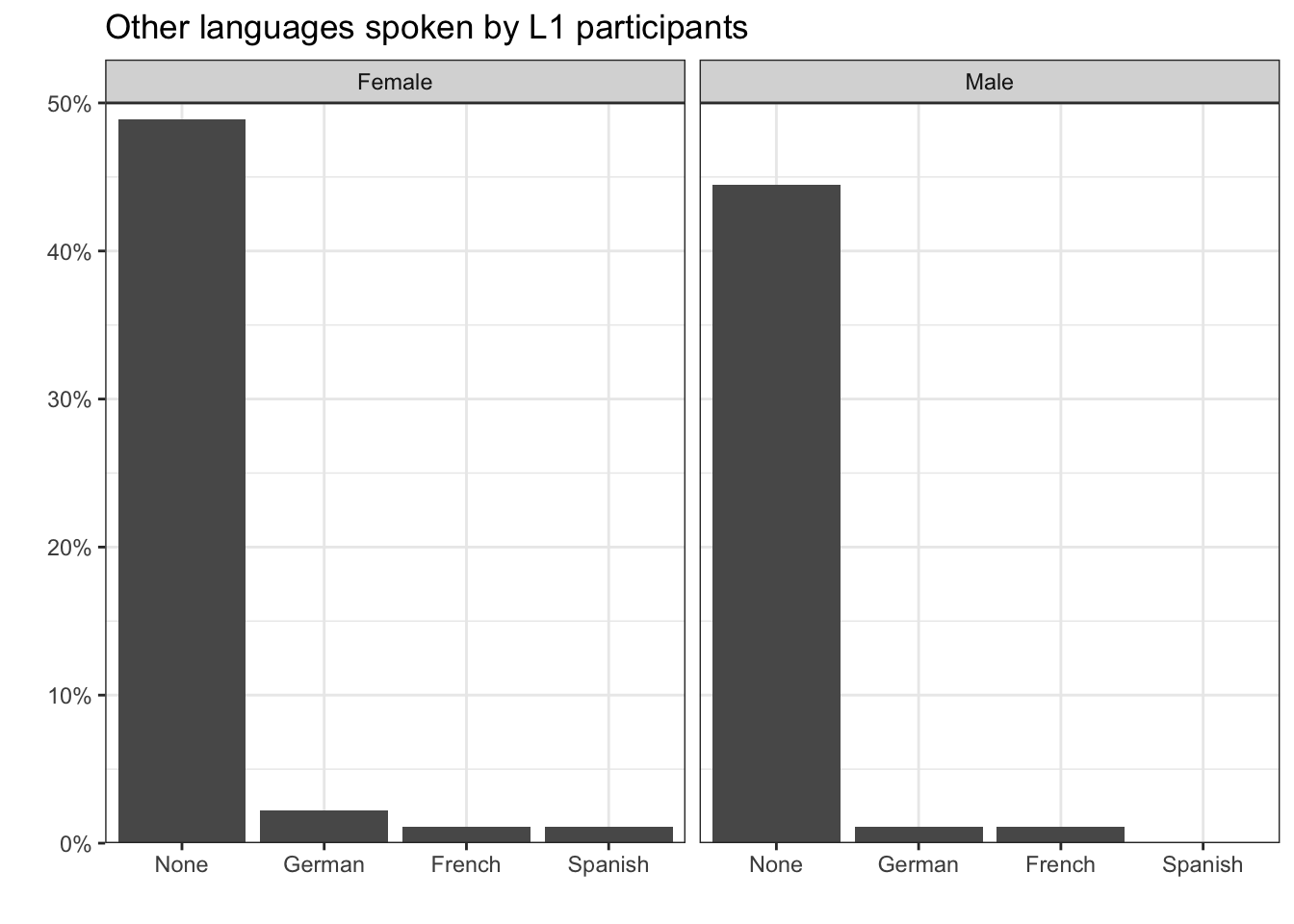
In addition to using frequency tables, we can visualise data distributions graphically. Barplots allow us to easily compare the distribution of categorical variables across different datasets and subsets of data. For example, in Figure 8.1, we can see that the distribution of additional languages spoken by the L1 participants is very similar in both the female and the male subset of participants.
Show the R code to produce the plot below (but note that data visualisation is covered in Chapter 10).
#install.packages("tidyverse")
library(tidyverse)

L1.data |>
  mutate(Gender = ifelse(Gender == "M", "Male", "Female")) |>
  ggplot(aes(x = fct_infreq(OtherLgs),
             y =..count../sum(..count..))) +
  geom_bar() +
  facet_wrap(~ Gender) +
  theme_bw() +
  scale_y_continuous(labels = scales::label_percent(),
                     expand = c(0,0),
                     limits = c(0,0.5)) +
  scale_x_discrete(expand = c(0.18,0)) +
  labs(x = "",
y = "")In Chapter 10, you will learn how to make plots like Figure 8.1 in R using the {ggplot2} package.
8.2.2 Distributions of numeric variables
In Dąbrowska (2019), on average, the L2 participants were younger than the L1 participants.
mean(L1.data$Age) - mean(L2.data$Age)[1] 4.828027The difference in mean age was more than four years. But are these two mean values good summaries of the central tendencies of participants’ ages? To check, it is important that we examine the full distribution of participants’ ages. We begin with the distribution of L2 participants’ ages.
We first use the table() function to tally L2 participants’ ages.
table(L2.data$Age)
20 21 22 23 24 25 26 27 28 29 30 31 32 33 34 35 37 38 39 40 41 42 46 47 48 51
 1  1  5  3  2  3  2  2  6  3  4  5  2  3  2  2  3  2  5  1  1  1  2  1  1  1
52 55 62
 1  1  1
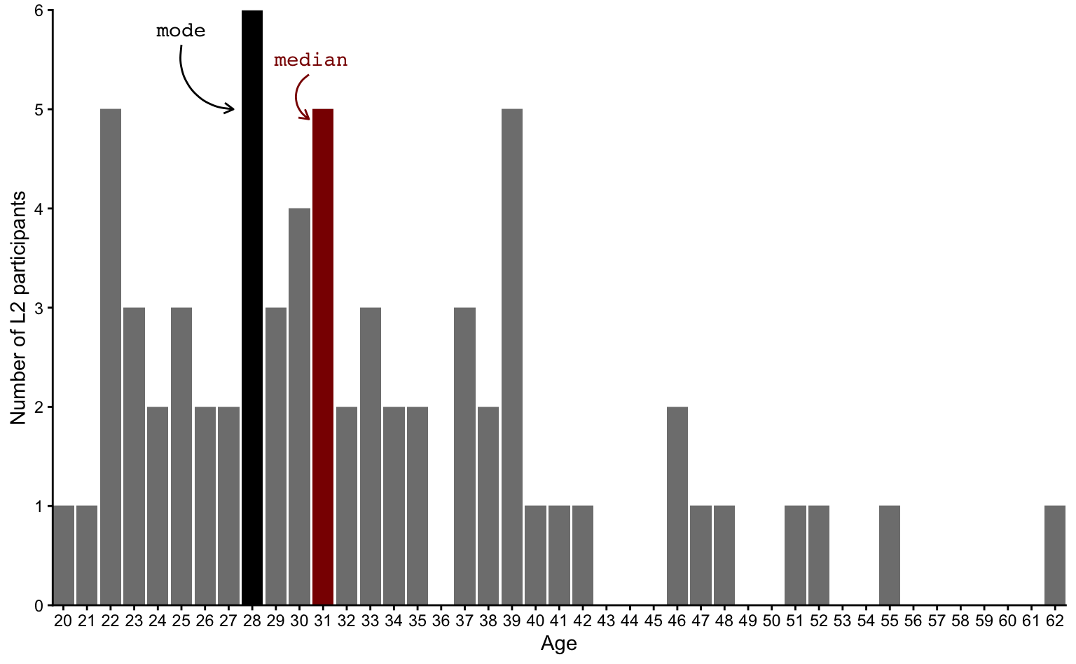
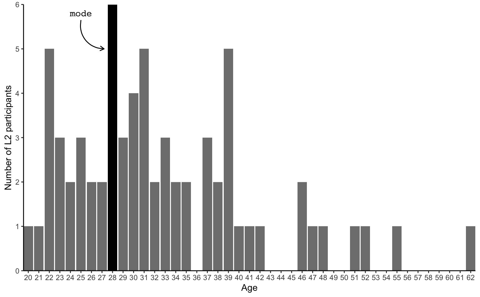
As the above table contains a lot of different values, it’s easier to visualise these numbers in the form of a bar chart (also called barplot) (see Figure 8.2). The mode (28) has been highlighted in black.
Show the R code to produce the plot below.
barplot.mode <-
L2.data |>
ggplot(mapping = aes(x = Age)) +
geom_bar(aes(fill = (Age == 28))) +
scale_fill_manual(values = c("TRUE" = "black"), guide = "none") +
theme_classic() +
scale_y_continuous(name = "Number of L2 participants",
breaks = scales::breaks_width(1),
expand = c(0, 0)) +
scale_x_continuous(breaks = scales::breaks_width(1),
expand = c(0, 0)) +
annotate(geom = "text",
x = 25,
y = 5.8,
label = "mode",
colour = "black",
family = "mono") +
annotate(geom = "curve",
x = 25,
y = 5.65,
xend = 27.2,
yend = 5,
curvature = 0.5,
arrow = arrow(length = unit(0.2, "cm")),
colour = "black")
barplot.mode- 1
-
We the L2.data data frame and pipe it into the
ggplot()function. - 2
-
We start a ggplot object, mapping
Ageto the x-axis. - 3
- We add a barplot layer, conditionally fill the bars: bars representing 28 years of age will have a different colour.
- 4
-
We manually control the colours of the bar fill, setting the bar representing
Age == 28to “#0000EE” and remove the legend. - 5
- We apply ggplot2’s classic theme.
- 6
- We ensure that there are tick marks for every single whole number and do not extend the limits of y-scale to avoid white space on the plot.
- 7
- We set the x-axis breaks and remove white space.
- 8
- We add label for the mode.
- 9
- We add a curved arrow for the mode label.
- 10
- We print the plot that we saved to the local environment under this name.
Inspecting the full distribution of ages in a plot, it’s much easier to see that the second most frequent ages after the mode of 28 are 22, 31 and 39. Now turn to Figure 8.3. How do these ages compare to the median age?
Show R code to generate the plot below.
barplot.mode.median <-
  barplot.mode +
  geom_bar(aes(fill = ifelse(Age == 31, "31", ifelse(Age == 28, "28", "Other")))) +
  scale_fill_manual(values = c("28" = "black", "31" = "darkred"), guide = "none") +
  annotate("text",
           x = 30.5,
           y = 5.5,
           label = "median",
           colour = "darkred",
           family = "mono") +
  annotate(geom = "curve",
           x = 30.4,
           y = 5.35,
           xend = 30.4,
           yend = 4.9,
           curvature = 0.6,
           arrow = arrow(length = unit(0.2, "cm")),
           colour = "darkred")

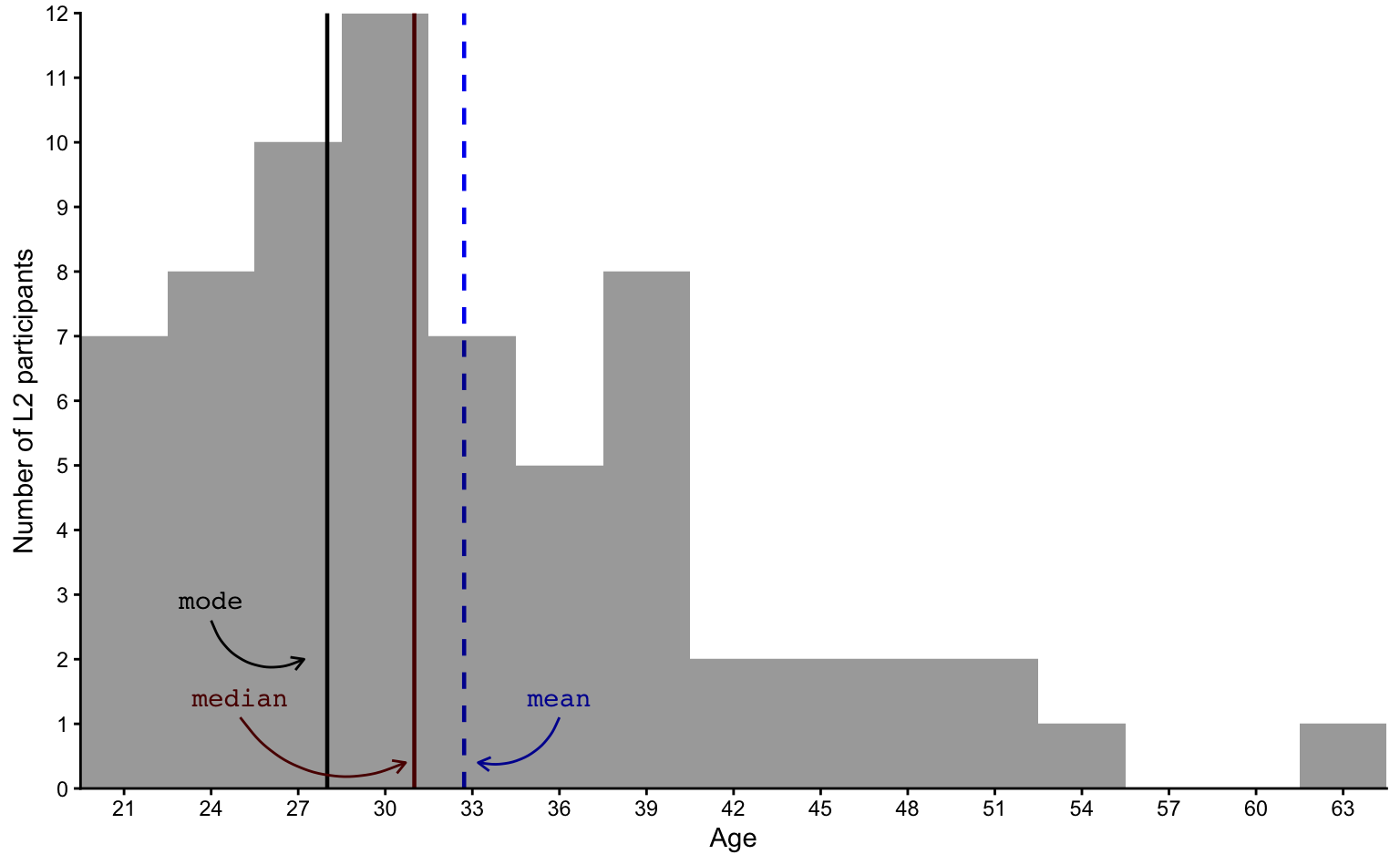
barplot.mode.medianWe can compare the mode (28) and median (31) to the mean (32.72), which, on the following bar chart, is represented as a blue dashed line.
Show R code to generate the plot below.
barplot.mode.median +
  geom_vline(aes(xintercept = mean(Age)),
             color = "#0000EE",
             linetype = "dashed",
             linewidth = 0.8) +
  # Add label for mean:
  annotate("text",
           x = 36,
           y = 5.3,
           label = "mean",
           colour = "#0000EE",
           family = "mono") +

  # Add curved arrow for mean:
  annotate(
    geom = "curve",
    x = 36,
    y = 5.15,
    xend = 33.2,
    yend = 4.4,
    curvature = -0.4,
    arrow = arrow(length = unit(0.2, "cm")),
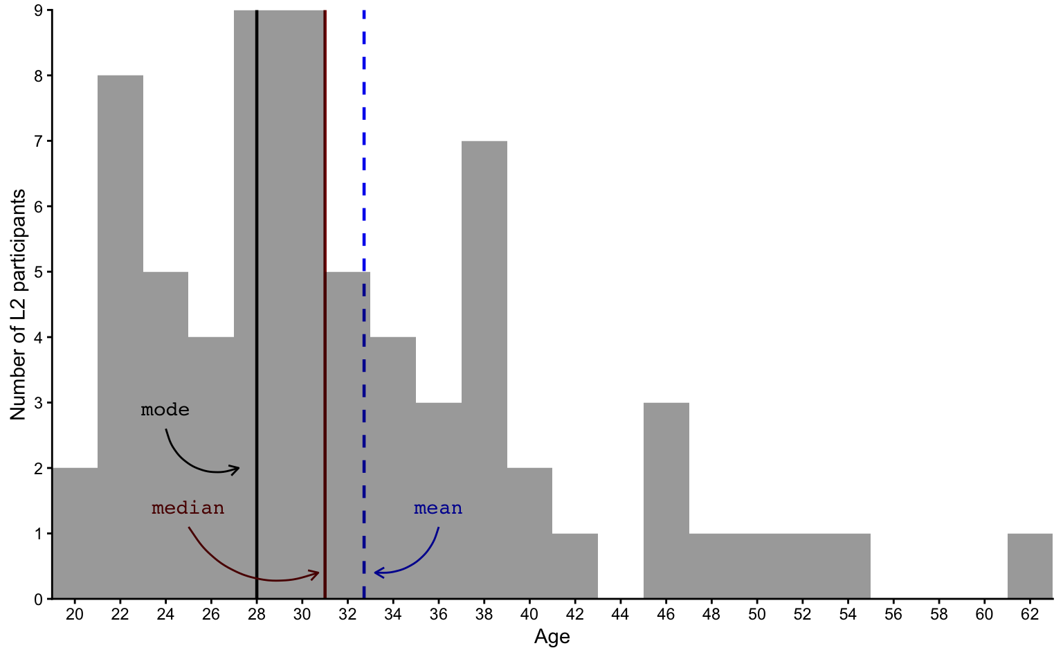
colour = "#0000EE")Next, we can reduce the number of bars by adding together the number of L2 participants aged 20-22, 22-24, 24-26, etc. This is what we call a histogram (see Figure 8.4). Histograms are used to visualise distributions and their bars are called bins because they “bin together” a number of values.
Show R code to generate the plot below.
age.histo <-
  L2.data |>
  ggplot(mapping = aes(x = Age)) +
    geom_vline(aes(xintercept = mean(Age)),
             color = "#0000EE",
             linetype = "dashed",
             linewidth = 0.8) +
    geom_vline(aes(xintercept = 28),
             color = "black",
             linewidth = 0.8) +
    geom_vline(aes(xintercept = 31),
             color = "darkred",
             linewidth = 0.8) +
  # Add label for mode:
  annotate("text",
           x = 24,
           y = 2.9,
           label = "mode",
           colour = "black",
           family = "mono") +
  # Add curved arrow for mode:
  annotate(
    geom = "curve",
    x = 24,
    y = 2.6,
    xend = 27.2,
    yend = 2,
    curvature = 0.5,
    arrow = arrow(length = unit(0.2, "cm")),
    colour = "black") +
  # Add label for mean:
  annotate("text",
           x = 36,
           y = 1.4,
           label = "mean",
           colour = "#0000EE",
           family = "mono") +
  # Add curved arrow for mean:
  annotate(
    geom = "curve",
    x = 36,
    y = 1.1,
    xend = 33.2,
    yend = 0.4,
    curvature = -0.4,
    arrow = arrow(length = unit(0.2, "cm")),
    colour = "#0000EE") +
    # Add label for median:
  annotate("text",
           x = 25,
           y = 1.4,
           label = "median",
           colour = "darkred",
           family = "mono") +
  # Add curved arrow for median:
  annotate(
    geom = "curve",
    x = 25,
    y = 1.1,
    xend = 30.7,
    yend = 0.4,
    curvature = 0.4,
    arrow = arrow(length = unit(0.2, "cm")),
    colour = "darkred") +
  theme_classic() +
  scale_y_continuous(name = "Number of L2 participants",
                     breaks = scales::breaks_width(1),
                     expand = c(0, 0)) +
  scale_x_continuous(breaks = scales::breaks_width(2),
                     expand = c(0, 0))

age.histo +
    geom_histogram(position = "identity",
                 binwidth = 2,
                 fill = "black",
alpha = 0.4)If we reduce the number of bins by having them cover three years instead of two, the shape of the histogram is simplified (see Figure 8.5).
Show R code to generate the plot below.
age.histo +
    geom_histogram(position = "identity",
                 binwidth = 3,
                 fill = "black",
                 alpha = 0.4) +
    scale_x_continuous(breaks = scales::breaks_width(3),
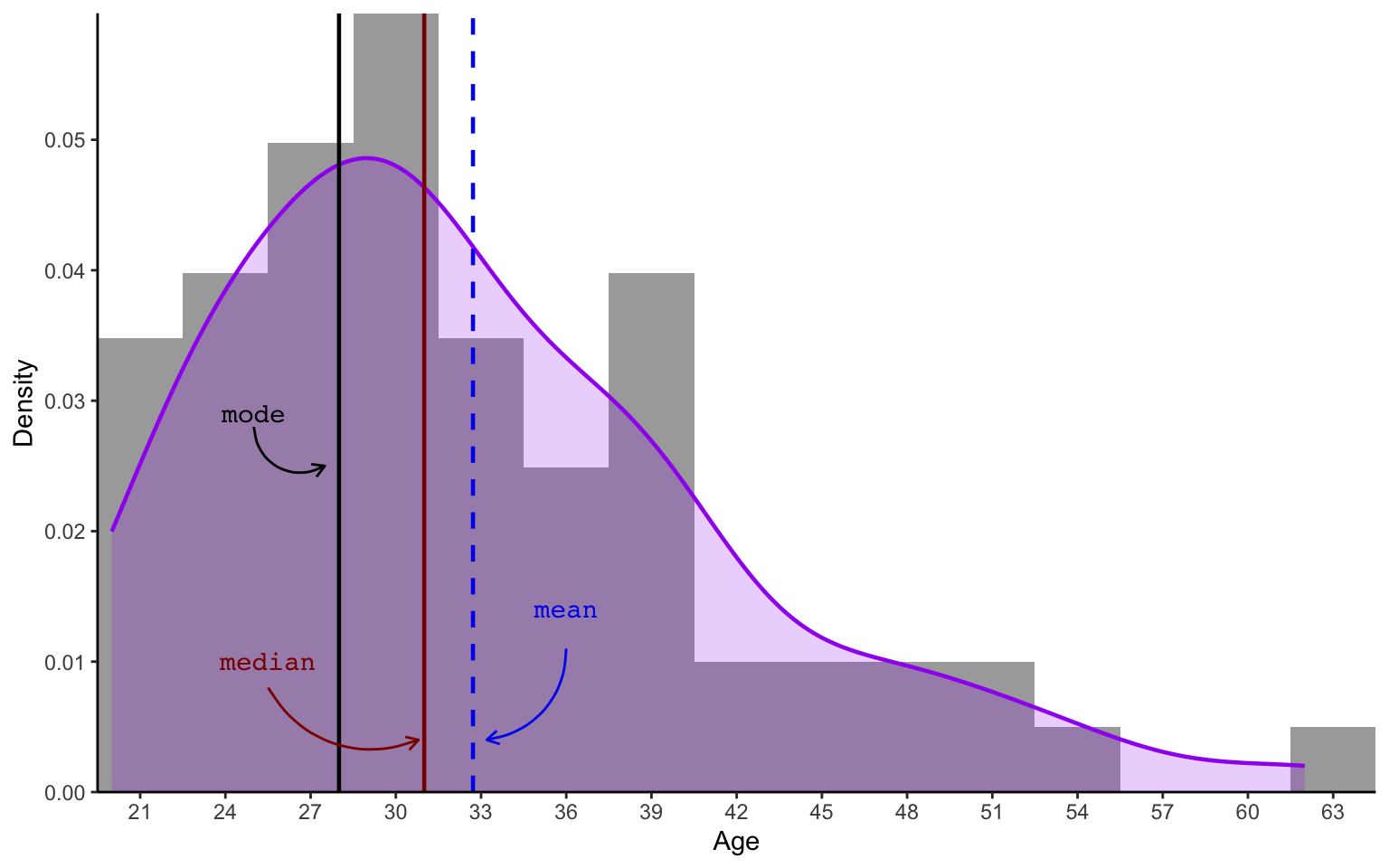
expand = c(0, 0))Alternatively, we can apply a density function to smooth over the bins of the histogram to generate a density plot of L2 participants’ ages (see purple curve in Figure 8.6). Such smoothed curves allow for a better comparison of distribution shapes across different groups and datasets. Note that, in a density plot, the values on the y-axis are no longer counts, but rather density probabilities. We will not use any fancy formulae to work this out mathematically, but you should understand that the total area under the curve (in purple) will always equal to 1, which corresponds to 100% probability. In this dataset, this is because there is a 100% probability that an L2 participant’s age is between 20 and 62.
Show R code to generate the plot below.
# There is no in-built function in R to calculate the mode of a numeric vector but we can define one ourselves:
get_mode <- function(x) {
  ux <- unique(x)
  ux[which.max(tabulate(match(x, ux)))]
}

L2.data |>
  ggplot(mapping = aes(x = Age)) +
  geom_histogram(aes(x = Age, y = after_stat(density)),
                 binwidth = 3,
                 fill = "black",
                 alpha = 0.4) +
  geom_density(colour = "purple",
               fill = "purple",
               alpha = 0.2,
               linewidth = 0.8) +
  geom_vline(aes(xintercept = mean(Age)),
             color = "#0000EE",
             linetype = "dashed",
             linewidth = 0.8) +
  geom_vline(aes(xintercept = get_mode(Age)),
             color = "black",
             linewidth = 0.8) +
  geom_vline(aes(xintercept = median(Age)),
             color = "darkred",
             linewidth = 0.8) +
  # Add label for mode:
  annotate("text",
           x = 25,
           y = 0.029,
           label = "mode",
           colour = "black",
           family = "mono") +

  # Add curved arrow for mode:
  annotate(
    geom = "curve",
    x = 25,
    y = 0.028,
    xend = 27.5,
    yend = 0.025,
    curvature = 0.6,
    arrow = arrow(length = unit(0.2, "cm")),
    colour = "black") +

  # Add label for mean:
  annotate("text",
           x = 36,
           y = 0.014,
           label = "mean",
           colour = "#0000EE",
           family = "mono") +

  # Add curved arrow for mean:
  annotate(
    geom = "curve",
    x = 36,
    y = 0.011,
    xend = 33.2,
    yend = 0.004,
    curvature = -0.4,
    arrow = arrow(length = unit(0.2, "cm")),
    colour = "#0000EE") +

  # Add label for median:
  annotate("text",
           x = 25.5,
           y = 0.01,
           label = "median",
           colour = "darkred",
           family = "mono") +

  # Add curved arrow for median:
  annotate(
    geom = "curve",
    x = 25.5,
    y = 0.008,
    xend = 30.8,
    yend = 0.004,
    curvature = 0.4,
    arrow = arrow(length = unit(0.2, "cm")),
    colour = "darkred") +

  theme_classic() +
  scale_y_continuous(name = "Density",
                     breaks = scales::breaks_width(0.01),
                     expand = c(0, 0)) +
  scale_x_continuous(breaks = scales::breaks_width(3),
expand = c(0, 0))If we wanted to work out the probability of an L2 participant being between 42 and 62 years old, we would have to calculate the area under the curve between these two points on the x-axis. Even without doing any maths, you can see that this area is considerably smaller than between the ages of 22 and 42. This means that, in this dataset, participants are considerably more likely to be between 22 and 42 than between 42 and 62 years old.4
The density plot of L2 participants’ ages features a characteristic bell-shaped curve, which indicates that the distribution resembles a normal distribution. However, it also features a long tail towards the older years. We are therefore dealing with a skewed distribution. Skewness is a measure of asymmetry in a distribution. Skewed distributions occur when one tail end of the bell is longer than the other. Here, the asymmetry is due to the fact that Dąbrowska (2019)’s L2 data includes quite a few participants who were older than 40 at the time of the study, whereas there were none who were younger than 20. As the tail is to the right of the plot, statisticians speak of a right skewed (or positive) distribution.
The median is usually better than the mean for describing the central tendency of a skewed distribution because it is less susceptible to the outlier(s) contained in the tail of a skewed distribution (see Section 8.1.2). Figure 8.6 confirms that the median is a better approximation of L2 participants’ ages than the mean.
8.2.3 Normal (or Gaussian) distributions
In a perfectly normally distributed variable, the mean and the median are exactly the same. They are both found at the centre of the distribution and the bell shape of the distribution is perfectly symmetrical. Hence, the skewness of a perfectly normal distribution is zero.
Perfectly normal distributions, however, are very rarely found in real life! Figure 8.7 shows what the normal distribution of 1,000 participants’ age might look like in real life (using numbers randomly generated from a perfectly normal distribution thanks to the R function rnorm()).
Show R code to generate the plot below.
# The {truncnorm} package contains density, probability, quantile and random number generation functions for the truncated normal distribution:
#install.packages("truncnorm")
library(truncnorm)

set.seed(42)
normal.age.sd8 <- round(rtruncnorm(mean = 35, sd = 8, n = 1000, a = 10, b = 100))
#get_mode(normal.age.sd8)

ggplot(mapping = aes(x = normal.age.sd8)) +
    geom_vline(aes(xintercept = mean(normal.age.sd8)),
             color = "#0000EE",
             linetype = "dashed",
             linewidth = 0.8) +
    geom_vline(aes(xintercept = median(normal.age.sd8)),
             color = "darkred",
             #linetype = "dotted",
             linewidth = 0.6) +
    # geom_vline(aes(xintercept = get_mode(normal.age.sd8)),
    #          color = "black",
    #          linewidth = 0.8) +

  # Add label for mean:
  annotate("text",
           x = 30.6,
           y = 0.014,
           label = "mean",
           colour = "#0000EE",
           family = "mono") +

  # Add curved arrow for mean:
  annotate(
    geom = "curve",
    x = 30.5,
    y = 0.013,
    xend = 34.7,
    yend = 0.008,
    curvature = 0.5,
    arrow = arrow(length = unit(0.2, "cm")),
    colour = "#0000EE") +

  # Add label for median:
  annotate("text",
           x = 39,
           y = 0.007,
           label = "median",
           colour = "darkred",
           family = "mono") +

  # Add curved arrow for median:
  annotate(
    geom = "curve",
    x = 38,
    y = 0.006,
    xend = 35.2,
    yend = 0.004,
    curvature = -0.5,
    arrow = arrow(length = unit(0.2, "cm")),
    colour = "darkred") +
  theme_classic() +
  scale_y_continuous(name = "Density",
                     breaks = scales::breaks_width(0.01),
                     expand = c(0, 0)) +
  scale_x_continuous(name = "Age",
                     breaks = scales::breaks_width(5),
                     expand = c(0, 0)) +
  geom_histogram(aes(x = normal.age.sd8, y = after_stat(density)),
                 binwidth = 2,
                 fill = "black",
                 alpha = 0.4) +
  geom_density(colour = "purple",
               linewidth = 0.8,
               fill = "purple",
alpha = 0.3)In Figure 8.7, the mean (34.838) and the median (35) age of our 1,000 fictitious learners are very close to each other. So close that, on the plot, the lines almost overlap. The skew is near zero, hence the density curve forms a near-symmetrical bell shape. This means that the purple area under the curve to the left of the central tendency is (pretty much) the same as the area to the right of the line. In other words, there are as many people whose age is below the central tendency (50%) as there are people whose age is above the central tendency (50%). These are the characteristics of a normal distribution.
8.2.4 Non-normal (or non-parametric) distributions
Returning to real research data, we saw that the distribution of L2 participants’ ages in Dąbrowska (2019) was close to a normal distribution, but with a right skew towards older years. This meant that the mean age was higher than median age.
Does the distribution of L1 participants’ ages follow a similar shape to the L2 participants (see Figure 8.6)? Are we dealing with a distribution that is normal, left or right skewed, or something entirely different?
Q8.8 What are the modal ages of the L1 and L2 participants in Dąbrowska (2019)?
Q8.9 Which of the following statements is true?
Q8.10 Which measure of central tendency best describes L1 participants’ ages?
Figure 8.8 shows the distribution of L1 participants’ ages both as a histogram (in grey) and a density plot (in purple). Both of these visualisations make quite clear that this distribution of ages is not at all normal! It is non-normal or non-parametric. This is because it does not consist of one (more or less) symmetrical bell shape. Instead, we can see several small bell shapes.
Show R code to generate the plot below.
L1.data |>
  ggplot(mapping = aes(x = Age)) +
  geom_histogram(aes(x = Age, y = after_stat(density)),
                 binwidth = 2,
                 fill = "black",
                 alpha = 0.4) +
  geom_density(colour = "purple",
               fill = "purple",
               alpha = 0.2,
               linewidth = 0.8) +
  geom_vline(aes(xintercept = mean(Age)),
             color = "#0000EE",
             linetype = "dashed",
             linewidth = 0.8) +
  geom_vline(aes(xintercept = get_mode(Age)),
             color = "black",
             linewidth = 0.8) +
  geom_vline(aes(xintercept = median(Age)),
             color = "darkred",
             linewidth = 0.8) +

  # Add label for mode:
  annotate("text",
           x = 20.5,
           y = 0.064,
           label = "mode",
           colour = "black",
           family = "mono") +

  # Add curved arrow for mode:
  annotate(
    geom = "curve",
    x = 20.5,
    y = 0.062,
    xend = 18,
    yend = 0.058,
    curvature = -0.4,
    arrow = arrow(length = unit(0.2, "cm")),
    colour = "black") +

  # Add label for mean:
  annotate("text",
           x = 40,
           y = 0.03,
           label = "mean",
           colour = "#0000EE",
           family = "mono") +

  # Add curved arrow for mean:
  annotate(
    geom = "curve",
    x = 40,
    y = 0.028,
    xend = 37.8,
    yend = 0.025,
    curvature = -0.4,
    arrow = arrow(length = unit(0.2, "cm")),
    colour = "#0000EE") +

  # Add label for median:
  annotate("text",
           x = 28,
           y = 0.01,
           label = "median",
           colour = "darkred",
           family = "mono") +

  # Add curved arrow for median:
  annotate(
    geom = "curve",
    x = 28,
    y = 0.008,
    xend = 31.7,
    yend = 0.004,
    curvature = 0.4,
    arrow = arrow(length = unit(0.2, "cm")),
    colour = "darkred") +

  theme_classic() +
  scale_y_continuous(name = "Density",
                     breaks = scales::breaks_width(0.01),
                     expand = c(0, 0)) +
  scale_x_continuous(breaks = scales::breaks_width(2),
expand = c(0, 0))The histogram also shows that the most frequent age (the mode) corresponds to the lowest age in the dataset (17) and that both the median and mean are far removed from most participants’ ages. This distribution of L1 participants’ ages points to the limits of measures of central tendency. They are useful to describe approximately normally distributed variables, but are far less informative when it comes to other types of distributions.
Q8.11 What can we reasonably deduce from the distribution of L1 participants’ ages visualised in Figure 8.8?
Q8.12 What are the pros of reporting the median rather than the mean to describe the central tendency of a variable?
Q8.13 What are the cons of reporting the median rather than the mean to describe the central tendency of a variable?
Understanding and being able to recognise the characteristics of a normal distribution is important as many statistical tests assume that the variables entered in these tests are (approximately) normally distributed (see Chapter 11 and Figure 11.12).
8.3 Measures of variability
Measures of central tendency should never be reported alone. As we saw with L1 participants’ age in Section 8.2.4, measures of central tendency are not always very informative and can even be misleading. But, even when they are informative, they only tell us part of the story: the average value of a dataset, but not the spread or variability of the data. For example, a mean age of 25 might suggest a group of young adults, but without a measure of variability, we can’t tell if the group is relatively homogeneous (e.g. all students in their twenties) or heterogeneous (e.g. with some participants in their teens and others in their thirties or older). Therefore, it is essential that we always report measures of central tendency in conjunction with measures of variability, such as the range, interquartile range, or standard deviation, to provide a more accurate picture of the data.
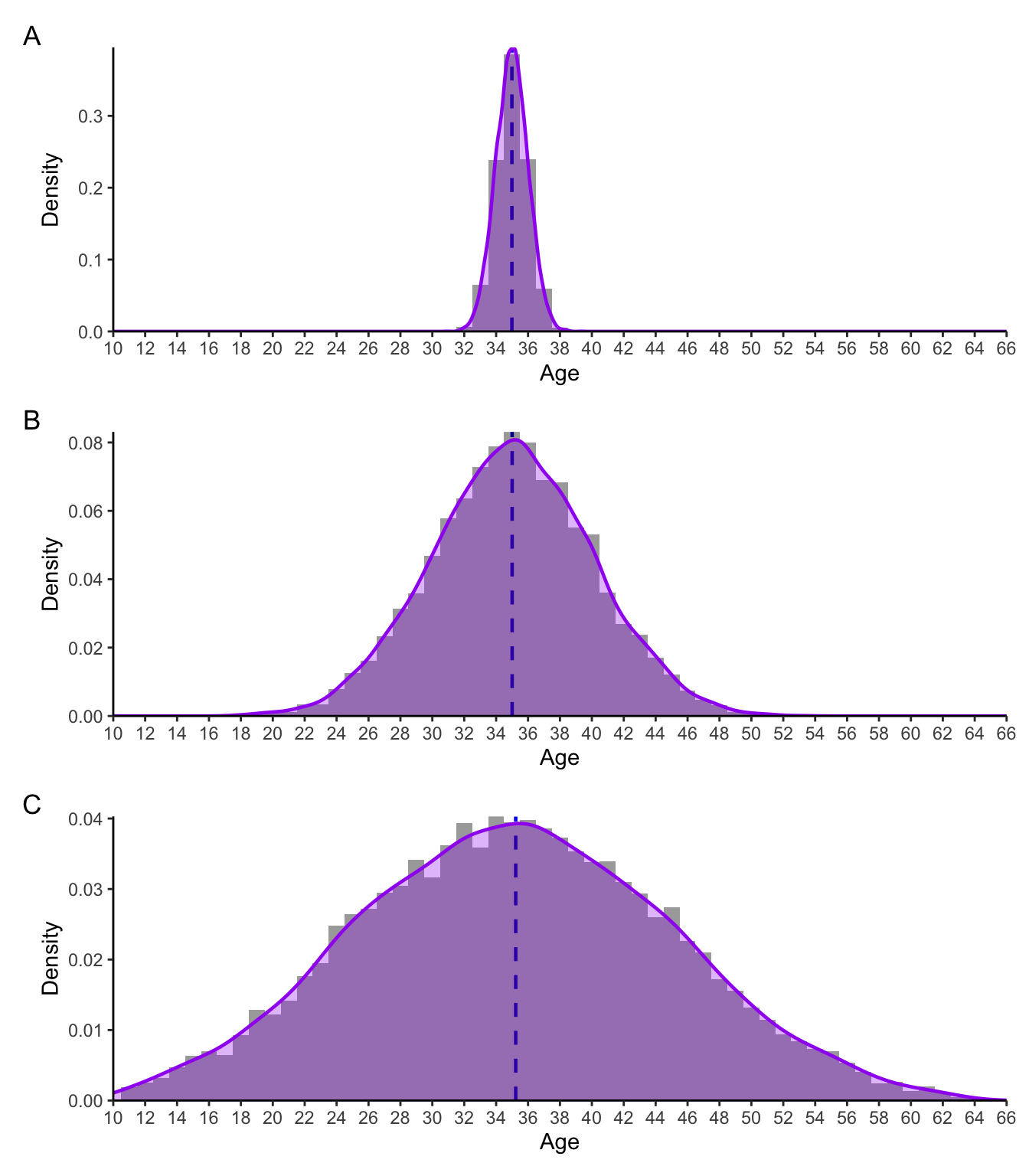
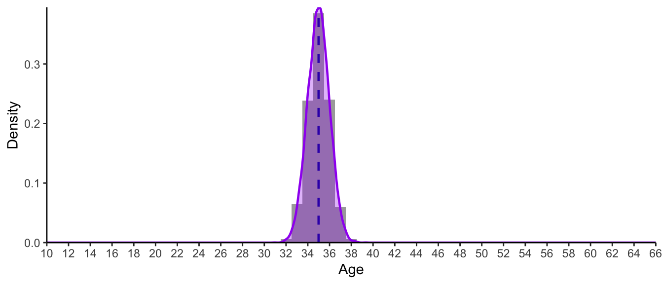
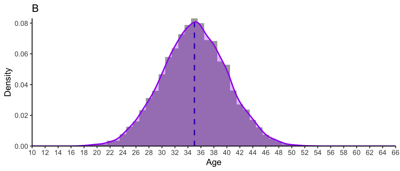
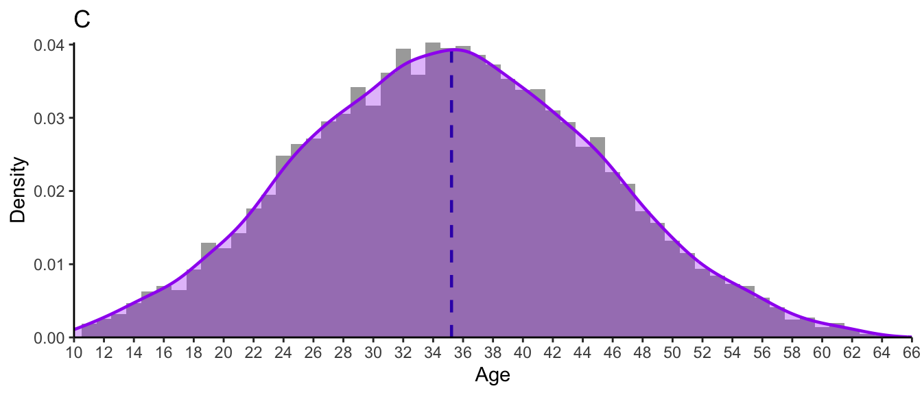
Consider the three distributions of ages presented in Figure 8.9. As you can tell from their shapes, these are three normal distributions. They each have exactly the same mean and median of 35; yet they evidently correspond to very different groups of people!
Show R code to generate the plot below.
# The {truncnorm} package contains density, probability, quantile and random number generation functions for the truncated normal distribution. You will need to install it before you can load it.

#install.packages("truncnorm")
library(truncnorm)

set.seed(42)
normal.age.A <- rtruncnorm(mean = 35, sd = 1, n = 10000, a = 10, b = 64)
normal.age.B <- rtruncnorm(mean = 35, sd = 5, n = 10000, a = 10, b = 64)
normal.age.C <- rtruncnorm(mean = 35, sd = 10, n = 10000, a = 10, b = 64)

normal.density <- function(ages) {
  ggplot(mapping = aes(x = ages)) +
      geom_vline(aes(xintercept = mean(ages)),
               color = "#0000EE",
               linetype = "dashed",
               linewidth = 0.8) +
    theme_classic() +
    scale_y_continuous(name = "Density",
                       #breaks = scales::breaks_width(0.01),
                       expand = c(0, 0)) +
    scale_x_continuous(name = "Age",
                       breaks = scales::breaks_width(2),
                       limits = c(10,66),
                       expand = c(0, 0)) +
    geom_histogram(aes(x = ages, y = after_stat(density)),
                   binwidth = 1,
                   fill = "black",
                   alpha = 0.4) +
    geom_density(colour = "purple",
                 linewidth = 0.8,
                 fill = "purple",
                 alpha = 0.3)
}

# The three plots are printed as one figure using the {patchwork} library. You will need to install this library before you can load it and use it.

#install.packages("patchwork")
library(patchwork)

normal.density(normal.age.A) / normal.density(normal.age.B) / normal.density(normal.age.C) +
    # Add captions A, B, C
plot_annotation(tag_levels = 'A')Whereas Group A only includes adults aged 32 to 39, Group C includes children as young as 10, as well as adults well into their 50s and early 60s - even though they both have the same mean/median on 35. This is why both measures of central tendency and variability are important when describing numeric variables! Measures of variability help us to understand how far each data point is from the central tendency. Hence, for Group A in Figure 8.9, we can say that all data points are pretty close to the mean/median of 35. In Group B, participants’ ages are, on average, more “spread out” to the left and right of the central tendency. And this is even more notable in Group C.
8.3.1 Range
The most basic measure of variability is range. It is calculated by subtracting the highest value of a variable from its lowest value. For example, in Dąbrowska (2019), the range of results obtained by the L1 participants in the English grammar comprehension test is:
max(L1.data$GrammarR) - min(L1.data$GrammarR)[1] 22By contrast, the range of results in this same test among the L2 participants is:
max(L2.data$GrammarR) - min(L2.data$GrammarR)[1] 40In practice, the range is usually reported by explicitly mentioning a variable’s lowest and highest values as this is usually much more informative than the range itself. Here is how Dąbrowska (2019) reports the age of the participants when describing her data:
The L1 participants were all born and raised in the United Kingdom and were selected to ensure a range of ages, occupations, and educational backgrounds. The age range was from 17 to 65 years […]. The nonnative participants ranged in age from 20 to 62 years […] (Dąbrowska 2019: 6).
Q8.14 Complete the description of the GrammarR variable in L1.data and L2.data below.
Copy and paste the following paragraph into a text processor (e.g. LibreOffice Writer or Microsoft Word) and fill in the six blanks using figures that you calculated in R. If necessary, round off values to two decimal places.
On average, English native speakers performed only marginally better in the English grammatical comprehension test (median = ______) than English L2 learners (median = ______). However, L1 participants’ grammatical comprehension test results ranged from ______to ______, whereas L2 participants’ results ranged from ______to ______.
Your paragraph should read as follows:
On average, English native speakers performed only marginally better in the English grammatical comprehension test (median = 76) than English L2 learners (median = 75). L1 participants’ grammatical comprehension test results ranged from 58 to 80. In this same test, L2 participants’ results ranged 40 to 80.
The following lines of R code can be used to obtain these numbers.
median(L1.data$GrammarR)[1] 76median(L2.data$GrammarR)[1] 75min(L1.data$GrammarR)[1] 58max(L1.data$GrammarR)[1] 80min(L2.data$GrammarR)[1] 40max(L2.data$GrammarR)[1] 808.3.2 Interquartile range
We saw that the median is a measure of central tendency that represents the middle value. This means that 50% of the data falls below the median and 50% falls above the median. Going back to the test results of our six learners of Breton in Fiji, this means that half of the class scored below 86.5 and the other half above 86.5.
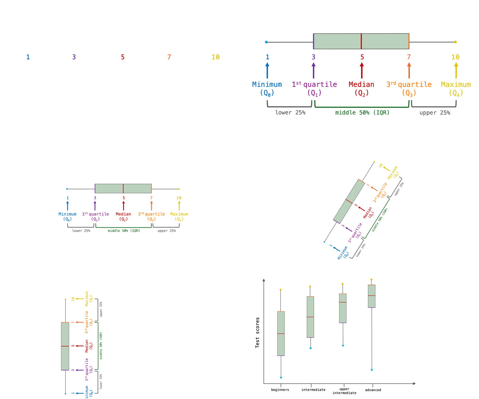
median(c(5, 82, 86, 87, 89, 91))[1] 86.5We can further subdivide the distribution into chunks of 25% of the data, or quartiles (see Figure 8.10).
The first quartile (Q1) is the value below which 25% of the data falls. In other words, the first quartile corresponds to a value that lies above one-quarter of the values in the data set.
The second quartile (Q2) is the median and, as we know, half of the data (25% + 25% = 50%) are below this value, the other half are above.
The third quartile (Q3) is the value below which 75% of the data falls. In other words, it is also the value above which the upper 25% of the data are.
The interquartile range (IQR) is the range between the second and the third quartile: it therefore covers the middle 50% of the data. This is illustrated below with a growing number of imaginary Breton learners.
The easiest way to examine a variable’s IQR in R is to use the handy summary() function which, when applied to a numeric variable, returns a number of useful descriptive statistics including its first and third quartiles.5
summary(L1.data$GrammarR) Min. 1st Qu. Median Mean 3rd Qu. Max.
58.00 71.25 76.00 74.42 79.00 80.00 From the output of the summary() function, we can easily calculate the IQR, which we know is equal to the range between the first and the third quantile.
79 - 71.25[1] 7.75Alternatively, we can compute the IQR directly using the IQR() function.
IQR(L1.data$GrammarR)[1] 7.75The reason that the summary() function is probably more useful than IQR() is that, like the full range, the interquantile range is not usually reported as the difference between Q3 and Q1. This is because it is more informative to consider the first quartile (Q1), the median (Q2), and the third quartile (Q3) together to grasp both the central tendency of a set of numbers and the amount of variability there is around this central tendency.
In practice, quartiles are rarely reported as numbers. Instead, they are usually visualised as boxplots. Boxplots present a visual summary of a numeric variable’s central tendency and variability around this central tendency. On a boxplot, the box represents the IQR. Its dividing line is the median. The whiskers and any outlier points represent the rest of the distribution (see Figure 8.11). In other words, the lower whisker roughly covers the lower 25% of the data and the upper whisker the top 25% of the data. Boxplots are most often displayed vertically and are used to visually compare the main characteristics of distributions of numeric values across different groups (e.g. grammar comprehension across different language proficiency groups).
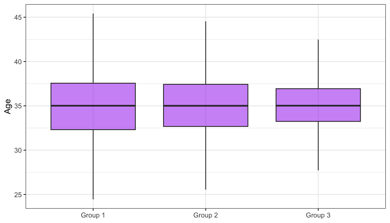
Remember that, in a perfectly normal distribution, the mean and median are equal. When a variable follows a normal distribution, its box is divided into two equal halves and the whiskers are of equal length (see Figure 8.12). This symmetry comes from the fact that the values are equally distributed to the left and right of the median/mean. For the same reason, the bells of the normal distributions in Figure 8.9 were all (almost) symmetrical, although they had very different heights and widths.
Show R code to generate the plot below.
normal.ages <- data.frame(Age = c(normal.age.A, normal.age.B, normal.age.C),
                          Group = c(rep("Group 3", 1000), rep("Group 2", 1000), rep("Group 1", 1000)))

ggplot(mapping = aes(y = Age,
                     x = Group),
       data = normal.ages) +
  geom_boxplot(outliers = FALSE,
               fill = "purple",
               alpha = 0.5) +
  theme_bw() +
  scale_y_continuous(breaks = seq(0, 70, 5)) +
labs(x = NULL)Q8.15 Examine the boxplots displayed in Figure 8.12.
Q8.16 The boxplots in Figure 8.12 are based on the same data as the three density plots in Figure 8.9. Compare the two figures. Which distribution corresponds to which boxplot?
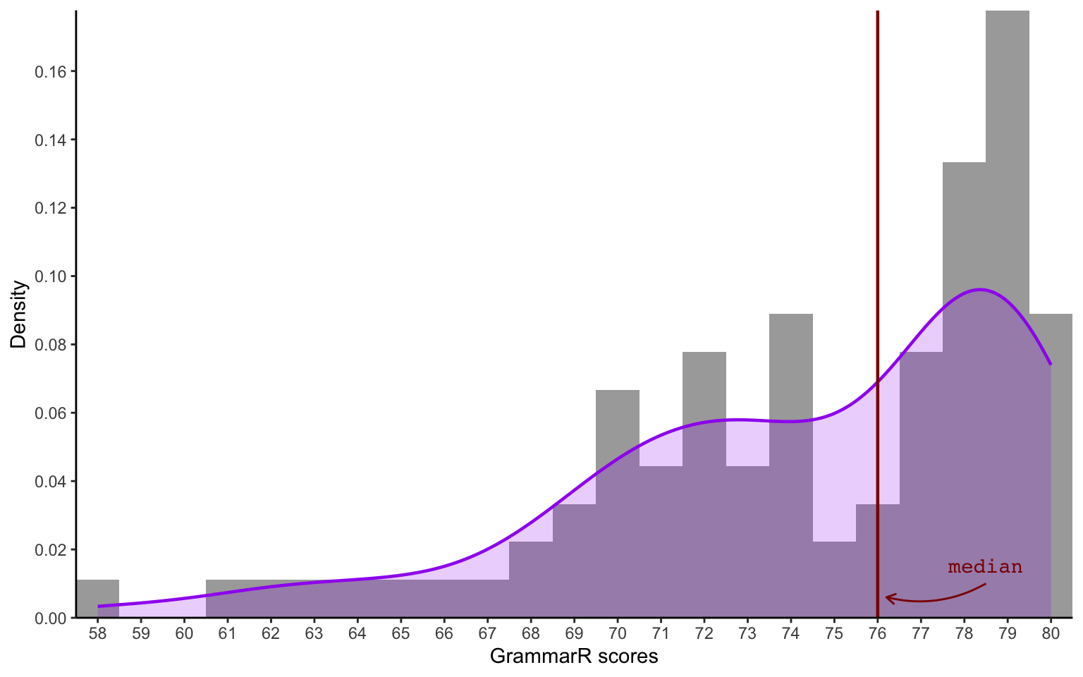
Q8.17 Examine the following distribution of scores on the grammatical comprehension test administered as part of Dąbrowska (2019).
Are the scores visualised in Figure 1 normally distributed?
Q8.18 Compare the following outputs of the summary() function.
summary(L1.data$GrammarR) Min. 1st Qu. Median Mean 3rd Qu. Max.
58.00 71.25 76.00 74.42 79.00 80.00 summary(L2.data$GrammarR) Min. 1st Qu. Median Mean 3rd Qu. Max.
40.00 58.50 75.00 67.76 78.00 80.00 Based on the outputs of the summary() function, what does Figure 1 display?
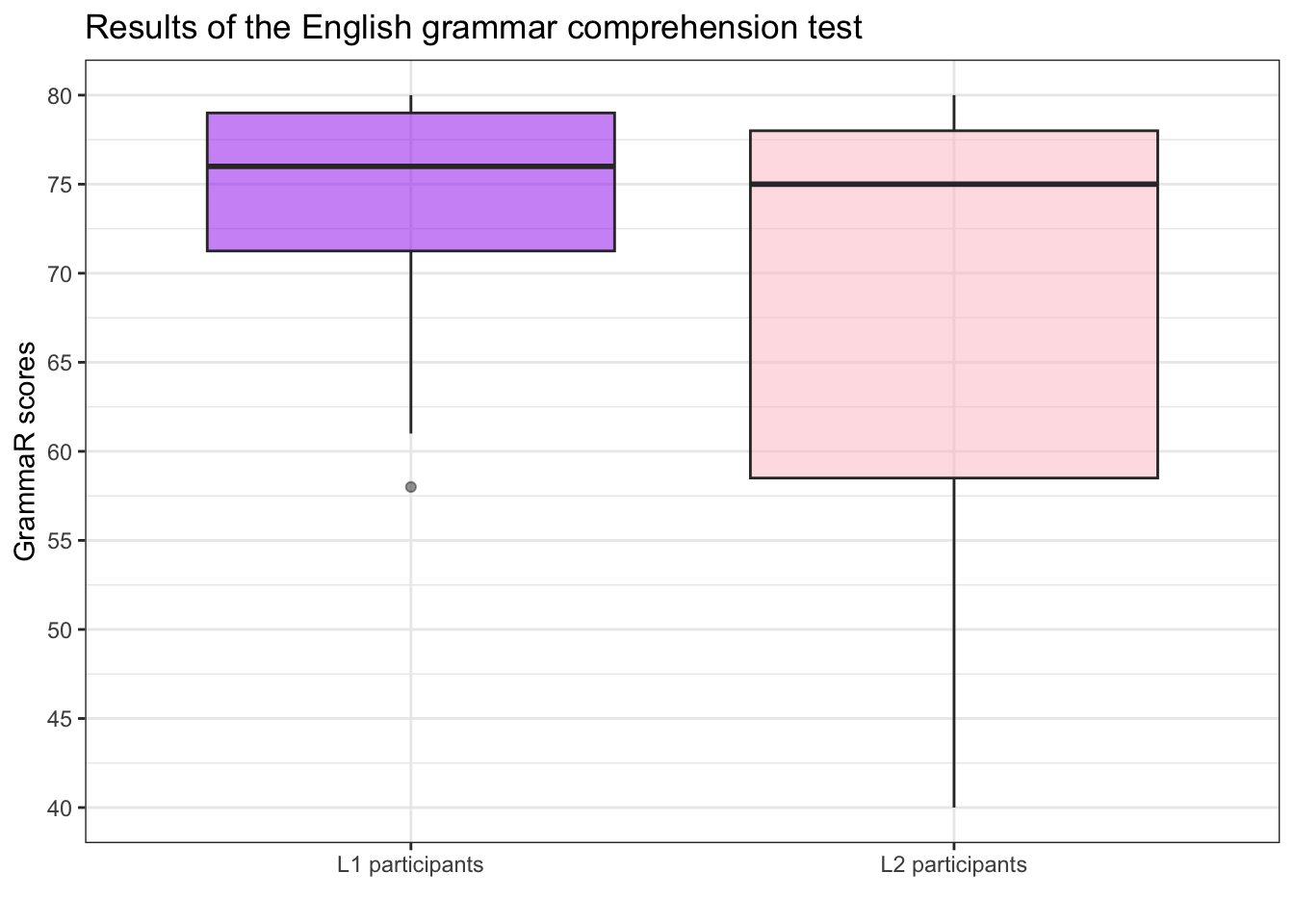
Q8.19 Compare the following boxplots which summarise the distribution of scores on the grammatical comprehension test (GrammarR) administered as part of Dąbrowska (2019).
Why do the two boxplots look so different?
8.3.3 Standard deviation
In the language sciences and in many other disciplines, standard deviation is the most common reported measure of variability. Whereas the interquartile range (IQR) is a measure of variability around the median, standard deviation (SD) measures variability around the mean. In other words, if you report a mean value as a measure of central tendency, you should report the standard deviation along side it. However, if you report the median, than it makes more sense to report the IQR in the form of a boxplot (see Section 8.3.2).
In a nutshell, the standard deviation tells us how far away, on average, each data point is from the mean.
Considering the test scores of our five Breton learners, we already know that the standard deviation is likely to be large because the mean (70.6) is quite far away from all five data points.
5, 82, 86, 89, 91To calculate how far exactly, we first measure how far each point is from the mean, e.g. for the first data point we calculate 5 - 70.6, for the second 82 - 70.6, etc.
Breton.scores <- c(5, 82, 86, 89, 91)

Breton.scores - mean(Breton.scores)
[1] -65.6 11.4 15.4 18.4 20.4As you can see, some of the differences between the data points and the mean value are negative, whilst others are positive. To calculate the standard deviation, we are not interested in whether data points are above or below the mean, but rather in how far removed they are from the mean. To remove any negative sign, we therefore square all these distances. The squaring operation (^2) also has the effect of making large differences even larger.
(Breton.scores - mean(Breton.scores))^2[1] 4303.36 129.96 237.16 338.56 416.16Remember that standard deviation is a measure of how different, on average, a set of numbers are from one another, with respect to the mean. We have just calculated the sum of the squared differences from the mean and we now need to calculate the average of these squared differences. To calculate the mean squared difference, we sum the differences and divide them by the number of data points.
sum((Breton.scores - mean(Breton.scores))^2) / 5[1] 1085.04This is the variance. The problem with the variance is that it is not in the original scale of our variable, but rather in squared units, i.e. here, in squared test scores, which is rather difficult to interpret! This is why we more commonly report the standard deviation, which is the square root of the variance. The square root function in R is sqrt().
sqrt(sum((Breton.scores - mean(Breton.scores))^2) / 5)[1] 32.93995From the above result, we can deduce that, on average, learners’ test scores are 32 points away from the group mean of 70.6 points.
And the good news is that there is a base R function to calculate the standard deviation. It is called sd(). However, if we use the sd() function to calculate the standard deviation of our five Breton learners’ test scores, we get a slightly different result… 🧐
sd(Breton.scores)[1] 36.82798This is because, in practice, we almost always divide the sum of squares not by the total number of data points (N ), but by the total number minus one (N-1). This is the difference between the population standard deviation and the sample standard deviation. The population standard deviation is used when we have access to the entire population (e.g. all L2 English users living in the UK!), which is exceedingly rare in real-world research. In most cases, we work with samples (e.g. as in Dąbrowska 2019, a sample of 67 L2 English users). Dividing by N-1 gives us a more accurate estimate of the population’s standard deviation based on our sample. It helps to reduce the bias in our estimate, making it a more reliable measure of variability around the mean.
In R, the sd() function calculates the sample standard deviation. We can check its output by manually writing out the formula for sample standard deviation:
sqrt(sum((Breton.scores - mean(Breton.scores))^2) / 4)[1] 36.82798With a normal distribution, the standard deviation informs us about the width of the bell around the central tendency. Figure 8.9 shows three normal distributions, all with a median/mean of 35, but with different bell shapes. This is because they have very different standard deviations around that central tendency of 35 years. Let us compare the distribution shapes of these three distributions:
Distribution A (Figure 8.15) is a normal distribution with a mean of 35 years (M = 35) and a standard deviation of one year (SD = 1).
Distribution B (Figure 8.16) is a normal distribution with a mean of 35 years (M = 35) and a standard deviation of 5 years (SD = 5).
Distribution C (Figure 8.17) is a normal distribution with a mean of 35 years (M = 35) and a standard deviation of 10 years (SD = 10).
The standard deviation provides a single metric of the variability around the mean. This means that knowing the mean and standard deviation of a numeric variable is not enough to tell us whether a distribution is (approximately) normal or skewed. Like the range and the IQR, a large standard deviation value indicates greater variability within a variable, but tells us nothing more. For instance, comparing the following two standard deviations tells us that there is a lot more variability around the mean of L2 participants’ grammar comprehension test scores than in that of the L1 participants, but nothing more about the distribution of the test scores in either group.
sd(L1.data$GrammarR) |>
  round(digits = 2)
[1] 5.01sd(L2.data$GrammarR) |>
round(digits = 2)[1] 13.48In this respect, boxplots are more informative (compare the above standard deviations with Figure 2). To evaluate the full shape of a numeric variable’s distribution, however, it is best to plot the full distribution as a histogram or density plot.
In sum, remember that, when describing variables, it is important to report both an appropriate measure of central tendency and an appropriate measure of variability. In addition, it is good practice to visualise the full distribution of a variable’s values in the form of a table, histogram, or density plot (you will learn how to do so in Chapter 10). This is because any combination of a single measure of central tendency and a single measure of variability can correspond to an array of different distribution shapes.
Q8.20 What is the standard deviation of L1 participants’ age in Dąbrowska (2019)? Calculate the sample standard deviation to two decimal places.
Q8.21 Compare the standard deviation of the Age variable in the L1 and L2 datasets. What can you conclude on the basis of this comparison?
Check your progress 🌟
You have successfully completed 0 out of 21 questions in this chapter.
Are you confident that you can…?
In Chapter 10, we will cover the basics of data visualisation and learn how to create a range of informative and elegant plots (including histograms and density plots) using the popular R package ggplot2. But, first, we need to learn about data wrangling (Chapter 9) to prepare our data for data visualisation and multivariable analyses. Are you ready? 🤓
Breton is the Celtic language of Brittany (now in North-West France). With around 216,000 active speakers (Wikipedia, 26/08/2024), Breton is classified as “severely endangered” in the UNESCO’s Atlas of the World’s Languages in Danger. It would presumably be quite a feat to put together a class of five Breton learners in Fiji, an island country far removed from Brittany in the South Pacific Ocean with fewer than one million inhabitants (Wikipedia, 26/08/2024)!↩︎
We also see that these data needs cleaning before we can do any serious data analysis. There are also a few typos (e.g. Unemploed) and synonyms (School Crossing Guard and School Crossing Patrol) that we will need to standardise. This process is part of data wrangling and we will cover how to do this in a reproducible way in
Rin Chapter 9.↩︎A Likert scale is a type of rating scale used to measure attitudes, opinions, or feelings. It typically consists of a series of statements or questions with a range of possible responses, often on a scale from “strongly disagree” to “strongly agree”. For example, in a study on language attitudes, participants might be asked to rate their agreement with the statement “I think it’s important to speak standard English in formal situations” on a scale from “1 (strongly disagree)” to “5 (strongly agree)”. The resulting variable will therefore consist of numbers ranging between 1 and 5. Although they are often incorrectly treated as such, Likert scales are not numeric variables, but rather ordinal variables (see Section 7.2). This is because the numbers refer to different categories that describe an order of responses, rather than an actual measured quantity.↩︎
Of course, there is an
Rfunction to help you do the maths! Theecdf()function allows us to calculate the area under the curve between the ages of 42 and 62.ecdf(L2.data$Age)(62) - ecdf(L2.data$Age)(42)[1] 0.119403In other words, there is a 12% probability of any L2 participant in this study being aged between 42 and 62 (corresponding to the light purple area in plot A). Compare this to the probability of a participant being between 22 and 42 years old. It is nearly 80%:
↩︎ecdf(L2.data$Age)(42) - ecdf(L2.data$Age)(22)[1] 0.7761194Quartiles can also be computed using the
quantile()function, which takes two arguments: the variable and a value between 0 and 1 corresponding to our quantile of interest. We are interested in the first and third quartiles, therefore in the values below which lie one quarter (0.25) and three-quarters (0.75) of all the data.To compute the first (Q1) and third quantile (Q3), we therefore enter:
↩︎quantile(L1.data$GrammarR, 0.25)25% 71.25quantile(L1.data$GrammarR, 0.75)75% 79
