library(here)
library(tidyverse)
#install.packages("patchwork")
library(patchwork)
#install.packages("ragg")
library(ragg)16 The semantics of emojis: ExploRing the results of an experimental study
Rose Hörsting is a second-year master’s student in linguistics at the University of Cologne. She completed her bachelor’s degree in linguistics at the Heinrich Heine University Düsseldorf, where she specialised in psycho- and neurolinguistics. Rose is particularly drawn to understanding language processing in both human and machine contexts. She was first introduced to R during her bachelor’s thesis, finding it intimidating at first, but has since developed an enthusiasm for statistics and programming. Now, Rose is enjoying the process of mastering R as she deepens her skills in data analysis.
Gina Reinhard is also a second-year student in the master’s programme in linguistics at the University of Cologne, specialising in computational linguistics. Like Rose, she completed her bachelor’s degree at Heinrich Heine University Düsseldorf, with a focus on foreign languages and linguistic diversity. Her background includes studying psychology at Osnabrück University and working at an AI company, which led to her interest in all things cognitive science as a combination of linguistics, psychology, and AI. She is currently working as a research assistant in the field of variational linguistics, studying dialects and regiolects while developing her skills in computational methods for linguistic analysis.
The authors made equal contributions to the chapter and are listed here in alphabetical order. Rose and Gina submitted an earlier version of this chapter as a term paper for Elen Le Foll’s M.A. seminar “More than counting words: Introduction to statistics and data visualisation in R” (University of Cologne, summer 2024). Elen supervised the project, provided feedback, and contributed to the present revised version of this chapter.
The authors thank Tatjana Scheffler, co-author of the original study reproduced in this chapter, for her valuable feedback. They have further revised the chapter based on her comments.
Chapter overview
This case-study chapter will guide you through the steps to reproduce selected results from a published experimental linguistics study (Fricke, Grosz & Scheffler 2024) using R.
The chapter will walk you through how to:
- Explore the data of a published linguistics study
- Preprocess the raw data for analysis (including how to translate, re-order, and re-categorise the levels of categorical variables)
- Analyse and interpret the frequency counts of categorical variables
- Visualise these frequencies as barplots
- Insert and display emojis in
Rand inggplotgraphs - Combine multiple plots into one figure using {patchwork}
- Interpret multi-panel plots
We will work with the original raw data from:
Fricke, L., Grosz, P. G., & Scheffler, T. (2024). Semantic differences in visually similar face emojis. Language and Cognition, 1–15. https://doi.org/10.1017/langcog.2024.12
16.1 Introducing the study 🙂
Face emojis are frequently used in text messages. They represent facial expressions and often make fundamental contributions to the subtext of a text message. A few studies have investigated the relationship between emojis and the emotions that they depict (Fugate & Franco 2021; Maier 2023; Pfeifer, Armstrong & Lai 2022). However, as emojis are a relatively recent phenomenon, there is still a lot to be discovered. In this chapter, we will look into a study by Fricke, Grosz & Scheffler (2024).
16.1.1 Deconstructing emojis into Action Units
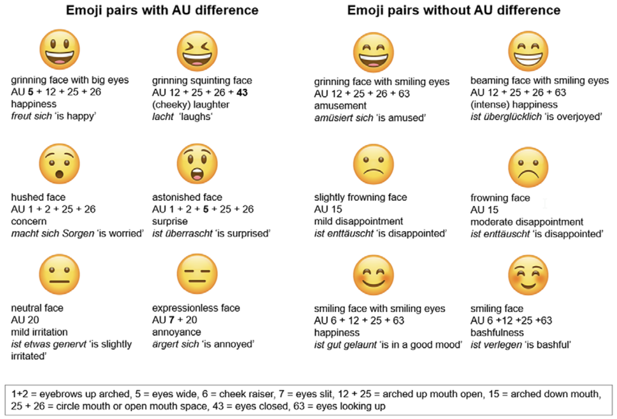
Fricke, Grosz & Scheffler (2024) compared “visually similar face emojis” using an emoji annotation system developed by Fugate & Franco (2021). This system is based on the Facial Action Coding System (FACS) for human faces (Ekman & Friesen 1978), which is an inventory of facial muscle movements that humans can make (such as raising the inner eyebrows or pulling down the corners of the lips). Fugate & Franco (2021) adapted FACS for emojis. The facial features of emojis, like eyebrows arched and eyes wide, are called Action Units (AUs). For convenience, AUs are assigned numbers, allowing them to be easily referenced. As you can see in Figure 16.1, each emoji consists of several AUs.
Fricke, Grosz & Scheffler (2024) defined two different types of emoji pairs: In the AU+ condition, the pairs of emojis are similar, but are assigned a different set of AUs. The emoji pairs in the AU- condition are also similar, but their AUs are identical. Fricke, Grosz & Scheffler (2024) deliberately selected emoji pairs that were as visually similar as possible to each other, while ensuring that the two emojis either differed by exactly one Action Unit (AU+) or had no differences in Action Units (AU-).
AUs capture the facial expressions of emojis and, as such, can assist linguists in accurately describing them. However, only expressions that can be consciously changed by humans receive labels. For example, the AU difference between 😃 and 😆 captures the fact that the former emoji has open eyes, while the latter has closed eyes. Since humans can choose whether to open or close their eyes, this is an AU+ pair. If the subtle difference between emojis is not manipulable by humans, as in 😄 and 😁, the emojis are described by identical AUs (AU-).
16.1.2 The experiment
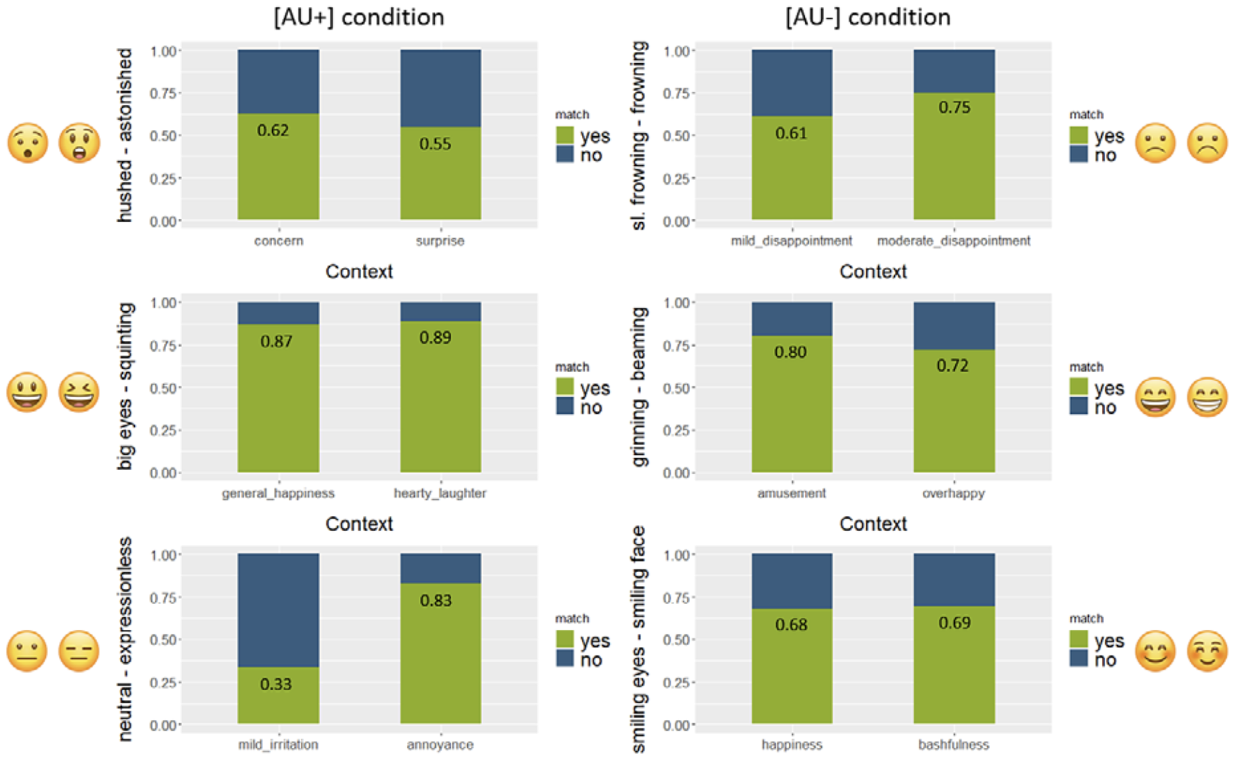
Three AU+ and three AU- emoji pairs were created (see Figure 16.1). Each pair was assigned two contexts, with each context corresponding to the prominent usage of one emoji, but not the other. For example, the contexts of the first pair are happiness and (cheeky) laughter. The contexts were assigned based on https://emojipedia.org and a previous norming study (Scheffler & Nenchev 2024).
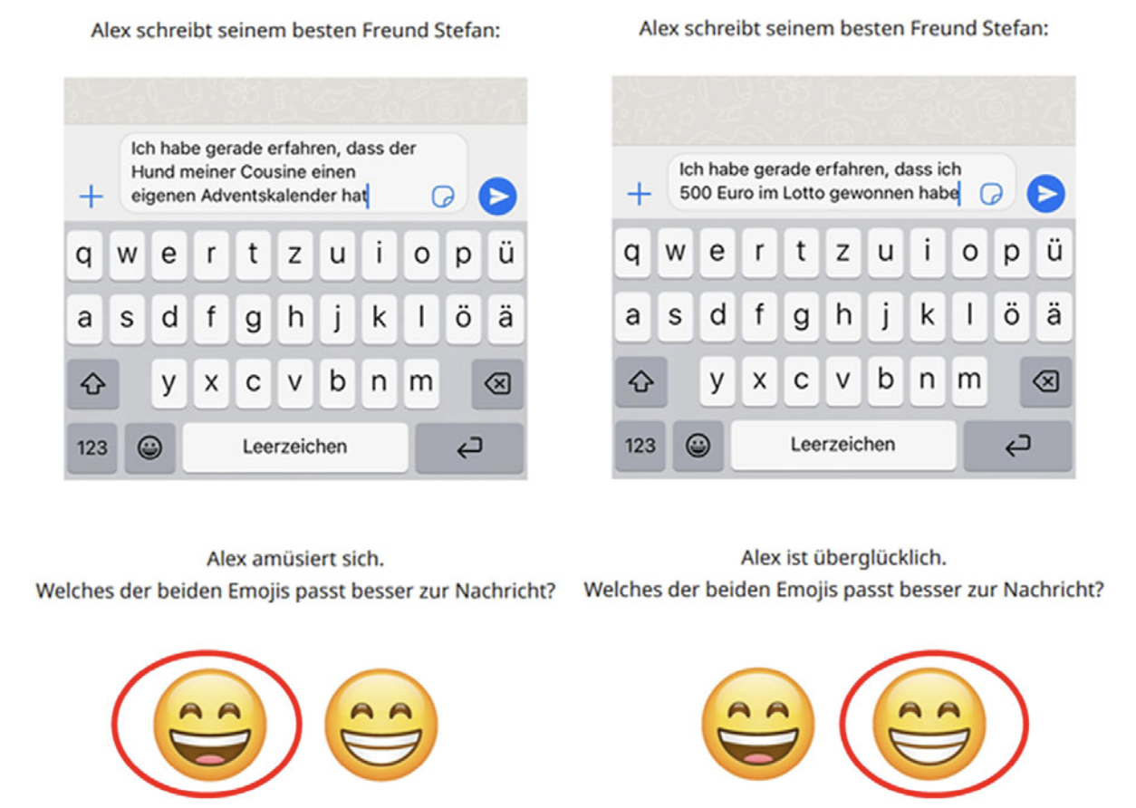
Four single-sentence narratives were created for each of the contexts (see Figure 16.2, translated from German below (translation Fricke, Grosz & Scheffler 2024: 6)).
Alex writes to his best friend Stefan:
I just learned that my cousin’s dog has his own advent calendar.
Alex is amused. Which of the emojis matches the message better? 😄😁
Alex writes to his best friend Stefan:
I just learned that I won 500 Euro in the lottery.
Alex is overjoyed. Which of the emojis matches the message better? 😄😁
These short narratives were divided up into into four experimental lists of 12 items. Each list also contained 12 filler items, so that each participant saw 24 items. The participants were then asked to help choose the emoji that best matched the context. Each participant saw each emoji pair twice. It was measured how often participants chose the context-matching emoji versus the non-matching emoji.
Fricke, Grosz & Scheffler (2024)’s central research question was: Do AU differences lead to differences in meaning between the two emojis of a pair? In line with the pictorial approach by Maier (2023) the authors hypothesized that visual differences between emojis which correspond to human facial features (AU+) would be more semantically relevant than those that do not (AU-). However, they noted that if no evidence were found to support this hypothesis, it would align with Grosz et al. (2023)’s lexicalist approach. This approach suggests that visual differences between emojis and their correspondence to human facial features are less significant, placing emphasis instead on the intrinsic meaning of the emoji and its constituent parts.
Read the abstract of the study:
Fricke, L., Grosz, P. G., & Scheffler, T. (2024). Semantic differences in visually similar face emojis. Language and Cognition, 1–15. https://doi.org/10.1017/langcog.2024.12
Q1. According to the abstract, what were the results of Fricke, Grosz & Scheffler (2024)’s experiment?
Q2. The actual results of the experiment were different from what Fricke, Grosz & Scheffler (2024) had expected. According to authors’ research hypothesis (visual differences between emojis which correspond to human facial features are more semantically relevant than those that do not), which of these experimental results were expected?
16.2 Exploring the relationship between gender and emoji understanding
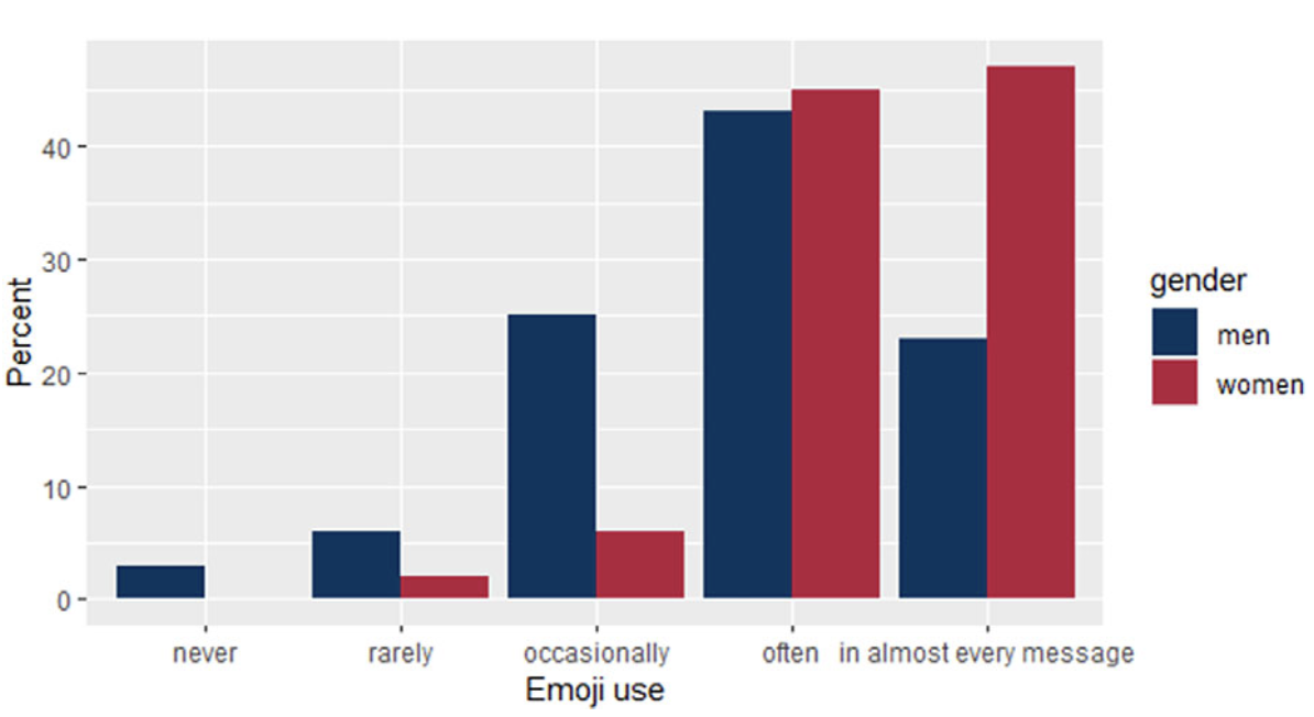
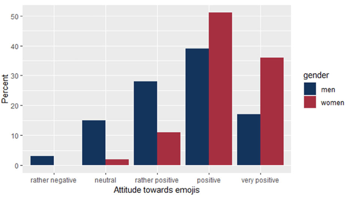
Fricke, Grosz & Scheffler (2024) asked participants about their gender, their attitude towards emojis, how often they use emojis on WhatsApp and how well they think they understand emojis. The authors visualised the distribution of men and women for emoji use and emoji attitude as barplots.
The plots in Figure 16.3 show that women use emojis more often and have a more positive attitude towards emojis than men. We want to find out whether women also reported a higher level of emoji understanding than men. Our analysis will involve three steps:
- Calculating the frequencies of the genders in the data
- Calculating the frequencies of the different levels of emoji understanding for each gender
- Visualising the frequencies in a barplot similar to the plots above.
16.2.1 ImpoRting the data
Fricke, Grosz & Scheffler (2024) have made their data and analysis code publicly available on the OSF repository (see Section 1.1). You can access these materials at https://osf.io/k2t9p/. There, the data is stored in the file raw_data.csv. To follow the steps of this chapter, you will need to download this file.
To run the code of this chapter, you will need the following packages. Make sure that they are installed and loaded before starting.
We import the authors’ raw data using the read.csv() and here() functions. You will need to adjust the file path to match the folder structure of your computer (see Section 6.5).
raw_data <- read.csv(file = here("data", "raw_data.csv"))As specified by Fricke, Grosz & Scheffler (2024: 8), we filter out participants who exceed the maximum age of 35 years for all following analyses. We do this by using the filter() function and store the result in a new data frame called df.
df <- raw_data |>
  filter(age <= 35)
16.2.2 Gender frequency analysis
Let’s first get a general overview: How many men, women, and non-binary people participated in the study?
The relevant variable in the data set is called gender. However, you will see that the names of the gender groups are in German. To figure out what the labels of the different gender groups are, we use the count() function:
df |>
  count(gender)
gender n
1 divers 72
2 männlich 2616
3 weiblich 1128Before we start analysing, we should translate the labels (levels) of the categories into English. Using a combination of mutate() and recode(), we translate männlich to men, weiblich to women, and divers to non-binary.1
df <- df |>
  mutate(gender = recode(gender,
                         "männlich" = "men",
                         "weiblich" = "women",
                         "divers" = "non-binary"))

df |>
  count(gender)
gender n
1 men 2616
2 non-binary 72
3 women 1128Now that gender variable have English labels, we want to determine how many male, female, and non-binary subjects participated. We have used the table() function, which determines the number of occurrences of the different genders in the data. But in this case counting the occurrences is not straightforward. The data frame contains 24 rows for each subject, as each participant saw 24 items (see Section 16.1.2). So, if we were to simply count the occurrences of men, women, and non-binary in the data with count(), we would end up with 24 times the values of the frequencies.
To determine the actual gender distribution, we need to count the occurrences according to the subjects’ unique IDs. To do this, we apply the distinct() function to keep only unique occurrences (to be precise, the first unique occurrence) of each submission_id. The argument .keep_all is set to TRUE, which means that all other variables in the data frame are kept and not deleted.
df |>
  distinct(submission_id, .keep_all = TRUE) |>
  count(gender)
gender n
1 men 109
2 non-binary 3
3 women 47The mode (see Section 8.1.3) of the gender variable in the dataset is men, as you can see from the output. The gender distribution is very uneven: 109 men, 47 women, and 3 non-binary people participated in the study. If we are not careful, this imbalance can lead to misleading data visualisations.
Q3. Which of these problems are likely to occur if we plot emoji understanding by gender in a barplot with unequal gender groups?
To solve this problem, we will use the same strategy as Fricke, Grosz & Scheffler (2024). We will use relative rather than absolute frequencies to make sure that the numbers for the different genders are comparable. This means that we will calculate the percentages of emoji understanding within each gender group, treating the total number of male, female, and non-binary participants separately as 100%, rather than counting all subjects together as 100%. In this way, we can see, for example, what percentage of men, women, and non-binary participants reported a very good emoji understanding and compare the numbers across groups.
16.2.3 How well do the different genders understand emojis?
Next, we calculate the relative frequencies of the different levels of emoji understanding for each gender.
The variable we are interested in is called emoji_understanding. Just like with gender, we first have to do some data wrangling. We use the count() function to get the labels:
df |>
  count(emoji_understanding)
emoji_understanding n
1 eher gut 912
2 gut 1344
3 mittelmäßig 48
4 sehr gut 1512We translate mittelmäßig to moderate, eher gut to rather good, gut to good, and sehr gut to very good:
df <- df |>
    mutate(emoji_understanding = recode(emoji_understanding,
                                        "mittelmäßig" = "moderate",
                                        "eher gut" = "rather good",
                                        "gut" = "good",
                                        "sehr gut" = "very good"))
df |>
  count(emoji_understanding)
emoji_understanding n
1 good 1344
2 moderate 48
3 rather good 912
4 very good 1512The levels are still in the wrong order. We need to rearrange them in an ascending order from moderate to very good. To do this, we define a vector c("moderate", "rather good", "good", "very good"). Using the factor() function, we encode this vector as a factor:
df <- df |>
    mutate(emoji_understanding = factor(emoji_understanding,
                                        levels = c("moderate",
                                                   "rather good",
                                                   "good",
                                                   "very good")))

df |>
  count(emoji_understanding)
emoji_understanding n
1 moderate 48
2 rather good 912
3 good 1344
4 very good 1512The levels now look good, so we can determine the frequencies for the different gender groups within emoji_understanding. We could do this by simply cross-tabulating gender with emoji understanding (see Section 8.1.3). But since we know that the sizes of the gender subsets are very unequal, we also want to calculate the relative frequencies to make the numbers comparable. There is an easy way to calculate relative frequencies using the proportions() function (see Section 8.2.1). However, we need to make two additional considerations:
- Our aim is to calculate proportions within groups and not across the whole data.
- We want to create a comprehensive visualisation that includes both groups of men and women in a single barplot.
To achieve both, we have to first group our data, using the powerful combination of group_by() and count(). We create a new data frame gender_understanding_count and again keep only each participant’s unique submission_id as above. We group the data by gender and count the frequencies for the different genders within the emoji_understanding factor:
df |>
  distinct(submission_id, .keep_all = TRUE) |>
  group_by(gender) |>
  count(gender, emoji_understanding)
# A tibble: 10 × 3
# Groups: gender [3]
gender emoji_understanding n
<chr> <fct> <int>
1 men moderate 1
2 men rather good 25
3 men good 41
4 men very good 42
5 non-binary rather good 1
6 non-binary good 2
7 women moderate 1
8 women rather good 12
9 women good 13
10 women very good 21In this table, n was calculated by the count() function and represents the number of occurrences for each combination of gender and emoji_understanding. Next, we use mutate() to add a column with the relative frequencies, which we calculate with the formula proportions(n) * 100 to obtain percentages.
gender_understanding_count <- df |>
  distinct(submission_id, .keep_all = TRUE) |>
  group_by(gender) |>
  count(gender, emoji_understanding) |>
  mutate(percentage = proportions(n) * 100)

gender_understanding_count
# A tibble: 10 × 4
# Groups: gender [3]
gender emoji_understanding n percentage
<chr> <fct> <int> <dbl>
1 men moderate 1 0.917
2 men rather good 25 22.9
3 men good 41 37.6
4 men very good 42 38.5
5 non-binary rather good 1 33.3
6 non-binary good 2 66.7
7 women moderate 1 2.13
8 women rather good 12 25.5
9 women good 13 27.7
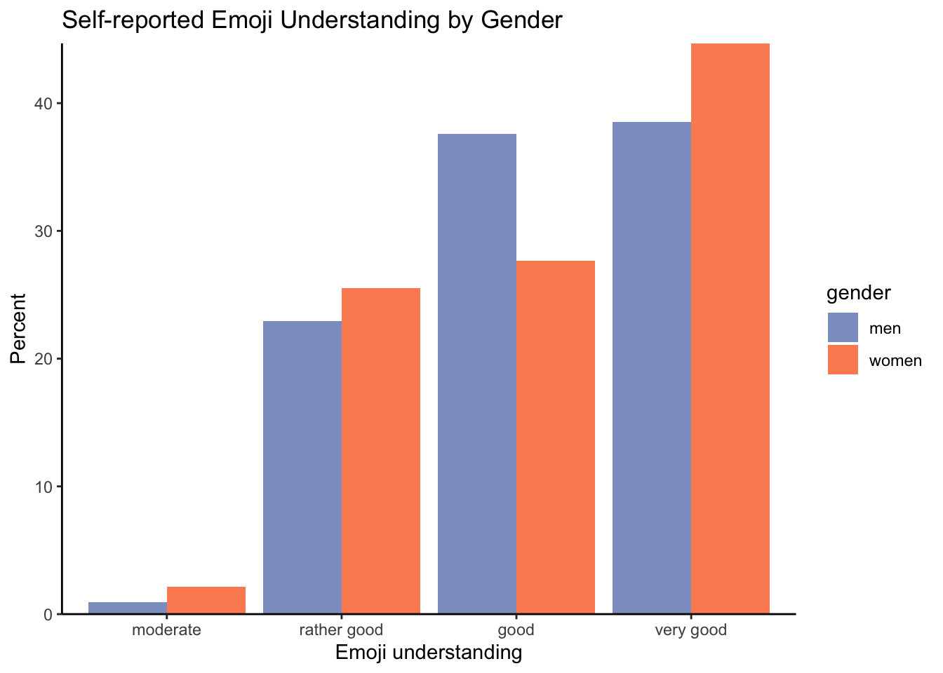
10 women very good 21 44.7 This tabular presentation of the data already shows us that non-binary participants reported either a rather good or good understanding of emojis. A higher percentage of women (44.7%) reported a very good emoji understanding compared to men (38.5%). But let’s create our barplot to see the distribution more clearly.
16.2.4 Data visualisation 📊
As mentioned above, we will visualise the relative rather than the absolute frequencies to make sure that the numbers for the different genders are comparable. In line with Fricke, Grosz & Scheffler (2024: 9), we also exclude the three non-binary participants. To this end, we use the filter() function combined with the != operator (see Section 5.5).
gender_understanding_count <- gender_understanding_count |>
  filter(gender != "non-binary")
We use ggplot() to create a barplot with the emoji_understanding categories on the x-axis and the relative frequencies that we calculated on the y-axis. The bars are coloured according to gender. We also add a title and axis labels. Finally, we remove the white space between the bottom of the bars with an additional scale_y_continuous(expand = c(0,0)) layer and change the colours to make our plot look nicer. The hexadecimal color values chosen here are from the colour-blind friendly palette “Set2” from the package {RColorBrewer}(Neuwirth 2022). Since we only need two colours, we chose to insert them manually to avoid having to install an additional package.
ggplot(gender_understanding_count,
       aes(x = emoji_understanding,
           y = percentage,
           fill = gender)) +
  geom_bar(stat = "identity", position = "dodge") +
  scale_y_continuous(expand = c(0,0)) +
  labs(title = "Self-reported Emoji Understanding by Gender",
       x = "Emoji understanding",
       y = "Percent") +
  scale_fill_manual(values = c("#8DA0CB", "#FC8D62")) +
  theme_classic()
As you can see from the barplot, the gender distribution for emoji understanding is much more even than for emoji use and emoji attitude (see Figure 16.3).
Q4. How do you interpret this plot?
When comparing our barplot to Figure 16.3, it is interesting to note that, whilst women reported more frequent use of emojis and a more positive attitude towards emojis, they did not report a higher understanding of emojis. It is possible that some women were more modest in rating their understanding of emojis than men, which could indicate a gender confidence gap. Reporting a good understanding likely requires more confidence compared to emoji use or attitude towards emoji.
16.3 Comparing matching rates between AU conditions
We will now turn to exploring the central research question of Fricke, Grosz & Scheffler (2024): Do AU differences lead to differences in meaning between the two emojis of a pair? As explained in Section 16.1.1, AUs are numbers which correspond to human-like facial features. In emoji pairs of the AU+ condition, the visual difference between the emojis is reflected in a number difference, e.g. grinning face with big eyes 😃 (AU: 5 + 12 + 25 + 26) and grinning squinting face 😆 (AU: 12 + 25 + 26 + 43). In the AU- condition, the visual difference does not correspond to an AU difference, e.g. grinning face with smiling eyes 😄 and beaming face with smiling eyes 😁 both have the same AUs (12 + 25 + 26 + 63).
Step by step, we will build an informative plot which will include all the information needed to answer this question. This plot will display how many times each emoji was chosen in its presumed corresponding context.
To achieve this, we need to create a variable that tells us when each participant responded with the matching emoji. In the following, we will create this variable based on the raw data from Fricke, Grosz & Scheffler (2024).
16.3.1 Preprocessing the data
First, we need a variable that includes the experimental conditions of each trial. The variable name tells us whether a trial consisted of an emoji pair with an AU difference (AU+) or not (AU-), or a filler. Trials with AU+ differences include “AU” in the trial name, those with no AU difference begin with “N”, and the fillers with “filler”.
df |>
  distinct(name)
name
1 filler-party
2 AU-23-L1
3 filler-heizung
4 AU-40-L1
5 filler-schlafen
6 filler-krank
7 N-04-L1
8 filler-friseur
9 N-37-L1
10 filler-zombieWe use a combination of mutate(), case_when() and str_detect() to construct a new variable (AU_difference) that captures the type of trial that we are dealing with. The command essentially says: look for the string “AU” in the column name, and in all cases where you find it (case_when()), insert the value “AU+” in a new column called AU_difference. We follow this procedure for the other trial conditions, too. If neither “AU”, “N” or “filler” is detected, nothing (NULL) is inserted in AU_difference.
df <- df |>
  mutate(AU_difference = case_when(str_detect(name, "AU") ~ "AU+",
                                   str_detect(name, "N") ~ "AU-",
                                   str_detect(name, "filler") ~ "filler",
                                   .default = NULL))
We use select() to compare the two columns and check that everything worked.
df |>
  slice(1:10) |>
  select(name, AU_difference)
name AU_difference
1 filler-party filler
2 AU-23-L1 AU+
3 filler-heizung filler
4 AU-40-L1 AU+
5 filler-schlafen filler
6 filler-krank filler
7 N-04-L1 AU-
8 filler-friseur filler
9 N-37-L1 AU-
10 filler-zombie fillerThis looks promising. Since we are only interested in the experimental items, we now filter out all filler trials.
df <- df |>
  filter(AU_difference != "filler")
We will now create another variable called context. The column of this variable will contain the context descriptions used by Fricke, Grosz & Scheffler (2024: 5) in Figure 16.1. Again, we combine mutate(), case_when() and str_detect(): In the question column, we look for context-characteristic strings, and add the context descriptions whenever we have a match. Again, we check the output with table().
df <- df |>
  mutate(context = case_when(str_detect(question, "freut sich") ~ "happiness",
                             str_detect(question, "lacht") ~ "(cheeky) laughter",

                             str_detect(question, "macht sich Sorgen") ~ "concern",
                             str_detect(question, "ist überrascht") ~ "surprise",
                             str_detect(question, "ist etwas genervt") ~ "mild irritation",
                             str_detect(question, "ärgert sich") ~ "annoyance",
                             str_detect(question, "amüsiert sich") ~ "amusement",
                             str_detect(question, "ist überglücklich") ~ "(intense) happiness",
                             str_detect(question, "ist enttäuscht") ~ "mild disappointment",
                             str_detect(question, "ist enttäuscht") ~ "moderate disappointment",
                             str_detect(question, "ist gut gelaunt") ~ "happiness2",
                             str_detect(question, "ist verlegen") ~ "bashfulness",
                                   .default = NULL))


table(df$context)
  (cheeky) laughter (intense) happiness           amusement           annoyance
                159                 159                 159                 159
        bashfulness             concern           happiness          happiness2
                159                 159                 159                 159
mild disappointment     mild irritation            surprise
318 159 159 Q5. Which problems become apparent when checking the content of our new context variable using the table() function?
The contexts mild disappointment and moderate disappointment have created some issues: In the question column, both are described as ist enttäuscht (‘is disappointed’). Except for their encoding in the name column, these contexts appear to be identical. At this point, we have no choice but to look for additional disambiguating information in Fricke, Grosz & Scheffler (2024)’s analysis script, which you can access at https://osf.io/k8dtp. The relevant information can be found in lines 522 and 523 (see Figure 16.4).
The emoji 🙁 (mild disappointment) is coded as N-36 and ☹️ (moderate disappointment) as N-37. We use this information to assign these two contexts to our context variable.
df <- df |>
  mutate(context = case_when(
                             str_detect(name, "N-36") ~ "mild disappointment",
                             str_detect(name, "N-37") ~ "moderate disappointment",
                                   .default = context))

table(df$context)
      (cheeky) laughter     (intense) happiness               amusement
                    159                     159                     159
              annoyance             bashfulness                 concern
                    159                     159                     159
              happiness              happiness2     mild disappointment
                    159                     159                     159
        mild irritation moderate disappointment                surprise
                    159                     159                     159
Finally, we add the critical variable that describes whether there is a match between the chosen emojis and the contexts: if the emoji and the context agree, the variable will have the value match. Otherwise, the value will be no match.
df <- df |>
  mutate(
  match = case_when(
    context == "happiness" & response == "grinning_face_with_big_eyes" ~ "match",
    context == "(cheeky) laughter" & response == "grinning_squinting_face" ~ "match",
    context == "concern" & response == "hushed_face" ~ "match",
    context == "surprise" & response == "astonished_face" ~ "match",
    context == "mild irritation" & response == "neutral_face" ~ "match",
    context == "annoyance" & response == "expressionless_face" ~ "match",
    context == "amusement" & response == "grinning_face_with_smiling_eyes" ~ "match",
    context == "(intense) happiness" & response == "beaming_face_with_smiling_eyes" ~ "match",
    context == "mild disappointment" & response == "slightly_frowning_face" ~ "match",
    context == "moderate disappointment" & response == "frowning_face" ~ "match",
    context == "happiness2" & response == "smiling_face_with_smiling_eyes" ~ "match",
    context == "bashfulness" & response == "smiling_face" ~ "match",
    .default = "no match"))
16.3.2 Building the plots
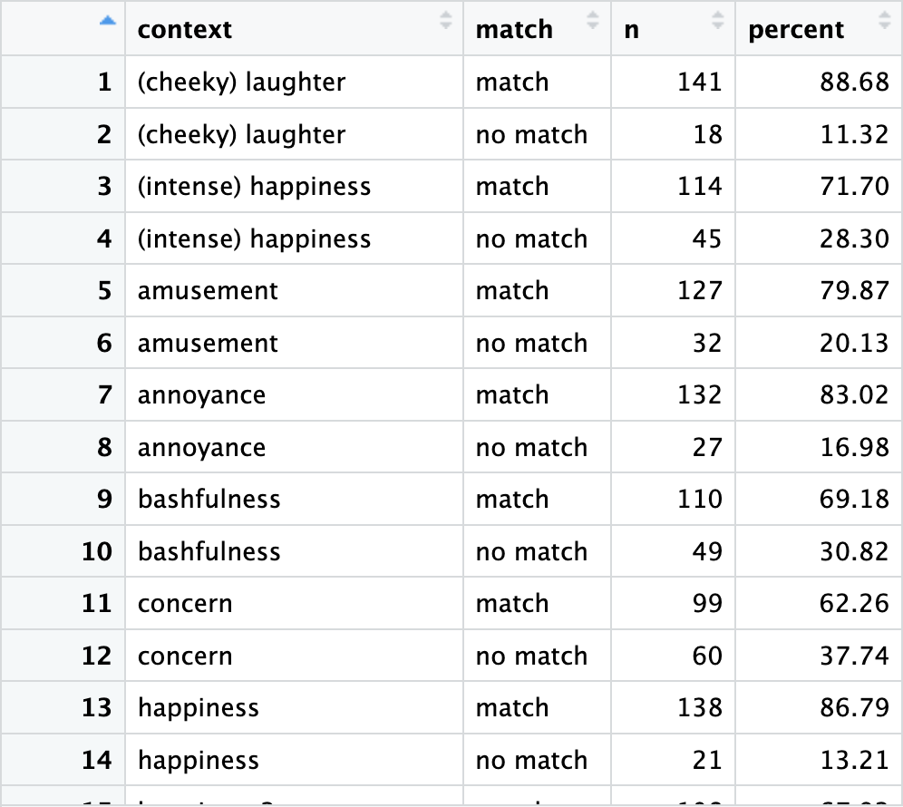
We will now build our plots to visualise the matching rates per emoji pair. In a new table called data_AU, we group the data by contexts. The command count(match) counts matches and non-matches for each context and stores them in a new column called n. We add the column percent to store the rounded percentage of matches and non-matches for each context-pair.
data_AU <- df |>
  group_by(context) |>
  count(match) |>
  mutate(percent = round(proportions(n)*100, 2))
Using the View() function, we take a look at our data.
View() function in RStudio
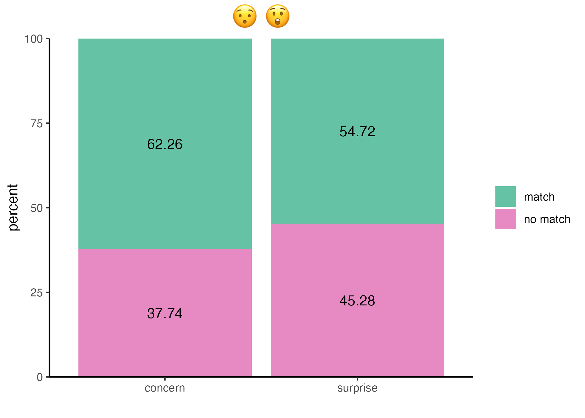
We plot the first emoji pair of the AU+ condition 😯 😲 with their respective contexts concern and surprise.
plot_concern_surprise <- data_AU |>
  filter(context == "concern" | context == "surprise") |>
  ggplot(aes(x = context, y = percent, fill = match)) +
  geom_col() +
  scale_x_discrete(limits = c("concern", "surprise")) +
  scale_y_continuous(expand = c(0,0)) +
  scale_fill_manual(values = c("#66C2A5", "#E78AC3")) +
  geom_text(aes(label = percent), position = position_stack(vjust = 0.5)) +
  labs(title = "😯 😲", x = "") +
  theme_classic() +
  theme(plot.title = element_text(hjust = 0.5, size = 20),
        legend.title=element_blank())
The code above creates a barplot and stores it in plot_concern_surprise. Here’s what each line of code does:
- Begin by assigning a clear name for the plot and call the data to be plotted.
- Filter the contexts, such that only rows of the contexts concern or (
|) surprise are plotted. - Create a
ggplotobject with the context values on the x-axis and percentages on the y-axis. Colours are filled corresponding to the match values. - Display the data as a barplot. By default,
geom_bar()counts how many times match and no match occur. However, as we have already calculated and stored the values in the columnpercent, we usegeom_col()to be able to use the data as is. - The context values, which are displayed on the x-axis, are discrete. With this command, we set and order the contexts.
- Use the “expand” argument of the
scale_y_continuous()function to remove the white space between the bars and the x-axis. - Adjust colours with values from “Set2” from the {RColorBrewer} package (see Section 16.2.4).
- Annotate the percentages of matching rates by adding them as text and placing them inside the plot, in the middle of the corresponding bars.
- Add the corresponding emojis at the top of the plot and remove the superfluous x-axis label “context”.
- Add a theme, in this case
theme_classic(). - Plots are left-aligned by default. Since we want the emojis to be displayed on top of their corresponding context bars, we move the title to the centre of the plot. To ensure that the emojis are easily interpretable, we also increase the font size to 20 points.
- Finally, we remove the title of the legend because the match and no match values are self-explanatory.
Let’s take a look at our plot. It’s looking great, but we don’t need just one plot, we need six: one for each emoji pair. We could write it all out for each emoji pair, but since the code is identical (except for the contexts and the emojis), it is much more efficient to define a function to do this.
plot_concern_surpriseFunctions are reusable code snippets that perform specific tasks. So far, we have only used built-in R functions (see Section 7.4) and functions from add-on packages such {dplyr} from the tidyverse (see Section 9.1), but we have not defined our own functions.
Defining our own functions can help us make our code more efficient and organised. As a rule of thumb, whenever writing new code seems redundant (i.e., when you find yourself copying and pasting entire sections of code), it is best to define a function for that task. This is will ensure that the task is always performed in the same way and, if you find that you need to amend the code to perform the task, you will only need to make the change once, within the function assigned to this task.
The basic structure of a function is function(argument). Looks familiar? Accordingly, we define a function the following way: function(parameters){function body}
Here are the steps:
- We define a function using the keyword
function. After this keyword, we write a list of parameters in brackets. Parameters act as placeholders for the function’s arguments. - We then write code in the function body and enclose it in curly brackets. The function body tells the function what it is meant to do when called upon.
- We assign our function a name using the assignment operator (
<-). This name will be used to call up the function. To avoid conflicts (see Section 9.2), we choose a name that is not already assigned to a built-in function.
In our case, the process of defining a plotting function is straightforward:
- We start with the keyword
function()and state that our function should takecontextsas its first argument andemojisas its second argument, as only these change with each plot. - We then simply paste the code that we just wrote for the above barplot inside the curly braces, replacing the specific contexts and emojis with the parameters of our function.
- We name our function
plot_AU_matchesto make clear what it does: it plots AU matches.
plot_AU_matches <- function(contexts, emojis) {
  data_AU |>
    filter(context %in% contexts) |>
    ggplot(aes(x = context, y = percent, fill = match)) +
    geom_col() +
    scale_x_discrete(limits = contexts) +
    scale_y_continuous(expand = c(0,0)) +
    scale_fill_manual(values = c("#66C2A5", "#E78AC3")) +
    geom_text(aes(label = percent), position = position_stack(vjust = 0.5)) +
    labs (x="", y = "percent", title = emojis) +
    theme_classic() +
    theme(plot.title = element_text(hjust = 0.5, size = 20),
          legend.title=element_blank())
}
We the apply this function to all contexts and emoji pairs by filling them in as the arguments.
plot_concern_surprise <- plot_AU_matches(c("concern", "surprise"), "😯 😲")
plot_happiness_cheeky <- plot_AU_matches(c("happiness", "(cheeky) laughter"), "😃 😆")
plot_mild_irr_annoyance <- plot_AU_matches(c("mild irritation", "annoyance"), "😐 😑")
plot_mild_disapp_mod_dissap <- plot_AU_matches(c("mild disappointment", "moderate disappointment"), "🙁️ ☹️")
plot_amusement_int_happiness <- plot_AU_matches(c("amusement", "(intense) happiness"), "😄 😁")
plot_happiness2_bashfulness <- plot_AU_matches(c("happiness2", "bashfulness"), "😊 ☺️")R and render plots with emojis 😰
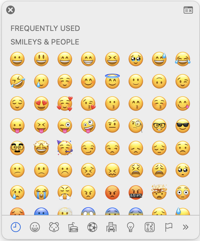
There are various ways to insert emojis in R. The easiest is to use the emoji keyboard (see Figure 16.6 (a)). To open it on MacOS, use the keyboard shortcut Crtl + ⌘ Cmd + Space or 🌐 fn + e and on Windows ⊞ Win + . (period). The emoji keyboard is also available in RStudio, if you go to the “Edit” drop-down menu and click on “Emojis & Symbols”. Alternatively, there are emoji libraries for R, for example {emo(ji)} (Wickham, François & D’Agostino McGowan 2024).
As we want to display emojis within plots, we need to pay even more attention to graphics. Emojis as part of plots created by ggplot cannot be displayed by default. Additional problems can occur when rendering a Quarto or RMarkdown document to HTML.
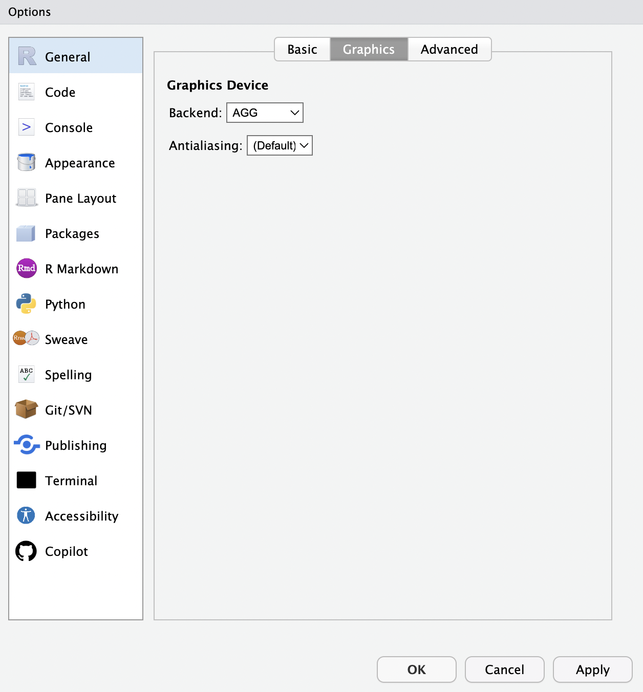
If displaying emojis as part of plots in RStudio does not work for you, you will need to use the high-quality graphics library “AGG” (“Anti-Grain Geometry”) or “Cairo” as your graphics backend in RStudio. To do this, head to the “Tools” drop-down menu and click on “Global Options”. Then, go to the “Graphics” tab and select the “AGG” or “Cairo” option (see Figure 16.6 (b)).
If you are using AGG as your graphics backend, you can use the {ragg} package (Pedersen & Shemanarev 2024) to correctly render your Quarto/RMarkdown document to HTML with all the emojis in the plots. This package provides graphic devices based on AGG and includes advanced text rendering, with support for emojis. To use {ragg} in combinination with the {knitr} engine, first install the package and then add the following setup command at the beginning of your document:
install.packages("ragg")

knitr::opts_chunk$set(dev = "ragg_png")
If AGG does not work for you, you can use Cairo. Cairo comes preinstalled with R so you don’t need to install it yourself. The set-up command for your Quarto/RMarkdown document is:
knitr::opts_chunk$set(dev.args = list(png = list(type = "cairo")))16.3.3 Assembling plots with {patchwork}
By applying our newly created function plot_AU_matches() to all emoji pairs and contexts, we have created one barplot for each emoji pair. We will now use the {patchwork} package (Pedersen 2024) to assemble the plots into one figure. As the name suggests, {patchwork} enables us to patch several plots together and arrange them as we wish. The basic operator to combine plots in {patchwork} is the + operator. Additionally, plots can be combined:
- Horizontally using
|and - Vertically using
/.
Brackets can be used to combine horizontal and vertical arrangements.
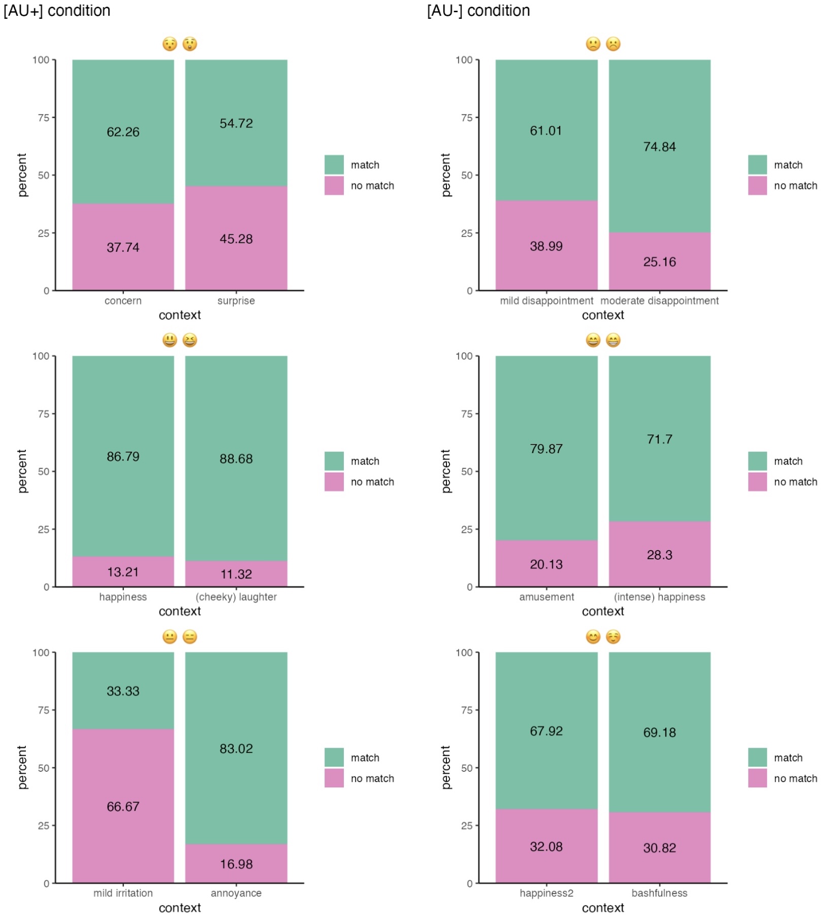
In line with the research question of Fricke, Grosz & Scheffler (2024), we want to compare the matching rates of emojis and contexts in the AU+ condition with the matching rates in the AU- condition. Our goal is therefore to create a plot that looks similar to Figure 16.8 created by Fricke, Grosz & Scheffler (2024).
First, let us plan the layout of our combined plot with some placeholder names. Our combined plot will have two columns and three rows: In both column1 and column2, three plots are stacked vertically on top of each other. These are the plots of the AU+ and the AU- condition, respectively. We then place these patchworks next to each other (horizontally) for comparison.
column1 <- p1 / p2 / p3

column2 <- p4 / p5 / p6

columns_combined <- column1 | column2
We follow the logic above to create our combined plot, choosing informative names for our subplots. To run this code, you will need to have the {patchwork} package installed and the library loaded.
#install.packages("patchwork")
#library(patchwork)

#AU+ condition:
AU_plus_patch <-
  plot_concern_surprise / plot_happiness_cheeky / plot_mild_irr_annoyance

#AU- condition:
AU_minus_patch <-
  plot_mild_disapp_mod_dissap / plot_amusement_int_happiness / plot_happiness2_bashfulness
To further specify the layout, we use the plot_layout() function from {patchwork}. By setting the “guide” argument to “collect”, legends that are identical within each patchwork are merged into one. We place the legends at the bottom of each subplot.
#AU+ condition:
AU_plus_patch <- AU_plus_patch +
  plot_layout(guides = "collect") & theme(legend.position = "bottom")

#AU- condition:
AU_minus_patch <- AU_minus_patch +
  plot_layout(guides = "collect") & theme(legend.position = "bottom")
Since AU_plus_patch and AU_minus_patch are to be combined in one plot, we need to add titles to keep them apart. Technically, it is possible (and recommended!) to use the plot_annotation() function of the {patchwork} package for this. However, annotations made with this function are only shown at the highest nesting level. As we will be building a double-nested plot, any annotations we do on the “blocks-of-three”-level will not be displayed. We can work around this by using the function wrap_elements(). This fixates the blocks in their current position and allows us to add titles using ggtitles() instead.
AU_plus_patch <- wrap_elements(plot = AU_plus_patch) +
  ggtitle("[AU+] condition")

AU_minus_patch <- wrap_elements(plot = AU_minus_patch) +
  ggtitle("[AU-] condition")
Finally, we put both columns together to get our final plot.
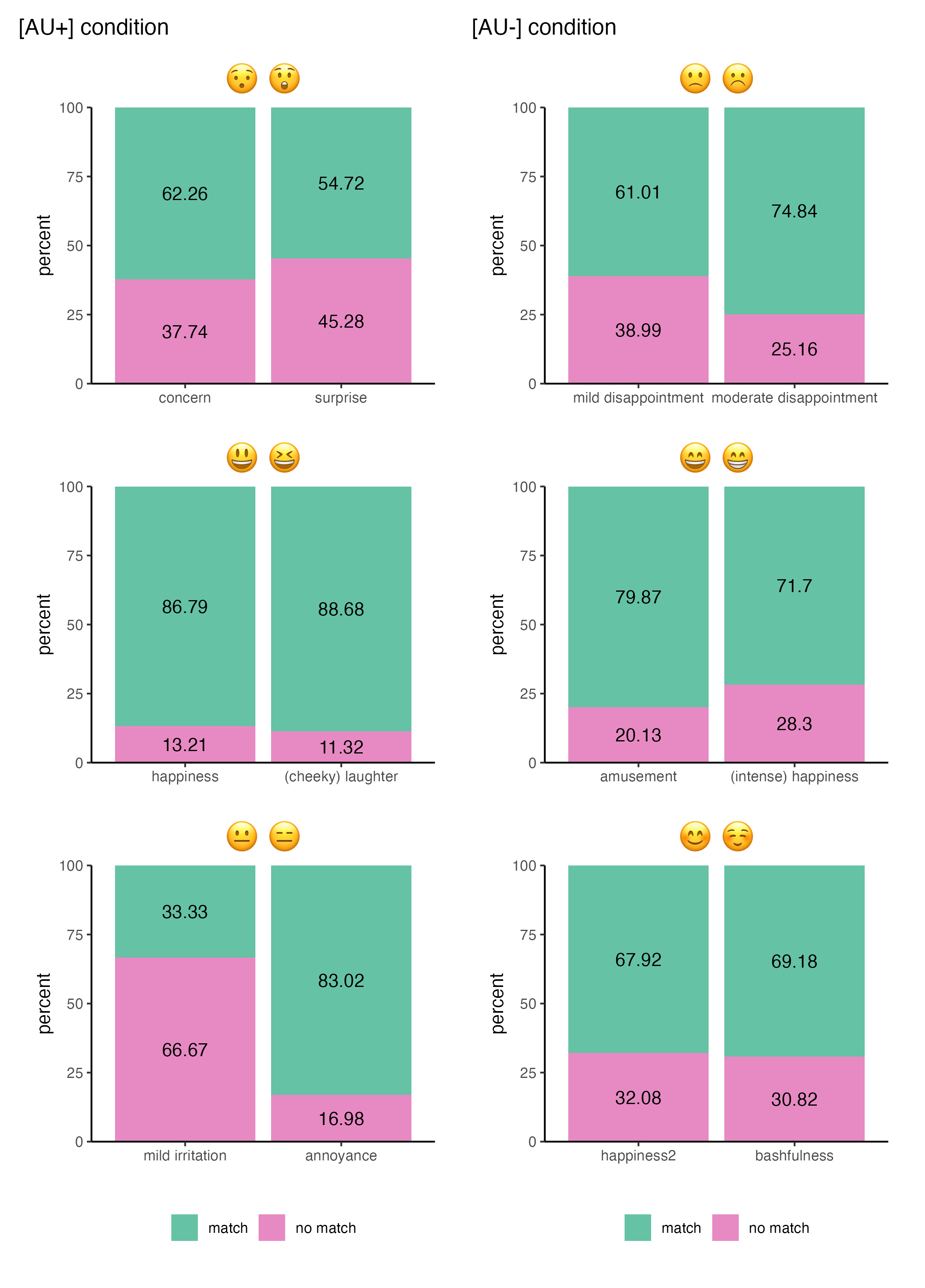
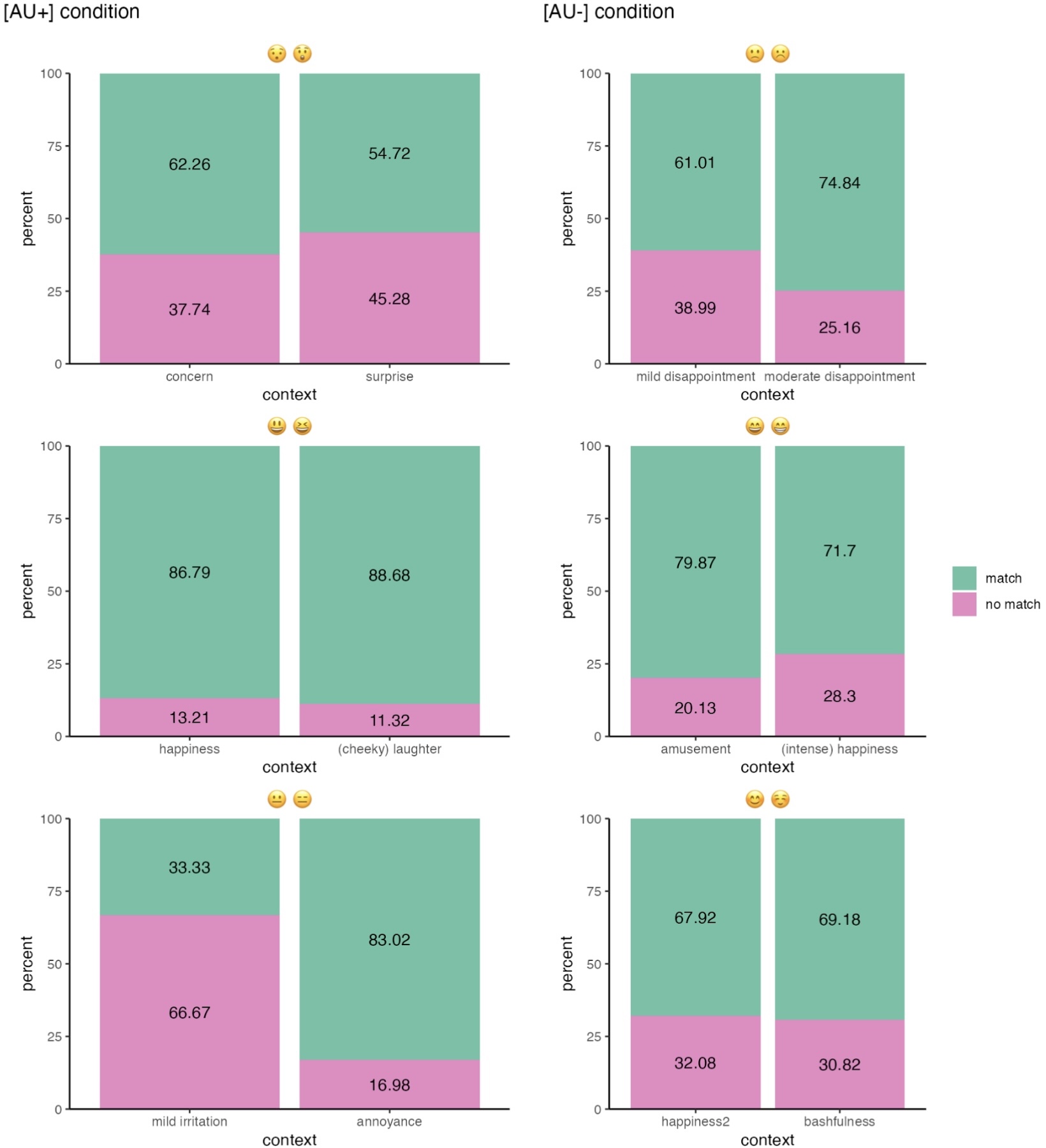
AU_plus_patch | AU_minus_patchFigure 16.9 contains information on the matching rates of all emoji pairs with their contexts. It contains the same information as Figure 16.8 from Fricke, Grosz & Scheffler (2024), but does not look exactly the same. Which look do you think is easiest to interpret?
You probably will have noticed that Figure 16.9 contains two identical legends. This is the trade-off we take by using the wrap_elements() function: We have fixated the patchworks in their state with their legends, which means that the legends cannot be merged later. There are a couple of other options that will produce different outcomes, however, none is going to be perfect: Since we do not want to delete the legend completely, one option would be to keep the legends of all six plots, as in Figure 16.10 (a). Another option would be to keep the legend of one block and delete the other. However, as you can see in Figure 16.10 (b), this makes the bars take up the space of the legend, and the bars in one block become wider than in the other one.
16.3.4 Interpreting the plot
By looking and interpreting Figure 16.9, we can now finally answer the research question: Do AU differences lead to differences in meaning between the two emojis of a pair?
Based on the descriptive statistics visualised in Figure 16.9, the answer is no, seemingly not. The AU difference does not seem to be critical when deciding which emoji to use in a specific context. The original study also concluded that the matching emoji was “generally preferred with matching rates above chance level” (Fricke, Grosz & Scheffler 2024: 11), both in the AU+ and in the AU- condition. Now, was all this work for nothing?
No, not at all! We can still draw some interesting inferences from the plot we created. For example, we see that minor visual differences between emojis do appear to affect the understanding and selection of emojis in different contexts: By slightly varying the contexts, participants were made to choose emojis with different facial features. Matching rates were quite similar within emoji pairs and, notably, also largely consistent across emoji pairs, regardless of their AU status. Hence, there is much more to explore in future linguistics studies on the semantics of emoji in text messages!
The following quiz questions are about the interpretation of Figure 16.9. The questions should help you make sense of the information displayed.
Q6. In which context pair did participants choose the matching emojis most often?
Q7. How can similar matching rates across emoji pairs (that is, across sub-plots) be interpreted?
Q8. Which interpretations of the lower left plot are correct? Select all that apply.
Q9. What are plausible reasons for the striking results presented in the lower left barplot? Select all that apply.
Overall, Figure 16.9 shows that there was indeed a preference for context-matching emojis. Importantly, participants preferred the context-matching emoji in both the AU+ condition and the AU- condition: The overall matching rate of AU- pairs is very similar to that of AU+ pairs. This means that whether or not emoji features coincided with human facial features did not (significantly) affect the participants’ decision for one emoji or the other.
The findings do not support Fricke, Grosz & Scheffler (2024)’s experimental hypothesis, which was based on the pictorial approach. Instead, as Fricke, Grosz & Scheffler (2024: 12) observe, the results suggest that visually similar emojis can convey different meanings, even when they correspond to the same human facial expressions.
This observation closely aligns with the predictions of the lexicalist approach proposed by Grosz et al. (2023). However, the authors caution that it does not provide definitive evidence for the lexicalist approach (Fricke, Grosz & Scheffler 2024: 12).
16.4 Conclusion
You have successfully completed 0 out of 9 quiz questions in this chapter.
You are now a pro in handling (stacked) barplots! You can build, customise, arrange, and interpret them. Barplots are powerful for visualising categorical data, offering a straightforward way to compare frequencies and make patterns apparent. However, they do have their limitations. For instance, they are not ideal for displaying continuous data. Building and assembling plots can be quite fiddly and it can take some trial-and-error to make the plot look like what you had imagined. But there is a solution for (almost) everything and hopefully, the beautiful plot you create in the process will be worth the effort.
This chapter’s analysis revealed gender-specific differences in emoji understanding, potentially indicating a gender confidence gap between men and women. On average, however, both genders reported at least a good understanding of emojis. The visualisations have been adjusted for the gender imbalance in the data, demonstrating the importance of accounting for differences in group sizes.
In this chapter, we have created an informative figure that answers the experiment’s research question by combining multiple plots. The question whether Action Unit (AU) differences are critical for emoji preference was answered in the negative. However, we have made several other discoveries along the way: As noted by Fricke, Grosz & Scheffler (2024), we have found that small changes of emojis’ facial features do affect choice patterns.
Emojis, it turns out, contain lots of information, and there is a science behind them 🤓. While experimentally measuring why we prefer certain emojis over other ones represents a real challenge, Fricke, Grosz & Scheffler (2024) provide valuable insights into this fascinating area of study. As the authors shared their data and code, we were able to successfully reproduce their results, as well as create new informative figures on the basis of their data.
This is a case study chapter of the web version of the textbook “Data Analysis for the Language Sciences: A very gentle introduction to statistics and data visualisation in R” by Elen Le Foll.
Please cite the current version of this chapter as:
Hörsting, Rose and Gina Reinhard. 2024. The semantics of emojis: ExploRing the results of an experimental study. In Elen Le Foll (Ed.), Data Analysis for the Language Sciences: A very gentle introduction to statistics and data visualisation in R. Open Educational Resource. https://elenlefoll.github.io/RstatsTextbook/ (accessed DATE).
References
Fricke, Lea, Patrick G Grosz, and Tatjana Scheffler. 2024. Semantic Differences in Visually Similar Face Emojis. Language and Cognition. Cambridge University Press 1–15. https://doi.org/10.1017/langcog.2024.12.
Fugate, Jennifer MB & Courtny L Franco. 2021. Implications for Emotion: Using Anatomically Based Facial Coding to Compare Emoji Faces Across Platforms. Frontiers in Psychology. Frontiers Media SA 12. 605928. https://doi.org/10.3389/fpsyg.2021.605928.
Grosz, Patrick Georg, Gabriel Greenberg, Christian De Leon & Elsi Kaiser. 2023. A semantics of face emoji in discourse. Linguistics and Philosophy. Springer 46(4). 905-957. https://doi.org/10.1007/s10988-022-09369-8
Maier, Emar. 2023. Emojis as Pictures. Ergo 10. https://doi.org/10.3998/ergo.4641.
Neuwirth, Erich. 2022. Package “RColorBrewer”. ColorBrewer Palettes 991. https://cran.r-project.org/web/packages/RColorBrewer/RColorBrewer.pdf.
Pedersen, Thomas Lin. 2024. Patchwork: The Composer of Plots. https://patchwork.data-imaginist.com.
Pedersen, Thomas Lin & Maxim Shemanarev. 2024. Ragg: Graphic Devices Based on AGG. https://ragg.r-lib.org.
Pfeifer, Valeria A, Emma L Armstrong & Vicky Tzuyin Lai. 2022. Do all facial emojis communicate emotion? The impact of facial emojis on perceived sender emotion and text processing. Computers in Human Behavior. Elsevier 126. 107016. https://doi.org/10.1016/j.chb.2021.107016.
Scheffler, Tatjana & Ivan Nenchev. 2024. Affective, semantic, frequency, and descriptive norms for 107 face emojis. Behavior Research Methods. Springer 1–22. https://doi.org/10.3758/s13428-024-02444-x.
Wickham, Hadley, Romain François & Lucy D’Agostino McGowan. 2024. Emo: Easily Insert ’emoji’. https://github.com/hadley/emo.
Packages used in this chapter
R version 4.4.1 (2024-06-14)
Platform: aarch64-apple-darwin20
Running under: macOS 15.1.1

Matrix products: default
BLAS:   /Library/Frameworks/R.framework/Versions/4.4-arm64/Resources/lib/libRblas.0.dylib
LAPACK: /Library/Frameworks/R.framework/Versions/4.4-arm64/Resources/lib/libRlapack.dylib;  LAPACK version 3.12.0

locale:
[1] en_US.UTF-8/en_US.UTF-8/en_US.UTF-8/C/en_US.UTF-8/en_US.UTF-8

time zone: Europe/Brussels
tzcode source: internal

attached base packages:
[1] stats     graphics  grDevices utils     datasets  methods   base

other attached packages:
 [1] grateful_0.2.10      knitcitations_1.0.12 ragg_1.3.3
 [4] patchwork_1.2.0      lubridate_1.9.3      forcats_1.0.0
 [7] stringr_1.5.1        dplyr_1.1.4          purrr_1.0.2
[10] readr_2.1.5          tidyr_1.3.1          tibble_3.2.1
[13] ggplot2_3.5.1        tidyverse_2.0.0      here_1.0.1
[16] checkdown_0.0.12     webexercises_1.1.0

loaded via a namespace (and not attached):
 [1] utf8_1.2.4        generics_0.1.3    xml2_1.3.6        stringi_1.8.4
 [5] hms_1.1.3         digest_0.6.36     magrittr_2.0.3    evaluate_0.24.0
 [9] grid_4.4.1        timechange_0.3.0  fastmap_1.2.0     plyr_1.8.9
[13] rprojroot_2.0.4   jsonlite_1.8.8    backports_1.5.0   httr_1.4.7
[17] fansi_1.0.6       scales_1.3.0      bibtex_0.5.1      textshaping_0.4.0
[21] cli_3.6.3         rlang_1.1.4       munsell_0.5.1     withr_3.0.1
[25] yaml_2.3.8        tools_4.4.1       tzdb_0.4.0        colorspace_2.1-0
[29] vctrs_0.6.5       R6_2.5.1          lifecycle_1.0.4   RefManageR_1.4.0
[33] htmlwidgets_1.6.4 pkgconfig_2.0.3   pillar_1.9.0      gtable_0.3.5
[37] Rcpp_1.0.12       glue_1.7.0        systemfonts_1.1.0 xfun_0.45
[41] tidyselect_1.2.1  rstudioapi_0.16.0 knitr_1.47        htmltools_0.5.8.1
[45] rmarkdown_2.27    compiler_4.4.1    markdown_1.13
Package references
[1] D. Barr and L. DeBruine. webexercises: Create Interactive Web Exercises in R Markdown (Formerly webex). R package version 1.1.0. 2023. https://github.com/psyteachr/webexercises.
[2] C. Boettiger. knitcitations: Citations for Knitr Markdown Files. R package version 1.0.12. 2021. https://github.com/cboettig/knitcitations.
[3] G. Grolemund and H. Wickham. “Dates and Times Made Easy with lubridate”. In: Journal of Statistical Software 40.3 (2011), pp. 1-25. https://www.jstatsoft.org/v40/i03/.
[4] G. Moroz. checkdown: Check-Fields and Check-Boxes for rmarkdown. R package version 0.0.12. 2023. https://agricolamz.github.io/checkdown/.
[5] G. Moroz. Create check-fields and check-boxes with checkdown. 2020. https://CRAN.R-project.org/package=checkdown.
[6] K. Müller. here: A Simpler Way to Find Your Files. R package version 1.0.1. 2020. https://here.r-lib.org/.
[7] K. Müller and H. Wickham. tibble: Simple Data Frames. R package version 3.2.1. 2023. https://tibble.tidyverse.org/.
[8] T. L. Pedersen. patchwork: The Composer of Plots. R package version 1.2.0. 2024. https://patchwork.data-imaginist.com.
[9] T. L. Pedersen and M. Shemanarev. ragg: Graphic Devices Based on AGG. R package version 1.3.3. 2024. https://ragg.r-lib.org.
[10] R Core Team. R: A Language and Environment for Statistical Computing. R Foundation for Statistical Computing. Vienna, Austria, 2024. https://www.R-project.org/.
[11] V. Spinu, G. Grolemund, and H. Wickham. lubridate: Make Dealing with Dates a Little Easier. R package version 1.9.3. 2023. https://lubridate.tidyverse.org.
[12] H. Wickham. forcats: Tools for Working with Categorical Variables (Factors). R package version 1.0.0. 2023. https://forcats.tidyverse.org/.
[13] H. Wickham. ggplot2: Elegant Graphics for Data Analysis. Springer-Verlag New York, 2016. ISBN: 978-3-319-24277-4. https://ggplot2.tidyverse.org.
[14] H. Wickham. stringr: Simple, Consistent Wrappers for Common String Operations. R package version 1.5.1. 2023. https://stringr.tidyverse.org.
[15] H. Wickham. tidyverse: Easily Install and Load the Tidyverse. R package version 2.0.0. 2023. https://tidyverse.tidyverse.org.
[16] H. Wickham, M. Averick, J. Bryan, et al. “Welcome to the tidyverse”. In: Journal of Open Source Software 4.43 (2019), p. 1686. DOI: 10.21105/joss.01686.
[17] H. Wickham, W. Chang, L. Henry, et al. ggplot2: Create Elegant Data Visualisations Using the Grammar of Graphics. R package version 3.5.1. 2024. https://ggplot2.tidyverse.org.
[18] H. Wickham, R. François, L. Henry, et al. dplyr: A Grammar of Data Manipulation. R package version 1.1.4. 2023. https://dplyr.tidyverse.org.
[19] H. Wickham and L. Henry. purrr: Functional Programming Tools. R package version 1.0.2. 2023. https://purrr.tidyverse.org/.
[20] H. Wickham, J. Hester, and J. Bryan. readr: Read Rectangular Text Data. R package version 2.1.5. 2024. https://readr.tidyverse.org.
[21] H. Wickham, D. Vaughan, and M. Girlich. tidyr: Tidy Messy Data. R package version 1.3.1. 2024. https://tidyr.tidyverse.org.
[22] Y. Xie. Dynamic Documents with R and knitr. 2nd. ISBN 978-1498716963. Boca Raton, Florida: Chapman and Hall/CRC, 2015. https://yihui.org/knitr/.
[23] Y. Xie. “knitr: A Comprehensive Tool for Reproducible Research in R”. In: Implementing Reproducible Computational Research. Ed. by V. Stodden, F. Leisch and R. D. Peng. ISBN 978-1466561595. Chapman and Hall/CRC, 2014.
[24] Y. Xie. knitr: A General-Purpose Package for Dynamic Report Generation in R. R package version 1.47. 2024. https://yihui.org/knitr/.
