library(here)

Dabrowska.data <- readRDS(file = here("data", "processed", "combined_L1_L2_data.rds"))11 InfeRential statistics
Chapter overview
This chapter provides an introduction to:
- sampling procedures
- null hypothesis significance testing (NHST)
- t-tests and correlation tests
- p-values, effect sizes, and confidence intervals
- the assumptions of statistical significance tests
Describing and visualising sample data, which we covered in Chapter 8 and Chapter 10, belongs to the realm of descriptive statistics. Attempting to generalise trends from our observed data to a larger population takes us to inferential statistics. Whereas descriptive statistics is about summarising and describing a specific dataset (our sample), with inferential statistics, we draw on our sample data to make educated guesses about a larger population that we have not directly collected data on. This helps us to determine whether the patterns that we observed thanks to descriptive statistics and data visualisations are likely to reflect broader trends that apply to the larger population or, instead, are more likely be attributable to random variation in the sample data.
WarningPrerequisites
As with previous chapters, all the examples, tasks, and quiz questions from this chapter are based on data from Dąbrowska (2019). Our starting point for this chapter is the wrangled combined dataset that we created and saved in Chapter 9. Follow the instructions in Section 9.7 to create this R object.
Alternatively, you can download Dabrowska2019.zip from the textbook’s GitHub repository. To launch the project correctly, first unzip the file and then double-click on the Dabrowska2019.Rproj file.
To begin, load the combined_L1_L2_data.rds file that we created in Chapter 9. This file contains the full data of all the L1 and L2 participants of Dąbrowska (2019). The categorical variables are stored as factors and obvious data entry inconsistencies and typos have been corrected (see Chapter 9).
Before you get started, check that you have correctly imported the data by examining the output of View(Dabrowska.data) and str(Dabrowska.data). In addition, run the following lines of code to load the {tidyverse} and create “clean” versions of both the L1 and L2 datasets as separate R objects.
library(tidyverse)

L1.data <- Dabrowska.data |>
  filter(Group == "L1")

L2.data <- Dabrowska.data |>
  filter(Group == "L2")
Once you are satisfied that your data are sound, read on to learn about frequentist statistical inference and significance testing!
11.1 From the sample to the population
In Chapter 8, we described the data collected by Ewa Dąbrowska using descriptive statistics thanks to measures of central tendencies (e.g. means) and measures of variability around the central tendency (e.g. standard deviations). In Chapter 10, we described the data visually using different kinds of statistical plots. These descriptive analyses enabled us to spot some interesting patterns (and there are many more for you to explore!). For instance, we noticed that:
On average, L2 participants scored lower than the L1 participants on the English grammar, vocabulary and collocation comprehension tests. This was to be expected, but our visualisations also revealed that many L2 participants scored at least as well and sometimes even better than average L1 participants.
On average, L2 participants obtained higher non-verbal IQ scores (as measured by the Blocks test) than L1 participants but, here, too, there was a lot of overlap between the two distributions.
For both L1 and L2 participants, there was a positive correlation between the number of years they were in formal education and their English grammar comprehension test scores: the longer they were in education, the better they performed on the test.
In this chapter, we ask whether these observations are likely to be generalisable beyond Dąbrowska (2019)’s sample of 90 English native speakers and 67 non-native English speakers to a broader population. In the context of this study, we will define the full population as all adult English native and non-native speakers living in the UK.
In the language and education sciences we rarely have access to the entire population for which we would ideally like to generalise our findings. For example, we can hardly go and test all English speakers living in the UK. Instead, we have to make due with a sample of L1 and L2 English speakers. Since our studies attempt to infer information about entire populations based only sample data, the quality of our samples is crucial: no sophisticated statistical procedure can produce any meaningful inferential statistics from a biased or otherwise flawed sample!
NoteSampling methods
There are different ways to draw samples from a population. The most common methods are summarised below.
| Method | What it means | Typical use in linguistics | Main advantages | Main limitations |
|---|---|---|---|---|
| Random sampling | Every member of the target population has an equal chance of being selected. | Rarely feasible for human populations, but can sometimes be approximated with census lists. Feasible in other contexts, e.g. when the target population are all words featured in a specific dictionary. | Minimises systematic bias. The results can be generalised using inferential statistics methods. | Requires a complete sampling frame (e.g. a list of all English speakers living in the UK) and a perfect world in which everyone sampled consents to participating in study. |
| Stratified sampling (a subtype of random sampling) |
The population is divided into strata (e.g. by dialectal region, age group, education level) and a random sample is drawn from each stratum. | Used when researchers need balanced data from distinct sub‑populations (e.g. speakers from several dialectal areas) and their intersections (e.g. a good balance of genders across each dialectal area). | Guarantees coverage of all relevant sub‑populations; reduces sampling error within the strata. | As above, requires reliable, exhaustive lists for each stratum and consent for all selected; more complex to organise. |
| Cluster sampling (a subtype of random sampling) |
Whole clusters (e.g. villages, schools, neighbourhoods) are randomly selected, then all members of the chosen clusters are studied. | Data collection in schools and fieldwork in remote regions where a full speaker list is impractical. | Efficient when clusters are naturally defined; reduces costs and organisational burden. | Increases sampling error if clusters are internally homogeneous; may miss variation outside selected clusters. |
| Representative (quota) sampling |
The sample is designed so as to match the population on key characteristics (e.g. age, gender, region, education). | Researchers recruit speakers until the sample mirrors known demographics from census data or other sources. | Often considered to provide a “good enough” picture when true random sampling is impossible. | Often difficult to implement because we rarely known enough about the characteristics of the full population; vulnerable to self-selection bias. |
| Convenience sampling | Participants are chosen because they are reachable and willing to participate. | Most common in experimental linguistics, online, and classroom‑based surveys. | Quicker, cheaper, and simpler. | Over‑represents certain groups; suffers from self-selection bias. |
In practice, it is quite common for combinations of these methods to be used. For example, when researchers run linguistics experiments via commercial platforms such as Qualtrics or Amazon MechanicalTurk, they can select their participants based on some demographic data to obtain a more representative sample. But the sample nonetheless remains a convenience sample as only people who sign up to earn money on these platforms can, by definition, be recruited. As you can imagine, these online crowdworkers are hardly representative of the full population, even if they are carefully sampled for age, gender, or socio-economic status (see e.g., Douglas, Ewell & Brauer 2023; Novielli, Kane & Ashbaugh 2025).
Provided we have a sufficiently representative sample, inferential statistics can help us to answer questions such as:
Across all adult English speakers in the UK …
do L1 speakers, on average, achieve higher scores than L2 speakers on English grammar and vocabulary comprehension tests?
do L2 English speakers, on average, perform better on the non‑verbal IQ (Blocks) test than L1 speakers?
is there a positive linear relationship between the number of years speakers were in formal education and their performance in an English grammar comprehension test?
does the strength of this education‑grammar comprehension relationship differ across L1 and L2 speakers, or across different age cohorts?
Though by no means the only framework available to us, the most common approach to answering such questions is null hypothesis significance testing (NHST) within the philosophy of frequentist statistics. What’s philosophy got to with statistics, you may ask? It turns out that, contrary to popular belief, statistics is anything but an exact science. By definition, statistical inference involves making inferences about the unknown. Therefore, there are different ways to approach these questions.
A promising alternative framework that is gaining traction in many disciplines, including in the language sciences, is Bayesian statistics (see Next-step resources for recommended readings). In this textbook, however, we will focus on the basic principles of statistical inference within the frequentist framework — not because it is easier than Bayesian statistics, but rather because it remains the most widely used framework to date. Hence, even if you decide not to use frequentist statistics for your own research, you will certainly need to understand its principles to correctly interpret the results of published studies.
TipYour turn!
Q11.1 Which of the following statements best describes random sampling?
Q11.2 True or false: In a convenience sample, the researcher can ensure that the sample is representative of the entire population if they are careful to match the sample to census demographics (age, gender, region, etc.).
11.2 Null hypothesis significance testing (NHST)
Let’s begin by considering the following, intriguing research question:
- Across all adult English speakers in the UK, do L2 English speakers, on average, perform better on the non‑verbal IQ (Blocks) test than L1 speakers?
In the sample collected by Dąbrowska (2019), we observed that L2 speakers, on average, performed better than L1 speakers on the Blocks test. For the two groups, the mean Blocks test scores were:
Dabrowska.data |>
  group_by(Group) |>
  summarise(mean = mean(Blocks),
            SD = sd(Blocks))
# A tibble: 2 × 3
Group mean SD
<fct> <dbl> <dbl>
1 L1 13.8 5.56
2 L2 17.5 4.70However, we are also aware that there is a lot of variation around these average values. The standard deviations (SD) around these mean values inform us that there is more variability in the L1 group than in the L2 group. Figure 11.1 visualises this variability (see Section 8.3.2 on how to interpret boxplots). On this boxplot, diamonds represent the mean values.
Show R code to generate plot.
group_means <- Dabrowska.data |>
  group_by(Group) |>
  summarise(mean_blocks = mean(Blocks))

ggplot(data = Dabrowska.data,
       aes(x = Group,
           y = Blocks)) +
  geom_boxplot(width = 0.5) +
  stat_summary(                     # Function to add statistics to plot.
    fun = mean,                     # We want to plot mean values
    geom = "point",                 # as points,
    shape = 18,                     # in a diamond shape,
    size = 4,                       # a little larger than the default.
    colour = "purple") +
  geom_line(
    data = group_means,
    aes(x = as.numeric(Group),
        y = mean_blocks),
    colour = "purple",
    linewidth = 1,
    linetype = "dashed") +
  geom_text(data = group_means,
    aes(x = as.numeric(Group),
        y = mean_blocks,
        label = sprintf("%.2f", mean_blocks)), # We also display the means as numeric values to two decimal points
        vjust = -1.4,                          # placing the labels slightly above the actual values.
        colour = "purple") +
  labs(x = NULL,
    y = "Non-verbal IQ (Blocks) test") +
  theme_bw()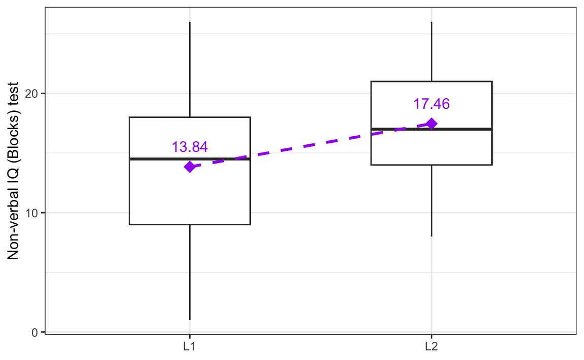
Following the NHST framework, we can quantify how likely it is that this observed difference in means — which is visualised as the dotted line in Figure 11.1 — could have occurred due to chance or naturally occurring variation, only. We start with the assumption that the patterns observed in our sample occurred by chance alone. This initial assumption is known as the null hypothesis (H0). It suggests that any patterns observed in our data arose by mere coincidence rather than due to any real effect or underlying relationship. To answer our research question, we formulate the following null hypothesis:
- H0: On average, adult English L1 and L2 speakers in the UK perform equally well on the non-verbal IQ (Blocks) test.
We can also formulate an alternative hypothesis. This is the hypothesis that we will adopt if we have enough evidence to reject the null hypothesis:
- H1: On average, adult English L2 speakers in the UK perform differently on the non-verbal IQ (Blocks) test than L1 speakers.
We can conduct a statistical significance test to test the likelihood of the null hypothesis given our observed data. Such tests allow us to estimate the probability of observing the patterns that we have noticed (or more extreme ones) in a sample size similar to ours, assuming that there is no real pattern or relationship in the full population. In other words, these tests help us evaluate whether our findings are likely to be a random occurrence within our sample or indicative of an actual trend that is likely to be found in the entire population.
It is important to understand that these tests do not prove anything. They rely on probabilities and, as such, can only inform us as to how likely our observations (or more extreme ones) are, assuming that the null hypothesis is true. Thus, statistical significance tests can only provide information about whether we can reasonably reject or fail to reject a null hypothesis based on our sample data.
WarningCommon misconception
Contrary to what is sometimes claimed, significance tests do not provide any information about the likelihood of either the null or the alternative hypothesis being true or false! In fact, what they provide can be conceptualised as the opposite: they help us to estimate the likelihood of our data given the null hypothesis. As Bodo Winter (2019: 171) writes:
Always remember that the null hypothesis is an assumption — its truth cannot be known.
By definition, inferential statistics is about attempting to infer unknown information about a population from a - often very small - sample of that population. As such, we cannot use statistics to prove or disprove a hypothesis that makes a claim about a population to which we do not have full access. Statistics may be a powerful science, but it’s not magic! 🧙♀️
11.3 Using t-tests to compare two group averages
The null hypothesis that we formulated above concerns the average non-verbal IQ test scores of two groups of individuals (English native speakers vs. non-native English speakers):
- H0: On average, adult English L1 and L2 speakers in the UK perform equally well on the non-verbal IQ (Blocks) test.
Provided that certain assumptions are met (see Section 11.7), we can test null hypotheses involving the comparison of two mean values using a t-test. The t-test takes three things into account:
- The magnitude of the difference between the two mean values (i.e. how big is the difference?)
- The amount of variability around the two means (i.e. how much variation is there around the means?)
- The sample size (i.e. how many data points — in this case, participants — are there?)
Our descriptive analysis showed that, on average, the L2 participants scored 3.62 points higher than the L1 participants in the sample data. But we know that mean values alone are not sufficient to describe data and, as we saw in Figure 11.1, there was a lot of variability around these mean values. Moreover, we know that our sample is relatively small: it only has 90 L1 speakers and 67 L2 speakers (though it’s worth noting that many experimental linguistics study have far fewer data points). The less data we have, the more likely we are to observe extreme values.1 This fact is also taken into account by statistical significance tests such as the t-test.
The R function t.test() takes a formula as its first argument and the data at its second argument. In R, formulas rely on the tilde symbol (~) to indicate that the variable to the left of the tilde is dependent on the variables to the right of the tilde. By specifying the formula as Blocks ~ Group, we are therefore testing whether the mean results of the Blocks test are dependent on whether the participants are L1 or L2 speakers of English (Group). In other words, we apply the t-test to test our null hypothesis, which can be reformulated as:
- H0: On average, the results of the non-verbal IQ (Blocks) test are not dependent on whether the test-takers are L1 or L2 speakers of English.
t.test(formula = Blocks ~ Group,
       data = Dabrowska.data)
    Welch Two Sample t-test

data:  Blocks by Group
t = -4.4084, df = 152.46, p-value = 1.956e-05
alternative hypothesis: true difference in means between group L1 and group L2 is not equal to 0
95 percent confidence interval:
 -5.239791 -1.996693
sample estimates:
mean in group L1 mean in group L2
        13.84444         17.46269
The output of the t.test() function is a bit overwhelming at first, so let’s focus on the most relevant aspects:
The first line of the output informs us that we ran a
Welch Two Sample t-test. We ran a two-sample test because we are comparing the means of two independent groups: L1 vs. L2 speakers. And it is a Welch t-test as opposed to a Student’s t-test because we are not assuming that the standard deviation of the two groups’ test scores in the full population is equal.2Next, the t-statistic is reported as
t = -4.4084. In this case, it is a negative value which means that the mean score of the first group (here L1) is lower than that of the second group (here L2). Note that, by default, the groups are ordered alphabetically. The larger the absolute value of the t-statistic, the greater the difference between the group means. At the same time, however, the more variability there is in the data, the lower the absolute value of the t-statistic.df = 152.46corresponds to the degrees of freedom. These are automatically calculated by thet.test()function based on the number of data points in our sample and the number of constraints in our test.The p-value is reported as
1.956e-05. This is scientific notation for: 1.956 multiplied by 10 to the power of minus 5 (1.956 * 10^-5), which equals0.00001956.3 This means that our test estimates that there is a very, very small probability (0.001956%) of observing a difference in mean scores on the Blocks test as large as we observed (3.62 points) or an even larger one under the null hypothesis, i.e. under the assumption that there is no real-world difference between L1 and L2 speakers’ performance on this test.The output also includes a 95% confidence interval (CI) of the difference between the means. It ranges from
-5.239791to-1.996693. In our sample, we observed a mean difference between L1 participants’ and L2 participants’ Blocks test scores of -3.62 points. If we were to repeat this experiment a 100 times with a 100 different samples of L1 and L2 speakers, we can be confident that, in 95 out of 100 repetitions, the confidence interval that we compute would include the true average difference across the entire population. In other words, the average difference between L1 and L2 speakers could be quite a bit larger than in Dabrowska’s sample or quite a bit lower, but is very unlikely to be zero (which would correspond to the null hypothesis of no difference). Given the same observed difference, the larger our sample, the smaller our confidence interval.At the very bottom of the output, we can read the sample estimates for the L1 and the L2 groups. These are the mean Blocks test scores that we had already calculated using descriptive statistics (see Section 11.2). They simply serve as a reminder that we are testing the statistical significance of the difference between these two means under the null hypothesis of no difference.
NoteHow to report t-tests
To summarise these results, we can write that we conducted a Welch two-sample t-test to compare the mean Blocks score of L1 and L2 English speakers. On average, L2 speakers performed significantly better (M = 17.46, SD = 4.70) than L1 speakers (M = 13.84, SD = 5.56), t(152.46) = -4.4084, p < 0.001.
WarningCommon misconception
Unfortunately, confidence intervals (CI) are a bit of a misnomer, which frequently leads to misunderstandings. Contrary to what so-called artificial “intelligence” tools (see Chapter 15) and even some statistics textbooks may claim, confidence intervals do not tell us that we can be 95% confident that the true difference across the entire population lies within the 95% confidence interval. Bodo Winter (2019: 165) clarifies this common misconception as follows:
[T]he actual population parameter of interest [i.e. in the case of a t-test, the difference in mean values] may or may not be inside the confidence interval – you will actually never know for sure. However, if you imagine an infinite series of experiments and compute a confidence interval each time, 95% of the time this interval would contain the true population parameter.
In other words, a 95% confidence interval does not tell us how confident we can be about any specific value, but rather that, in the long-run, if the study were to be repeated many times, 95% of the time, the 95% confidence interval would contain the true value.
TipYour turn!
Consider the following research question:
- Across all adult English speakers in the UK, do L1 speakers, on average, achieve higher scores than L2 speakers on the English receptive vocabulary test?
Q11.3 Which null hypothesis could you formulate for this research question?
Q11.4 Run a t-test on the Dąbrowska (2019) data to test the null hypothesis that you selected in Q11.3 above. What is the value of the t-statistic?
🐭 Click on the mouse for a hint.
Show sample code to answer Q11.4.
# It is always a good idea to visualise the data before running a statistical test:
Dabrowska.data |>
  ggplot(mapping = aes(y = Vocab,
                       x = Group)) +
  geom_boxplot(alpha = 0.7) +
  theme_bw()

# Running the t-test:
t.test(formula = Vocab ~ Group,
       data = Dabrowska.data)
Q11.5 What is the p-value associated with the t-test you ran above?
Q11.6 The p-value is very, very small. What does this mean? Select all that apply.
🐭 Click on the mouse for a hint.
11.4 Statistical significance and p-values
When used correctly, p‑values are a very useful metric that can help us to determine whether an observed statistic, such as a difference in means in a t-test, is likely to be due to chance variation in the sample rather than indicative of a true effect in the population. A common way to use p‑values is to define — prior to conducting the analysis — a significance level threshold (also called alpha or \(\alpha\)-level), which corresponds to the risk that we are willing to accept of mistakenly concluding that there is an effect when, in fact, there is none (this is called a false positive result).4 In the language and social sciences, the significance level is typically set to 0.05. This means that, if the null hypothesis is true, we accept a 5% risk of obtaining a p-value that suggests that we should reject the null hypothesis when, in fact, we shouldn’t. Within this statistical framework, the significance level should be chosen before looking at the data and be clearly mentioned in the methods section of every study that uses statistical significance testing (more on this in Section 13.7).
ImportantNo risk no fun?
Just because 0.05 is (currently) the most widely used \(\alpha\)-level, this doesn’t mean that you have to use 0.05, too. If you are not comfortable accepting a 5% risk of reporting a false positive (which, statistically speaking, will happen one in 20 times, after all), you can define a lower threshold, e.g. 0.01, corresponding to a 1% risk. However, depending on how large your observed effect is and how much data you have, you may find that, with a lower significance‑level, you fail to reject the null hypothesis even when there is a true effect in the population so it’s a difficult balance to strike. This is where statistical power comes into play (see e.g. Lakens 2022: Chapter 2).
In the NHST framework, when the calculated p‑value is smaller than our chosen significance level (\(\alpha\)), we reject the null hypothesis in favour of the alternative hypothesis and say that the result is statistically significant. When the p‑value is larger than our \(\alpha\)-level, we fail to reject the null hypothesis and say that the result is not statistically significant. However, the latter does not prove that the null hypothesis is true. It only tells us that the data that we have do not provide enough evidence against the null hypothesis. Note that, following this school of statistics, the actual p-value is irrelevant: it is either below or above the \(\alpha\)-level threshold. We do not compare p-values and it does not make sense to claim that one result is more or less statistically significant than the other.
Once p < \(\alpha\), a result is claimed to be ‘statistically significant’, which is just the same as saying that the data are sufficiently incompatible with the null hypothesis. If the researcher obtained a significant result for a t-test, the researcher may act as if there actually was a group difference in the population (Winter 2019: 168).
Contrary to what some researchers seem to believe, in and of themselves, p-values are not the holy grail! They can only meaningfully be interpreted together with other important contextual information such as the context in which the data were collected, the magnitude of the observed effect (the effect size), and the variability around the estimated effect, which data visualisation can help us to better grasp (see Figure 11.2).

The problem with p-values is that they are a composite metric that is dependent on three aspects:
- The size of the observed effect (the larger the effect, the smaller the p-value)
- The variability within the data (the less variability, the smaller the p-value)
- The sample size (the larger the sample size, the smaller the p-value)
Note that the size (or magnitude) of the observed effect is only one of three factors that influence the p-value! It is therefore incorrect to claim that an effect (e.g. a difference in means) is particularly large based on a particularly small p-value. It is equally incorrect to claim that a p-value that falls below the chosen significance level points to a (statistically) relevant result. To evaluate the relevance of a result, we need contextual information that goes far beyond the results of a single statistical test. It is very important to remember that, in statistics, “significance” and “significant” are terms that have nothing to do with either the relevance or importance of findings!
11.5 Effect sizes and confidence intervals
In Section 11.3, we saw that the larger the absolute value of the t-statistic, the greater the difference between the group means. At the same time, the more variability there is in the data, the lower the absolute value of the t-statistic. This makes the t-statistic a measure of effect size. However, it is an unstandardised measure, which means that t-statistic values cannot be compared across different studies.

By contrast, Cohen’s d is a standardised effect size measure. As such, it can be used to compare the magnitude of the difference in mean values across different variables, samples, and studies. Cohen’s d (the d stands for difference) can be calculated by dividing the difference between two means (the raw strength of an effect) by the standard deviation of both groups together (the overall variability of the data). But fear not: we don’t need to do the maths ourselves as the formula is implemented in several R packages. In the following, we will use cohens_d() from the {effectsize} package (Ben-Shachar, Lüdecke & Makowski 2020) which, like the t.test() function, also takes a formula as its first argument.
#install.packages("effectsize")
library(effectsize)
Recall the difference that we observed between L1 and L2 English speakers’ non-verbal IQ (Blocks) test results in Figure 11.1. With the cohens_d() function, we can now answer the question: How large is this L1 vs. L2 effect?
cohens_d(Blocks ~ Group,
         data = Dabrowska.data)
Cohen's d | 95% CI
--------------------------
-0.69 | [-1.02, -0.37]
- Estimated using pooled SD.The output shows that Cohen’s d is -0.69. As with the t-statistic, the minus sign tells us that the L1 group performed worse than the L2 participants. The absolute value, here 0.69, corresponds to the size of the effect. According to Cohen’s (1988) own rule of thumb, the absolute values can be interpreted as follows:
- Cohen’s d = 0.2 - 0.5 → Small effect size
- Cohen’s d = 0.5 - 0.8 → Medium effect size
- Cohen’s d > 0.8 → Large effect size
However, Cohen (1988: 25) himself cautioned that:
The terms “small,” “medium,” and “large” are relative, not only to each other, but to the area of behavioral science or even more particularly to the specific content and research method being employed in any given investigation […].
Hence, it is important that linguists and education researchers base their interpretation of standardised effect sizes on prior research relevant to their field of research (see, e.g. Plonsky & Oswald (2014) for L2 research).
The output of the cohens_d() function above also includes a 95% confidence interval (CI) around Cohen’s d. It turns out that there is a direct relationship between the confidence interval around an effect size and the statistical significance of a null hypothesis significance test: if an effect is statistically significant in a two-sided5 independent t-test with a significance (\(\alpha\)) level of 0.05, the 95% confidence interval (CI) for the mean difference between the two groups will not include zero. The t-test that we conducted on the results of the Blocks test across the L1 and L2 groups produced a p-value of 0.00001956 which is less than 0.05 and was therefore statistically significant at the \(\alpha\)-level of 0.05. But we didn’t really need to check the p-value because we can see that the effect is statistically significant at the \(\alpha\)-level of 0.05 by looking at the 95% CI around the standardised effect size: the lower bound is -1.02 and the upper bound -0.37. In other words, the CI does not straddle zero. This is important because a Cohen’s d of zero which would correspond to no effect.
Now, let’s consider a new research question and a new null hypothesis:
- H0: On average, the results of the non-verbal IQ (Blocks) test are not dependent on the gender of the test-takers.
Recall that, in this dataset, Gender is a binary variable. The descriptive statistics suggest that male participants perform slightly better than female participants on the non-verbal IQ test, but that there is quite a bit of variability in the data:
Dabrowska.data |>
  group_by(Gender) |>
  summarise(mean = mean(Blocks),
            SD = sd(Blocks))
# A tibble: 2 × 3
Gender mean SD
<fct> <dbl> <dbl>
1 F 15.2 5.30
2 M 15.7 5.81We now compute a standardised effect size for this gender gap: Cohen’s d.
cohens_d(Blocks ~ Gender,
       data = Dabrowska.data)
Cohen's d | 95% CI
-------------------------
-0.10 | [-0.42, 0.22]
- Estimated using pooled SD.Here, the cohens_d() function compares the scores of the female participants with those of the male participants because “female” comes first alphabetically. Hence, the negative Cohen’s d value means that, on average, males perform better than females. However, we note that the effect size (-0.10) is very small.
Now turning to the 95% confidence interval (CI) also output by the function, we can see that, while the lower confidence bound corresponds to a negative effect size, the upper bound is positive, which means that the confidence interval contains the possibility of an effect size of zero, corresponding to no effect at all. Hence, we must conclude that this difference in scores between female and male participants is not statistically significant at an \(\alpha\)-level of 0.05. We can confirm this by performing a t-test. It returns a p-value that is greater than 0.05:
t.test(formula = Blocks ~ Gender,
       data = Dabrowska.data)
    Welch Two Sample t-test

data:  Blocks by Gender
t = -0.59558, df = 124.58, p-value = 0.5525
alternative hypothesis: true difference in means between group F and group M is not equal to 0
95 percent confidence interval:
 -2.352092  1.263946
sample estimates:
mean in group F mean in group M
       15.17021        15.71429
NoteHow to report p-values, effect sizes, and confidence intervals
To summarise these results, we can write that, while male participants performed marginally better (M = 15.71, SD = 5.81) than female participants (M = 15.17, SD = 5.30), this difference is very small (Cohen’s d = -0.10; 95% CI [-042, 0.22]) and is not statistically significant, t(124.58) = 0.5956, p = 0.5525.
Note that, even though it is not always done in linguistics publications, it is good practice to report exact p-values as opposed to only writing p > 0.05 or NS for non-significant. For a start, exact values allow the reader to interpret the test results as they wish. Moreover, exact p-values are often needed for meta-analytic research. The APA7 guide recommends reporting exact p-values unless they are below 0.001, in which case we can report p <.001 instead.
By default, the cohens_d() function computes a 95% confidence interval but, if we had chosen a lower \(\alpha\)-level of, say, 0.01, we can change this default:
cohens_d(Blocks ~ Gender,
       data = Dabrowska.data,
       ci = 0.99)
Cohen's d | 99% CI
-------------------------
-0.10 | [-0.52, 0.32]
- Estimated using pooled SD.As you can see, this increases the size of the interval, making it harder to obtain a statistically significant result. This is because lowering the \(\alpha\)-level means that we are reducing our risk of reporting a false positive result, i.e. reporting a difference based on our data where no real difference exists.
TipYour turn!
Compute three Cohen’s d values to capture the magnitude of the difference between L1 and L2 speakers:
- English grammar (
Grammar) test scores - English receptive vocabulary (
Vocab) test scores, and - English collocation (
Colloc) test scores.
As these are three standardised effect sizes, we can compare them.
Q11.7 Comparing the three Cohen’s d that you computed, which statement(s) is/are true?
🐭 Click on the mouse for a hint.
Show sample code to answer Q11.7.
cohens_d(Grammar ~ Group,
       data = Dabrowska.data)

cohens_d(Vocab ~ Group,
       data = Dabrowska.data)

cohens_d(Colloc ~ Group,
       data = Dabrowska.data)
Q11.8 Now compute 99% confidence intervals (CI) around the same three Cohen’s d values. Which statement(s) is/are true?
🐭 Click on the mouse for a hint.
Show code to answer Q11.8.
cohens_d(Grammar ~ Group,
       data = Dabrowska.data,
       ci = 0.99)

cohens_d(Vocab ~ Group,
       data = Dabrowska.data,
       ci = 0.99)

cohens_d(Colloc ~ Group,
       data = Dabrowska.data,
       ci = 0.99)
Q11.9 Consider the code and its outputs below. We are now comparing the English grammar comprehension test scores of male and female native speakers of Romance languages only. Hence, we are now looking at a very small sample size comprising just five female and one male participants.
Dabrowska.Romance <- Dabrowska.data |>
  filter(NativeLgFamily == "Romance")

table(Dabrowska.Romance$Gender)
F M
5 1 cohens_d(Grammar ~ Gender,
data = Dabrowska.Romance)Cohen's d | 95% CI
-------------------------
-1.04 | [-3.24, 1.27]
- Estimated using pooled SD.Which statement(s) is/are true about the standardised effect size computed for the difference in the English comprehension grammar scores of male and female Romance L1 speakers in this very small dataset (n = 6)?
🦉 Hover over the owl for a first hint.
🐭 Click on the mouse for a second hint.
11.6 Correlation tests
So far, we have looked at just one type of statistical significance test, the t-test, which we used to compare two mean values. This kind of t-test is used to test the association between a numeric variable (e.g. test scores ranging from 0 to 100) and a binary categorical variable (e.g. L1 vs. L2 status). In this section, we return to correlations — a concept we first discussed in Section 10.2.5 when we generated and interpreted scatter plots. Recall that correlations capture the strength of the association between two numeric variables (e.g. age and grammar test scores).
At the beginning of the chapter, we summarised the following observations based on our descriptive analyses of the Dąbrowska (2019) data:
- For both L1 and L2 participants, there is a positive correlation between the number of years that they were in formal education and their English grammar comprehension test scores: the longer they were in formal education, the better they performed on the test (see Figure 11.3).
Show R code to generate plot.
Dabrowska.data |>
  ggplot(mapping = aes(x = EduTotal,
                       y = Grammar)) +
  facet_wrap(~ Group) +
  geom_point() +
  geom_smooth(method = "lm",
              se = FALSE) +
  labs(x = "Number of years in formal education",
       y = "English grammar test scores") +
  theme_bw()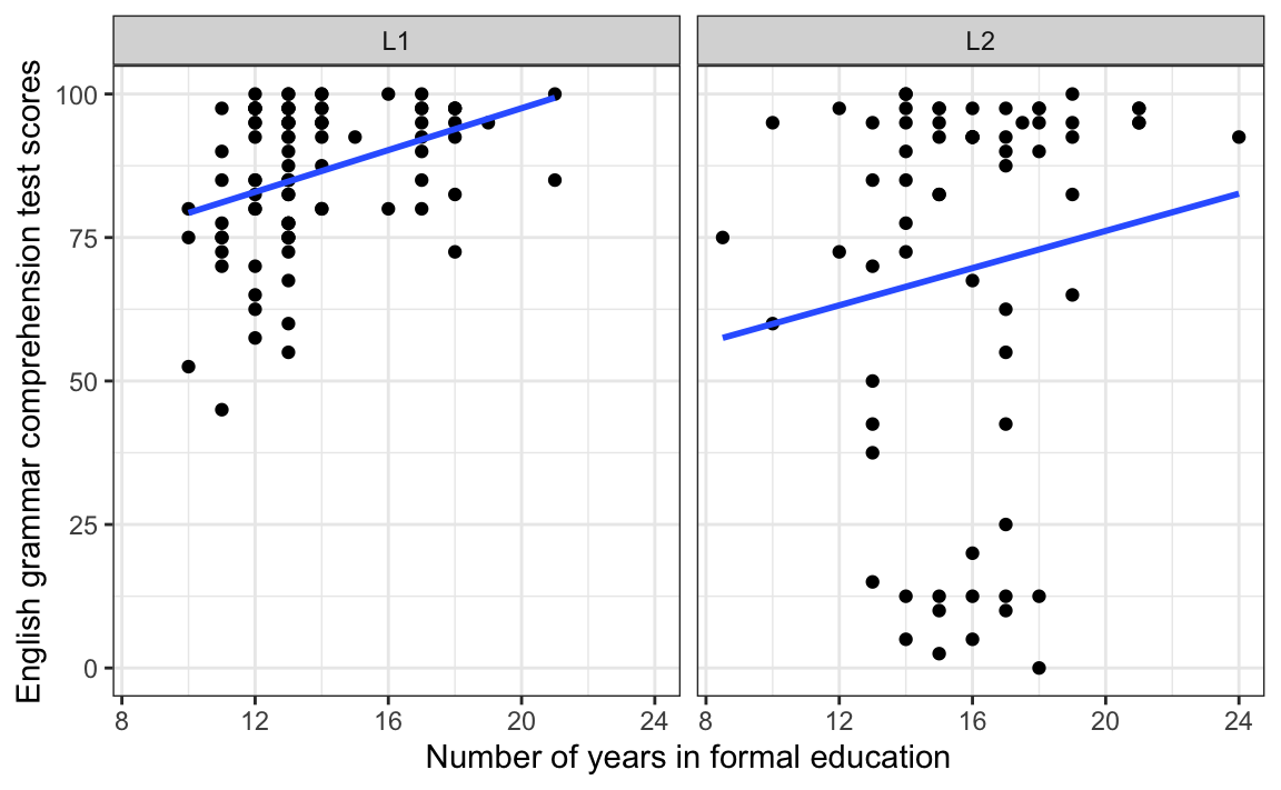
How strong are the correlations visualised by the blue regression lines on Figure 11.3? And how likely is it that we might observe such correlations or stronger ones by chance alone? The first question is about the size of the effect, whilst the second is about its statistical significance. In R, we can answer both questions using the cor.test() function. This function also takes a formula as its first argument: the two numeric variables whose correlation we want to estimate come after the tilde (~) and the two variables are combined using the plus (+) operator:
cor.test(formula = ~ EduTotal + Grammar,
         data = L1.data)
    Pearson's product-moment correlation

data:  EduTotal and Grammar
t = 3.5821, df = 88, p-value = 0.0005581
alternative hypothesis: true correlation is not equal to 0
95 percent confidence interval:
 0.1615747 0.5250334
sample estimates:
      cor
0.3567294
As with the t.test() (see Section 11.3), the output of the cor.test() function includes a t-statistic (t), a number of degrees of freedom (df; which here corresponds to the number of data points minus two), and a p-value. Immediately, we can see that the p-value is < 0.05, which means that, for the L1 population, we can reject the null hypothesis that there is no correlation between the total number of years that participants spent in education and their English grammar comprehension test scores. But how strong is the correlation? To find out, we turn to the sample estimate, Pearson’s r: cor = 0.36. Like Cohen’s d, Pearson’s r is also a standardised effect size. It can range between -1 and +1.
A correlation coefficient of 1 means that there is a perfect positive linear relationship between the two variables.
Example: The relationship between the number of questions that a person correctly answered in a test and the percentage of questions that they got right.
Show code to simulate data with a perfect positive correlation.
# First, let's imagine that 100 learners took a test with 10 questions. We simulate the number of questions that they answered correctly using the `sample()` function that generates random numbers, specifying that learners can get between zero and 10 questions right:
correct.answers <- sample(0:10, 100, replace = TRUE)

# Next, we convert the number of correctly answered questions into the percentage of questions that they answered correctly:
accuracy <- correct.answers / 10 * 100

# Finally, we compute the correlation coefficient between the number of  and the percentage of correctly answered questions:
cor(correct.answers, accuracy)

# The correlation coefficient (Pearson's r) equals 1 because the two variables are perfectly correlated with each other. If we know one variable, there is a simple mathematical formula that allows us to obtain the exact value of the other!
A correlation coefficient of 0 means that there is no linear relationship between the two variables. Note that, in the real world, we will never find correlations of exactly zero, but rather very close to zero.
Example: The relationship between two completely randomly generated strings of numbers (but see Note 12.1 on the risk of observing spurious correlations).
Show code to simulate random data with a near-zero correlation.
# First, we set a seed to ensure that the outcome of our randomly generated number series are always exactly the same:
set.seed(42)

# Next, we generate two series of a thousand randomly generated numbers ranging between 0 and 100:
x <- sample(0:100, 1000, replace = TRUE)
y <- sample(0:100, 1000, replace = TRUE)

# We can now compute the correlation coefficient. As expected, we find that it is very close to zero but not exactly zero:
cor(x, y)

# However, if we run a correlation test on our two randomly generated variables x and y, we find that a) the p-value is > 0.05 and b) our 95% confidence interval includes 0:
cor.test(x, y)

# We can therefore conclude there is not enough evidence in our sample data to reject the null hypothesis of no correlation in the full population. This makes sense because we are testing the correlation of two independently randomly generated strings of numbers that shouldn't have anything to do with each other!
A correlation coefficient of -1 means that there is a perfect negative linear relationship between the two variables.
Example: The relationship between the number of errors a person makes in a test and the percentage of questions that they got right.
Show code to simulate data with a perfectly negative correlation.
# First, let's imagine that 100 learners took a test with 20 questions. We simulate the number of errors that they each made:
errors <- sample(0:20, 100, replace = TRUE)

# Next, we convert the number of errors into the percentage of questions that they correctly answered:
accuracy <- ((20 - errors)/20) * 100

# Finally, we compute the correlation coefficient between the number of errors and the percentage of correctly answered questions:
cor(errors, accuracy)
Going back to the output of the cor.test() function above, we have a correlation coefficient of 0.36, which is positive, meaning that we are looking at a positive correlation. We already knew this from the direction of the regression line in the L1 panel of Figure 11.3. We now need to ask ourselves: is 0.36 a weak, medium or strong positive correlation? Again, it depends… For some research questions in the language sciences, 0.36 may be considered a medium-sized correlation but, for others, it may be considered a small correlation. As always, numbers alone do not suffice to draw conclusions: we need contextual information about our specific research domain (see also Plonsky & Oswald 2014).
The output of the cor.test() function also returned a 95% confidence interval around the correlation coefficient: [0.16, 0.53]. It does not straddle zero, which is why our p-value was < 0.05. That said, the lower bound of the interval corresponds to a very small correlation, suggesting that the correlation in the full L1 population may be considerably smaller than what we observed in our data or quite a bit larger as demonstrated by the upper bound. In other words, there is quite a bit of uncertainty around the strength of this correlation coefficient because there is a lot variability in the data and we do not have a particularly large sample size.
NoteHow to report correlation tests
To summarise these results, we can write that, in this dataset, there is a positive and statistically significant correlation between the number of years that L1 participants reported spending in formal education and their receptive English vocabulary test scores, r = 0.36, 95% CI [0.16, 0.53], df = 88, p < 0.001.
How about L2 speakers? From the L2 panel of Figure 11.3, we can see that the Grammar scores of L2 participants are, on average, much further away from the regression line than in the L1 panel, suggesting that it summarises the data far less well. Indeed, when we run the correlation test on the L2 data, we not only find that the correlation coefficient is much smaller (0.13), we also note that the 95% confidence interval around this coefficient [-0.11, 0.36] includes zero.
cor.test(formula = ~ EduTotal + Grammar,
         data = L2.data)
    Pearson's product-moment correlation

data:  EduTotal and Grammar
t = 1.0936, df = 65, p-value = 0.2782
alternative hypothesis: true correlation is not equal to 0
95 percent confidence interval:
 -0.1093254  0.3629045
sample estimates:
      cor
0.1344131
Along with a p-value that is larger than 0.05, this suggests that we do not have enough evidence to reject the null hypothesis of no correlation between years in formal education and English grammar comprehension in the L2 population.
NoteHow to report non-significant results
To summarise these results, we can write that, in this dataset, there is a small positive, but non-significant correlation between the number of years that L2 participants reported spending in formal education and their receptive English vocabulary test scores, r = 0.13, 95% CI [-0.11, 0.36], df = 65, p = 0.2782.
Non-significant results should always be reported. It is crucial to understand that, within the frequentist school of statistics, a non-significant result does not allow us to accept the null hypothesis. It merely means that we cannot reject the null hypothesis, which is not the same thing!
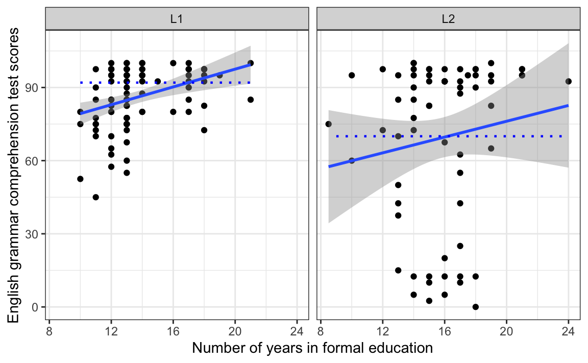
Confidence intervals around correlation coefficients can be difficult to interpret as numbers. The good news is that they can easily be visualised using the {ggplot2} library. In Section 10.2.5, we used the argument se = FALSE inside the geom_smooth() function. If, instead, we set this argument to TRUE, 95% confidence intervals will be displayed as grey bands around the regression lines. To change the \(\alpha\)-level, you will need to change the default value of the level argument.
Dabrowska.data |>
  ggplot(mapping = aes(x = EduTotal,
                       y = Grammar)) +
  facet_wrap(~ Group) +
  geom_point() +
  geom_smooth(method = "lm",
              se = TRUE,
              level = 0.95) +
  labs(x = "Number of years in formal education",
       y = "English grammar test scores") +
  theme_bw()
The interpretation of the grey bands is as follows: if it’s possible to draw a horizontal (flat) line that stays within the 95 % confidence band, it is very likely that there is no statistically significant correlation between the two numeric variables displayed on the plot at the \(\alpha\)-level of 0.05. As illustrated in Figure 11.5, it is impossible to draw such a line in the L1 panel, which is why we reject the null hypothesis of no correlation between years spent in formal education and grammar comprehension test scores for L1 speakers. We conclude that this correlation is significantly different from zero. By contrast, it is perfectly possible to draw such a horizontal line in the L2 panel, which is why we conclude that, at the \(\alpha\)-level of 0.05, we do not have enough evidence to reject the null hypothesis of no correlation in the L2 population. This correlation is not statistically significantly different from zero.
TipYour turn!
Generate a facetted scatter plot (similar to Figure 11.4) visualising the correlation between age (Age) and English receptive vocabulary test scores (Vocab) for L1 and L2 participants in two separate panels. Add a grey band visualising 95% confidence intervals around the regression lines.
Q11.10 Looking at your plot only, which of these statements can you confidently say is/are true?
🐭 Click on the mouse for a hint.
Show code to generate the plot needed to answer Q11.10.
Dabrowska.data |>
   ggplot(mapping = aes(x = Age,
                        y = Vocab)) +
     geom_point() +
     facet_wrap(~ Group) +
     geom_smooth(method = "lm",
                 se = TRUE) +
  theme_bw()
Now use the cor.test() function to find out how strong the correlations are in both the L1 and the L2 groups. Use the default \(\alpha\)-level of 0.05.
Q11.11 Based on the outputs of the cor.test() function, which of these statements can you confidently say is/are true? Note that, in this question and the next one, values are reported to two decimal places.
🐭 Click on the mouse for a hint.
Show code to answer Q11.11.
cor.test(formula = ~ Age + Vocab,
         data = L1.data)

cor.test(formula = ~ Age + Vocab,
         data = L2.data)
Consider the code and its output below. Figure 1 visualises the correlation between L2 speakers’ English receptive vocabulary test scores (Vocab) and their age of arrival in the UK (Arrival).
L2.data |>
   ggplot(mapping = aes(x = Arrival,
                        y = Vocab)) +
     geom_point() +
     geom_smooth(method = "lm",
                 se = TRUE) +
  theme_bw()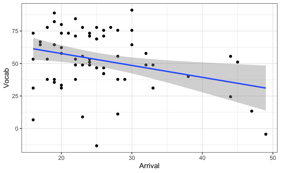
Q11.12 Run a correlation test on the correlation visualised in Figure 1. How strong is the correlation (to two decimal places)?
🐭 Click on the mouse for a hint.
Show code to answer Q11.12.
cor.test(formula = ~ Vocab + Arrival,
         data = L2.data)
Q11.13 How likely are we to observe such a strong correlation or an even stronger one in a sample of this size, if there is actually no correlation in the full L2 population?
🐭 Click on the mouse for a hint.
11.7 Assumptions of statistical tests
A crucial aspect that we have glossed over so far in this chapter is that the results of statistical tests, such as t-tests and correlation tests, can only be considered to be accurate if the test’s underlying assumptions are met.
11.7.1 Randomisation
The only assumption that we have mentioned so far is that of random sampling (Section 11.1). In practice, this assumption is rarely met in the language sciences. For instance, the L1 and L2 participants recruited for Dąbrowska (2019) were not randomly drawn from the entire adult UK population. Dąbrowska (2019: 5-6) reports that the participants “were recruited through personal contacts, church and social clubs, and advertisements in local newspapers”. As Nimon (2012: :1) write, transparency over the sampling procedure is crucial to interpreting the results of a study:
When the assumption of random sampling is not met, inferences to the population become difficult. In this case, researchers should describe the sample and population in sufficient detail to justify that the sample was at least representative of the intended population (Wilkinson and APA Task Force on Statistical Inference, 1999). If such a justification is not made, readers are left to their own interpretation as to the generalizability of the results.
11.7.2 Independence
Another crucial assumption of statistical significance tests such as t-tests and correlation tests is that the data points be independent of each other. We assumed that this is the case with the Dąbrowska (2019) datasets because they only have one observation per variable and participant (although interdependencies may occur at other levels, e.g. when several participants come from the same school, work place, or neighbourhood). If, however, we had multiple observations per participant because they completed the tests twice, say once in the morning and once in the evening, and then entered both the morning and the evening data into a single statistical test, our data would violate the assumption of independence and the results of the test would be inaccurate.
When our data violate the assumption of independence, we cannot use statistical significance tests like t-tests. Instead, we must turn to statistical methods that allow us to model these interdependencies in the data. In the language sciences, this is most commonly achieved using mixed-effects models (see Winter (2019) and Section 13.9).
11.7.3 Normality
For many inferential statistical tests commonly reported in the language sciences, it is also assumed that the population data are normally distributed (see Section 8.2.3). This assumption is often quite reasonable, because many real-world quantities are normally distributed. This is why we typically say that this assumption can be relaxed if we have more than 30 observations per group.
However, some things in the world are inherently non-normally distributed. For instance, word frequencies in a text or corpus are never normally distributed: a handful of words occur extremely frequently (in written English typically: the, of, a, in, to, etc.) and some words are fairly frequent, but the vast majority are very infrequent (see Section 12.4.2 and Figure 12.10). Reaction times is another example of a kind of variable that hardly ever meets the criterion of normality. One way to deal with highly skewed distributions like word frequencies and reaction times is to apply transformations to these variables before attempting to do any inferential statistics (see Winter 2019: Chapter 5).
Of course, we cannot check if the population data meet the assumption of normality because we do not have the entire population data (and if we did, we wouldn’t need inferential statistics!) so the best we can do is check if our sample data are normally distributed. This is best achieved visually. For instance, before conducting a t-test comparing the mean difference in Grammar scores in the L1 and L2 groups using the t.test() function, we should first visualise the two distributions of Grammar scores to check that they are approximately normally distributed. Figure 11.7 shows that this is clearly not the case!
Show code to generate plot.
Dabrowska.data |>
  ggplot(mapping = aes(x = Grammar,
                       fill = Group)) +
  geom_density(alpha = 0.7) +
  scale_fill_viridis_d() +
  labs(x = "English grammar test scores") +
  theme_minimal()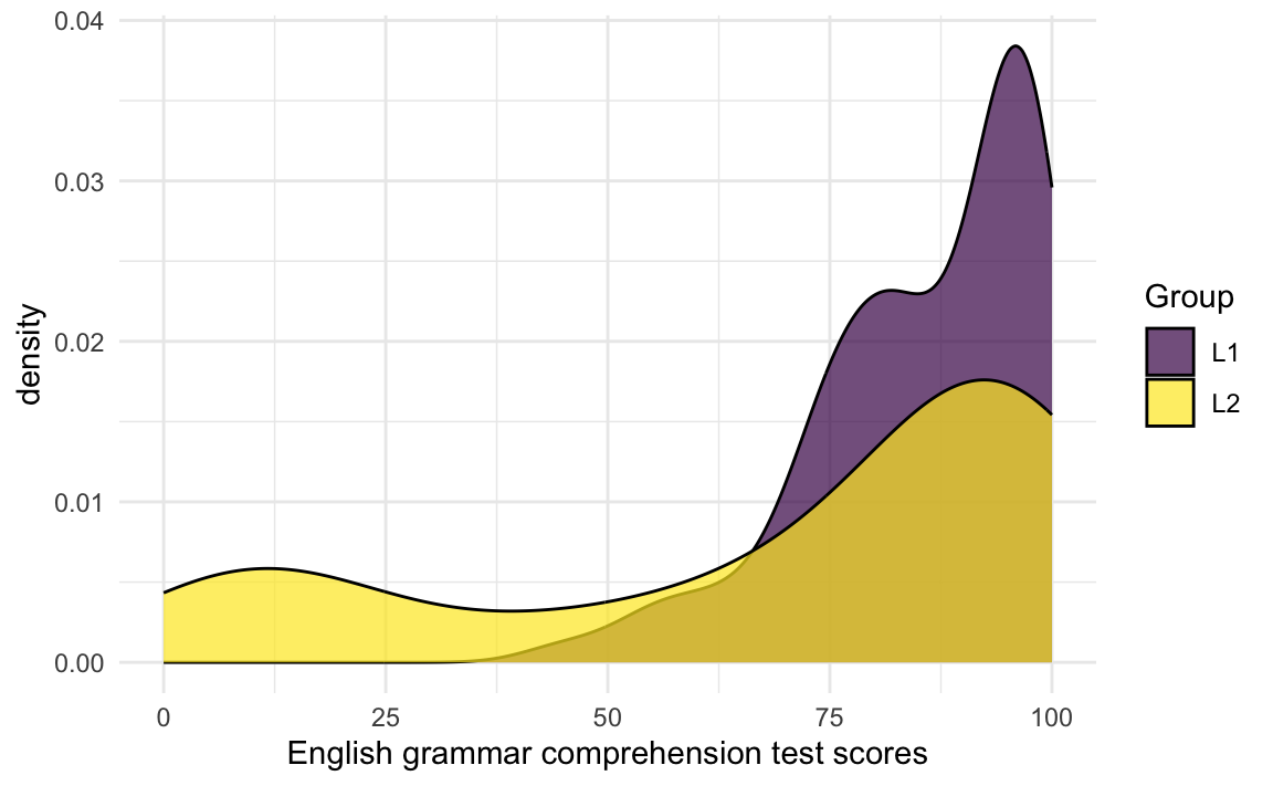
We are dealing here with non-normal or non-parametric data, hence we need a non-parametric version of the t-test: the Wilcoxon test (also known as the Mann-Whitney test or the U-test):
wilcox.test(Grammar ~ Group,
            data = Dabrowska.data)
    Wilcoxon rank sum test with continuity correction

data:  Grammar by Group
W = 3640, p-value = 0.026
alternative hypothesis: true location shift is not equal to 0
The output of the wilcox.test() function tells us that there is a 2.6% chance of obtaining our observed difference in median Grammar scores in an L1 and L2 sample of this size or an even larger difference under the assumption of the null hypothesis (of no difference across the two groups). Hence, if we had previously defined our \(\alpha\)-level as 0.05, we reject the null hypothesis. If, however, we had chosen a stricter \(\alpha\)-level of 0.01, we fail to reject the null hypothesis. This demonstrates why it is crucial that we set our significance level before conducting our analyses (for more on this, see Section 13.9).
The Wilcoxon test does not make any assumptions about the distributions of the population data, which means that it can be used for all kinds of continuous variables including word frequencies. However, there is a drawback: it is usually less powerful than the standard t-test. Using it, we may therefore be more likely to report a false negative (i.e. to fail to report a real difference in two means), which is why a transformation may be wiser (for more about transformations, see Winter 2019: Chapter 5). Also, non-parametric tests are not a free-for-all: other test assumptions, in particular concerning the representativeness of the sample and the independence of the data points, still hold!
11.7.4 Linearity and outliers
An important assumption of Pearson’s correlation coefficient (r) is that the continuous variables are linearly related. This is best perceived visually: if you plot the two variables against one another in a scatter plot (see Section 10.2.5), the points should fall roughly along a single, straight line. When the true association is non-linear (e.g. curvilinear), Pearson’s r will underestimate the strength of that association as it only captures the linear component of an association (Tabachnick & Fidell 2013: 117).
Moreover, correlation tests and many other statistical significance tests are sensitive to outliers. Hence, it is important to identify any outliers (again, this is best achieved by plotting our data as part of preliminary data exploration) and to carefully consider the extent to which they may influence the results of our analyses.
In 1973, the statistician Frank Anscombe put together a small dataset with four pairs of variables (x and y) with the aim of illustrating the necessity to visualise data rather than relying solely on statistics. The dataset is included in base R so we can access it by calling its name (anscombe) without downloading or installing anything:
anscombe x1 x2 x3 x4 y1 y2 y3 y4
1 10 10 10 8 8.04 9.14 7.46 6.58
2 8 8 8 8 6.95 8.14 6.77 5.76
3 13 13 13 8 7.58 8.74 12.74 7.71
4 9 9 9 8 8.81 8.77 7.11 8.84
5 11 11 11 8 8.33 9.26 7.81 8.47
6 14 14 14 8 9.96 8.10 8.84 7.04
7 6 6 6 8 7.24 6.13 6.08 5.25
8 4 4 4 19 4.26 3.10 5.39 12.50
9 12 12 12 8 10.84 9.13 8.15 5.56
10 7 7 7 8 4.82 7.26 6.42 7.91
11 5 5 5 8 5.68 4.74 5.73 6.89Known as the Anscombe Quartet, the dataset’s four pairs of variables have exactly the same correlation coefficient (when rounded to two decimal places):
cor(anscombe$x1, anscombe$y1) |>
  round(2)
[1] 0.82cor(anscombe$x2, anscombe$y2) |>
round(2)[1] 0.82cor(anscombe$x3, anscombe$y3) |>
round(2)[1] 0.82cor(anscombe$x4, anscombe$y4) |>
round(2)[1] 0.82However, when we visualise the data in scatter plots, it turns out that the relationships between each pair are completely different!
See {ggplot2} code to generate the figure.
Pair1 <- ggplot(data = anscombe,
       mapping = aes(x = x1, y = y1)) +
  geom_point(colour = "blue",
             size = 2,
             alpha = 0.8) +
  labs(title="Pair 1") +
  geom_smooth(method = "lm",
              colour = "blue",
              se = FALSE) +
  theme_bw()

Pair2 <- ggplot(data = anscombe,
       mapping = aes(x = x2, y = y2)) +
  geom_point(colour = "orange",
             size = 2,
             alpha = 0.8) +
  labs(title="Pair 2") +
  geom_smooth(method = "lm",
              colour = "orange",
              se = FALSE) +
  theme_bw()

Pair3 <- ggplot(data = anscombe,
       mapping = aes(x = x3, y = y3)) +
  geom_point(colour = "darkgreen",
             size = 2,
             alpha = 0.8) +
  labs(title="Pair 3") +
  geom_smooth(method = "lm",
              colour = "darkgreen",
              se = FALSE) +
  theme_bw()

Pair4 <- ggplot(data = anscombe,
       mapping = aes(x = x4, y = y4)) +
  geom_point(colour = "darkred",
             size = 2,
             alpha = 0.8) +
  labs(title="Pair 4") +
  geom_smooth(method = "lm",
              colour = "darkred",
              se = FALSE) +
  theme_bw()

#install.packages("patchwork")
library(patchwork)
Pair1 + Pair2 + Pair3 + Pair4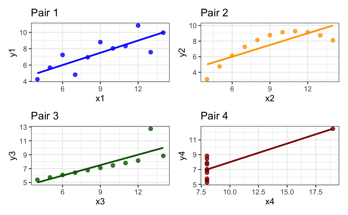
From Figure 11.8, we can immediately see that the relationship between the two variables in Pair 2 is non-linear, which makes the yellow linear regression line nonsensical. The data visualisations for Pairs 3 and 4 illustrate how a single outlier can either create an illusion of a correlation that does not exist (Pair 4) or overestimate one that does exist but is probably considerably weaker than Pearson’s r would lead us to believe (Pair 3).
The assumption of linearity is relevant to many widely used statistical methods – notably linear regression models (see Chapter 12 and Chapter 13) – which rely on Pearson’s correlation coefficients. In practice, researchers usually assume linearity unless there is a strong theoretical reason to expect a non‑linear pattern (Cohen et al. 2003). However, this assumption should always be checked. The most straightforward way to do this is to visualise the data.
NoteNon-parametric correlations
For an in-depth explanation of non-parametric correlation coefficients (Spearman’s \(\rho\) and Kendall’s \(\tau\)) and statistical significance tests with examples from the language sciences, see Levshina (2015: Chapter 6).
11.7.5 Homogeneity of variance (homoscedasticity)
When conducting a Student’s t-test, the variances of the samples should be constant, or homogeneous. This is referred to as the assumption of homogeneity of variance or homoscedasticity. It means that the variances of the groups entered in a test should be roughly the same.
Again, this assumption is best examined visually. For example, we can generate a boxplot to check that the variance of the two groups that we want to compare with a t-test are roughly equal (see Figure 11.9).
See code to generate boxplots.
ggplot(Dabrowska.data,
       aes(x = Group, y = Grammar, fill = Group)) +
  geom_boxplot(alpha = 0.7) +
  scale_fill_viridis_d(guide = NULL) +  # This removes the legend which, in this plot, is redundant.
  theme_bw()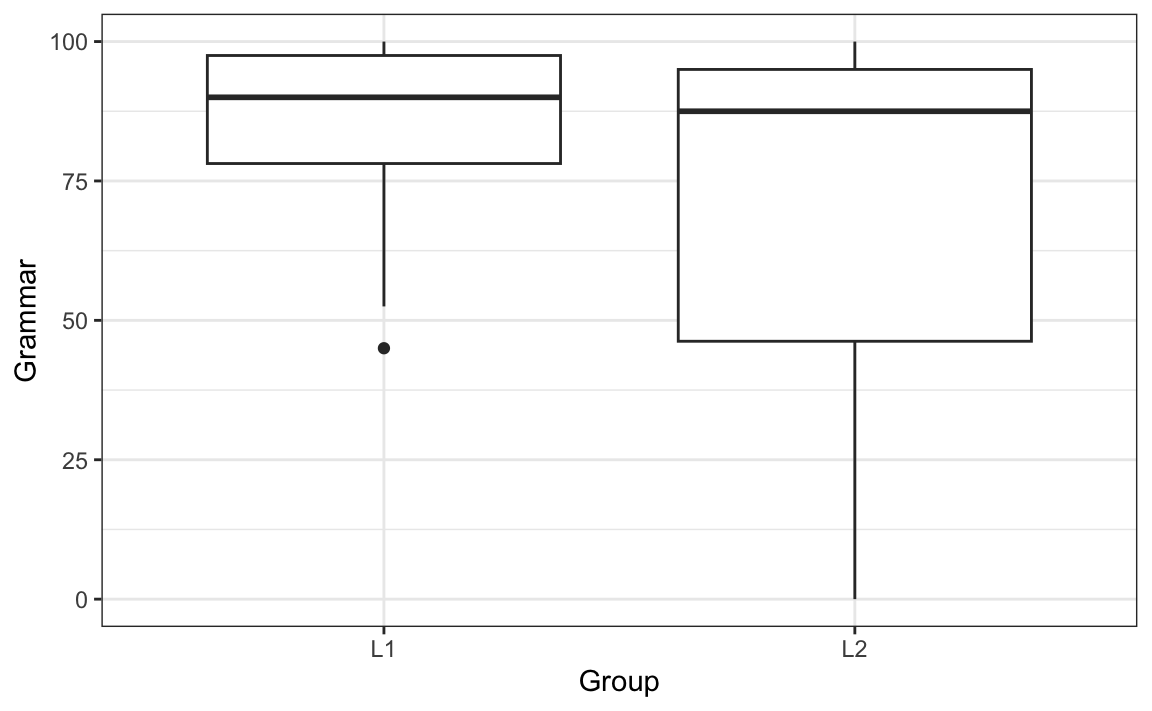
As we already saw in Section 11.7.3, the Grammar scores of the L2 group are not normally distributed; hence, we can also see from Figure 11.9 that there is much more variance in the L2 data than there is in the L1. In other words, we have heterogeneity of variance. One way to deal with this is to conduct a non-parametric test instead: Wilcox’s test does not assume homogeneity of variance. However, if your data meet the criterion of normality and only fails to meet that homogeneity of variance, you can still conduct a parametric t-test because the standard t.test() function in R includes Welch’s adjustment to correct for unequal variances (Field, Miles & Field 2012: 373).
The assumption of homoscedasticity is also relevant to correlation tests and linear regression (see Section 12.4.3). To check the assumption of homoscedasticity for a correlation, we can visualise the variance (or variability) around the correlation (the linear regression line) with the help of a scatter plot. In Figure 11.10, we can see that this variance is much larger for higher Vocab scores than for low to medium scores.
See code to generate scatterplot.
Dabrowska.data |>
  filter(Group == "L1") |>
  ggplot(aes(x = Vocab, y = EduTotal)) +
  geom_point() +
  geom_smooth(method = "lm",
              se = FALSE) +
  theme_bw()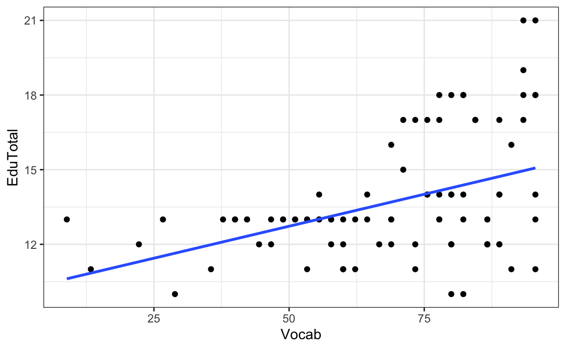
In other words, these data do not meet the assumption of homoscedasticity. In this case, we should therefore use a non-parametric correlation statistic, such as Spearman’s \(\rho\) (‘rho’) and Kendall’s \(\tau\) (‘tau’). As we are looking at a relatively small dataset here (only L1 speakers) and some speakers performed equally well on the Vocab test (in other words, we have some ties in the ranks), Kendall’s \(\tau\) is recommended:
cor.test(formula = ~ Vocab + EduTotal,
         data = L1.data,
         method = "kendall")
    Kendall's rank correlation tau

data:  Vocab and EduTotal
z = 3.5406, p-value = 0.0003992
alternative hypothesis: true tau is not equal to 0
sample estimates:
      tau
0.2761618
It returns a correlation coefficient \(\tau\) of 0.28 and a p-value of < 0.05, which allows us to reject the null hypothesis of no association between Vocab and EduTotal scores among L1 English speakers.
CautionOptional (fun) task 🦖
Inspired by the Anscombe Quartet, Matejka & Fitzmaurice (2017) created a set of 12 pairs of variables that have the same descriptive statistics as the data that produce a scatter plot representing a tyrannosaurus (see Figure 2).
1. Install and load the datasauRus package to access the R data object datasaurus_dozen:
install.packages("datasauRus")
library(datasauRus)

datasaurus_dozen
2. Run the following code to compare the descriptive statistics of all three datasets within the datasaurus_dozen. The fourth set, dino, is the one visualised in Figure 2. Note that there is a very small, negative correlation between all pairs of variables of -0.0656.
datasaurus_dozen |>
  group_by(dataset) |>
  summarise(
    mean_x = mean(x),
    mean_y = mean(y),
    std_dev_x = sd(x),
    std_dev_y = sd(y),
    corr_x_y = cor(x, y))
# A tibble: 13 × 6
dataset mean_x mean_y std_dev_x std_dev_y corr_x_y
<chr> <dbl> <dbl> <dbl> <dbl> <dbl>
1 away 54.3 47.8 16.8 26.9 -0.0641
2 bullseye 54.3 47.8 16.8 26.9 -0.0686
3 circle 54.3 47.8 16.8 26.9 -0.0683
4 dino 54.3 47.8 16.8 26.9 -0.0645
5 dots 54.3 47.8 16.8 26.9 -0.0603
6 h_lines 54.3 47.8 16.8 26.9 -0.0617
7 high_lines 54.3 47.8 16.8 26.9 -0.0685
8 slant_down 54.3 47.8 16.8 26.9 -0.0690
9 slant_up 54.3 47.8 16.8 26.9 -0.0686
10 star 54.3 47.8 16.8 26.9 -0.0630
11 v_lines 54.3 47.8 16.8 26.9 -0.0694
12 wide_lines 54.3 47.8 16.8 26.9 -0.0666
13 x_shape 54.3 47.8 16.8 26.9 -0.06563. Run the following code to visualise the relationships between the other 12 pairs of variables.
ggplot(datasaurus_dozen,
       aes(x = x, y = y, colour = dataset)) +
  geom_point() +
  facet_wrap(~ dataset, ncol = 3) +
  theme_bw() +
  theme(legend.position = "none") +
  labs(x = NULL,
       y = NULL)
4. Add a geom_ layer (see Section 10.1.2) to the following {ggplot2} code to add a blue linear regression line in all 13 panels.
View code to complete Part 4 of the task.
ggplot(datasaurus_dozen,
       aes(x = x, y = y, colour = dataset)) +
  geom_point() +
  facet_wrap(~ dataset, ncol = 3) +
  geom_smooth(method = "lm",
              se = FALSE,
              colour = "blue") +
  theme_bw() +
  theme(legend.position = "none") +
  labs(x = NULL,
       y = NULL)
Clearly, if we had only used correlation statistics to describe the relationships between these 13 pairs of variables, we would have missed some literally dinosaur-sized patterns! 🤯


11.8 Multiple testing problem
In Section 11.4 we saw that conducting a statistical test with an \(\alpha\)-level of 0.05 means that we accept a 5% risk of falsely rejecting the null hypothesis when it is actually true. Falsely rejecting the null hypothesis leads to a false positive result, also referred to as making a Type I error. It is crucial to understand that if we perform multiple tests on the same data, we dramatically increase the risk of reporting such false positive results. This is known as the multiple testing or multiple comparisons problem.
Imagine that we want to test 20 independent null hypotheses on a single dataset using \(\alpha\) = 0.05 as our significance threshold. Even if all null hypotheses are actually true, the probability of obtaining at least one significant result, i.e. at least one p-value < 0.05, by chance is equal to 64%, as shown below:
1 - (1 - 0.05)^20[1] 0.6415141Thus, having conducted 20 independent tests, we have a 64% chance of finding at least one statistically significant result purely by chance. As the number of tests increases, this probability approaches certainty (see also Baayen 2008: 106-107). With 100 tests, we reach 99%!
1 - (1 - 0.05)^100[1] 0.9940795To avoid reporting false positive results, it is therefore recommended that we correct our \(\alpha\)-level to account for the number of tests performed on the data. The simplest (but also most conservative) approach to do so is called the Bonferroni correction. It consists in adjusting our chosen \(\alpha\)-level by dividing it by the number of tests that we are conducting on the data. Hence, if we want to use 0.05 as our significance level and conduct 20 independent tests on the same data, we divide 0.05 by 20:
0.05 / 20[1] 0.0025This means that we would now only report the outcome of statistical test as “statistically significant” if its p-value is < 0.0025. Other correction methods for multiple testing exist. Holm’s method, for example, is a popular, slightly less conservative alternative to the Bonferroni correction. The base R function p.adjust() can be used to automatically adjust p-values using different methods including Bonferroni’s and Holm’s.
The following line of code creates an R object that contains seven p-values. These are the p-values that we obtained from the seven independent statistical tests that we performed on the Dąbrowska (2019) data as part of this chapter:
p_values <- c(1.956e-05, 0.000007032, 0.5525, 0.0005581, 0.2782, 0.026, 0.0003992)At our chosen \(\alpha\)-level of 0.05, five of these p-values were statistically significant, leading us to reject the corresponding five null hypotheses. However, if we apply Holm’s correction using the p.adjust() function, we find that we can only reject four of these null hypotheses.
p_values.adjusted <- p.adjust(p_values, method = "holm")

p_values.adjusted
[1] 1.1736e-04 4.9224e-05 5.5640e-01 2.2324e-03 5.5640e-01 7.8000e-02 1.9960e-03It can be difficult to interpret numbers displayed in scientific notation, so here they are in standard notation:
format(p_values.adjusted, scientific = FALSE)[1] "0.000117360" "0.000049224" "0.556400000" "0.002232400" "0.556400000"
[6] "0.078000000" "0.001996000"To find out which of these corrected p-values are below 0.05, we can use the < operator like this:
p_values.adjusted < 0.05[1] TRUE TRUE FALSE TRUE FALSE FALSE TRUEIt is crucial to understand that every p-value represents a probabilistic finding, not a definitive statement about reality. A p-value of 0.03 does not mean that there is a 97% chance that the alternative hypothesis is true. Rather it indicates that, if the null hypothesis were true and we were to run this experiment many times, we would observe data at least as extreme as in our sample only 3% of the time. Given the probabilistic nature of statistical inference and the multiple testing problem, the replication of findings across independent studies is essential for cumuluative knowledge building in science (see Section 14.2). No single study, regardless of its sample size or p-value, can ever provide us with definitive evidence.
Because of the multiple testing problem, only reporting statistically significant results and failing to report the number of tests conducted to find them is considered a Questionable Research Practice (QRP) (on QRPs in linguistics, see Isbell et al. 2022; Plonsky et al. 2024; Wood et al. 2024). It is one way to p-hack results, along with not correcting for multiple comparisons. A great resource for definitions and links to further literature on good research practices is the FORRT Glossary — a community-sourced glossary of Open Scholarship terms (Parsons et al. 2022). Below is the FORRT Glossary’s entry for QRPs:
Questionable Research Practices or Questionable Reporting Practices (QRPs)
Also available in: Arabic | German |
Definition: A range of activities that intentionally or unintentionally distort data in favour of a researcher’s own hypotheses - or omissions in reporting such practices - including; selective inclusion of data, hypothesising after the results are known (HARKing), and p-hacking. Popularized by John et al. (2012).
Related terms: Creative use of outliers, Fabrication, File-drawer, Garden of forking paths, HARKing, Nonpublication of data, p-hacking, p-value fishing, Partial publication of data, Post-hoc storytelling, Preregistration, Questionable Measurement Practices (QMP), Researcher degrees of freedom, Reverse p-hacking, Salami slicing
Reference: Banks et al. (2016); Fiedler and Schwartz (2016); Hardwicke et al. (2014); John et al. (2012); Neuroskeptic (2012); Sijtsma (2016); Simonsohn et al. (2011)
Drafted and Reviewed by: Mahmoud Elsherif, Tamara Kalandadze, William Ngiam, Sam Parsons, Mariella Paul, Eike Mark Rinke, Timo Roettger, Flávio Azevedo
TipYour turn!
The dataset from Dąbrowska (2019) includes the results of numerous additional tests that we have not yet examined.
In this task, we imagine that a friend of yours has decided to test whether, on average, male and female speakers performed equally well on four additional English grammar tests. The four variables that he selected correspond to participants’ scores on English tests assessing participants’ mastery of:
- the active voice (
Active) - the passive voice (
Passive) - post-modified subjects (
Postmod) - subject relatives (
SubRel)
Your friend conducted the following four t-tests to find out whether he could reject the the null hypothesis of no difference in the average performance of male and female English speakers in these four grammar tests. He chose 0.05 as his significance threshold and, on the basis of these four tests, concluded that he could reject the null hypothesis in two out of four tests: the one concerning the active voice and the one about subject relatives.
t.test(formula = Active ~ Gender,
       data = Dabrowska.data)

t.test(formula = Passive ~ Gender,
       data = Dabrowska.data)

t.test(formula = Postmod ~ Gender,
       data = Dabrowska.data)

t.test(formula = SubRel ~ Gender,
       data = Dabrowska.data)
Q11.14 Your friend tells you that, based on the results of the two significant t-tests, he has decided to write a term paper focussing on how men have a better understanding of the active voice and subject relative constructions than women. You warn him that this approach reminds you of a questionable research practice (QRP) that you read about in the FORRT glossary. Which one?
🐭 Click on the mouse for a hint.
Q11.15 You explain to your friend that, if he wants to conduct four separate tests on the same dataset, he needs to correct the p-values for multiple testing. Which reason(s) can you use to explain this to your friend?
🐭 Click on the mouse for a hint.
Q11.16 How high is your friend’s risk of erroneously rejecting the null hypothesis in at least one of his four tests?
🐭 Click on the mouse for a hint.
Show sample code to answer Q11.16
1 - (1 - 0.05)^4 Q11.17 Use Holm’s correction to correct the four p-values that your friend obtained to account for the fact that he conducted four tests on the same dataset. After correction, which null hypotheses can be rejected at \(\alpha\)-level = 0.05?
🐭 Click on the mouse for a hint.
Show sample code to answer Q11.17
# Running the four t-tests and saving the output as four R objects to the local environment:
active.ttest <- t.test(formula = Active ~ Gender,
       data = Dabrowska.data)

passive.ttest <- t.test(formula = Passive ~ Gender,
       data = Dabrowska.data)

postmod.ttest <- t.test(formula = Postmod ~ Gender,
       data = Dabrowska.data)

subjrel.ttest <- t.test(formula = SubRel ~ Gender,
       data = Dabrowska.data)

# Extracting just the p-values from the test outputs
p.values <- c(active.ttest$p.value, passive.ttest$p.value, postmod.ttest$p.value, subjrel.ttest$p.value)

# The original p-values:
p.values

# Applying Holm's correction to the p-values
p_values.adjusted <- p.adjust(p.values, method = "holm")

# The adjusted p-values in scientific notation:
p_values.adjusted

# Now only the first p-value is below 0.05:
p_values.adjusted < 0.05
NoteIn search of the truth…
Inferential statistics, even if used correctly, when all test assumptions are met and p-values corrected for multiple comparisons, tell us nothing about the validity or reliability of our results. Fancy statistics cannot fix inaccurate measurements or inconsistent annotations! In her study, Ewa Dąbrowska largely relied on tests that had been tested for validity and reliability in previous studies, which is why we trust that these test instruments mostly do measure what they claim to measure (which makes them valid) and that the results that they produce are consistent across participants (which makes them reliable). However, if this is not the case, we need to be extremely careful about the claims that we are making based on such data!
Recall how we observed that, for both L1 and L2 participants, there was a positive correlation between the number years they were in formal education and their English grammar comprehension test scores: the longer they were in formal education, the higher their test scores. Even if we show that, post-adjustment for multiple testing, this correlation is statistically significant at a conventional level of significance, this result could well be an artefact of our measuring instrument: perhaps the participants who spent less time in formal education simply have less practice completing academic-style tests. Maybe, as a result, they did not fully understand the instructions or were unable to complete the test within the given time. Not being good at completing this test, however, may not be reflective of how well they can actually understand complex grammatical structures in English because understanding language typically doesn’t happen in artificial test contexts!
11.9 From testing to modelling
This chapter has given you the keys to understanding the basics of inferential statistics following the frequentist null hypothesis significance testing (NHST) framework. We looked at how we can use t-tests and correlation tests to infer information about a population based on a random sample from the population. We introduced p-values, standardised effect sizes, and confidence intervals. These are complex concepts that take time to understand. Frequentist inferential statistics can be very powerful and useful, but it isn’t intuitive. Most people will need to read this chapter and other resources (see recommended readings below) several times to really get to grips with these concepts.
In the following two chapters, we will move from single statistical tests to multiple linear regression models. In Chapter 12, we will first see how t-tests and correlation tests can be understood and computed as simple linear regression models before exploring the potential of multiple linear regression models in Chapter 13. The latter allow us to quantify and test the effects of several variables in a single model. Multiple linear regression naturally handles multiple predictors simultaneously, thus providing more nuanced insights into the contributions of each variable and their potential interactions.
TipRecommended readings 📚
Çetinkaya-Rundel, Mine & Johanna Hardin. 2021. Foundations of inference. In Introduction to Modern Statistics 2e. An Open Access e-book: https://openintro-ims.netlify.app/foundations-of-inference
Jané, Matthew B., Qinyu Xiao, Siu Kit Yeung, Flavio Azevedo, Mattan S. Ben-Shachar, Aaron R Caldwell, Denis Cousineau, et al. 2024. Guide to effect sizes and confidence intervals. An Open Educational Resource: https://doi.org/10.17605/OSF.IO/D8C4G.
Lakens, Daniël. 2022. Improving Your Statistical Inferences. https://doi.org/10.5281/ZENODO.6409077. An Open Educational Resource: https://lakens.github.io/statistical_inferences/.
Winter, Bodo. 2020. Statistics for Linguists: An Introduction Using R. New York: Routledge. https://doi.org/10.4324/9781315165547.
Check your progress 🌟
Well done! You have successfully completed this chapter introducing the complex topic of inferential statistics. You have answered 0 out of 17 questions correctly.
Are you confident that you can…?
If you are not immediately convinced by this statement, imagine that a friend flips a coin three times and gets heads all three times. On the basis of these observed data, they claim that the coin is biased towards heads. How likely are you to believe their claim that the coin is unfair? Probably not very likely. But what about if they flip the coin 10 times and it lands on head all 10 times? This seems far more unlikely to happen by chance alone. In fact, the probability of getting three heads in a row with a fair coin is 0.125%, which means that, in the long-run, it will happen 1 in 8 times, whereas the probability of getting 10 heads in a row is just 0.001%, which is a one-in-a-thousand-times occurrence! Of course, this doesn’t mean that it will never happen with a fair coin, but it is a very rare occurrence.↩︎
Which, based on the results of our descriptive statistics, is a very reasonable assumption to make about the full population. If, however, you wanted to conduct a Student’s t-test that treats the variance of both groups as equal, then you would need to change the default value of the
var.equalargument of thet.test()function toTRUE(for details, see?t.test).↩︎In scientific notation, “E” stands for “exponent”, which refers to the number of times a number needs to be multiplied by 10 or, if it is followed by a minus sign, multiplied by minus 10. This notation is used as a shorthand way of writing very large or very small numbers. One way to convert values from scientific notation to standard notation in
Ris to use theformat()function like this:↩︎format(1.956e-05, scientific = FALSE)[1] "0.00001956"Again, it is important to note that this is by no means the only way to interpret p-values. As with many things in statistics, how you interpret p-values depends on the statistical philosophy that you subscribe to. The approach described in this textbook corresponds to the statistical hypothesis testing approach developed by Neyman & Pearson (1933) (see e.g. Lakens 2022: Section 1.1), which is the most widely used to date.↩︎
All of the statistical tests performed in this chapter are two-sided. For a discussion of one-sided vs. two-sided tests, see Lakens (2022): Section 5.10).↩︎