8 / 10 * 100[1] 80Roduction to statistical modellingThis chapter will take you from statistical tests to statistical modelling. By the end of this chapter, you will be able to:
lm() function to fit linear regression models with:
This section explains how the principle of correlation, which we covered in Section 11.5, is integral to linear regression modelling. We begin with a ‘toy’ example to familiarise ourselves with the concept of statistical modelling. It is important to take the time to genuinely understand how simple linear regression works before moving on to more complex, real-world research questions.
In the following, we will fit a simple linear regression model to predict the percentage of correct answers that a student obtained in a multiple-choice test based on the number of questions that they correctly answered in this same test. Clearly, this is a purely hypothetical example because, if we know the number of questions that a student correctly answered and how many questions there were in the test, we can easily calculate the percentage of questions that the student answered correctly.
If a test has 10 questions and a student answered 8 of them correctly, we can calculate the percentage of questions that they successfully answered like this:
8 / 10 * 100[1] 80And we can simplify this operation to a single multiplication:
8 * 10[1] 80We will fit our first simple linear regression model on a simulated dataset. It consists of 100 test results expressed:
N.correct), andAccuracy).The dataset contains 100 rows corresponding to the results of 100 test-takers. Table 12.1 displays the first six rows of this simulated dataset (test.results).
# First, we set a seed to ensure that the outcome of our randomly generated number series are always exactly the same:
set.seed(42)

# Second, we simulate the number of questions that 100 learners answered correctly using the `sample()` function that generates random numbers, specifying that learners got between 1 and 10 questions right:
N.correct <- sample(1:10, 100, replace = TRUE)

 # Third, we convert the number of correctly answered questions into the percentage of questions that these learners answered correctly:
Accuracy <- N.correct / 10 * 100

# Finally, we put these two variables together in a dataframe:
test.results <- data.frame(N.correct, Accuracy)| N.correct | Accuracy |
|---|---|
| 1 | 10 |
| 5 | 50 |
| 1 | 10 |
| 9 | 90 |
| 10 | 100 |
| 4 | 40 |
We can now plot the two variables of our simulated dataset as a scatter plot to visualise the correlation between the number of questions learners answered correctly (N.correct) and the percentage of questions they answered accurately (Accuracy). As expected, these two variables are perfectly correlated: every data point sits exactly on the regression line.
library(tidyverse)
ggplot(data = test.results,
       aes(x = N.correct, y = Accuracy)) +
  geom_smooth(method = "lm",
              se = FALSE) +
  geom_point(alpha = 0.5,
             size = 2) +
  labs(x = "Number of correct answers",
       y = "% of questions correctly answered") +
  scale_x_continuous(limits = c(0, 10.5), expand = c(0,0), breaks = c(0,2,4,6,8,10)) +
  scale_y_continuous(limits = c(0, 105), expand = c(0,0), breaks = c(0, 20, 40, 60, 80, 100)) +
  theme_bw()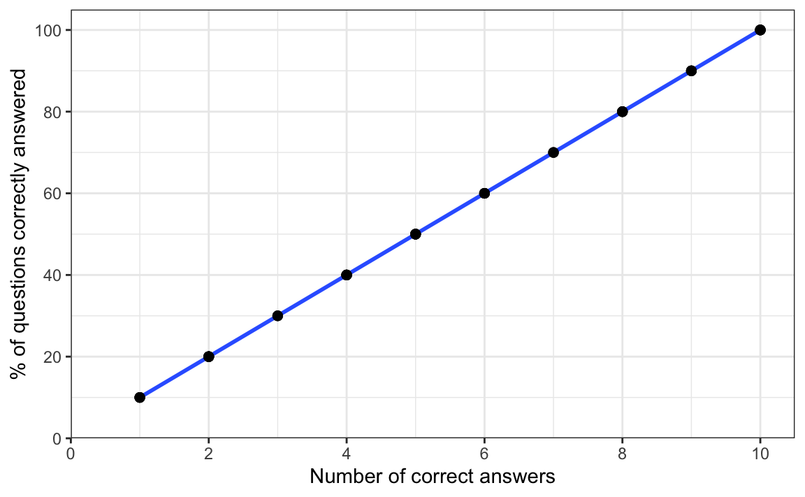
This is confirmed by a correlation test (see below), which shows:
1,R can display: < 2.2e-16), and[1, 1].cor.test(~ N.correct + Accuracy,
data = test.results)
    Pearson's product-moment correlation

data:  N.correct and Accuracy
t = 156587349, df = 98, p-value < 2.2e-16
alternative hypothesis: true correlation is not equal to 0
95 percent confidence interval:
 1 1
sample estimates:
cor
  1
Now, we use the base R function lm() to fit a simple linear model to predict the percentage of questions that learners correctly answered based on the number of correct answers that they gave. Like the significance test functions that we saw in Chapter 11, lm() takes a formula as its first argument. We want to predict the proportion of questions that learners correctly answered as a percentage (Accuracy) so this variable comes before the tilde (~). In statistical modelling, the variable that we want to predict is referred to as the outcome variable.1 We want to use the number of correct answers that the learners gave to make our prediction, so we place the variable N.correct after the tilde. Variables used to predict the outcome are called predictors.2
test.model <- lm(formula = Accuracy ~ N.correct,
                 data = test.results)
We have saved our model to our local environment as an R object called test.model. We can now use the summary() function to examine the model:
summary(test.model)
Call:
lm(formula = Accuracy ~ N.correct, data = test.results)

Residuals:
       Min         1Q     Median         3Q        Max
-3.648e-14 -1.351e-15 -4.300e-16  7.280e-16  7.057e-14

Coefficients:
             Estimate Std. Error   t value Pr(>|t|)
(Intercept) 9.681e-15  1.781e-15 5.436e+00    4e-07 ***
N.correct   1.000e+01  2.890e-16 3.461e+16   <2e-16 ***
---
Signif. codes:  0 '***' 0.001 '**' 0.01 '*' 0.05 '.' 0.1 ' ' 1

Residual standard error: 8.319e-15 on 98 degrees of freedom
Multiple R-squared:      1, Adjusted R-squared:      1
F-statistic: 1.198e+33 on 1 and 98 DF,  p-value: < 2.2e-16
In addition to this model summary, the code above outputs a warning about an “essentially perfect fit” in the Console. We will come to this warning at the end of this section, but for now let’s start by looking at the coefficients of our model summary. Every model has an intercept coefficient estimate ((Intercept)), which is the value that the model predicts for the outcome variable when the predictor variables are zero. In other words, it is where the regression line would cross the y-axis if the line were extended to go all the way to zero as in Figure 12.2.
ggplot(data = test.results,
       aes(x = N.correct, y = Accuracy)) +
  geom_abline(slope = 10,
              intercept = c(0,0),
              linetype = "dotted",
              colour = "blue") +
  geom_smooth(method = "lm",
              se = FALSE) +
  geom_point(alpha = 0.5,
             size = 2) +
  labs(x = "Number of correct answers",
       y = "% of questions correctly answered") +
  scale_x_continuous(limits = c(0, 10.5), expand = c(0,0), breaks = c(0,2,4,6,8,10)) +
  scale_y_continuous(limits = c(0, 105), expand = c(0,0), breaks = c(0, 20, 40, 60, 80, 100)) +
  theme_bw()
In our case, we only have one predictor, so the intercept coefficient that our model estimates (5.151e-15) corresponds to the predicted percentage of questions answered correctly (outcome) when the number of correct answers (predictor) is equal to zero. Instinctively, we know that this value should be zero because 0 points in a test = 0% correct in the test. And, indeed, our model predicts an intercept extremely close to zero (5.151e-15). Using the format() function, we can convert this coefficient estimate from scientific notation to standard notation:
format(5.151e-15, scientific = FALSE)[1] "0.000000000000005151"The second, N.correct coefficient estimate in our model summary is displayed as 1.000e+01 which is equal to:
format(1.000e+01, scientific = FALSE)[1] "10"This coefficient estimate means that, for every correct answer, our prediction for the percentage of questions answered correctly increases by 10%. For example, if a student answered 9 questions correctly, our model predicts that the percentage of correctly answered question is equal to the intercept coefficient of (nearly) zero plus 9 multiplied by 10, which is equal to 90%:
-5.151e-15 + 9 * 10[1] 90In our model summary, the coefficient estimate for N.correct is associated with a p-value of <2e-16. It corresponds to the p-value of our cor.test() on the same data, and is actually the smallest value that R will display. In other words, it is extremely small. This p-value indicates that we can safely reject the null hypothesis that this coefficient is zero under the assumptions of a linear regression model. In other words, we can reject the null hypothesis that the number of correct answers is not a useful predictor to predict the percentage of correctly answered questions under the assumption of a linear regression model (more on these assumptions in Section 11.6).
The penultimate line of the model summary is also important. It features two R-squared (R2) values. Like the absolute values of correlation coefficients, these can range between 0 and 1. R2 = 0 means that the model accounts for 0% of the variance in the outcome variable. R2 = 1 means that the model accounts for 100% of the variance, i.e. that it can perfectly predict the values of the outcome variable from the predictor variable(s). As our simulated test.results dataset is based on a perfect correlation, our model is able to perfectly predict the outcome variable, hence both our R2 values equal 1. In this chapter and Chapter 13, however, we will focus on the adjusted R-squared value because it accounts for the fact that the more predictors we include in our model, the easier it is to predict the outcome variable.
Finally, you may have also noticed that the lm() function returned a warning message when we fitted this practice model:
Warning message:
In summary.lm(test.model) :
  essentially perfect fit: summary may be unreliable
With this message, the authors of the lm() function are warning us that our model can make almost perfect predictions. Given that in real-life research this is extremely unlikely, an “essentially perfect” prediction is usually a sign that we may have made an error of some kind. Here, however, we can safely ignore this warning because we know that the number of correct answers can, indeed, be converted to percentages of correctly answered questions with perfect accuracy (hence our R2 of 1 or 100%).
In the remaining sections of the chapter, we fit simple regression models to real data from:
Dąbrowska, Ewa. 2019. Experience, Aptitude, and Individual Differences in Linguistic Attainment: A Comparison of Native and Nonnative Speakers. Language Learning 69(S1). 72–100. https://doi.org/10.1111/lang.12323.
Our starting point for this chapter is the wrangled combined dataset that we created and saved in Chapter 9. Follow the instructions in Section 9.7 to create this R object.
Alternatively, you can download Dabrowska2019.zip from the textbook’s GitHub repository. To launch the project correctly, first unzip the file and then double-click on the Dabrowska2019.Rproj file.
library(here)

Dabrowska.data <- readRDS(file = here("data", "processed", "combined_L1_L2_data.rds"))
Before you get started, check that you have correctly imported the data by examining the output of View(Dabrowska.data) and str(Dabrowska.data). In addition, run the following lines of code to load the {tidyverse} packages and create “clean” versions of the L1 and L2 datasets as separate R objects:
library(tidyverse)

L1.data <- Dabrowska.data |>
  filter(Group == "L1")

L2.data <- Dabrowska.data |>
  filter(Group == "L2")
Once you are satisfied that the data are correctly loaded, you are ready to start modelling! 🚀
Recall that, in Section 11.5, we saw that there is a positive correlation between the total number of years that English L1 speakers spent in formal education (EduTotal) and their English grammar comprehension test scores (Grammar). Figure 12.3 suggests that this positive correlation also holds for the association between the number of years participants spent in formal education and their receptive vocabulary test scores (Vocab).
L1.data |>
  ggplot(mapping = aes(x = EduTotal,
                       y = Vocab)) +
  geom_point() +
  geom_smooth(method = "lm",
              se = FALSE) +
  theme_bw()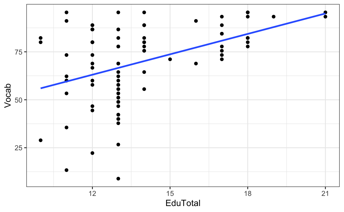
On average, the longer L1 speakers were in formal education, the better they performed on the vocabulary test. The correlation is larger than for Grammar scores, and it is statistically significant at an α-level of 0.05 (r = 0.43, 95% CI [0.24, 0.58]):
cor.test(formula = ~ Vocab + EduTotal,
         data = L1.data)
    Pearson's product-moment correlation

data:  Vocab and EduTotal
t = 4.4281, df = 88, p-value = 2.721e-05
alternative hypothesis: true correlation is not equal to 0
95 percent confidence interval:
 0.2410910 0.5824698
sample estimates:
      cor
0.4268695
The straight (i.e. linear) regression line going through our scatter plot in Figure 12.3, does not go through all the data points like it did in Figure 12.1. This is because, if we know how long an L1 participant was in formal education, we cannot perfectly predict how well they will perform on the Vocab test, even though we do know that, on average, having spent longer in formal education correlates with Vocab test scores. Indeed, Figure 12.3 clearly shows that some of the individuals who attended formal education for the least amount of time scored very low, whilst others scored very high in the Vocab test. This is not surprising, as we can expect that many other factors will play a role in L1 vocabulary knowledge.
We now fit a simple linear regression model using the lm() function (which stands for linear model) to the L1 data from Dąbrowska (2019) with the aim of predicting Vocab scores (our outcome variable) based on the number of years that they spent in formal education (EduTotal; our predictor variable):
model1 <- lm(formula = Vocab ~ EduTotal,
             data = L1.data)
We examine the model using the summary() function:
summary(model1)
Call:
lm(formula = Vocab ~ EduTotal, data = L1.data)

Residuals:
    Min      1Q  Median      3Q     Max
-57.725 -10.716   0.526  12.417  36.033

Coefficients:
            Estimate Std. Error t value Pr(>|t|)
(Intercept)  20.5159    11.1519   1.840   0.0692 .
EduTotal      3.5460     0.8008   4.428 2.72e-05 ***
---
Signif. codes:  0 '***' 0.001 '**' 0.01 '*' 0.05 '.' 0.1 ' ' 1

Residual standard error: 18.51 on 88 degrees of freedom
Multiple R-squared:  0.1822,    Adjusted R-squared:  0.1729
F-statistic: 19.61 on 1 and 88 DF,  p-value: 2.721e-05
This time, we’ll begin our interpretation of the model summary from the top:
The first line is a reminder of the model formula and of the data on which we fitted our linear model (lm).
The second paragraph provides information about the residuals. They represent the difference between participants’ actual Vocab scores (the observed values) and the model’s predictions (the predicted values). Hence, they correspond to the variance in Vocab scores that is left unaccounted for by the model. The closer to zero the residuals are, the better the model fits the data. However, no real-life model is perfect so we expect there to be some “left-over” variance.
Min, 1Q, Median, 3Q, and Max are the minimum, first quartile, median, third quartile, and maximum residuals, respectively. These are the descriptive statistics of a distribution that are typically displayed in a boxplot (see Section 8.3.2). These statistics give us a sense of the spread of the residuals. Whilst these values can be informative, it’s best to plot residuals to get a sense of their distribution (see Section 12.4.3). Ideally, the residuals should be normally distributed and centred around zero (see Section 12.4).The intercept coefficient estimate of 20.516 is the model’s prediction for the vocabulary score of participants who spent zero years (!) in formal education (EduTotal = 0). It is the model’s baseline or reference Vocab score.
The EduTotal coefficient estimate of 3.546 means that, for each year of formal education, our model predicts that Vocab test scores will increase by an additional 3.546 units on top of the baseline score of 20.516, provided that all other variables remain the same. Hence, if an individual spent 14 years in formal education, their predicted Vocab score is:
20.5159 + 14*3.5460[1] 70.1599The p-value associated with the EduTotal coefficient is very small (2.72e-05).
format(2.72e-05, scientific = FALSE)[1] "0.0000272"It suggests that the predictor EduTotal makes a statistically significant contribution to our model predicting Vocab scores among L1 speakers.
The adjusted R-squared (R²) is 0.1729, which means that our model accounts for ca. 17% of the total variance in Vocab scores. That may not seem a lot, but it is worth recalling that our model only includes one predictor variable. We can reasonably assume that other predictors will help us to predict L1 speakers’ vocabulary knowledge more accurately (e.g. their age, how much they read, perhaps their profession, etc.).
Did you notice that the t-value and the p-value associated with the EduTotal coefficient in our linear regression model are exactly the same as those that we obtained earlier using the cor.test() function? This is because linear regression with a single numeric predictor is – under the hood – exactly the same as a Pearson’s correlation test!
Moreover, we said that R² stands for the squared coefficient of correlation, which is why, if we take the square root of our unadjusted R² coefficient, we get 0.43, which corresponds to the correlation coefficient (Pearson’s r) that we obtained from the cor.test() function:
sqrt(0.1822)[1] 0.4268489Having gone through Chapter 11, you may now ask yourself: why do we need correlation tests if simple linear regression does the same thing? 🧐 Honestly, we don’t. Chapter 11 introduced correlation tests and t-tests because they are widely used in the language sciences, so it is important that you understand them, but the truth is: you can achieve much more by taking a modelling rather than a testing approach to analysing data. Read on to find out more!
Figure 12.4 visualises the Vocab scores that our first model (model1) predicts as a function of the number of years that L1 speakers have spent in formal education. We can access our model’s predictions by applying the predict() function to our model object (model1). By definition, regression models predict perfect linear associations. As shown in Figure 12.4, here, our model predicts a perfect, positive linear association between our predictor variable (EduTotal) and our outcome variable (Vocab).
ggplot(L1.data,
       aes(x = EduTotal,
           y = predict(model1))) +
  geom_abline(slope = 3.55,
              intercept = 20.51,
              linetype = "dotted",
              colour = "blue") +
  geom_count() +
  scale_size_area(guide = NULL) +
  labs(y='Predicted Vocab scores',
       x='Years in formal education') +
  theme_bw()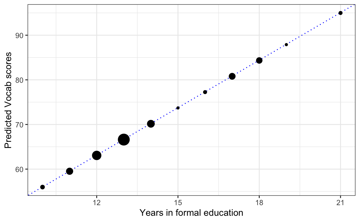
You may have noticed that there are fewer dots on Figure 12.4 than data points in the dataset that we used to fit the model (N = 90). This is because, if more than one L1 participant reported having been in formal education for the same duration of time, the model predicts the same Vocab score for all these people and this means that the dots overlap on the plot of predicted values. To ensure that we keep in mind that a single dot may represent more than one participant, in Figure 12.4, the geom_count() function is used to map the size of each dot onto the number of participants that it represents.
This is all very well, but as we learnt from Figure 12.3, in reality, our predictor variable EduTotal does not correlate perfectly with Vocab scores — far from it! Let us now compare the predicted values of our model with the observed values from the data. How well does our model fit the data? To help us answer this question, Figure 12.5 visualises the relationship between L1 participants’ actual Vocab scores (x-axis) and the scores that the model predicted for these participants (y-axis).
pred_vals   <- predict(model1) # Vector of predictions
xmin_pred   <- min(pred_vals)  # Lowest predicted score

highlight_df <- data.frame(
  x = c(xmin_pred, pred_vals[68]),
  y = c(L1.data$Vocab[which.min(pred_vals)],
      91))

ggplot(L1.data,
       aes(x = pred_vals,
           y = Vocab)) +
  geom_point() +
  # 45° reference line (the "perfect‑prediction" line):
  geom_abline(intercept = 0,
              slope = 1,
              linetype = "dotted",
              colour = "blue") +
  annotate("segment",
           x = xmin_pred,
           y = 29,
           yend = xmin_pred,
           colour = "blue",
           arrow = arrow(length = unit(0.25, "cm"))) +
  annotate("segment",
           x = pred_vals[68],
           y = 91,
           yend = pred_vals[68],
           colour = "blue",
           arrow = arrow(length = unit(0.25, "cm"))) +
  geom_point(data = highlight_df,
             aes(x = x, y = y),
             colour = "blue") +
  scale_y_continuous(limits = c(0, 100),
                     expand = c(0,0)) +
  scale_x_continuous(limits = c(0, 100),
                     expand = c(0,0)) +
  labs(x = "Predicted Vocab scores",
       y = "Actual Vocab scores") +
  theme_bw()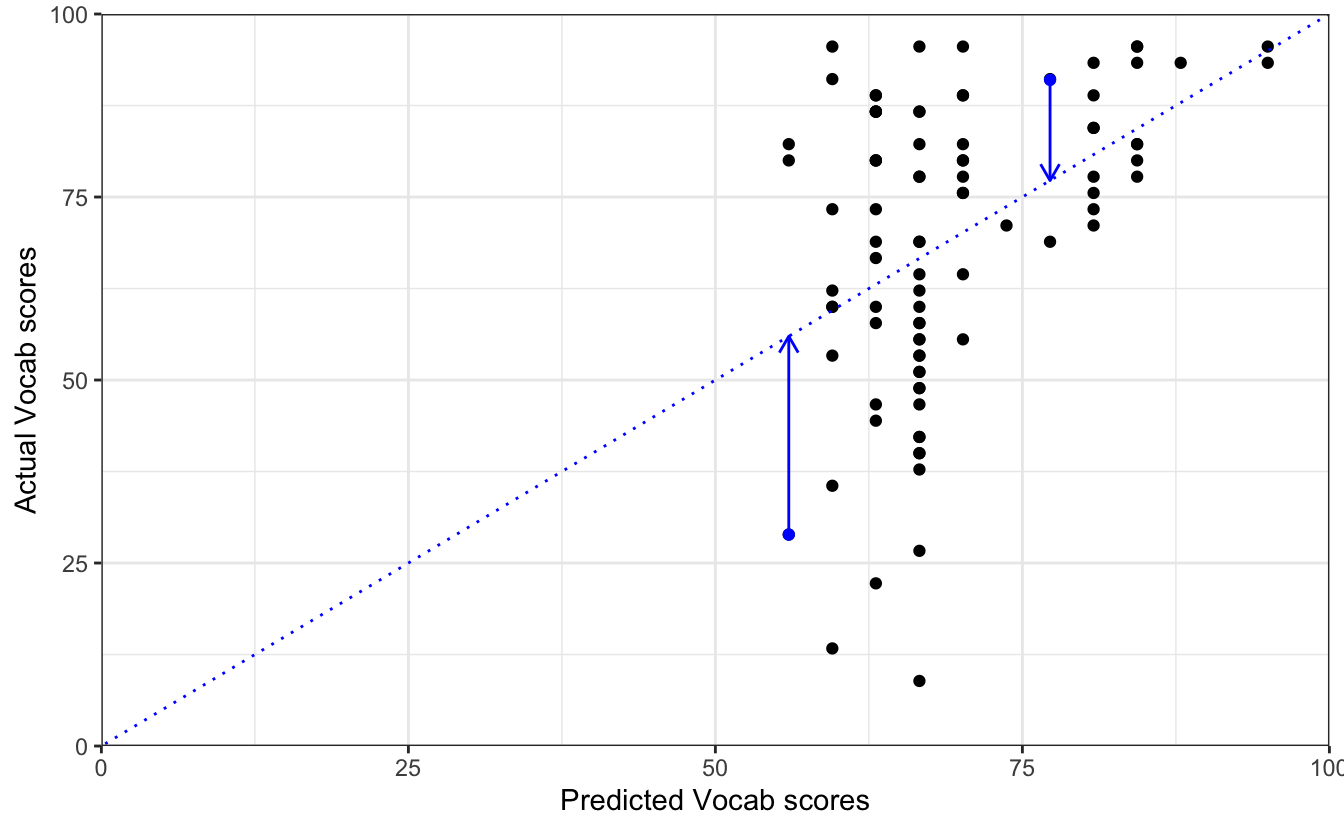
Vocab test scores
In Figure 12.5, the dotted blue line represents where the points would lie, if model1 perfectly predicted Vocab scores based only on the number of years that participants spent in formal education. The dots that fall on or very close to the dotted line stand for L1 participants for whom our model accurately predicts their Vocab score based solely on the number of years they spent in formal education. The further the dots are from the dotted line, the worse the predictions for these speakers. The distances between each point and the dotted line in Figure 12.5 correspond to the model’s residuals. Residuals are therefore the ‘left-over’ variability in the data that our model cannot account for.
Residuals can be positive or negative, depending on whether the dots on the predicted vs. actual values plot are above or below the dotted line of perfect fit. However, what matters more are their absolute values. The larger the residuals, the worse the model fit. Returning to the question, ‘How good is our model fit?’, we can conclude from Figure 12.5 that it’s not great. But we already knew that from the model’s fairly low R² value and, crucially, we also know that many other factors are likely to account for some of the remaining variation in vocabulary scores.
You may be familiar with the Latin phrase:
or its English equivalent:
They both refer to the human tendency to assume that, if two things are regularly associated, one probably causes the other. However, this is a logical fallacy. For example, even if we had observed a very high correlation between the number of years participants were in formal education and their receptive vocabulary test scores (and had therefore reported an excellent model fit with very small residuals), this would by no means imply that, on average, spending more time in formal education leads to greater vocabulary knowledge. A correlation merely describes an association; it tells us nothing about any causal relationship.
It is often tempting to interpret the results of statistical tests and models causally, but this is the result of a well-known human cognitive bias (see, e.g, Matute et al. 2015; Kaufman & Kaufman 2018). In the language sciences and across the social sciences more generally, there are usually far too many potential factors at play to warrant any causal interpretation. What we are modelling throughout this chapter and Chapter 13 are statistical associations. We cannot draw any conclusions about what caused what from these models. In the context of statistical modelling, we can extend the famous saying to: Association does not imply causation.
There are three main reasons for this:
There may be one or more confounding variables that we have not accounted for in our model. For instance, we can predict with a fair degree of accuracy how much vocabulary an infant understands based on their weight. However, the weight of young children is, of course, highly correlated with their age and, by extension, the amount of language exposure they’ve had so far in their life. Clearly, it is not their weight that is causing them to understand more words. Unfortunately, it’s not always that obvious. Going back to model1, it is very likely that some of the younger participants in the Dąbrowska (2019) dataset were still in formal education at the time of data collection; this includes all those who reported being students. In other words, for at least some of the participants, the EduTotal variable confounds age and years spent in formal education.
Even if there is a causal effect, it may not be in the direction that we assume. For example, the vocabulary knowledge of adult learners of a foreign language is probably a fairly good predictor of how many foreign language classes these adult learners have attended. However, this does not mean that vocabulary knowledge causes adults to attend classes. If anything, it is more likely to be the other way around. Whilst it seems rather obvious in this example, in linguistics and education, complex interdependencies between predictors are very common. Consider reading ability: the more a child reads, the better they become at reading. Therefore, we might conclude that spending more time reading leads to better reading skills. However, for some children, poor reading skills may actually cause a lack of motivation and interest in reading in the first place. Clearly, determining causal relationships is tricky!
Finally, it is important to consider the possibility that even a statistically significant association could be entirely spurious. This happens more often than you might think, and it is more likely to happen with smaller datasets. Moreover, the more we test associations, the more likely we are to find statistically significant ones (see Section 11.7 on the multiple testing problem and Type 1 errors). When associations are very strong, we may be tempted to think that they are real, but this may not be the case. To raise awareness of this risk, Tyler Vigen conducted correlation tests on millions of combinations of randomly selected variables and created a website featuring thousands of examples of very large and highly significant correlations that are all entirely spurious (e.g. Figure 12.6).

In this task, you will seek answers to the research question: To what extent can the results of the non-verbal IQ Blocks test be used to predict Vocab scores among L1 and L2 speakers of English based on the data from Dąbrowska (2019)? As we will be answering this question within a linear regression framework, what we are really asking is: To what extent are these variables linearly associated with each other?
Q12.1 Fit a linear model to predict Vocab scores among L1 participants based on their Blocks test scores. What is the adjusted R2 value of this model?
taskmodel1 <- lm(formula = Vocab ~ Blocks,
                 data = L1.data)

summary(taskmodel1) # Adjusted R-squared:  0.07232
Q12.2 According to your model, which of these values is the predicted Vocab score of an L1 speaker with a Blocks score of 20?
# a) Taking a numerical approach, you can add up the model coefficients printed in the model summary. As always, start with the intercept coefficient and add to it the coefficient corresponding to an increase in one point on the Blocks test multiplied by the number of points that this participant achieved (20):
summary(taskmodel1)

54.5614 + 1.0527*20

# Alternatively, we can take the coefficient estimate values directly from the model object to get an even more precise prediction like this:
taskmodel1$coefficients[1] + (taskmodel1$coefficients[2] * 20)

# b) Taking a graphical approach, we need to plot the model's predicted Vocab scores against all Blocks test scores in the dataset in order to find out how what the model's prediction is for a Blocks test score of 20. The ggplot code below adds an arrow and a dotted line to help you read the predicted Vocab score from the plot:
ggplot(L1.data,
       aes(x = Blocks,
           y = predict(taskmodel1))) +
  geom_point() +
  annotate("segment",
           x = 20,
           y = 50,
           yend = 75,
           colour = "blue",
           arrow = arrow(length = unit(0.25, "cm"))) +
  annotate("segment",
           x = 0,
           xend = 19.5,
           y = 75.6,
           colour = "blue",
           linetype = "dotted") +
  labs(y='Predicted Vocab scores',
       x='Blocks test scores') +
  theme_minimal()
Q12.3 Now fit a new linear model to predict Vocab scores among L2 participants based on their Blocks test scores. Comparing the adjusted R2 value of this new L2 model to your previous L1 model, which of these statements is/are true?
taskmodel2 <- lm(formula = Vocab ~ Blocks,
                 data = L2.data)

summary(taskmodel2) # Adjusted R-squared:  0.007177
summary(taskmodel1) # Adjusted R-squared:  0.07232
Q12.4 In your L2 model, the p-value for the Blocks predictor should be 0.228620. True or false: This p-value means that there is a 23% chance of obtaining a Blocks coefficient estimate of 0.72 or higher in a random sample of 67 L2 speakers of English when there is actually no association between the results of the Blocks test and those of the Vocab test?
Let us now see how much of the variation across all receptive English vocabulary test scores in the Dąbrowska (2019) data we can accurately predict if we only include a single categorical binary variable predictor in our model: whether the Vocab scores belong to L1 or L2 speakers of English. Hence, in the following model, we keep the same outcome variable (Vocab), but now we try to predict it using the Group variable as our single predictor.
We know that, on average, L1 speakers score better on the Vocab test than L2 speakers. However, as illustrated in Figure 12.7, we also know that there is quite a bit of variability around the mean scores of the L1 and L2 speakers.
group_means <- Dabrowska.data |>
  group_by(Group) |>
  summarise(mean_vocab = mean(Vocab))

ggplot(data = Dabrowska.data,
       aes(x = Group,
           y = Vocab)) +
  geom_boxplot(width = 0.5) +
  stat_summary(
    fun = mean,                     # what to plot
    geom = "point",                 # as a point
    shape = 18,                     # in a diamond shape
    size = 4,                       # a little larger than the default
    colour = "blue") +
  geom_line(
    data = group_means,
    aes(x = as.numeric(Group),
        y = mean_vocab),
    colour = "blue",
    linewidth = 1,
    linetype = "dashed") +
  geom_text(data = group_means,
    aes(x = as.numeric(Group),
        y = mean_vocab,
        label = sprintf("%.2f", mean_vocab)), # print the means to two decimal points
    vjust = -1.4,
    colour = "purple") +
  labs(x = NULL,
    y = "Non-verbal IQ (Blocks) test") +
  theme_bw(base_size = 14)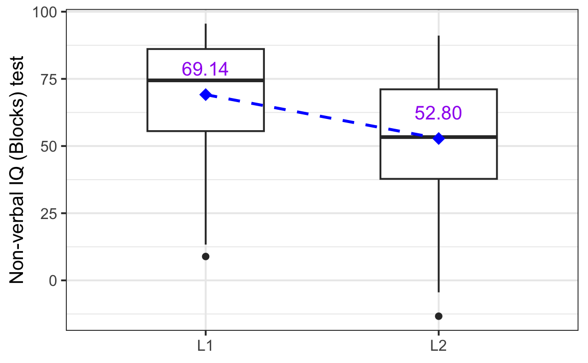
A t-test shows that the mean difference between L1 and L2 speakers is statistically significant (p = 7.032e-06):
t.test(Vocab ~ Group,
       data = Dabrowska.data)
    Welch Two Sample t-test

data:  Vocab by Group
t = 4.6768, df = 133.83, p-value = 7.032e-06
alternative hypothesis: true difference in means between group L1 and group L2 is not equal to 0
95 percent confidence interval:
  9.425801 23.240497
sample estimates:
mean in group L1 mean in group L2
        69.13580         52.80265
Cohen’s d is large (0.77) and the 95% confidence interval does not go anywhere near zero:
library(effectsize)

cohens_d(Vocab ~ Group,
         data = Dabrowska.data)
Cohen's d | 95% CI
------------------------
0.77 | [0.44, 1.09]
- Estimated using pooled SD.So we can be confident that the Group variable will be a useful predictor to predict Vocab in a simple linear regression model. We can use exactly the same formula as earlier to fit our model:
model2 <- lm(formula = Vocab ~ Group,
             data = Dabrowska.data)

summary(model2)
Call:
lm(formula = Vocab ~ Group, data = Dabrowska.data)

Residuals:
    Min      1Q  Median      3Q     Max
-66.136 -13.580   2.753  17.531  38.308

Coefficients:
            Estimate Std. Error t value Pr(>|t|)
(Intercept)   69.136      2.247  30.763  < 2e-16 ***
GroupL2      -16.333      3.440  -4.748 4.64e-06 ***
---
Signif. codes:  0 '***' 0.001 '**' 0.01 '*' 0.05 '.' 0.1 ' ' 1

Residual standard error: 21.32 on 155 degrees of freedom
Multiple R-squared:  0.127, Adjusted R-squared:  0.1213
F-statistic: 22.54 on 1 and 155 DF,  p-value: 4.644e-06
Let’s break down the model summary:
The intercept coefficient estimate is the predicted Vocab score when Group is at its reference level. By default, in R, the reference level of a categorical variable is the level that comes first alphabetically. Here, it’s therefore ‘L1’ for the English native speaker group. The model’s estimated Vocab test score for an L1 participant is therefore 69.136 points. If you check Figure 12.7, you will see that this value corresponds to the mean L1 Vocab score in our data.
The GroupL2 coefficient estimate is the estimated change in Vocab score for an L2 speaker as compared to the reference level of an L1 speaker. The estimate is -16.333, which means that L2 speakers are predicted to score 16.333 points lower than L1 speakers on this test. If you subtract this GroupL2 coefficient estimate from the Intercept, you will find that it corresponds to the mean L2 Vocab score in our data:
69.136 - 16.333[1] 52.803The p-value associated with the coefficient GroupL2 is extremely small (4.64e-06). It informs us that Group is a statistically significant predictor of receptive English vocabulary knowledge based on our data.
The adjusted R-squared value indicates the proportion of variation in Vocab scores that the model can account for when we know a participant’s native-speaker status: 12.13% (0.1213). This value is not particularly impressive. However, this is not surprising given that our model attempts to predict vocabulary scores based solely on whether someone is an L1 or L2 speaker of English. With only this information, the model can only predict that L1 speakers will achieve the mean L1 score and L2 speakers the mean L2 score of the sample data.
Here, too, it is worth noticing that fitting a simple linear regression model with a single binary predictor is — under the hood — exactly the same thing as conducting an independent two-sample t-test. Compare the t-statistic of the t-test that we computed earlier with that of the t-statistic of the GroupL2 coefficient reported in the summary of our second model. If we ignore the signs of the t-values, we can see that they are almost identical!
Also, notice how the p-value computed by the t.test() function and that reported for our GroupL2 coefficient are almost identical. They both correspond to values that are extremely close to zero.
The very small differences between these values are due to the default correction that the t.test() function in R makes for unequal group variances (see Section 8.3). If we switch off this correction, both the t-statistic and the p-value are exactly the same as those reported in the summary of our second linear model above:
t.test(Vocab ~ Group,
       data = Dabrowska.data,
       var.equal = TRUE)
    Two Sample t-test

data:  Vocab by Group
t = 4.7478, df = 155, p-value = 4.644e-06
alternative hypothesis: true difference in means between group L1 and group L2 is not equal to 0
95 percent confidence interval:
  9.537477 23.128821
sample estimates:
mean in group L1 mean in group L2
69.13580 52.80265 Q12.5 Draw a boxplot showing the distribution of Vocab scores among male and female participants in Dabrowska.data. Based on your boxplot, do you expect Gender to be a statistically significant predictor of Vocab scores?
Dabrowska.data |>
  ggplot(mapping = aes(x = Gender,
                       y = Vocab)) +
  geom_boxplot() +
  labs(x = "Gender",
       y = "Vocab scores") +
  theme_minimal()
Q12.6 Fit a model with Vocab as the outcome variable and Gender as the predictor to test your intuition based on your boxplot. Is Gender a statistically significant predictor of Vocab score in this simple linear regression model?
taskmodel3 <- lm(formula = Vocab ~ Gender,
                 data = Dabrowska.data)

summary(taskmodel3) # p-value associated with coefficient estimate for GenderM = 0.957
Q12.7 The adjusted R2 coefficient of the model is -0.006433. True or false: This means that male participants, on average, score 0.006433 fewer points than female participants on the Vocab test?
The beauty of the statistical modelling approach — as opposed to the testing approach — is that we can include all kinds of predictors in our models using a single function, lm(), and R’s formula syntax. So far, we have seen that predictors can be numeric variables (e.g. EduTotal) and categorical binary variables (e.g. Group). In this section, we see how a categorical variable with more than two levels can be entered in a linear regression model.
To demonstrate this, we will now attempt to predict participants’ Vocab scores based on their occupational group (OccupGroup), which can be one of four broad categories (see Section 10.1.2):
C: Clerical positions
I: Occupationally inactive (i.e. unemployed, retired, or homemakers)
M: Manual jobs
PS: Professional-level jobs or studying for a degree
According to the descriptive statistics visualised in Figure 12.8, it looks like participants’ professional occupation group is unlikely to be terribly useful to predict their vocabulary knowledge. Nonetheless, we can see that — perhaps somewhat counter-intuitively — so-called “occupationally inactive” participants (“I”) tend to score higher than the other participants.
Dabrowska.data |>
  ggplot(mapping =
           aes(y = Vocab,
               x = OccupGroup,
               fill = OccupGroup,
               colour = OccupGroup)) +
  geom_boxplot(alpha = 0.3,
               outliers = FALSE) + # If the outliers are plotted as part of the boxplot, these data points will be duplicated by the geom_jitter() function.
  geom_jitter(alpha = 0.8,
              width = 0.2) +
  scale_color_viridis_d(guide = "none") +
  scale_fill_viridis_d(guide = "none") +
  theme_bw()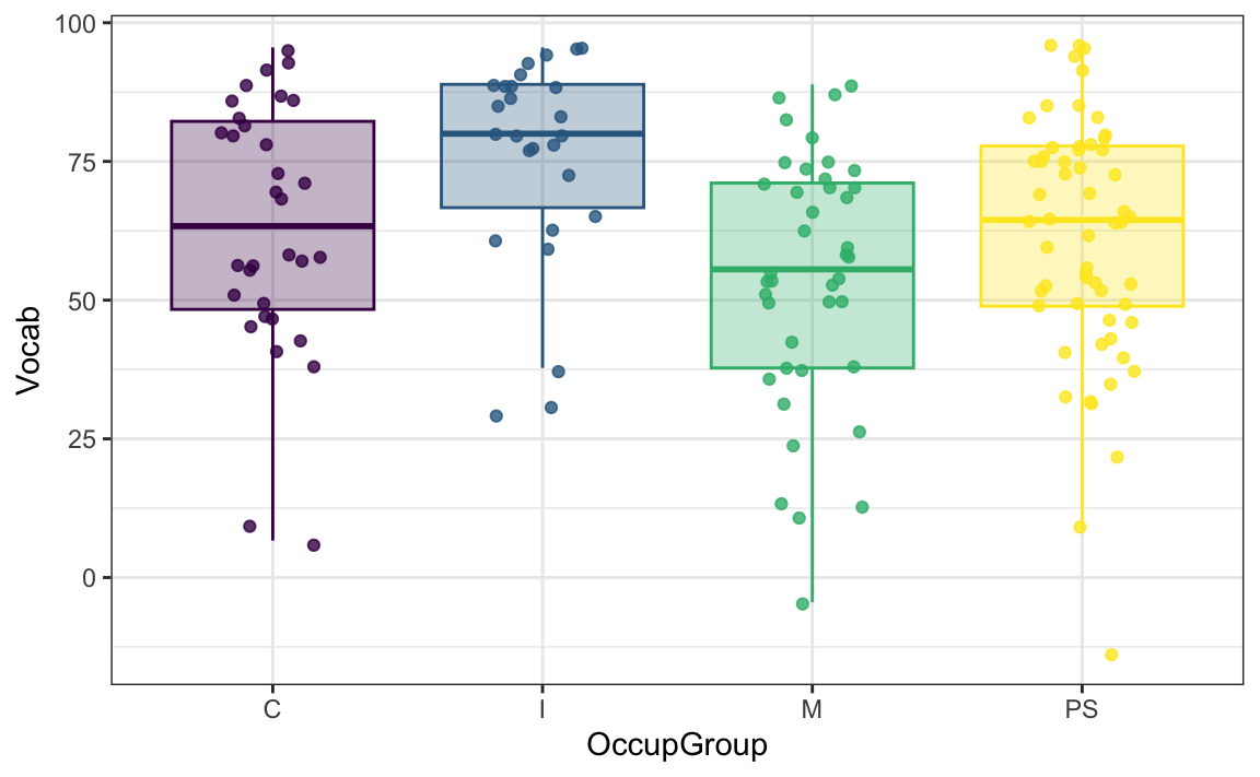
So, let’s compute a simple linear model with OccupGroup as a predictor of Vocab and examine its summary:
model3 <- lm(formula = Vocab ~ OccupGroup,
             data = Dabrowska.data)

summary(model3)
Call:
lm(formula = Vocab ~ OccupGroup, data = Dabrowska.data)

Residuals:
    Min      1Q  Median      3Q     Max
-74.406 -13.504   3.372  16.705  34.688

Coefficients:
             Estimate Std. Error t value Pr(>|t|)
(Intercept)    63.333      3.867  16.379   <2e-16 ***
OccupGroupI    12.393      5.775   2.146   0.0335 *
OccupGroupM    -9.133      5.160  -1.770   0.0787 .
OccupGroupPS   -2.261      4.817  -0.469   0.6395
---
Signif. codes:  0 '***' 0.001 '**' 0.01 '*' 0.05 '.' 0.1 ' ' 1

Residual standard error: 21.87 on 153 degrees of freedom
Multiple R-squared:  0.09288,   Adjusted R-squared:  0.07509
F-statistic: 5.222 on 3 and 153 DF,  p-value: 0.001849
The estimate of the intercept corresponds to the reference level of the OccupGroup variable. Remember that the reference level is always the first level. We can check the order of the levels in any factor variable using the levels() function:
levels(Dabrowska.data$OccupGroup)[1] "C" "I" "M" "PS"By default, the levels are ordered alphabetically. In the OccupGroup variable, the first level is “C”, which corresponds to a clerical position. This means that our third model predicts that English speakers in a clerical position will score 63.333 points on the Vocab test. Those that belong to the “inactive” group (“I”) will score 12.393 more points than those, i.e.:
63.333 + 12.393[1] 75.726Participants who have manual jobs (“M”) are predicted to score -9.133 points fewer than those in clerical positions, and so-called “professionals” (“PS”) will do slightly worse than clerks (-2.261 points). Compare these predicted values to those observed in the data shown in Figure 12.8.
The adjusted R2 value for our model is relatively low (0.07509). This means that our model accounts for about 7.5% of the total variance in Vocab scores across the dataset. Given that the R2 of model1 was 0.1213, this indicates that OccupGroup is a considerably less useful predictor variable to help us predict participants’ Vocab scores than whether or not they are an L1 speaker (Group).
What’s more, the model summary reveals that only one of the model3’s three coefficient estimates is statistically significantly different from 0 at the α-level of 0.05: OccupGroupI with a p-value of 0.0335. This means that we can reject the null hypothesis that there is no difference in Vocab scores between speakers of the occupational group “C” (the reference level) and those of the occupational group “I”. For the other two occupational groups, we do not have enough evidence to reject the null hypothesis of no difference compared to the reference level “C”.
We can display the predicted Vocab scores for each occupational group, together with a 95% confidence interval around these predicted values using the emmeans() function from the {emmeans} package (Lenth & Piaskowski 2025):
#install.packages("emmeans")
library(emmeans)

emmeans(model3, ~ OccupGroup)
OccupGroup emmean SE df lower.CL upper.CL
C 63.3 3.87 153 55.7 71.0
I 75.7 4.29 153 67.3 84.2
M 54.2 3.42 153 47.5 60.9
PS 61.1 2.87 153 55.4 66.7
Confidence level used: 0.95 The {visreg} package (Breheny & Burchett 2017) provides an efficient way of visualising model predictions and residuals. In Figure 12.9 we visualise the model’s predicted values (as blue lines) and the confidence intervals output by the emmeans() function (as grey bands), together with the model’s residuals (as grey dots).
library(visreg)

visreg(model3, gg = TRUE) +
  labs(x = "Occupational groups",
       y = "Predicted Vocab scores") +
  theme_bw()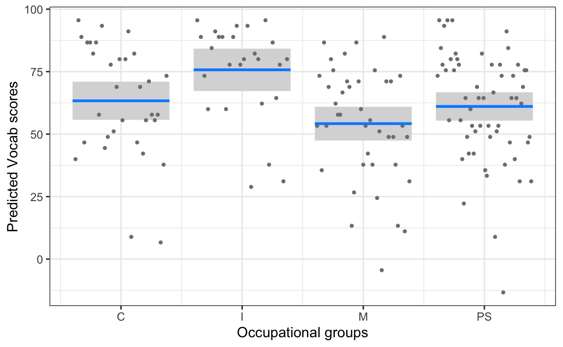
When we use the argument “gg = TRUE”, the visreg() function outputs a ggplot object that we can then manipulate and customise just like any other ggplot object (see Chapter 10).
You may come across the type of simple linear regression model that we have just covered, involving a continuous numeric outcome variable and a categorical predictor with more than two levels, under the guise of a statistical significance test, namely the one-way ANOVA (ANalysis Of VAriance).
If you compare the summary of the following one-way ANOVA with that of the third model (model3), you will spot some similarities. However, it is necessary to carry out so-called post-hoc tests to get as much information out of an ANOVA as we can get from the summary of our simple linear regression model.
anova1 <- aov(formula = Vocab ~ OccupGroup,
    data = Dabrowska.data)

summary(anova1)
Df Sum Sq Mean Sq F value Pr(>F)
OccupGroup 3 7495 2498.5 5.222 0.00185 **
Residuals 153 73205 478.5
---
Signif. codes: 0 '***' 0.001 '**' 0.01 '*' 0.05 '.' 0.1 ' ' 1In this task, you will explore whether L2 participants’ native language is a useful predictor when trying to model their English Vocab scores.
Q12.8 Fit a linear model to model L2 participants’ Vocab score based on their native language (NativeLg). According to the model’s adjusted R2 coefficient, how much of the variance in Vocab scores among L2 participants does this model account for?
taskmodel3 <- lm(formula = Vocab ~ NativeLg,
                data = L2.data)

summary(taskmodel3) # Adjusted R-squared:  0.1331
Q12.9 In this model, there is a greater difference between the multiple R2 and the adjusted R2 coefficients than in all previous models in this chapter. Why might that be?
Q12.10 One way to reduce the number of levels in the NativeLg variable is to model Vocab scores based on L2 participants’ native language family, instead. Fit a model that attempts to predict Vocab scores among L2 participants based on the NativeLgFamily variable (the creation of this variable was a Your turn! task in Section 9.5.2). Based on your comparison of the two models, which of the following statements is/are true?
taskmodel4 <- lm(formula = Vocab ~ NativeLgFamily,
                data = L2.data)

summary(taskmodel4)
Q12.11 According to your NativeLgFamily model, what is the predicted Vocab score of an L2 participant with a Baltic L1?
# The Baltic language family is the first level in this categorical predictor (because we haven't changed the order which, by default, is alphabetical):
levels(L2.data$NativeLgFamily)

# The Intercept coefficient corresponds to an L2 participant with a Baltic native language:
summary(taskmodel4)
Q12.12 According to your NativeLgFamily model, what is the predicted Vocab score of an L2 participant with a Slavic L1?
# a) Numeric approach
summary(taskmodel4)

73.778 + -23.749

# b) Graphical approach
library(visreg)

visreg(taskmodel4, gg = TRUE) +
  labs(title = "Participants' L1 language family",
       x = NULL,
       y = "Vocab scores") +
  theme_bw()

# The predicted value for the Slavic L1 speakers is visualised by the last blue line.
Q12.13 According to the NativeLgFamily model, Hellenic L1 speakers are predicted to perform considerably better than the reference level of Baltic L1 speakers. However, the p-value associated with this coefficient estimate is very large (0.4591). Why is that?
# The plot of predicted values (see code below) shows that the coefficient estimate for Hellenic speakers is based on only one data point (as is also the case for Germanic speakers).
library(visreg)
visreg(taskmodel4, gg = TRUE) +
  labs(title = "Participants' L1 language family",
       x = NULL,
       y = "Vocab scores") +
  theme_bw()

# We can check the distribution of native language family using the `table()`, `summary()` or `count()` functions:
table(L2.data$NativeLgFamily)

summary(L2.data$NativeLgFamily)

L2.data |>
  count(NativeLgFamily)
Q12.14 Apply the emmeans function from the {emmeans} package to the NativeLgFamily model to compute the predicted mean Vocab scores of each L1 language family group. Romance L1 speakers are predicted to attain a mean score of 66.3. This predicted score is associated with a 95% confidence interval that spans from 43.2 to 56.8. What does this mean?
#install.packages("emmeans")
library(emmeans)

emmeans(taskmodel4, ~ NativeLgFamily)Similar to the statistical tests that we conducted in Chapter 11, linear regression also has a number of assumptions that should be met if we want to obtain reliable results that we can trust. It is therefore very important that we check that these assumptions are met.
This is the same assumption as for the statistical tests that we covered in Chapter 11 (see Section 11.6.2). It means that each observation in our dataset should be unrelated to every other observation. In other words, knowing the value of one data point shouldn’t give us any information about any other data point in our dataset. This assumption is critical because violations can lead to unjustifiably low p-values and narrower confidence intervals.
Independence violations arise from the way data were collected. For example, if we test the same person several times, their test results are likely to be more similar to each other than to the results of other participants. Similarly, if we collect data over time, today’s measurement might be influenced by yesterday’s value. When pupils are sampled from different schools, pupils within the same school or class might be more similar to each other than to pupils from other schools and/or classes.
If our data do not meet the assumption of independence, we need to use a different analysis method that can account for the fact that our data points are related to each other. In the language sciences, this is most commonly achieved using mixed-effects models. In this textbook, however, we only cover fixed-effects models for which the assumption of independence must be held.
The linearity assumption requires that the relationship between the numeric predictor variables entered into a model and the outcome variable follows a straight (i.e. linear) line rather than a curved one. This assumption is fundamental because linear regression, as the name suggests, can only ever fit a straight line through the data. If the true relationship between our predictors is curved, forcing a straight line through the data will lead to poor predictions and misleading conclusions.
To check this assumption, it is best to plot the predictor variable against the outcome variable in the form of a scatter plot (see Figure 12.1). When examining such plots, we are looking for rough straight-line patterns. We are not expecting all the same data points to fall on the linear regression line (that would be entirely unrealistic with real data). However, the points should be scattered around an imaginary straight line without showing any obvious curved patterns.
In Figure 12.10, by contrast, the data points follow a curved pattern and the blue linear regression line is nonsensical. With these data, making predictions based on this linear model would generate systematic prediction errors. Such a pattern of errors indicates that the assumption of linearity is violated.
Linear regression models assume homogeneity — or constant variance — of the residuals (see Section 11.6.5). This assumption is best checked by visually examining the model residuals. In Figure 12.11, we plot the residuals of model1 and check that their variability does not systematically increase or decrease as the outcome variable increases or decreases.
# Create a data frame containing the model's residuals and predictions:
residual_data <- data.frame(
  fitted_values = fitted(model1),
  residuals = residuals(model1)
)

# Create plot of fitted values vs. residuals:
ggplot(residual_data,
       aes(x = fitted_values, y = residuals)) +
  geom_point(alpha = 0.6) +
  geom_hline(yintercept = 0, color = "blue", linewidth = 1) +
  labs(x = "Predicted Vocab scores (fitted values)",
       y = "Model residuals") +
  theme_minimal()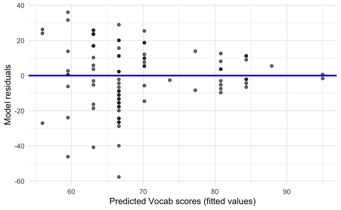
In Figure 12.11, we can see that the residuals are not randomly spread across both sides of the blue line, but rather that they form a funnel-like shape: the spread of residuals tends to be larger for low predicted Vocab scores and becomes progressively smaller for higher predicted scores. This pattern indicates that our model is more accurate when it comes to predicting high Vocab scores than lower ones. This constitutes a violation of the assumption of equal variance or homoscedasticity.
Ideally, model residuals also ought to be normally distributed, with a mean of zero. However, this assumption becomes less important as the sample size increases (Williams, Grajales & Kurkiewicz 2013: 10). Again, it is best to check the distribution of residuals visually. As shown in Figure 12.12, the residuals of model1 are fairly normally distributed.
ggplot(residual_data,
       aes(x = residuals)) +
  geom_density(fill = "purple",
               alpha = 0.6) +
  geom_vline(xintercept = 0,
             colour = "blue",
             linewidth = 0.8,
             linetype = "dotted") +
  theme_minimal()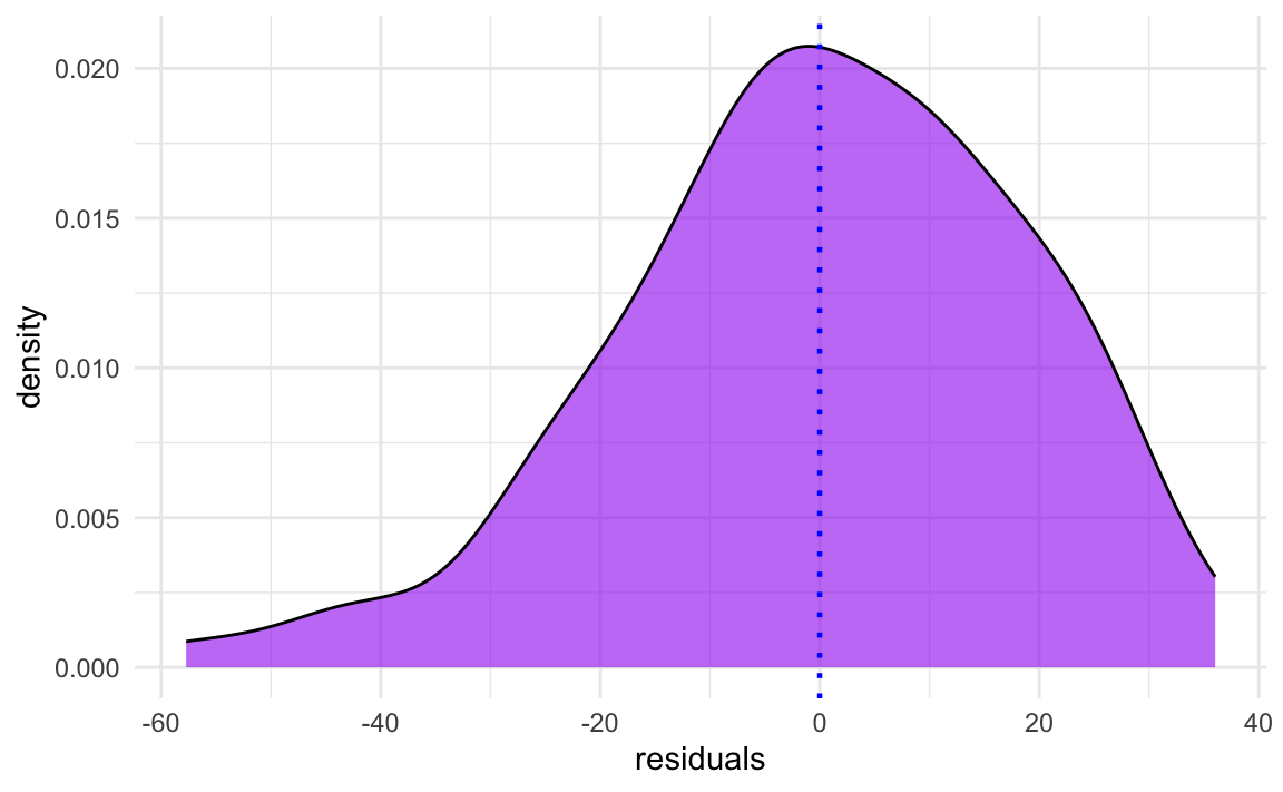
Figure 12.12 shows that the distribution of the residuals of model1 are slightly left-skewed, but that the distribution is more or less centered around zero. Indeed, the model’s mean residual is almost exactly zero:
summary(model1$residuals) Min. 1st Qu. Median Mean 3rd Qu. Max.
-57.7253 -10.7158 0.5255 0.0000 12.4168 36.0334 When the sample size is small and the model residuals are not normally distributed, the inferences that we can draw from the model are less trustworthy. However, with larger sample sizes, regression is relatively robust to the assumption of normally distributed residuals (Williams, Grajales & Kurkiewicz 2013: 3).
In this chapter, we fitted simple linear regression models. These models demonstrate that we can – to a greater or lesser degree – predict (or model) participants’ receptive vocabulary knowledge test scores on the basis of a single predictor such as the number of years that they spent in formal education or their occupational group.
We have referred to the variable that we are trying to predict as the outcome variable. It is worth knowing that it is sometimes also called the dependent variable because we are attempting to model its ‘dependence’ on one or more independent variables (which we have called predictors). In Chapter 13, we will continue to use the terminology of outcome and predictor variables, but you should be aware that some textbooks and researchers will speak of dependent and independent variables, instead.3
While our simple linear regression models did allow us to account for some of the variance in participants’ Vocab test scores, like the statistical tests that we conducted in Chapter 11, they still only allow us to capture one aspect of receptive vocabulary knowledge at a time. What we really want to do is to be able to enter several predictor variables into a single model. For example, it would be interesting to know whether the number of years spent in formal education remains a significant predictor of Vocab scores when controlling for participants’ occupational groups. This can be achieved with multiple linear regression, and that’s coming up in the next chapter!
Well done! You have successfully completed this chapter introducing the linear regression modelling. You have answered 0 out of 14 questions correctly.
Are you confident that you can…?
You are now ready to move on the really exciting stuff: multiple regression modelling! 🤓 Coming up in Chapter 13…
This variable is sometimes referred to as the dependent variable (see Section 12.5).↩︎
These variables are also sometimes referred to as independent variables (see Section 12.5).↩︎
This choice of terminology is largely a personal one but, in my experience, learners find this terminology less confusing as it is immediately obvious what is being predicted (the outcome or dependent variable) and what is used to make the prediction (the predictors or the independent variables). Another advantage is that the term predictor can be used by itself (i.e. without the word “variable”), which is handy because when we enter a categorical variable into a model, there are as many predictors as there are variable levels.↩︎