🐭 Click on the mouse for a hint.
Ch. 10: Tasks & Quizzes
TipYour turn!
Q10.1 Which of the following labels can be added or modified using the labs() function?
TipYour turn!
Q10.2 Study Figure 10.21 and think about which {ggplot2} functions were used to generate it. 🤔
Then, click on the “Show R code” button the figure to compare your intuitions with the actual code. Note that there may well be more than one solution, so do try out your version and see if you can spot any differences!
TipYour turn!
Q10.3 Compare the two plots below. Which one makes it easier to see which occupational group has the fewest participants and why?
Barplot
Show R code to create the barplot.
Dabrowska.data |>
  mutate(OccupGroup = fct_recode(OccupGroup,
                                 `Professionally inactive` = "I",
                                 `Clerical profession` = "C",
                                 `Manual profession` = "M",
                                 `Professional-level job/\nstudent` = "PS")) |>
  filter(Gender == "M") |>
  ggplot(mapping = aes(x = OccupGroup,
                       fill = OccupGroup)) +
  geom_bar() +
  labs(x = NULL,
       y = "Participants") +
  scale_fill_viridis_d() +
  coord_flip() +
  theme_minimal() +
  theme(axis.text = element_text(size = 15),
        legend.position = "none")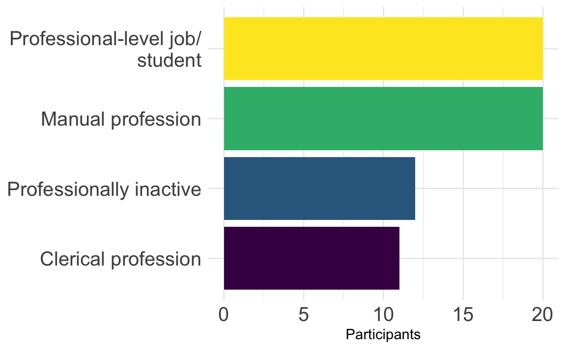
Pie chart
Show R code to create the pie chart.
Dabrowska.data |>
  mutate(OccupGroup = fct_recode(OccupGroup,
                                 `Professionally inactive` = "I",
                                 `Clerical profession` = "C",
                                 `Manual profession` = "M",
                                 `Professional-level job/\nstudent` = "PS")) |>
  filter(Gender == "M") |>
  ggplot(mapping = aes(x = "", fill = OccupGroup)) +
    geom_bar(width = 1) +
    scale_fill_viridis_d(direction = -1) +
    coord_polar("y") +
    theme_void(base_size = 20) # This increases the font size.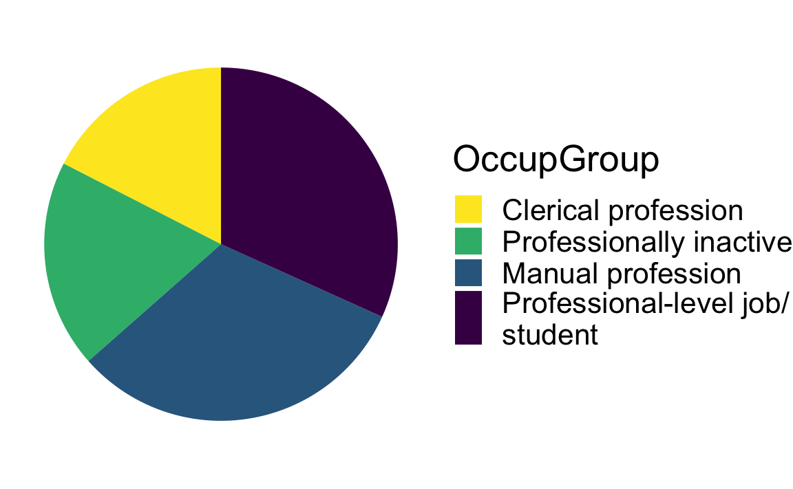
🦉 Hover over the owl for a first hint.
🐭 Click on the mouse for a second hint.
TipYour turn!
Using the {ggplot2} library, create a barplot that shows the distribution of occupational groups (OccupGroup) among male L1 and L2 participants in Dąbrowska (2019)’s study.
Q10.4 Drawing on the information provided by your barplot, how many male participants reported having manual jobs?
Show sample code to answer Q10.4
Dabrowska.data |>
  filter(Gender == "M") |>
  ggplot(mapping = aes(x = OccupGroup)) +
  geom_bar() +
  labs(x = "Occupational group",
       y = "Male participants") +
  theme_minimal()
Q10.5 Is the legend in the barplot that you have created necessary?
See code.
Dabrowska.data |>
  filter(Gender == "M") |>
  ggplot(mapping = aes(x = OccupGroup,
                       fill = OccupGroup)) +
  geom_bar() +
  theme_minimal() +
  theme(legend.position = "none")
Q10.6 Create a pie chart that shows the distribution of occupational groups among male participants (as shown in Figure 10.20). Which line of code is essential to create a pie chart using {ggplot2}?
Show code to create pie chart below.
Dabrowska.data |>
  filter(Gender == "M") |>
  ggplot(mapping = aes(x = "",
                       fill = OccupGroup)) +
    geom_bar(width = 1) +
    coord_polar("y") +
    theme_void()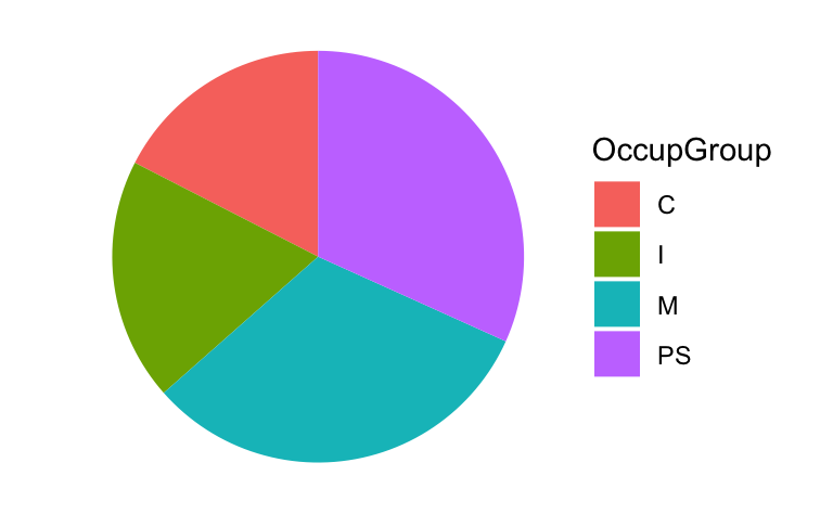
Q10.7 Transform the pie chart that you just created in c. to make it look like the plot below. To achieve this, wrangle the data before piping it into the data argument of the ggplot() function. Which {tidyverse} function can you use to rename the labels?
Show sample code to answer Q10.7
Dabrowska.data |>
  mutate(`OccupGroup` = fct_recode(OccupGroup,
                                 `Professionally inactive` = "I",
                                 `Clerical profession` = "C",
                                 `Manual profession` = "M",
                                 `Professional-level job` = "PS")) |>
  filter(Gender == "M") |>
  ggplot(mapping = aes(x = "",
                       fill = OccupGroup)) +
  geom_bar(width = 1) +
  coord_polar("y") +
  theme_void() +
labs(fill = "Occupational group") # This last line of code changes the title of the legend, which is the label for the variable associated with the `fill` aestetics. 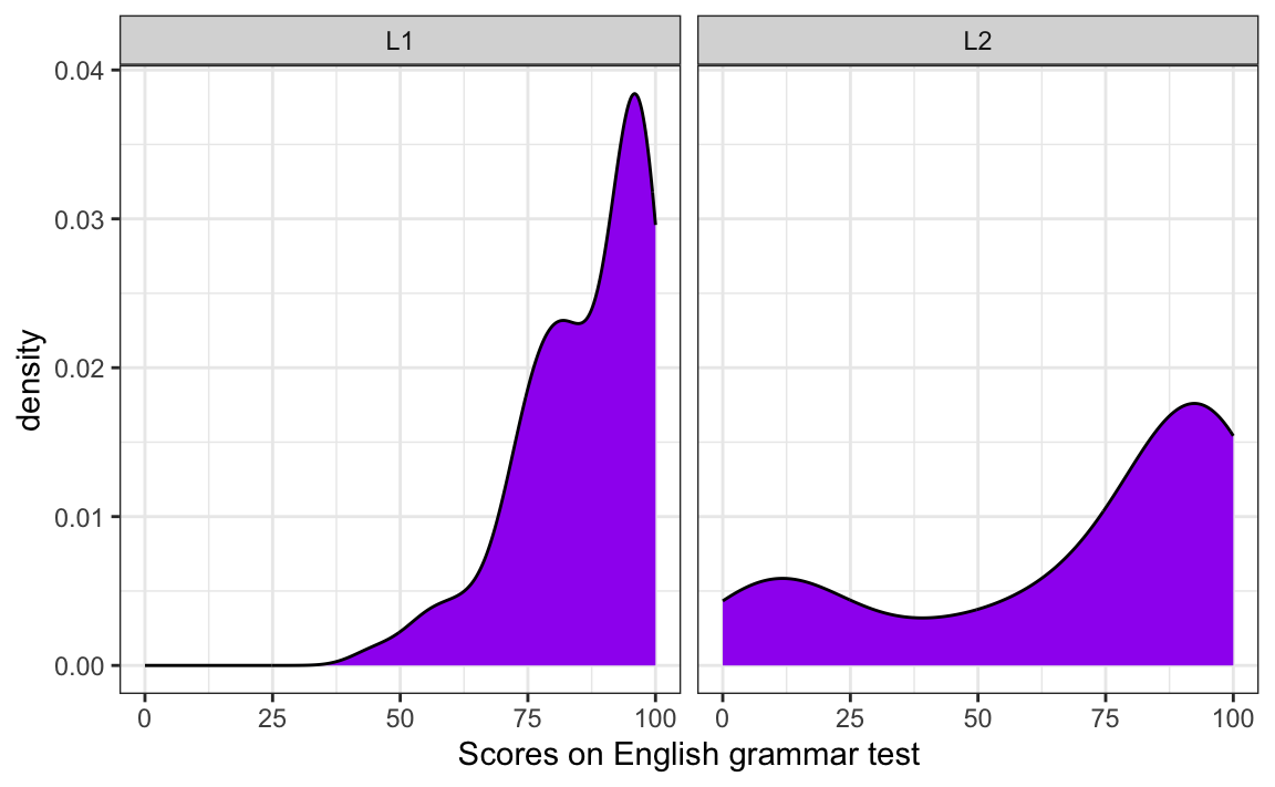
TipYour turn!
Q10.13 Which line of code needs to be added to the code used to generate Figure 10.25 to produce a two-panel density plot as in the figure below?
Show sample code to help you answer Q10.13.
ggplot(data = Dabrowska.data,
       mapping = aes(x = Grammar)) +
  geom_density(fill = "#440154") +
  facet_wrap(~ Group) +
  labs(x = "Scores on English grammar test") +
  theme_bw()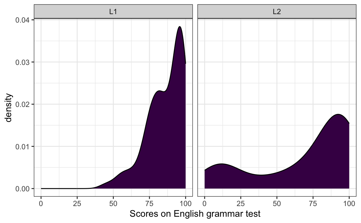
Q10.14 Create four density plots to visualise the distribution of participants’ ART (Author Recognition Test), Blocks (non-verbal IQ test), Colloc (English collocation test), and Vocab (English vocabularly test) scores.
Which variable’s distribution is closest to a normal distribution?
Show sample code to help you answer Q10.13.
Dabrowska.data |>
  select(Vocab, Colloc, ART, Blocks) |>
  tidyr::gather() |>  # This function from tidyr converts a selection of variables into two variables: a key and a value. The key contains the names of the original variable and the value the data. This means we can then use the facet_wrap function from ggplot2
  ggplot(aes(value)) +
    theme_bw() +
    facet_wrap(~ key, scales = "free", ncol = 2) +
    scale_x_continuous(expand=c(0,0)) +
    geom_density(fill = "#440154")
TipYour turn!
Q10.15 Create a boxplot to compare how participants in different occupational groups (OccupGroup) performed on the English grammar test. Which part of the code used to produce Figure 10.28 do you need to modify to achieve this?
Show sample code to answer Q10.15.
Dabrowska.data |>
  ggplot(mapping = aes(y = Grammar,
                       x = OccupGroup)) +
  geom_boxplot() +
  theme_minimal() +
  labs(y = "Grammar scores")
Q10.16 The code below was used to create Figure 1, except that the arguments of the aes() function have been deleted. Which data mappings were specified inside the aes() function to produce Figure 1?
Dabrowska.data |>
  mutate(Group = fct_recode(Group,
                            `L1 participants` = "L1",
                            `L2 participants` = "L2")) |>
  ggplot(mapping = aes(█ █ █ █ █ █ █ █ █ █ █ █)) +
    geom_boxplot(alpha = 0.8) +
    scale_fill_viridis_d(option = "viridis") +
    scale_y_continuous(breaks = seq(0, 100, 10)) +
    labs(y = "Grammar scores",
         x = NULL,
         fill = "Occupational group",
         title = "English grammar comprehension test results",
         subtitle = "among L1 and L2 participants with different occupations") +
    theme_bw() +
    theme(element_text(size = 12),
          legend.position = "bottom", # We move the legend to the bottom of the plot.
          legend.box.background = element_rect()) # We add a frame around the legend.
Show answer to Q10.16.
Dabrowska.data |>
  mutate(Group = fct_recode(Group,
                            `L1 participants` = "L1",
                            `L2 participants` = "L2")) |>
  ggplot(mapping = aes(y = Grammar,
                       x = Group,
                       fill = OccupGroup,
                       facet = OccupGroup)) +
    geom_boxplot(alpha = 0.8) +
    scale_fill_viridis_d(option = "viridis") +
    scale_y_continuous(breaks = seq(0, 100, 10)) +
    labs(y = "Grammar scores",
         x = NULL,
         fill = "Occupational group",
         title = "English grammar comprehension test results",
         subtitle = "among L1 and L2 participants with different occupations") +
    theme_bw() +
    theme(element_text(size = 12),
          legend.position = "bottom", # We move the legend to the bottom of the plot.
          legend.box.background = element_rect()) # We add a frame around the legend.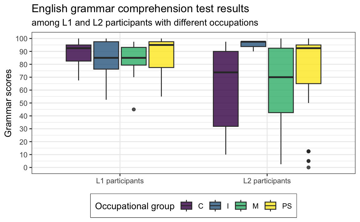
🦉 Hover over the owl for a first hint.
🐭 Click on the mouse for a second hint.
TipYour turn!
In this quiz, you will explore another hypothesis:
L2 speakers’ grammar comprehension scores (
Grammar) are positively correlated with their length of residence in the UK (LoR): L2 speakers who have lived in the UK for longer have a better understanding than those who arrived more recently.
Using {ggplot2}, create a scatterplot that allows you to explore this hypothesis.
Q10.17 What do you need to do before piping the data into the ggplot() function?
🐭 Click on the mouse for a hint.
Show sample code to answer Q10.17.
Dabrowska.data |>
  filter(Group == "L2") |>
  ggplot(mapping = aes(x = LoR,
                       y = Grammar)) +
  geom_point() +
  labs(x = "Length of residence in the UK (years)",
       y = "Grammar test scores") +
  theme_bw()
Q10.18 On your scatterplot, which data point(s) are clearly outliers?
🐭 Click on the mouse for a hint.
Identifying outliers is important to check and understand our data. If we spot an outlier corresponding to a participant having lived in a country for 400 years, we can immediately tell that something has gone wrong during data collection and/or pre-processing. In this case, however, common sense tells us that it is prefectly possible to have lived 40+ years in a country. Still, compared to the rest of the data, the outlier is striking and we should check that it is not due to an error.
Q10.19 Using data wrangling functions from the {tidyverse} (see 9 Data wRangling), check whether the outlier participant is old enough to have lived in the UK for longer than 40 years. How old were they when they first came to the UK?
🐭 Click on the mouse for a hint.
Show sample code to answer Q10.19.
Dabrowska.data |>
  filter(LoR > 40) |>
  select(Age, LoR)

62-42
Q10.20 In order to better visualise a potential correlation between L2 participants’ grammar comprehension test results and how long they’ve lived in the UK, we will exclude the outlier and re-draw the scatterplot. Which function can you use to exclude the identified outlier before piping the data into the ggplot() function?
🐭 Click on the mouse for a hint.
Show sample code to answer Q10.20.
Dabrowska.data |>
  filter(Group == "L2") |>
  filter(LoR < 40) |>
  ggplot(mapping = aes(x = LoR,
                       y = Grammar)) +
  geom_point() +
  geom_smooth(method = "lm",
              se = FALSE) +
  labs(x = "Length of residence in the UK (years)",
       y = "Grammar test scores") +
  theme_bw()
Q10.21 Having removed the outlier point from the scatterplot, now add a regression line to visualise the correlation between the two variables. Which of the following options best fits the gap in the sentence below?
In this group of L2 speakers, there is _____________________ correlation between participants’ grammar test scores and their length of residence in the UK.
🐭 Click on the mouse for a hint.
Show sample code to answer Q10.21.
Dabrowska.data |>
  filter(Group == "L2") |>
  filter(LoR < 40) |>
  ggplot(mapping = aes(x = LoR,
                       y = Grammar)) +
  geom_point() +
  geom_smooth(method = "lm",
              se = FALSE) +
  labs(x = "Length of residence in the UK",
       y = "Grammar test scores") +
  theme_bw()
Check your progress 🌟
Well done! You have successfully completed this chapter on data visualisation using the Grammar of Graphics approach. You have answered 0 out of 21 questions correctly.