Ch. 11: Tasks & Quizzes
TipYour turn!
Q11.1 Which of the following statements best describes random sampling?
Q11.2 True or false: In a convenience sample, the researcher can ensure that the sample is representative of the entire population if they are careful to match the sample to census demographics (age, gender, region, etc.).
TipYour turn!
Consider the following research question:
- Across all adult English speakers in the UK, do L1 speakers, on average, achieve higher scores than L2 speakers on the English receptive vocabulary test?
Q11.3 Which null hypothesis could you formulate for this research question?
Q11.4 Run a t-test on the Dąbrowska (2019) data to test the null hypothesis that you selected in Q11.3 above. What is the value of the t-statistic?
🐭 Click on the mouse for a hint.
Show sample code to answer Q11.4.
# It is always a good idea to visualise the data before running a statistical test:
Dabrowska.data |>
  ggplot(mapping = aes(y = Vocab,
                       x = Group)) +
  geom_boxplot(alpha = 0.7) +
  theme_bw()

# Running the t-test:
t.test(formula = Vocab ~ Group,
       data = Dabrowska.data)
Q11.5 What is the p-value associated with the t-test you ran above?
Q11.6 The p-value is very, very small. What does this mean? Select all that apply.
🐭 Click on the mouse for a hint.
TipYour turn!
Compute three Cohen’s d values to capture the magnitude of the difference between L1 and L2 speakers:
- English grammar (
Grammar) test scores - English receptive vocabulary (
Vocab) test scores, and - English collocation (
Colloc) test scores.
As these are three standardised effect sizes, we can compare them.
Q11.7 Comparing the three Cohen’s d that you computed, which statement(s) is/are true?
🐭 Click on the mouse for a hint.
Show sample code to answer Q11.7.
cohens_d(Grammar ~ Group,
       data = Dabrowska.data)

cohens_d(Vocab ~ Group,
       data = Dabrowska.data)

cohens_d(Colloc ~ Group,
       data = Dabrowska.data)
Q11.8 Now compute 99% confidence intervals (CI) around the same three Cohen’s d values. Which statement(s) is/are true?
🐭 Click on the mouse for a hint.
Show code to answer Q11.8.
cohens_d(Grammar ~ Group,
       data = Dabrowska.data,
       ci = 0.99)

cohens_d(Vocab ~ Group,
       data = Dabrowska.data,
       ci = 0.99)

cohens_d(Colloc ~ Group,
       data = Dabrowska.data,
       ci = 0.99)
Q11.9 Consider the code and its outputs below. We are now comparing the English grammar comprehension test scores of male and female native speakers of Romance languages only. Hence, we are now looking at a very small sample size comprising just five female and one male participants.
Dabrowska.Romance <- Dabrowska.data |>
  filter(NativeLgFamily == "Romance")

table(Dabrowska.Romance$Gender)
F M
5 1 cohens_d(Grammar ~ Gender,
data = Dabrowska.Romance)Cohen's d | 95% CI
-------------------------
-1.04 | [-3.24, 1.27]
- Estimated using pooled SD.Which statement(s) is/are true about the standardised effect size computed for the difference in the English comprehension grammar scores of male and female Romance L1 speakers in this very small dataset (n = 6)?
🦉 Hover over the owl for a first hint.
🐭 Click on the mouse for a second hint.
TipYour turn!
Generate a facetted scatter plot (similar to Figure 11.4) visualising the correlation between age (Age) and English receptive vocabulary test scores (Vocab) for L1 and L2 participants in two separate panels. Add a grey band visualising 95% confidence intervals around the regression lines.
Q11.10 Looking at your plot only, which of these statements can you confidently say is/are true?
🐭 Click on the mouse for a hint.
Show code to generate the plot needed to answer Q11.10.
Dabrowska.data |>
   ggplot(mapping = aes(x = Age,
                        y = Vocab)) +
     geom_point() +
     facet_wrap(~ Group) +
     geom_smooth(method = "lm",
                 se = TRUE) +
  theme_bw()
Now use the cor.test() function to find out how strong the correlations are in both the L1 and the L2 groups. Use the default \(\alpha\)-level of 0.05.
Q11.11 Based on the outputs of the cor.test() function, which of these statements can you confidently say is/are true? Note that, in this question and the next one, values are reported to two decimal places.
🐭 Click on the mouse for a hint.
Show code to answer Q11.11.
cor.test(formula = ~ Age + Vocab,
         data = L1.data)

cor.test(formula = ~ Age + Vocab,
         data = L2.data)
Consider the code and its output below. Figure 1 visualises the correlation between L2 speakers’ English receptive vocabulary test scores (Vocab) and their age of arrival in the UK (Arrival).
L2.data |>
   ggplot(mapping = aes(x = Arrival,
                        y = Vocab)) +
     geom_point() +
     geom_smooth(method = "lm",
                 se = TRUE) +
  theme_bw()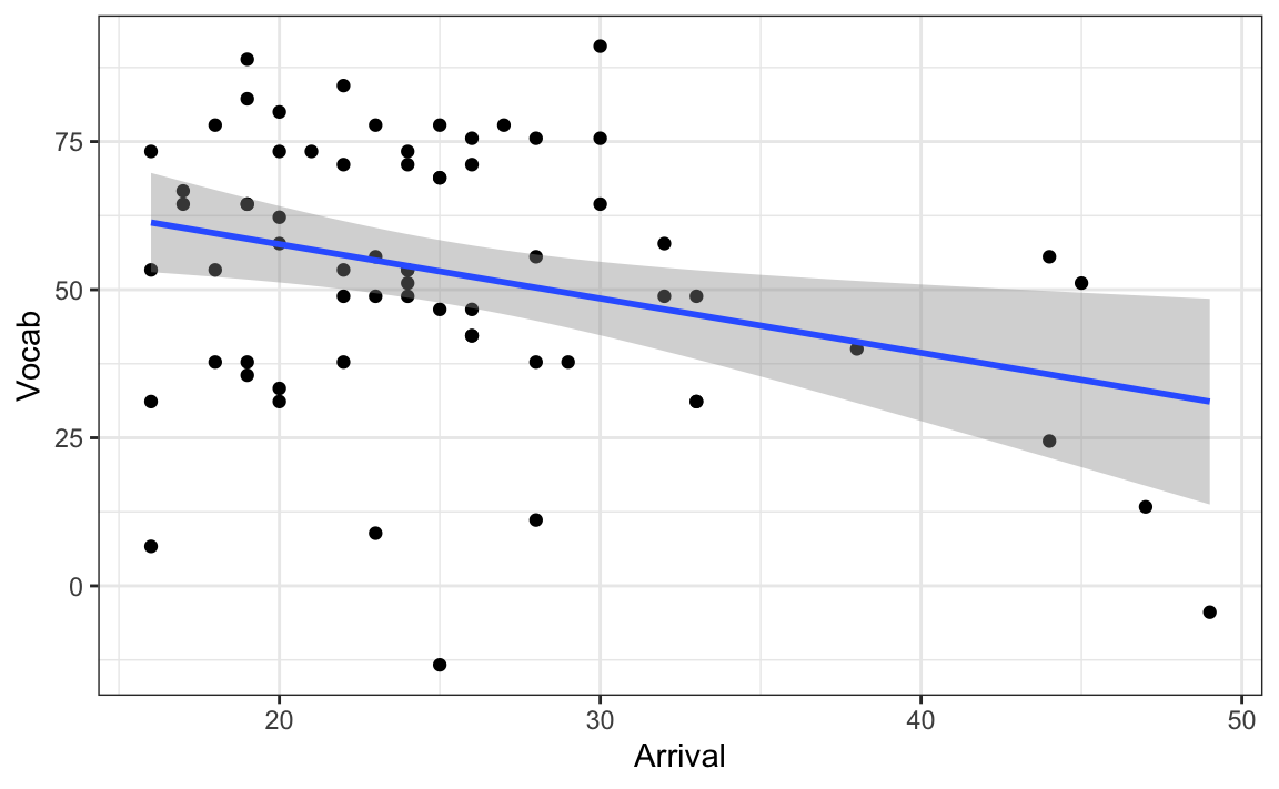
Q11.12 Run a correlation test on the correlation visualised in Figure 1. How strong is the correlation (to two decimal places)?
🐭 Click on the mouse for a hint.
Show code to answer Q11.12.
cor.test(formula = ~ Vocab + Arrival,
         data = L2.data)
Q11.13 How likely are we to observe such a strong correlation or an even stronger one in a sample of this size, if there is actually no correlation in the full L2 population?
🐭 Click on the mouse for a hint.
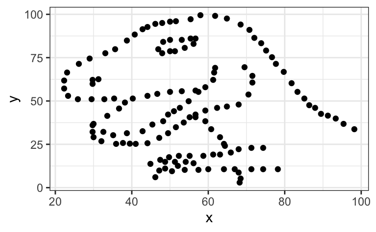
CautionOptional (fun) task 🦖
Inspired by the Anscombe Quartet, Matejka & Fitzmaurice (2017) created a set of 12 pairs of variables that have the same descriptive statistics as the data that produce a scatter plot representing a tyrannosaurus (see Figure 2).
1. Install and load the datasauRus package to access the R data object datasaurus_dozen:
install.packages("datasauRus")
library(datasauRus)

datasaurus_dozen
2. Run the following code to compare the descriptive statistics of all three datasets within the datasaurus_dozen. The fourth set, dino, is the one visualised in Figure 2. Note that there is a very small, negative correlation between all pairs of variables of -0.0656.
datasaurus_dozen |>
  group_by(dataset) |>
  summarise(
    mean_x = mean(x),
    mean_y = mean(y),
    std_dev_x = sd(x),
    std_dev_y = sd(y),
    corr_x_y = cor(x, y))
# A tibble: 13 × 6
dataset mean_x mean_y std_dev_x std_dev_y corr_x_y
<chr> <dbl> <dbl> <dbl> <dbl> <dbl>
1 away 54.3 47.8 16.8 26.9 -0.0641
2 bullseye 54.3 47.8 16.8 26.9 -0.0686
3 circle 54.3 47.8 16.8 26.9 -0.0683
4 dino 54.3 47.8 16.8 26.9 -0.0645
5 dots 54.3 47.8 16.8 26.9 -0.0603
6 h_lines 54.3 47.8 16.8 26.9 -0.0617
7 high_lines 54.3 47.8 16.8 26.9 -0.0685
8 slant_down 54.3 47.8 16.8 26.9 -0.0690
9 slant_up 54.3 47.8 16.8 26.9 -0.0686
10 star 54.3 47.8 16.8 26.9 -0.0630
11 v_lines 54.3 47.8 16.8 26.9 -0.0694
12 wide_lines 54.3 47.8 16.8 26.9 -0.0666
13 x_shape 54.3 47.8 16.8 26.9 -0.06563. Run the following code to visualise the relationships between the other 12 pairs of variables.
ggplot(datasaurus_dozen,
       aes(x = x, y = y, colour = dataset)) +
  geom_point() +
  facet_wrap(~ dataset, ncol = 3) +
  theme_bw() +
  theme(legend.position = "none") +
  labs(x = NULL,
       y = NULL)
4. Add a geom_ layer (see Geometries) to the following {ggplot2} code to add a blue linear regression line in all 13 panels.
View code to complete Part 4 of the task.
ggplot(datasaurus_dozen,
       aes(x = x, y = y, colour = dataset)) +
  geom_point() +
  facet_wrap(~ dataset, ncol = 3) +
  geom_smooth(method = "lm",
              se = FALSE,
              colour = "blue") +
  theme_bw() +
  theme(legend.position = "none") +
  labs(x = NULL,
       y = NULL)
Clearly, if we had only used correlation statistics to describe the relationships between these 13 pairs of variables, we would have missed some literally dinosaur-sized patterns! 🤯
TipYour turn!
The dataset from Dąbrowska (2019) includes the results of numerous additional tests that we have not yet examined.
In this task, we imagine that a friend of yours has decided to test whether, on average, male and female speakers performed equally well on four additional English grammar tests. The four variables that he selected correspond to participants’ scores on English tests assessing participants’ mastery of:
- the active voice (
Active) - the passive voice (
Passive) - post-modified subjects (
Postmod) - subject relatives (
SubRel)
Your friend conducted the following four t-tests to find out whether he could reject the the null hypothesis of no difference in the average performance of male and female English speakers in these four grammar tests. He chose 0.05 as his significance threshold and, on the basis of these four tests, concluded that he could reject the null hypothesis in two out of four tests: the one concerning the active voice and the one about subject relatives.
t.test(formula = Active ~ Gender,
       data = Dabrowska.data)

t.test(formula = Passive ~ Gender,
       data = Dabrowska.data)

t.test(formula = Postmod ~ Gender,
       data = Dabrowska.data)

t.test(formula = SubRel ~ Gender,
       data = Dabrowska.data)
Q11.14 Your friend tells you that, based on the results of the two significant t-tests, he has decided to write a term paper focussing on how men have a better understanding of the active voice and subject relative constructions than women. You warn him that this approach reminds you of a questionable research practice (QRP) that you read about in the FORRT glossary. Which one?
🐭 Click on the mouse for a hint.
Q11.15 You explain to your friend that, if he wants to conduct four separate tests on the same dataset, he needs to correct the p-values for multiple testing. Which reason(s) can you use to explain this to your friend?
🐭 Click on the mouse for a hint.
Q11.16 How high is your friend’s risk of erroneously rejecting the null hypothesis in at least one of his four tests?
🐭 Click on the mouse for a hint.
Show sample code to answer Q11.16
1 - (1 - 0.05)^4 Q11.17 Use Holm’s correction to correct the four p-values that your friend obtained to account for the fact that he conducted four tests on the same dataset. After correction, which null hypotheses can be rejected at \(\alpha\)-level = 0.05?
🐭 Click on the mouse for a hint.
Show sample code to answer Q11.17
# Running the four t-tests and saving the output as four R objects to the local environment:
active.ttest <- t.test(formula = Active ~ Gender,
       data = Dabrowska.data)

passive.ttest <- t.test(formula = Passive ~ Gender,
       data = Dabrowska.data)

postmod.ttest <- t.test(formula = Postmod ~ Gender,
       data = Dabrowska.data)

subjrel.ttest <- t.test(formula = SubRel ~ Gender,
       data = Dabrowska.data)

# Extracting just the p-values from the test outputs
p.values <- c(active.ttest$p.value, passive.ttest$p.value, postmod.ttest$p.value, subjrel.ttest$p.value)

# The original p-values:
p.values

# Applying Holm's correction to the p-values
p_values.adjusted <- p.adjust(p.values, method = "holm")

# The adjusted p-values in scientific notation:
p_values.adjusted

# Now only the first p-value is below 0.05:
p_values.adjusted < 0.05
Check your progress 🌟
Well done! You have successfully completed this chapter introducing the complex topic of inferential statistics. You have answered 0 out of 17 questions correctly.